Supermarket launch campaign email designs from top brands



1. Farm Boy : Refresh Your Palate at our Salad Bar!
Objective
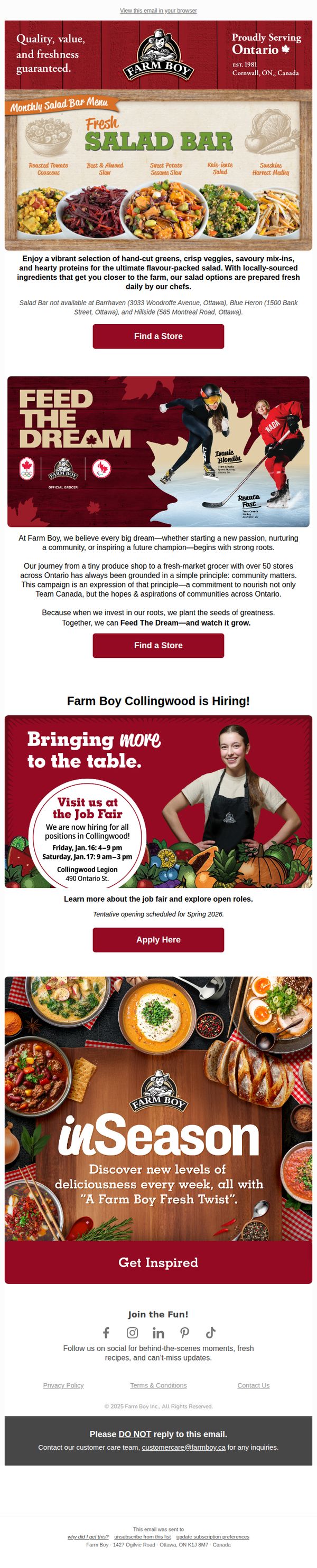
To drive in-store traffic by highlighting the freshness and variety of Farm Boy’s salad bar while simultaneously promoting community values and local hiring opportunities. The email aims to position Farm Boy as a community-centered, fresh-focused grocer that inspires both culinary exploration and local engagement.
Why this works
Farm Boy masterfully blends product promotion with community storytelling, using the salad bar as a gateway to highlight local sourcing and daily freshness, which builds trust and emotional connection with customers who value transparency and quality.
How to implement
The inclusion of athlete endorsements and a community-driven campaign like 'Feed The Dream' elevates the brand beyond grocery shopping into a lifestyle and values-based experience, making customers feel they’re supporting something bigger than just a meal.
Pro Tip
The primary CTA 'Find a Store' appears twice but is visually identical and lacks urgency or personalization, adding a location-aware dynamic element or time-sensitive incentive (e.g., 'First 50 visitors this week get a free topping') would boost conversion. • The email lacks a clear visual hierarchy between the salad bar promotion and the hiring/job fair section, which risks diluting the primary goal; reordering or visually separating these sections with distinct headers or color blocks would improve focus and reduce cognitive load.
2. Farm Boy : Hosting Last-Minute? Farm Boy Has New Year’s Eve Covered
Objective
This email aims to convert last-minute New Year’s Eve planners into shoppers by showcasing convenient, festive products that solve hosting stress. It positions Farm Boy as the go-to solution for effortless holiday entertaining with ready-to-serve items and clear department guidance.
Why this works
Farm Boy brilliantly targets last-minute hosts by framing their products as stress-free solutions, not just food, but time-saving, crowd-pleasing experiences that turn chaotic prep into confident celebration.
How to implement
Each product is presented with a clear department location and prep time, reducing friction for time-pressed shoppers and subtly reinforcing Farm Boy’s organized, customer-first in-store experience.
Pro Tip
Add a countdown timer or 'limited stock' indicator near the CTA to heighten urgency for last-minute shoppers, especially since the email targets time-sensitive New Year’s Eve planning. • Include a short testimonial or social proof near the product grid, such as '9/10 hosts say these appetizers saved their party', to build trust and reduce decision fatigue for new customers.
3. Waitrose: Welcome to a new month of Little Treats, Shawanda 👋
Objective
This email aims to welcome the recipient, Shawanda, to Waitrose’s new 'Little Treats' loyalty program by explaining how it works and encouraging immediate engagement through spending milestones. It seeks to drive repeat purchases by framing rewards as delightful surprises tied to regular shopping behavior.
Why this works
The email brilliantly personalizes the welcome by using the recipient’s name and framing the program as a delightful surprise rather than a transactional reward, which builds emotional connection and encourages ongoing participation through positive anticipation.
How to implement
By visually mapping the spending journey with clear milestones (£50, £100, £250) and progress indicators, the email transforms abstract loyalty into a tangible, gamified experience that motivates incremental spending while reducing cognitive load for the customer.
Pro Tip
Add a countdown timer or monthly progress bar near the top to create urgency and reinforce the reset cycle, helping members visualize how much they’ve spent and how close they are to their next treat, this would strengthen behavioral momentum. • Include a brief testimonial or social proof from another member who recently redeemed a treat, ideally with a photo or quote, to build credibility and emotional resonance by showing real people enjoying the rewards.
4. The Fresh Market: Celebrate our new Aventura store!
Objective
This email aims to drive foot traffic and excitement for The Fresh Market’s new Aventura Square store opening by highlighting exclusive in-store events, limited-time BOGO deals, and member-only savings to convert local shoppers into first-time visitors.
Why this works
The email brilliantly anchors its entire campaign around a single, emotionally resonant event, the grand opening of a new store, which transforms a routine promotion into a community celebration that customers feel compelled to attend.
How to implement
By featuring a celebrity chef meet-and-greet with tangible perks like cookbook giveaways and butter tart tastings, the email elevates the in-store experience beyond transactional shopping into a memorable, shareable social occasion that drives urgency and FOMO.
Pro Tip
The primary CTA 'SHOP BOGO DEALS' is buried beneath multiple product images; relocating it above the product grid or adding a sticky CTA bar would significantly improve conversion by reducing scroll friction and guiding users toward the core offer faster. • The wine discount section lacks visual emphasis and clear hierarchy, adding a countdown timer or bold badge like 'WEDNESDAY ONLY!' directly on the wine bottles would increase perceived urgency and prevent the offer from being overlooked amid the BOGO-heavy layout.
5. Sainsbury's: This just in: Pieces to elevate every room
Objective
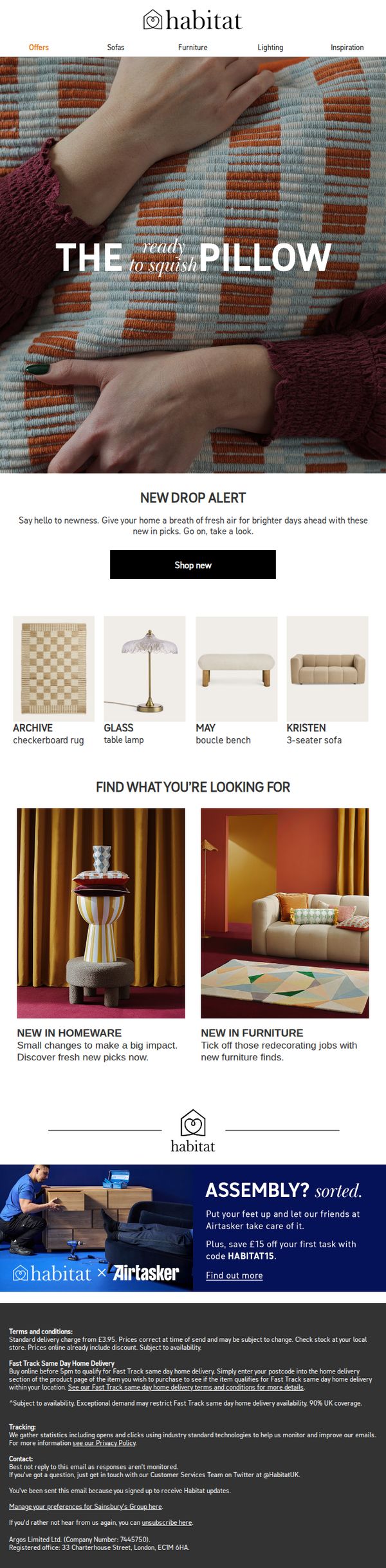
To drive immediate engagement with Habitat’s latest home decor and furniture arrivals by highlighting tactile, trend-led pieces that refresh living spaces. The email aims to convert curiosity into clicks with a clear 'Shop new' CTA and strategic product groupings.
Why this works
The email masterfully uses tactile language like 'ready to squish' to evoke sensory appeal, making inanimate objects feel inviting and emotionally resonant, a subtle but powerful technique to boost desire and reduce purchase hesitation.
How to implement
By splitting the product grid into two distinct categories, 'New in Homeware' and 'New in Furniture', the email guides users through logical shopping paths, reducing decision fatigue and helping them self-segment based on their current renovation or styling goals.
Pro Tip
The hero section’s headline 'THE ready to squish PILLOW' visually dominates but lacks a direct link to the CTA, adding a subtle arrow or hover effect on the pillow image that leads to the 'Shop new' button would strengthen visual flow and reduce friction. • The 'Find what you’re looking for' section uses compelling imagery but doesn’t include direct category links or filters, embedding clickable category headers (e.g., 'Browse Homeware') would improve navigation and reduce bounce rate by guiding users deeper into the funnel.
6. The Fresh Market: Meet our newest fresh finds

Objective
To introduce and drive excitement around newly launched products that align with The Fresh Market’s curated, health-conscious, and globally inspired brand identity, encouraging customers to visit their local store to explore and purchase these fresh finds.
Why this works
The email successfully frames each new product with a compelling origin story or nutritional benefit, turning commodity items into curated discoveries that feel exclusive and worth exploring in-store.
How to implement
By pairing bold visual product displays with concise, benefit-driven copy, the email creates an effortless browsing experience that educates while enticing, making it easy for shoppers to connect emotionally and functionally with each item.
Pro Tip
Add a subtle countdown timer or limited-availability note near the CTA to create urgency, since the email highlights new products that may be perceived as exclusive or seasonal, which could boost immediate store visits. • Include a short customer testimonial or social proof snippet beneath one or two top products to build trust and validate the curated claim, especially for new brands like Nomad or Javvy that may be unfamiliar to some shoppers.
7. The Fresh Market: Tonight’s dinner: Chuck, Chicken & More + pasta essentials

Objective
This email aims to drive immediate in-store or delivery purchases by promoting time-sensitive Tuesday meal deals on proteins and pasta essentials, while also encouraging loyalty program sign-ups and highlighting January product features to boost overall basket size.
Why this works
The email brilliantly anchors urgency by tying every major offer to a single date, January 13, which creates a powerful psychological trigger for immediate action without overwhelming the reader with multiple deadlines.
How to implement
By pairing protein deals with pasta essentials under the ‘Dinner Pasta-bilities’ headline, the campaign smartly bundles complementary items to encourage larger purchases while subtly guiding customers toward complete meal solutions, not just individual discounts.
Pro Tip
The hero section’s $5 meal deal CTA is visually strong but lacks a direct link to the specific pizza offer; adding a secondary button labeled ‘Get the $5 Pizza Deal’ would reduce friction and align the CTA with the most eye-catching visual element. • The ‘January Features’ section lists multiple products but doesn’t visually prioritize the highest-margin or most exclusive items, using a ‘Best Seller’ badge or ‘Editor’s Pick’ tag on the Java Trading coffee would guide attention and increase perceived value.
8. Farm Boy : Touchdown on Flavour at This Month's Hot Bar!

Objective
To drive in-store traffic and meal orders by promoting Farm Boy’s Game Day Hot Bar menu and Valentine’s Day dinner for two, while also reinforcing brand values through community and athlete sponsorships. The email blends seasonal promotions with emotional storytelling to encourage immediate action and long-term brand loyalty.
Why this works
Farm Boy brilliantly ties seasonal events like Game Day and Valentine’s Day to their Hot Bar menu, making everyday meals feel like celebratory experiences that customers can’t wait to share with friends or loved ones.
How to implement
By featuring real Canadian athletes and community initiatives, Farm Boy elevates its brand beyond food, it becomes a champion of local dreams and national pride, which deepens emotional connection and trust with its audience.
Pro Tip
The Valentine’s Day ‘Dinner for Two’ section lacks urgency or scarcity cues, adding a countdown timer or limited-availability note would strengthen conversion by creating FOMO around the romantic meal offer. • The ‘inSeason’ section feels disconnected from the rest of the campaign; it should be repositioned or reframed to tie into the Game Day or Valentine’s Day themes, perhaps as ‘Seasonal Game Day Sides’ or ‘Valentine’s In-Season Pairings’ to maintain narrative cohesion.
9. The Fresh Market: New year, big news: $2.99lb chicken breasts are back 🎉

Objective
This email aims to drive immediate in-store or online purchases by highlighting time-sensitive meat deals and exclusive Tuesday promotions, while also encouraging new sign-ups to the loyalty program to boost long-term customer retention.
Why this works
The email masterfully creates urgency by anchoring the entire campaign around a single date, January 6, making the deals feel exclusive and time-bound, which drives immediate action without overwhelming the reader with multiple deadlines.
How to implement
By grouping products into themed sections like 'Taco Tuesday Essentials' and '$5 Meal Deal,' the campaign transforms commodity pricing into curated meal experiences, helping shoppers visualize usage and increasing perceived value beyond just cost savings.
Pro Tip
Add a countdown timer or 'Only X hours left' indicator near the top of the email to visually reinforce urgency for the January 6 deals, which would increase conversion by tapping into real-time scarcity psychology. • Reposition the 'Buy 1, Get 1 50% Off Coffee' offer higher in the email, perhaps just below the $5 pizza deal, to leverage cross-category impulse buying, coffee is a high-frequency item that can boost basket size when placed near meal-focused promotions.
10. Sainsbury's: New in this week
Objective
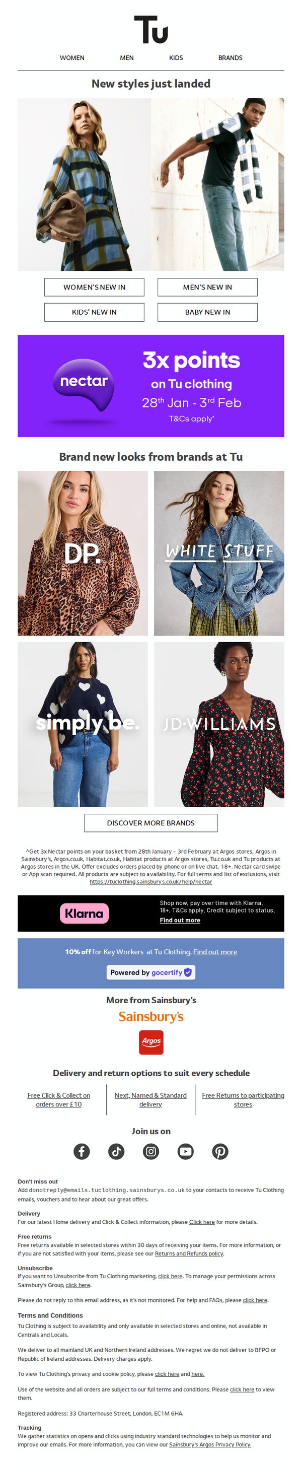
To drive immediate engagement and sales by highlighting newly arrived clothing styles across genders and age groups, while incentivizing purchases through a limited-time Nectar points promotion.
Why this works
The email masterfully combines urgency and reward by pairing a time-bound 3x Nectar points promotion with fresh arrivals, creating a compelling reason for customers to shop now rather than later.
How to implement
By visually segmenting new arrivals into clearly labeled categories, Women’s, Men’s, Kids’, and Baby, the email caters to diverse household shoppers while reducing decision fatigue through intuitive navigation.
Pro Tip
The primary CTA 'DISCOVER MORE BRANDS' is buried beneath promotional banners and lacks visual hierarchy; relocating or enlarging it near the product grid would better guide users toward exploration and conversion. • The Nectar points offer lacks a countdown timer or visual urgency cue; adding a dynamic element like 'Only 3 days left!' would reinforce scarcity and boost immediate action without cluttering the layout.