Proven Thanksgiving Launch Campaign email designs you can use
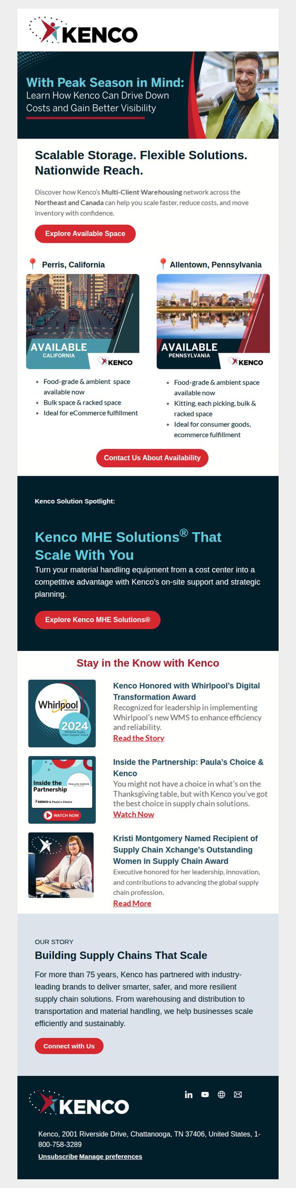


1. Kenco Group, Inc. : ⌛Peak Season Is Here Check Out Available Support
Objective
This email aims to drive immediate engagement from logistics and eCommerce businesses by highlighting Kenco’s scalable warehousing solutions during peak season, encouraging recipients to explore available space and connect with support teams to reduce costs and improve inventory visibility.
Why this works
The email smartly anchors its message in the urgency of peak season, immediately positioning Kenco as a timely, problem-solving partner rather than just a service provider, which increases relevance and emotional resonance with time-sensitive logistics decision-makers.
How to implement
By showcasing two specific, geographically distinct warehouse locations with tailored benefits, like food-grade space in California and kitting capabilities in Pennsylvania, the email creates localized relevance and reduces buyer hesitation by proving tangible, ready-to-use capacity.
Pro Tip
Add a countdown timer or urgency indicator near the 'Explore Available Space' CTA to reinforce peak season time sensitivity and nudge faster action, especially since the subject line already uses a clock emoji to imply urgency. • Include a brief customer testimonial or stat (e.g., '92% of clients reduced fulfillment costs by Q4') near the hero section to build social proof early, since the current testimonials are buried in the 'Stay in the Know' section and lack immediate persuasive impact.
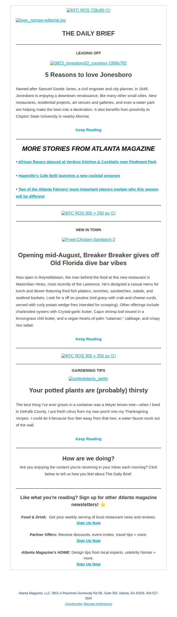
2. Atlanta Magazine: 5 Reasons to love Jonesboro
Objective
This email aims to engage local readers by highlighting Jonesboro’s cultural and culinary renaissance while promoting Atlanta Magazine’s broader content ecosystem. It also seeks to grow newsletter subscriptions by showcasing value across food, lifestyle, and community stories.
Why this works
The email opens with a compelling local story that taps into civic pride and neighborhood identity, making readers feel personally connected to the content before they even click through.
How to implement
Each article teaser is framed with vivid sensory language and specific local references, like ‘red gravy with crab and cheese curds’, which transforms generic food writing into mouthwatering, place-based storytelling that drives curiosity.
Pro Tip
Add a visual hierarchy to the 'Keep Reading' CTAs, such as bolding or color contrast, to make them stand out more against body text and reduce scroll-past behavior. • Include a small map pin or neighborhood badge next to the Jonesboro headline to visually anchor the story geographically, reinforcing local relevance and increasing emotional resonance.
3. CB2: LAUNCHING NOW | This exclusive Le Creuset color is a *mood*
Objective
This email aims to drive immediate sales of the new Le Creuset thyme collection by highlighting its exclusive availability at Crate & Barrel and pairing it with lifestyle-driven content that inspires cooking and seasonal entertaining. It also seeks to cross-sell complementary kitchen items and promote brand loyalty through community engagement and design services.
Why this works
The email brilliantly frames the new Le Creuset thyme color as a seasonal mood rather than just a product, tapping into emotional buying triggers by associating it with the cozy, herb-garden-inspired feeling of fall that resonates year-round with home cooks and design lovers alike.
How to implement
By embedding a simple, one-pot recipe directly into the product narrative, the campaign transforms a cookware launch into an experiential moment, subtly guiding the customer from aspiration to action by showing exactly how the Dutch oven enhances everyday meals with minimal effort and maximum flavor.
Pro Tip
The 'save up to 40%' offer section lacks urgency or time-bound framing, adding a countdown timer or 'limited stock' indicator would heighten perceived scarcity and encourage faster decision-making, especially since the sale is tied to a new product launch. • The transition from the recipe section to the Thanksgiving promotion feels abrupt and disjointed; integrating a brief connecting phrase like 'Perfect for your holiday table' would create a smoother narrative flow and better align the recipe with the seasonal shopping intent.
4. Crate & Barrel: LAUNCHING NOW | This exclusive Le Creuset color is a *mood*
Objective
To drive immediate sales of the exclusive Le Creuset thyme collection by positioning it as a must-have seasonal aesthetic and functional upgrade for the home cook, while cross-promoting Thanksgiving-ready kitchen essentials and brand loyalty programs.
Why this works
The email brilliantly ties a new product launch to seasonal emotion, calling the thyme color a 'mood' and linking it to fall’s cozy, herb-garden vibe, making it feel less like a purchase and more like a lifestyle upgrade.
How to implement
By embedding a recipe and cooking tip directly within the product flow, Crate & Barrel transforms a promotional email into a useful culinary guide, subtly reinforcing product utility while building trust through helpful content.
Pro Tip
Add a limited-time countdown timer near the 'save up to 40%' offer to create urgency and prevent decision fatigue, especially since the sale is tied to a new product launch that benefits from FOMO. • Reposition the 'Shop New Kitchen' and 'Shop Kitchen Bestsellers' CTAs to appear after the recipe section, where the user is already engaged with cooking content, to increase conversion likelihood through contextual relevance.
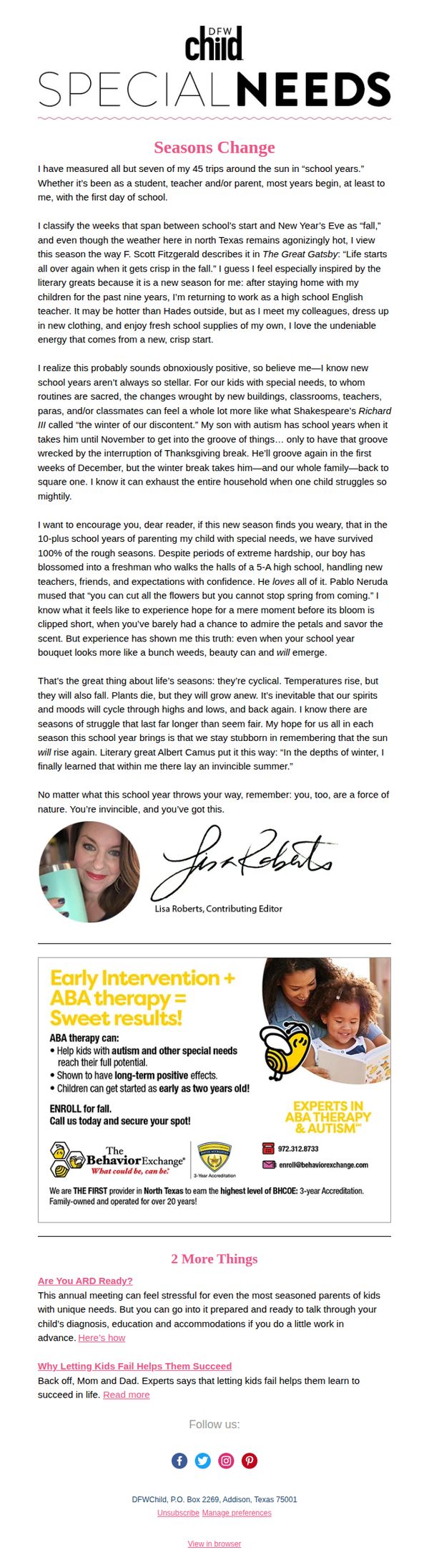
5. DFWChild: Special Needs: When a new school year starts in the weeds
Objective
This email aims to emotionally connect with parents of children with special needs as they navigate the challenges of a new school year, while also promoting early intervention services through a sponsored ad for ABA therapy. It seeks to validate their struggles and offer hope through personal storytelling and actionable resources.
Why this works
The email opens with a deeply personal, literary-inspired reflection on the emotional weight of the school year for special needs families, immediately building trust and resonance by acknowledging their unique struggles without sugarcoating reality.
How to implement
By weaving in quotes from literary giants like Fitzgerald and Neruda, the message elevates the parent’s daily experience into something poetic and universal, helping them feel seen and dignified in their often-overlooked emotional labor.
Pro Tip
Add a visual countdown or seasonal icon (e.g., falling leaves or a school bus) near the 'Enroll for fall' CTA to reinforce urgency and tie the offer more tightly to the back-to-school theme already established in the narrative. • Include a short testimonial quote from a parent who benefited from ABA therapy directly beneath the ad’s bullet points to humanize the service and bridge the emotional story with the practical solution being offered.
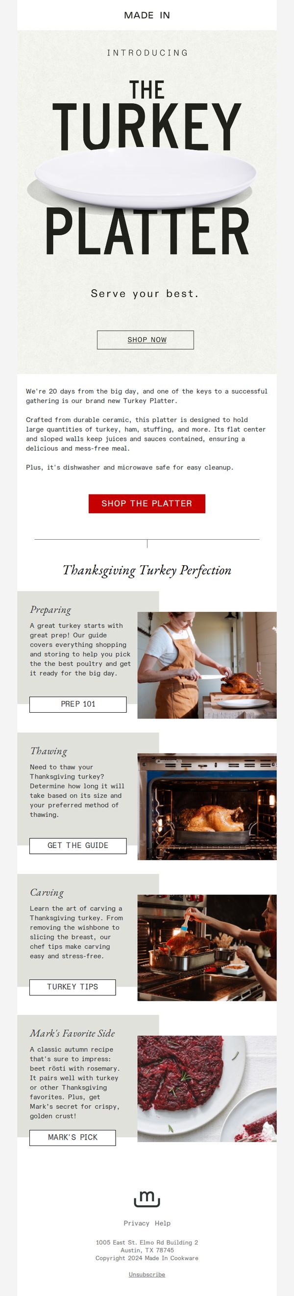
6. Made In: 17 Days Until The Big Day: Introducing The Turkey Platter!
Objective
This email aims to build anticipation for Thanksgiving by introducing Made In’s new Turkey Platter as an essential centerpiece for holiday meals, while also positioning the brand as a trusted guide for turkey preparation through educational content and recipe inspiration.
Why this works
The email brilliantly ties a new product launch to a cultural milestone, Thanksgiving, creating urgency and relevance by counting down the days until ‘the big day,’ which transforms a simple product intro into a timely, must-have solution for holiday hosts.
How to implement
Instead of just selling a platter, the campaign positions Made In as a culinary partner by offering a full suite of turkey prep guides, from thawing to carving, building trust and authority while subtly reinforcing the platter’s role in a seamless, stress-free meal experience.
Pro Tip
Add a visual countdown timer near the hero section to reinforce urgency and create a dynamic, time-sensitive trigger that encourages immediate action rather than passive reading. • Include a small testimonial or social proof snippet near the ‘Shop the Platter’ CTA, such as ‘Loved by 5,000+ hosts this season’, to reduce friction and validate the product’s value before the user clicks.
7. Boutique by the Box: Luxurious Style: Nookie Dresses from Revolve! 🔥
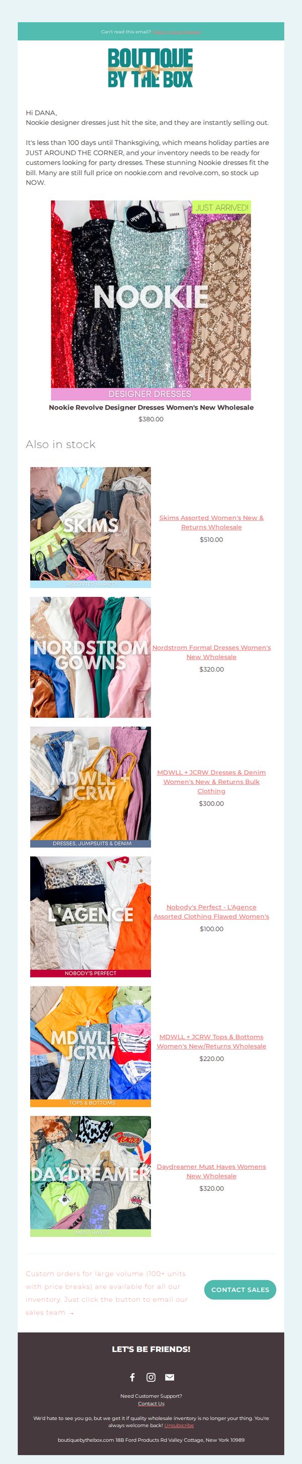
Objective
This email aims to drive immediate wholesale purchases of Nookie designer dresses by positioning them as urgent, holiday-ready inventory for retailers. It leverages scarcity and seasonal timing to motivate quick stocking decisions before Thanksgiving.
Why this works
The email brilliantly frames the Nookie dresses as a time-sensitive holiday solution, tapping into retailers’ urgency to stock partywear before Thanksgiving, which creates immediate emotional pressure to act.
How to implement
By highlighting that these dresses are still full price on Revolve and Nookie.com, the email positions the wholesale offer as a rare, high-margin opportunity that retailers can’t afford to miss.
Pro Tip
Add a countdown timer near the hero section to visually reinforce the 'less than 100 days until Thanksgiving' urgency, increasing perceived scarcity and prompting faster decisions. • Include a short testimonial or case study from a retailer who successfully sold Nookie dresses during last year’s holiday season to build social proof and reduce purchase hesitation.
8. Garden & Gun: A Letter from Our Editor About G&G’s New Issue
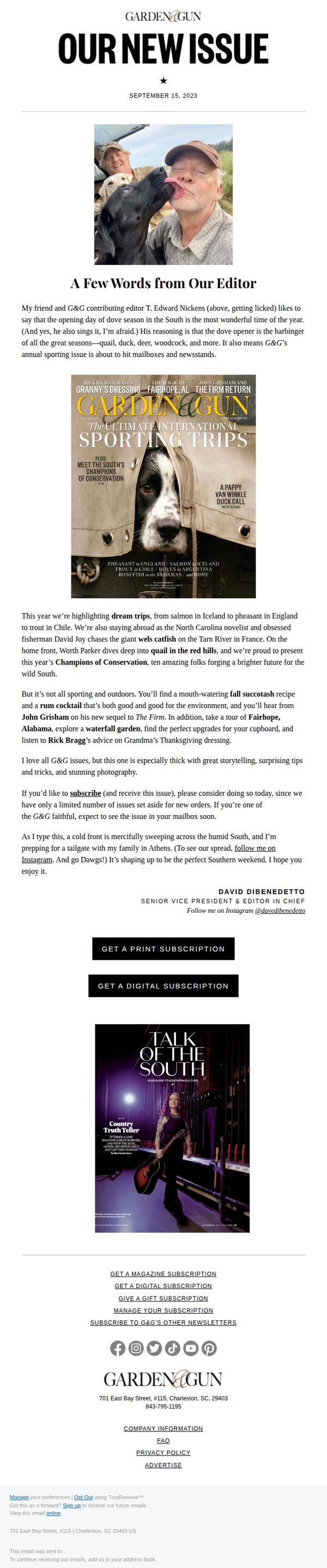
Objective
This email aims to generate excitement and drive subscriptions for Garden & Gun’s new issue by personalizing the message through the editor’s voice and highlighting compelling content that resonates with Southern lifestyle and outdoor traditions. It seeks to convert readers into subscribers by emphasizing limited availability and emotional connection to the brand.
Why this works
The email opens with a warm, personal note from the editor that feels like a letter from a friend, instantly building trust and emotional resonance while subtly anchoring the issue’s theme to Southern traditions and seasonal rituals.
How to implement
By weaving in vivid storytelling, like chasing catfish in France or hunting quail in the red hills, the email transforms a subscription pitch into an invitation to experience rich, immersive narratives that readers can’t get elsewhere, making the offer feel exclusive and culturally valuable.
Pro Tip
Add a subtle countdown timer or stock indicator near the CTAs to reinforce urgency around the 'limited number of issues set aside for new orders,' which would strengthen conversion by tapping into scarcity psychology without disrupting the editorial tone. • Include a short, embedded video or audio clip of the editor reading the opening paragraph to deepen personal connection and increase time-on-email, especially for mobile users who may skim text-heavy content.
9. Made In: NEW Pie Recipe + Overnight Shipping Last Call

Objective
This email aims to drive last-minute holiday purchases by combining a chef-curated dessert recipe with urgency-driven Black Friday offers and overnight shipping deadlines, positioning Made In as the essential partner for Thanksgiving meal prep.
Why this works
The email brilliantly merges culinary inspiration with commerce by featuring a chef’s exclusive pie recipe upfront, making the product feel like an essential tool rather than just another kitchen gadget, which builds emotional resonance before pushing the sale.
How to implement
By embedding a live countdown timer directly beneath the CTA, the campaign creates visceral urgency without relying on generic phrases, it visually anchors the deadline in the user’s mind and pairs perfectly with the ‘overnight shipping’ promise to justify immediate action.
Pro Tip
The 'Watch the Recipe' button is visually underweighted compared to the primary CTA; repositioning or styling it with equal prominence would better balance content engagement and conversion, especially since recipe video views can increase purchase intent. • The footer’s warranty and return policy icons are clustered together without clear visual hierarchy, separating them with spacing or brief explanatory microcopy (e.g., 'Hassle-Free Returns: No Questions Asked') would strengthen trust signals at the decision point.
10. New Jersey Monthy: NJ's War on Leaf Blowers 🍂
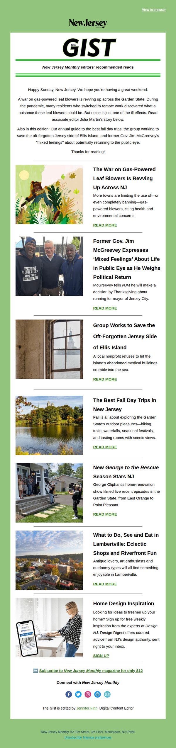
Objective
This email aims to engage New Jersey residents by delivering curated local content that blends timely news, cultural insights, and seasonal lifestyle tips, while subtly encouraging subscription to the full magazine through a low-friction offer at the end.
Why this works
The email opens with a culturally relevant, slightly provocative headline about leaf blowers to immediately hook local readers who’ve experienced the seasonal noise, turning a mundane annoyance into a shared community moment that invites curiosity.
How to implement
Each article preview pairs a compelling visual with a concise, benefit-driven summary that answers ‘why should I care?’, making it easy for readers to self-select content that matches their interests without overwhelming them with options.
Pro Tip
Add a secondary CTA above the footer, such as ‘Read the Full Story’ linked to the lead article, to capture early interest before readers scroll past, increasing click-through without disrupting the editorial flow. • Include a brief social proof element near the subscription offer, like ‘Join 50,000+ NJ readers who get the full magazine delivered monthly,’ to reinforce credibility and reduce perceived risk for new subscribers.