Launch Campaign email examples & ideas for underwear brands



1. Parade: New neons? Actually *in* for fall
Objective
This email aims to drive immediate engagement and sales by showcasing Parade’s bold new fall collection that blends neon colors and mixed-media prints, positioning them as unexpectedly trendy for the season while encouraging customers to shop the latest styles.
Why this works
Parade brilliantly flips seasonal expectations by introducing neon and mixed-media prints as fall staples, creating intrigue and urgency through the unexpected, a smart psychological hook that makes customers feel ahead of the trend rather than chasing it.
How to implement
The email uses high-energy, personality-driven visuals with diverse models to emotionally connect with the audience, turning product shots into lifestyle moments that feel authentic and shareable, which strengthens brand identity and encourages social validation.
Pro Tip
Add a subtle countdown timer or limited-edition badge near the 'Shop now' CTA in the hero section to amplify urgency, especially since the collection is positioned as new and trend-forward, this would nudge hesitant shoppers to act faster. • Include a short testimonial or social proof snippet under the 'Body Party' or 'Under Wraps' sections, for example, 'Loved by 10K+ customers', to reinforce credibility and reduce perceived risk for first-time buyers exploring bold new prints.
2. MeUndies: New Pumpkin Spice Print
Objective
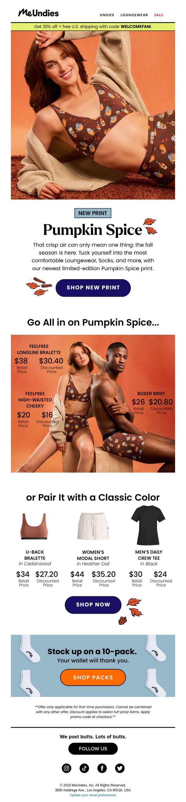
To drive immediate sales of the new limited-edition Pumpkin Spice print loungewear and underwear by creating seasonal urgency and showcasing discounted pricing, while encouraging cross-category purchases through complementary product pairings.
Why this works
The email brilliantly ties a seasonal flavor trend, pumpkin spice, to intimate apparel, transforming a novelty concept into a compelling, limited-edition product launch that feels both timely and emotionally resonant with fall shoppers.
How to implement
By displaying discounted prices directly beside retail values in bold, contrasting typography, the campaign visually reinforces savings without requiring extra clicks, making the value proposition instantly digestible and persuasive for price-sensitive buyers.
Pro Tip
Add a subtle countdown timer near the 'SHOP NEW PRINT' CTA to amplify urgency around the limited-edition status, leveraging psychological scarcity to nudge hesitant shoppers toward immediate action. • Include a short customer testimonial or social proof snippet under the hero section, such as 'Over 5,000 sold in first 48 hours', to validate popularity and reduce perceived risk for first-time buyers.
3. Victoria's Secret - IT : 🍀 NEW St. Patrick's Day Drop 🍀
Objective
This email aims to drive immediate sales by promoting a St. Patrick’s Day-themed product drop and time-sensitive offers across Victoria’s Secret and PINK lines, while also encouraging app downloads and loyalty program sign-ups to boost long-term engagement.
Why this works
The email masterfully ties seasonal celebration to product launches by using St. Patrick’s Day as a thematic anchor, making the new arrivals feel timely, exclusive, and emotionally resonant with the audience’s desire for festive self-expression.
How to implement
By layering multiple limited-time offers, like $25 tees, 40% off sleepwear, and a free tote with purchase, the campaign creates urgency without overwhelming the reader, guiding them through a natural funnel from discovery to conversion with clear visual breaks.
Pro Tip
The 'Last Day' banners for $25 tees and free tote are visually similar but placed in different sections without a unified countdown timer, which dilutes urgency, adding a single dynamic countdown at the top would reinforce scarcity across all time-sensitive offers. • The product grid at the bottom lacks consistent visual hierarchy; some category tiles (like 'Beauty') are smaller and less prominent than others, potentially reducing click-through, standardizing tile size and adding hover effects would improve discoverability and user flow.
4. Mack Weldon: One great boxer brief. Two new blues.
Objective
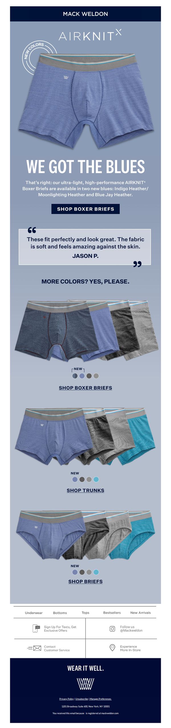
To drive immediate sales of Mack Weldon’s new AirKnit boxer briefs in two new blue shades by highlighting their comfort, fit, and performance while encouraging exploration of other product lines through clear CTAs and social proof.
Why this works
The email brilliantly leverages a simple, emotionally resonant headline, 'We Got the Blues', to turn a color launch into a memorable, personality-driven moment that feels conversational and brand-aligned, not just transactional.
How to implement
By embedding a real customer quote directly beneath the hero product, the campaign builds instant credibility and sensory appeal, making the abstract claim of 'soft fabric' feel tangible and trustworthy to skeptical shoppers.
Pro Tip
Add a subtle countdown timer or limited-edition badge near the 'New Colors' section to create urgency around the two new blues, encouraging faster decision-making without disrupting the clean layout. • Include a small icon or visual cue next to each product category (Trunks, Briefs) indicating which items are 'New' or 'Bestseller' to help users quickly identify top-performing or trending styles without reading text.
5. Wolford - FR: Subtle Details for the Lunar New Year
Objective
This email campaign aims to celebrate the Lunar New Year by positioning Wolford’s hosiery as a luxurious, statement-making accessory for the festive season, encouraging immediate purchase through aspirational imagery and seasonal symbolism.
Why this works
The campaign brilliantly ties product features, like gold threads and sparkling crystals, to Lunar New Year themes of prosperity, making functional hosiery feel culturally significant and emotionally resonant.
How to implement
By focusing on subtle, luxurious details rather than overt holiday motifs, Wolford maintains its premium brand identity while still tapping into seasonal sentiment without appearing gimmicky or diluted.
Pro Tip
Add a subtle countdown timer or limited-edition badge near the CTA to create urgency, since the Lunar New Year is time-bound and customers may respond better to scarcity cues. • Include a short testimonial or influencer quote near the product grid to build social proof, especially since luxury hosiery relies heavily on perceived quality and wearability confidence.
6. Parade: Don't sleep on this new print
Objective
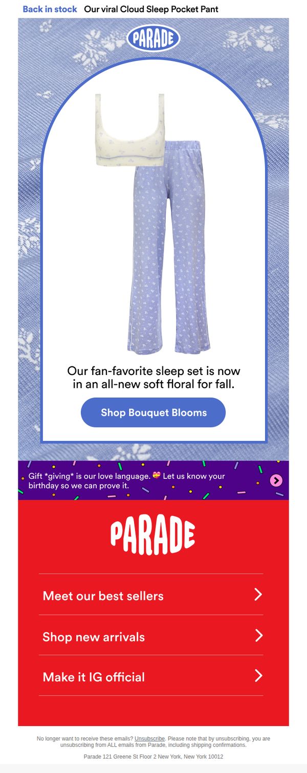
To re-engage customers by announcing the restock of a popular sleep set in a new fall floral print, encouraging immediate purchase through a clear, visually appealing CTA. The email also aims to strengthen brand connection by inviting birthday info for personalized gifting.
Why this works
The email leverages urgency and nostalgia by calling out a fan-favorite product returning in a seasonal print, which taps into emotional attachment while creating a timely reason to buy now.
How to implement
Using a clean, arched product frame against a textured background draws the eye naturally to the sleep set, making the visual hierarchy intuitive without overwhelming the customer with clutter.
Pro Tip
Add a countdown timer or limited-quantity indicator under the CTA to heighten urgency, since the subject line implies scarcity but the body lacks time-sensitive reinforcement. • Include a small testimonial or social proof snippet near the product image, such as 'Loved by 10K+ customers', to validate the 'fan-favorite' claim and reduce perceived risk.
7. Purty: The new full briefs are live!! 🫶
Objective
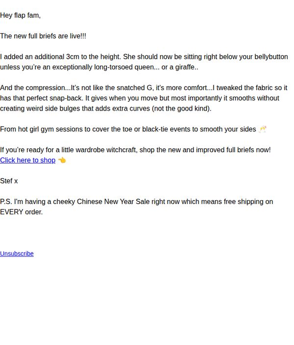
To announce and drive immediate sales for Purty’s newly launched full briefs by highlighting their improved fit and comfort, while leveraging a limited-time free shipping promotion to create urgency and reward loyal customers.
Why this works
The email opens with a warm, conversational tone that instantly builds rapport by addressing subscribers as 'flap fam,' making the announcement feel like insider news from a trusted friend rather than a sales pitch.
How to implement
It strategically highlights specific product improvements, like the added 3cm height and refined compression, with relatable, humorous language that turns technical specs into emotional benefits, helping customers visualize the fit and feel before clicking.
Pro Tip
Add a visual of the new full briefs in the email body to reinforce the product improvements described, customers are more likely to convert when they can see the fit and fabric details alongside the playful copy. • Reposition the CTA button to be more prominent and visually distinct, currently buried in plain text, it should be a bold, colored button placed immediately after the product benefits to reduce friction and increase click-through rates.
8. Victoria's Secret - AU: 🍀 NEW St. Patrick's Day Drop 🍀

Objective
This email aims to drive immediate engagement and sales by promoting Victoria’s Secret PINK’s limited-edition St. Patrick’s Day collection while cross-promoting new spring bras and beauty products. It also encourages loyalty program sign-ups and credit card adoption through targeted incentives.
Why this works
The email brilliantly ties seasonal celebration to product launches by using St. Patrick’s Day motifs not just as decoration but as a thematic anchor that makes the new collection feel exclusive and timely, encouraging urgency without sounding pushy.
How to implement
By blending lifestyle imagery with clear category tiles, like 'PANTIES,' 'SWIM,' and 'BEAUTY', the email creates an intuitive visual navigation system that reduces friction for shoppers while subtly guiding them toward high-margin or new-arrival items.
Pro Tip
Add a countdown timer or 'limited stock' indicator under the St. Patrick’s Day drop section to amplify urgency, since the campaign leverages a time-sensitive holiday theme but currently lacks real-time scarcity cues. • Reposition the 'GET $2/$65 WEAR EVERYWHERE BRAS' CTA to appear directly beneath the hero image or as a sticky banner, since it’s a high-value offer that’s currently buried below secondary content, reducing its visual hierarchy and impact.
9. JustWears: New colour launch! 🐟🐙🦑
Objective
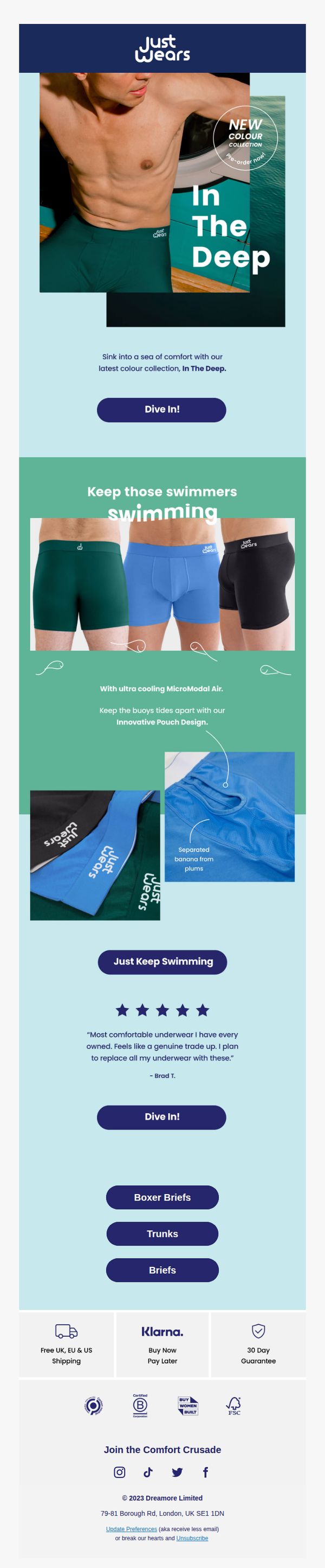
This email aims to drive pre-orders for JustWears’ new 'In The Deep' color collection by highlighting its comfort, innovative design, and ocean-inspired aesthetic, while encouraging immediate action through compelling CTAs and social proof.
Why this works
The email brilliantly ties product features to a vivid oceanic theme, using phrases like 'Sink into a sea of comfort' and 'Keep those swimmers swimming' to emotionally anchor the collection in relaxation and movement, making technical specs feel experiential.
How to implement
By showcasing the 'Innovative Pouch Design' with a zoomed-in visual and cheeky copy ('Separated banana from plums'), the brand transforms a functional benefit into a memorable, humorous selling point that reduces awkwardness and increases relatability for male shoppers.
Pro Tip
Add a countdown timer or limited-edition badge near the 'Pre-order now' tag in the hero section to create scarcity and urgency, which is currently missing despite the new launch context. • Include a small visual icon or label next to each product type (Boxer Briefs, Trunks, Briefs) indicating which styles are available in the new 'In The Deep' colors, to reduce confusion and streamline the decision-making process.
10. Pepper: New color alert!
Objective
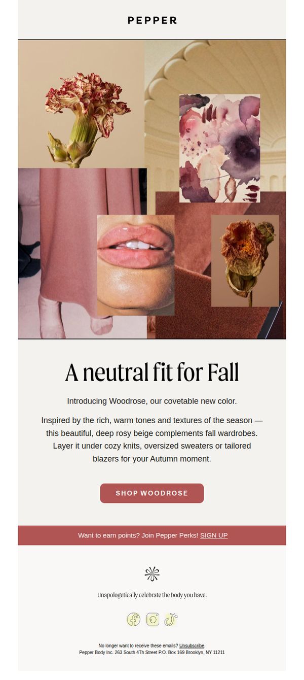
To introduce and drive sales of Pepper’s new Woodrose color by positioning it as a seasonal essential that complements fall fashion, while encouraging immediate engagement through a clear product-focused CTA.
Why this works
The email masterfully ties the new Woodrose shade to seasonal fashion by describing it as a 'neutral fit for Fall', creating instant relevance and emotional resonance with customers already thinking about autumn wardrobes.
How to implement
Instead of generic product promotion, it offers styling guidance, suggesting layering under knits or blazers, which transforms the color from a cosmetic choice into a wardrobe solution, increasing perceived value and purchase intent.
Pro Tip
Add a small visual swatch or color chip next to the 'SHOP WOODROSE' button to reinforce the shade’s appearance and reduce cognitive load for users deciding whether to click. • Include a brief customer testimonial or social proof near the CTA, such as 'Loved by 2K+ customers this season', to build trust and urgency around the new launch.