Valentine’s Day launch campaign email designs from top brands



1. Leaf Envy: For every kind of love 💗
Objective
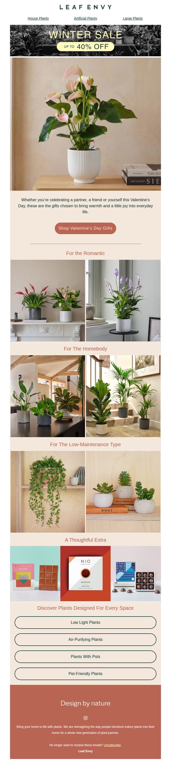
This email campaign aims to drive Valentine’s Day gift purchases by positioning plants as thoughtful, emotionally resonant gifts for various relationship types and personal lifestyles, while promoting a limited-time winter sale of up to 40% off.
Why this works
By segmenting plant gift recommendations into personality-driven categories like 'For the Romantic' or 'For the Homebody,' the email creates emotional resonance and reduces decision fatigue, making it easier for recipients to visualize gifting scenarios and feel personally addressed.
How to implement
The strategic placement of a secondary 'Thoughtful Extra' section featuring chocolate and cards subtly expands the average order value by cross-selling complementary gift items without diluting the core plant-focused message, making the offer feel more complete and indulgent.
Pro Tip
Add a visible countdown timer near the 'Up to 40% Off' banner to create urgency and reinforce the limited-time nature of the sale, which could increase immediate click-through rates and reduce cart abandonment. • Integrate a short testimonial or social proof snippet under the hero image, such as 'Loved by 10,000+ plant parents this season', to build credibility and reduce perceived risk for first-time gift buyers unfamiliar with gifting plants.
2. Away: Gifts for your perfect match
Objective
This email campaign aims to drive Valentine’s Day gift purchases by positioning Away’s travel essentials as thoughtful, lasting gifts for couples. It encourages recipients to treat their partner, or themselves, with curated, durable travel gear that symbolizes shared adventures.
Why this works
The email brilliantly reframes travel gear as romantic, emotionally resonant gifts, tying durability and design to the idea of lasting relationships, which elevates the product beyond utility into a symbol of shared journeys and affection.
How to implement
By featuring curated pairings like suitcases with totes and offering a $50 discount on matched sets, the campaign smartly simplifies gifting decisions while nudging customers toward higher-value, bundled purchases that feel personalized and intentional.
Pro Tip
Add a countdown timer or urgency indicator near the $50 duo discount to create scarcity and nudge immediate action, especially since Valentine’s Day is a time-sensitive gifting occasion. • Include a short testimonial or customer quote near the product grid to build social proof and reinforce the emotional message that these gifts are loved by real couples who’ve used them on actual trips.
3. Wildgrain: Get a one-time box just in time for Valentine’s ❤️
Objective
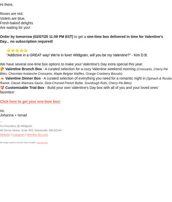
To drive immediate purchases of one-time Valentine’s Day boxes by leveraging romantic urgency and curated meal experiences, without requiring a subscription commitment.
Why this works
The email brilliantly taps into seasonal romance by framing baked goods as love tokens, not just food, making the purchase feel emotionally meaningful rather than transactional.
How to implement
By offering three distinct themed boxes tailored to different Valentine’s moments, brunch, dinner, or custom favorites, it empowers recipients to choose their own narrative, increasing perceived personal value.
Pro Tip
Add a visual preview or thumbnail image for each box option to help customers instantly visualize the contents and boost click-through rates on the CTA. • Include a brief testimonial quote near the CTA that highlights delivery reliability or gift recipient delight to reduce hesitation about ordering last-minute.
4. Italic: NEW: The Valentine's Day Edit
Objective
This email aims to inspire customers to curate a romantic, elevated Valentine’s Day experience at home by showcasing thoughtfully designed tableware, gourmet food items, and ambiance-enhancing products. It positions Italic as the go-to brand for creating memorable, intimate moments through intentional home entertaining.
Why this works
The email masterfully frames Valentine’s Day not as a commercial obligation but as an intimate, curated experience, using warm visuals and sensory language to position products as essential tools for creating meaningful moments, not just purchases.
How to implement
By grouping products into thematic sections like 'Cook with intention' and 'Set the tone in gold,' the campaign guides the customer through a narrative journey, making the shopping experience feel editorial and emotionally resonant rather than transactional.
Pro Tip
Add a subtle countdown timer near the hero section to create urgency around Valentine’s Day gifting, since the campaign’s timing is date-sensitive and customers may delay purchase without a visual nudge. • Include a short customer testimonial or social proof near the 'Little Add-Ons' section to validate the gifting appeal, for example, 'Perfect for last-minute romantic gestures', to reduce hesitation around impulse buys.
5. Away: HARD LAUNCH: The Valentine's Day Capsule
Objective
To drive immediate engagement and sales for Away’s limited-edition Valentine’s Day Capsule collection by highlighting romantic, travel-ready products that blend style and durability, encouraging recipients to shop both online and in-store.
Why this works
The email brilliantly frames the Valentine’s Day Capsule as a shared experience, not just luggage, but a romantic journey you take together, which emotionally aligns with the holiday while still speaking to Away’s core travel audience.
How to implement
Using bold color contrasts like blush pink and cherry red on the suitcase visually anchors the limited-edition nature of the product, making it feel exclusive and desirable without needing to say ‘limited’ more than once.
Pro Tip
Add a subtle countdown timer near the CTA in the hero section to reinforce urgency around the limited-edition capsule, leveraging FOMO without cluttering the clean layout. • Include a short testimonial or user-generated photo from a couple who traveled with Away luggage during Valentine’s Day last year to build social proof and emotional connection within the hero or offer section.
6. Pangaia: The Valentine’s Edit
Objective
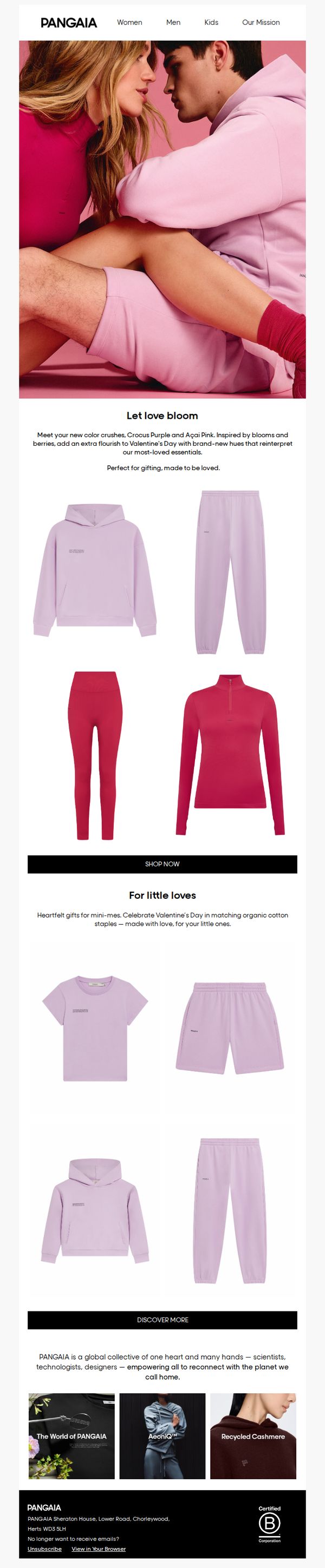
To drive Valentine’s Day gift purchases by showcasing limited-edition colorways of core apparel items that evoke romance and togetherness, while reinforcing the brand’s sustainable ethos through curated product storytelling.
Why this works
The email brilliantly ties seasonal emotion to product color stories, framing new hues like Crocus Purple and Açaí Pink as romantic ‘crushes’ that transform everyday essentials into giftable, love-infused experiences, which elevates the perceived value beyond mere apparel.
How to implement
By segmenting offerings into ‘For little loves’ with matching organic cotton sets, the campaign thoughtfully extends its gifting appeal to families, making the Valentine’s narrative inclusive and emotionally resonant across age groups without diluting the romantic core theme.
Pro Tip
Add a subtle countdown timer or ‘Limited Stock’ indicator near the CTA to create urgency around the Valentine’s color crushes, especially since these are framed as new and seasonal, this would nudge hesitant shoppers toward immediate action. • Include a short customer testimonial or gifting quote under the ‘Let love bloom’ section to humanize the emotional appeal, for example, ‘My partner loved the matching set, it felt like a hug we could both wear’, to strengthen social proof and emotional resonance.
7. END. Clothing: The Valentine's Day edit

Objective
This email aims to drive Valentine’s Day gift purchases by curating gender-specific product collections that appeal to both givers and recipients, while subtly promoting the brand’s broader lifestyle offerings through cross-category discovery.
Why this works
The email smartly segments gifting by gender with dedicated 'For Him' and 'For Her' sections, making it effortless for shoppers to navigate and reducing decision fatigue during a high-pressure gifting season.
How to implement
By featuring luxury accessories, fragrances, and lifestyle items alongside apparel, the campaign elevates the perceived value of the gift guide and positions END. as a curator of elevated, experience-driven gifting, not just a retailer.
Pro Tip
Add a limited-time urgency element like a countdown timer or 'Last Chance' badge near the CTA buttons to nudge hesitant shoppers toward immediate action, especially since Valentine’s Day is date-sensitive. • Include a short testimonial or social proof snippet under each product category (e.g., 'Loved by 2K+ gifters this week') to build trust and reduce perceived risk for first-time buyers unfamiliar with the curated brands.
8. Charlotte Tilbury - UK: Skincare Is Self-Care 🤍

Objective
This email campaign aims to position Charlotte Tilbury’s skincare line as an essential act of self-love and self-care, especially timed for Valentine’s Day, while driving immediate purchases through product highlights and a limited-time delivery incentive.
Why this works
By framing skincare as self-care and self-love, the email taps into emotional motivation rather than just product features, making the purchase feel indulgent and personally rewarding rather than transactional.
How to implement
Each product section uses a benefit-driven headline paired with a sensory promise, like 'skin feels 2x more hydrated', which creates immediate desire by translating technical ingredients into tangible, relatable experiences.
Pro Tip
Add a subtle countdown timer near the 'Last Chance, Darlings!' section to visually reinforce urgency and prevent the offer from feeling generic or indefinite. • Include a short customer testimonial or review snippet under each product to build social proof, especially for high-ticket items like Magic Serum, which could reduce perceived risk for new buyers.
9. Rowing Blazers: ALL-NEW POOH 🍯
Objective
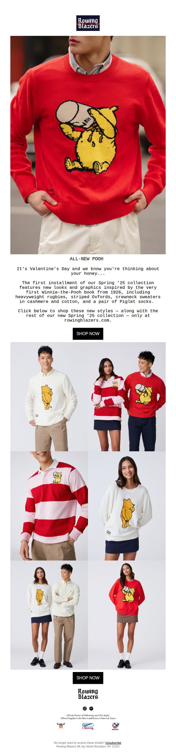
This email aims to drive immediate traffic and sales for Rowing Blazers’ new Spring ’25 collection by leveraging the nostalgic appeal of Winnie-the-Pooh, while tying the launch to Valentine’s Day as a gifting occasion for loved ones.
Why this works
The email brilliantly ties a seasonal holiday, Valentine’s Day, to a product launch by positioning the Pooh collection as the perfect gift for your ‘honey,’ creating emotional resonance while driving commercial intent.
How to implement
By anchoring the collection in the 1926 Winnie-the-Pooh book, Rowing Blazers adds historical depth and storytelling to the products, transforming casual apparel into collectible, culturally rich fashion pieces that appeal to both nostalgia and exclusivity.
Pro Tip
Add a subtle countdown timer near the CTA to create urgency around the ‘first installment’ of the Spring ’25 collection, encouraging immediate clicks rather than passive browsing. • Include a short testimonial or social proof snippet, like ‘Loved by 10K+ customers’ or a quote from a fashion influencer, near the product grid to build trust and reduce hesitation before purchase.
10. RTÉ2 : Your all-in-one update 👀

Objective
This email aims to re-engage subscribers by delivering a curated, multi-category update that highlights RTÉ2’s latest news, entertainment, sports, and cultural content, encouraging immediate interaction through clicks to watch, stream, or listen.
Why this works
The email brilliantly segments content by audience interest, news, sports, lifestyle, and entertainment, making it easy for subscribers to instantly find what resonates with them without scrolling endlessly.
How to implement
Each content block includes a clear, action-oriented CTA like 'WATCH LIVE' or 'LISTEN NOW,' which reduces friction and drives immediate engagement by aligning the button with the user’s intent in that section.
Pro Tip
The hero section’s CTA 'READ MORE' is too generic, replacing it with a benefit-driven phrase like 'Discover 10 Romantic Irish Getaways' would better align with the Valentine’s theme and increase click-through intent. • The 'Editor’s picks' section lacks visual hierarchy, adding a subtle border or background tint to the two featured tiles would help them stand out from surrounding content and draw attention to curated recommendations.