Proven WIRED Media email designs you can use




1. India’s lander touches down on the moon. Russia’s has crashed
Objective
This email aims to engage WIRED readers with a curated selection of timely, thought-provoking tech, science, and culture stories while subtly promoting subscription through a limited-time offer and podcast content. It balances editorial depth with commercial intent to drive both readership and conversions.
Why this works
WIRED masterfully balances hard-hitting global news with niche tech reviews and cultural commentary, creating a content rhythm that keeps readers scrolling while feeling intellectually rewarded with every new section they encounter.
How to implement
The inclusion of a time-sensitive, deeply discounted subscription offer right after a high-impact story creates psychological momentum, readers are more likely to convert when they’re emotionally engaged and perceive immediate value in continued access.
Pro Tip
The subscription CTA appears buried after multiple articles, move the 'Subscribe now' button higher, perhaps after the first or second story, to capture attention while reader interest is highest and reduce scroll fatigue before conversion. • The 'Summer Sale' banner uses conflicting pricing visuals ($29.99 crossed out next to $5) that may confuse or erode trust, simplify to 'Just $5 for a limited time' with a countdown timer to create urgency without visual clutter.
2. Free coffee beans and discounted espresso machines
Objective
This email aims to drive early engagement with Amazon’s upcoming Prime Day by surfacing exclusive, time-sensitive deals across tech, home, and lifestyle categories, while also promoting WIRED’s own subscription through a limited-time offer.
Why this works
WIRED smartly bundles early Prime Day deals with lifestyle hooks, like coffee beans and camping gear, to make tech discounts feel more personal and timely, not just transactional.
How to implement
The email uses visual storytelling with bold, playful illustrations to break up dense deal lists, making the content feel energetic and digestible rather than overwhelming or salesy.
Pro Tip
The primary CTA 'Subscribe now' is buried below multiple product grids, move it above the fold or repeat it after key deal sections to capture attention before users scroll away. • The coffee-themed section mentions 'free coffee beans' in the subject line but doesn’t visually or textually highlight any actual freebie, clarify or remove the promise to avoid misleading expectations.
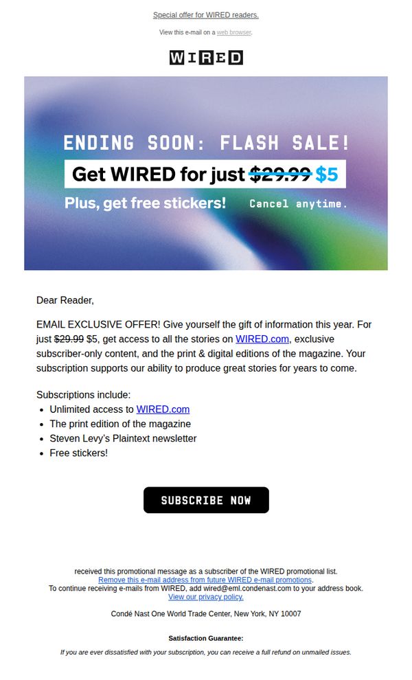
3. Last Chance: Get WIRED for $5 + Enjoy FREE Stickers in Our Flash Sale!
Objective
This email aims to drive urgent subscription conversions by highlighting a limited-time flash sale price of $5 for WIRED, while sweetening the offer with free stickers to increase perceived value and reduce hesitation. It targets existing readers with an exclusive, time-sensitive incentive to act now.
Why this works
The email leverages urgency and exclusivity by framing the discount as a flash sale available only to email subscribers, which taps into FOMO and encourages immediate action without overwhelming the reader with too many options.
How to implement
By visually striking through the original price and boldly displaying the discounted rate alongside a bonus gift (free stickers), the email creates a compelling value proposition that feels like a personal reward rather than a generic promotion.
Pro Tip
Add a countdown timer in the hero section to visually reinforce urgency and create real-time pressure, which could increase conversion rates by making the 'ending soon' claim more tangible and immediate. • Include a short testimonial or subscriber quote near the CTA to build social proof, for example, 'Over 50,000 readers upgraded this week', to validate the offer and reduce skepticism about the steep discount.
4. People are increasingly worried that AI will make life worse
Objective
This email aims to inform readers about growing public concern over AI’s societal impact while positioning WIRED as a trusted voice for navigating the complexities of emerging technology. It also seeks to convert engaged readers into subscribers by highlighting exclusive content and limited-time offers.
Why this works
The email opens with a relatable, emotionally resonant question, 'How Do You Feel About Our AI-Mediated Future?', which immediately invites readers to reflect personally, making the topic feel urgent and relevant rather than abstract or academic.
How to implement
By anchoring the narrative in credible data from Pew Research Center and weaving in expert commentary from AI ethicists and former government officials, the email builds authority without overwhelming the reader, striking a balance between journalistic depth and digestible insight.
Pro Tip
The CTA 'SUBSCRIBE NOW' appears only in the advertisement banner and lacks visual prominence in the main content flow; adding a secondary, contextually placed CTA after the 'Need to Know' section would capture readers at peak engagement. • The email lacks a clear visual hierarchy between editorial content and promotional material; separating the subscription offer with a distinct visual break or color block would reduce cognitive friction and improve conversion clarity.
5. How Neuralink keeps dead monkey photos secret
Objective
This WIRED newsletter aims to engage readers with high-impact, tech-forward stories while subtly promoting subscription through a limited-time offer, blending investigative journalism with commercial intent to drive conversions without compromising editorial tone.
Why this works
WIRED masterfully balances hard-hitting investigative journalism with commercial messaging by placing the subscription offer after a compelling story, making the CTA feel like a natural next step rather than a sales pitch.
How to implement
The use of bold, emotionally charged headlines like 'How Neuralink Keeps Dead Monkey Photos Secret' creates immediate curiosity and urgency, drawing readers into deeper content while reinforcing the brand’s reputation for uncovering tech industry truths.
Pro Tip
The subscription CTA appears only once and is buried after multiple articles; adding a sticky or floating CTA bar near the top would capture attention earlier without interrupting the reading experience. • The podcast section includes a survey CTA but lacks a direct link to the podcast episode itself, adding a 'Listen Now' button alongside the 'Play' icon would reduce friction and increase audio engagement.
6. A medieval French skeleton is rewriting the history of syphilis

Objective
This WIRED newsletter aims to engage readers with a curated mix of science, tech, and culture stories while subtly promoting subscription and job listings. It balances editorial depth with commercial intent to retain and monetize its audience.
Why this works
WIRED masterfully blends high-impact science storytelling with timely tech news, creating a compelling narrative rhythm that keeps readers scrolling without feeling overwhelmed by commercial breaks or ads.
How to implement
The newsletter strategically places its subscription CTA after a strong editorial hook, the medieval syphilis story, leveraging curiosity and credibility to convert engaged readers into paying subscribers.
Pro Tip
The subscription CTA appears twice, once as a banner and again as text, which creates redundancy; consolidating into one visually dominant, scroll-triggered CTA after the third article would reduce friction and increase conversion focus. • The job listings at the bottom lack visual hierarchy and context; adding a brief headline like 'Top Tech Jobs This Week' or a small icon set would help them stand out and feel more integrated with the editorial tone.
7. A Revelation About Trees Is Messing With Climate Calculations

Objective
This email aims to engage science enthusiasts by delivering a curated weekly roundup of compelling science stories while subtly promoting WIRED’s subscription through strategic placement of a discounted offer at the bottom. It balances editorial value with conversion intent.
Why this works
The email opens with a bold, curiosity-driven headline that immediately hooks readers by suggesting a paradigm shift in climate science, leveraging urgency and mystery to drive clicks without resorting to clickbait clichés.
How to implement
Each article preview is paired with a vivid, thematically relevant image and a concise, benefit-driven summary that tells the reader exactly what they’ll learn, turning abstract science into digestible, emotionally resonant stories.
Pro Tip
The subscription offer section could benefit from a countdown timer or limited-time badge to create urgency, since the $5 price point is already compelling but lacks temporal pressure to drive immediate action. • The 'More from WIRED Science' section could be restructured with a 'Recommended for You' label or personalized tagline based on past reading behavior to increase relevance and click-through rates for non-subscribers.
8. This website exposes the truth about soaring food prices

Objective
This email aims to engage readers with WIRED’s latest tech, science, and culture stories while promoting subscription conversions through a limited-time offer. It balances editorial depth with commercial intent to drive both readership and revenue.
Why this works
The email masterfully blends high-impact journalism with timely commercial offers, using urgent, curiosity-driven headlines to pull readers into stories while subtly anchoring them to a subscription CTA that feels like a natural next step rather than a sales pitch.
How to implement
By featuring a time-sensitive deal, $5 for a $29.99 subscription, the campaign leverages scarcity and perceived value to convert casual readers, positioning the offer as an exclusive perk for those who engage with WIRED’s editorial content, not just a generic discount.
Pro Tip
The subscription CTA appears only once and is buried mid-email; adding a sticky or repeated CTA button near the top and bottom would capture attention from skimmers and reinforce conversion intent without disrupting the editorial flow. • The email lacks personalization cues, such as the reader’s name or past article preferences, which could increase relevance and emotional connection; even a simple 'Based on your interest in tech, here’s what’s next' would boost engagement and perceived value.
9. 'Super Mario Bros. Wonder' Is What Happens When Devs Have Time to Play

Objective
This email aims to engage readers with WIRED’s latest tech, culture, and science content while driving subscriptions through a limited-time offer. It balances editorial storytelling with a clear commercial goal: converting curious readers into paying subscribers.
Why this works
The email masterfully opens with a high-energy pop culture hook, Super Mario Bros. Wonder, to immediately capture attention, then seamlessly transitions into deeper tech and societal narratives, proving that entertainment can be a gateway to serious journalism.
How to implement
By embedding a bold, time-sensitive subscription offer directly after the first major article, the campaign capitalizes on reader momentum, turning curiosity into conversion without disrupting the editorial flow or feeling overly salesy.
Pro Tip
The subscription CTA appears only once in a visually dense layout, adding a sticky or floating CTA button near the bottom would recapture attention from readers who scroll past the initial offer without committing. • The email lacks personalization cues like the reader’s name or tailored content recommendations, which could increase engagement and conversion by making the experience feel more curated and relevant to individual interests.
10. Preppers are patriots

Objective
This email aims to engage readers with WIRED’s editorial voice by blending provocative cultural commentary with deep-dive reporting, encouraging clicks to long-form stories while reinforcing brand identity through curated content and reader interaction.
Why this works
The email opens with a bold, personality-driven hook that immediately establishes editorial tone, using irony and self-awareness to disarm readers while drawing them into a culturally charged topic that feels both urgent and unexpected.
How to implement
By weaving in reader engagement prompts, like inviting comments or emails, it transforms passive consumption into active participation, subtly building community around WIRED’s editorial mission without sacrificing journalistic authority or depth.
Pro Tip
The primary CTA ‘READ THE BIG STORY →’ is visually underwhelming and buried beneath the editor’s bio; repositioning it as a bold, color-contrasted button directly under the headline would significantly increase click-through rates. • The ‘What Say You?’ section invites reader feedback but lacks a clear, clickable submission mechanism, adding a direct mailto link or embedded form would reduce friction and increase response rates from engaged subscribers.