Proven Media NPS email designs you can use




1. Architectural Digest: These 35 Kitchen Cabinet Colors Will Stand the Test of Time
Objective
This email aims to drive engagement with Architectural Digest’s premium content by highlighting visually compelling, design-forward stories that appeal to interior design enthusiasts, while also promoting a limited-time subscription offer to convert readers into paying subscribers.
Why this works
The email strategically leads with high-impact, emotionally resonant imagery from iconic homes to immediately capture attention and establish credibility, making readers feel they’re being granted exclusive access to world-class design stories.
How to implement
By embedding a bold, time-sensitive subscription offer mid-email, Architectural Digest capitalizes on peak reader interest, right after they’ve been hooked by stunning visuals, turning passive scrollers into potential paying customers without disrupting the editorial flow.
Pro Tip
The subscription CTA is visually buried within a pink banner that clashes with the editorial tone; repositioning it as a sticky footer bar or floating button would increase visibility without compromising the aesthetic cohesion of the design. • The repeated use of identical 'CONTINUE READING' CTAs for every article reduces urgency and personalization; tailoring the button text to each story (e.g., 'See the Cabinet Colors Designers Swear By') would better align with user intent and boost click-through rates.
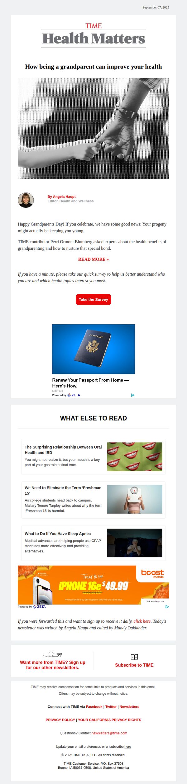
2. TIME: How being a grandparent can improve your health
Objective
This email aims to engage readers by highlighting the emotional and physical health benefits of grandparenting, while subtly encouraging interaction through a survey and promoting additional content and subscriptions.
Why this works
The email opens with an emotionally resonant hook, tying Grandparents Day to personal health benefits, which immediately creates relevance for its target audience and encourages them to keep reading.
How to implement
By embedding a quick survey right after the main article teaser, the campaign cleverly turns passive readers into active participants, gathering valuable data while deepening engagement without disrupting the flow.
Pro Tip
The primary CTA 'READ MORE »' is visually underwhelming and buried beneath the author bio; elevating it with stronger contrast or animation would better guide users toward the core content. • The ad placements (passport renewal and iPhone deal) feel disconnected from the health/grandparenting theme; replacing them with health-related sponsorships or TIME-branded wellness products would improve thematic cohesion and trust.
3. Fortune: Next-Gen Wall Street
Objective
This email aims to position Fortune as a thought leader by delivering exclusive, data-driven insights from Goldman Sachs’ intern survey, while subtly promoting its analytics products and newsletter subscriptions to deepen reader engagement and conversion.
Why this works
Fortune leverages exclusive, high-credibility data from Goldman Sachs to instantly establish authority, making readers feel they’re accessing insider intelligence not available elsewhere, a powerful hook for time-poor professionals.
How to implement
The email smartly embeds product promotion within editorial content by offering a free Global 500 dataset, turning a news story into a lead generation engine without disrupting the reader’s experience or trust.
Pro Tip
The CTA 'SUBSCRIBE' appears twice, once in a bright blue banner and again in a gray footer button, creating visual redundancy; consolidate into one high-impact, centrally placed CTA with stronger urgency language like 'Join 500K+ Leaders Today'. • The 'Reporter’s Notebook' and 'Around the Table' sections, while informative, dilute the core message; consider moving secondary content below the fold or into a collapsible 'More Insights' section to keep focus on the Goldman data and conversion goal.
4. Yachting World : Wally's new TP52 beater, Grand Soleil 34.1 on test, Orca deterrent device to be tested
Objective
To engage marine enthusiasts with curated, high-interest content including new yacht launches, product innovations, and adventurous sailing stories, while subtly driving subscriptions and brand loyalty through strategic CTAs and sponsored content.
Why this works
The email masterfully blends editorial excitement with commercial intent by placing compelling product features and yacht reviews alongside clear, low-friction CTAs that invite deeper engagement without disrupting the reader’s curiosity.
How to implement
By segmenting content into thematic blocks like 'Sea Trial,' 'Latest News,' and 'Used Boats,' the campaign creates a magazine-like rhythm that respects the reader’s time while encouraging exploration across diverse interests within the marine lifestyle.
Pro Tip
The primary CTA 'Read More' is repetitive and lacks urgency or personalization; consider varying CTAs per section (e.g., 'See the Wallyrocket51 in Action' or 'Discover the Cadet Dinghy’s Secret') to better match content tone and boost click-through rates. • The subscription offer buried under 'Used Boats' lacks visual prominence and emotional appeal; relocate it to a dedicated banner above the fold with a stronger hook like 'Get Exclusive Boating Content + £10 Amazon Gift Card' to increase conversion.
5. Harvard Business Review: Managing the Return: Preparing to Give Difficult Feedback
Objective
This email aims to guide managers through the emotional and strategic challenges of delivering difficult feedback by offering research-backed frameworks and relatable personal insights, ultimately encouraging readers to engage with HBR’s deeper content on leadership communication.
Why this works
The email opens with a vulnerable, first-person admission from the editor that immediately builds trust and signals this isn’t just theoretical advice, it’s battle-tested wisdom from someone who’s struggled with the same managerial dilemmas your audience faces daily.
How to implement
By weaving in expert quotes and research-backed frameworks, like Melody Wilding’s strategies and Chamorro-Premuzic and Clark’s three reasons for underperformance, the email elevates practical advice into credible, actionable leadership science without overwhelming the reader.
Pro Tip
Add a subtle visual cue, like a small icon or colored underline, to the 'Read more' CTAs to increase click visibility, since the current blue text blends too much with the body copy and lacks visual hierarchy. • Include a brief, bolded takeaway or one-sentence summary after each major section (e.g., 'Key Insight: Anticipating worst-case scenarios actually reduces anxiety and improves outcomes') to reinforce retention and cater to skimmers.
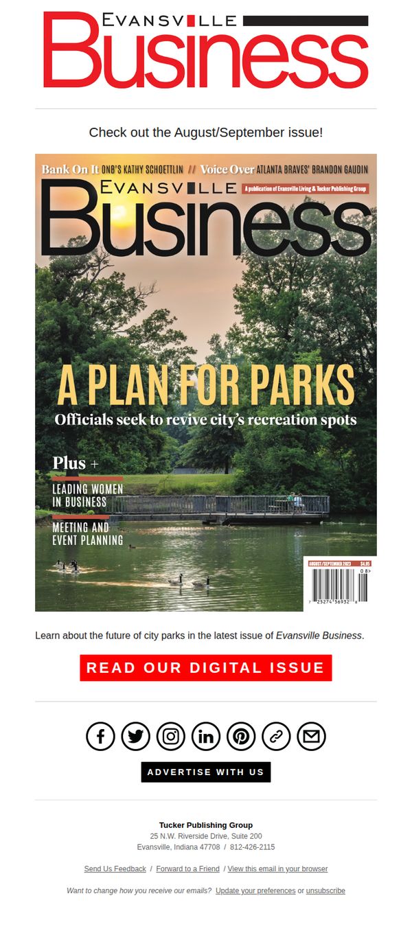
6. Evansville Living: Read the August/September issue of Evansville Business magazine
Objective
To drive engagement with the latest digital issue of Evansville Business magazine by highlighting its key stories and encouraging immediate reading through a prominent call-to-action. The email aims to reinforce brand authority and reader loyalty by showcasing relevant local business content.
Why this works
The email leverages the magazine’s physical cover as the hero visual, instantly signaling credibility and editorial quality while creating a seamless transition from print to digital for loyal readers.
How to implement
By spotlighting timely, locally relevant topics like city park revitalization and leading women in business, the email taps into community pride and professional curiosity to motivate clicks without relying on discounts or urgency.
Pro Tip
Add a brief teaser snippet or pull quote from the 'A Plan for Parks' feature directly under the headline to give readers a taste of the content and increase perceived value before clicking. • Include a small visual indicator, such as a 'New Issue' badge or date stamp, near the CTA to reinforce timeliness and encourage immediate action rather than deferral.
7. Allrecipes: The Only Frozen Pizza We'll Buy Any Night of the Week

Objective
To engage readers by revealing a top-rated frozen pizza pick while driving traffic to recipe content and encouraging user feedback through a survey. The email positions Allrecipes as a trusted source for quick, reliable meal solutions.
Why this works
By leading with a bold, opinionated headline about frozen pizza, the email instantly grabs attention from time-strapped home cooks who crave trustworthy shortcuts without sacrificing flavor or quality.
How to implement
The inclusion of real user testimonials beneath each chicken pizza recipe builds social proof organically, making readers feel confident in trying these dishes even if they’re skeptical about convenience meals.
Pro Tip
Add a visual countdown timer or urgency cue near the 'READ MORE' CTA for the frozen pizza section to nudge immediate clicks, especially since the subject line implies exclusivity and time-sensitive relevance. • Reposition the 'START SURVEY!' button higher or duplicate it near the footer to increase completion rates, currently buried between content blocks, it risks being overlooked despite its strategic value for audience engagement.
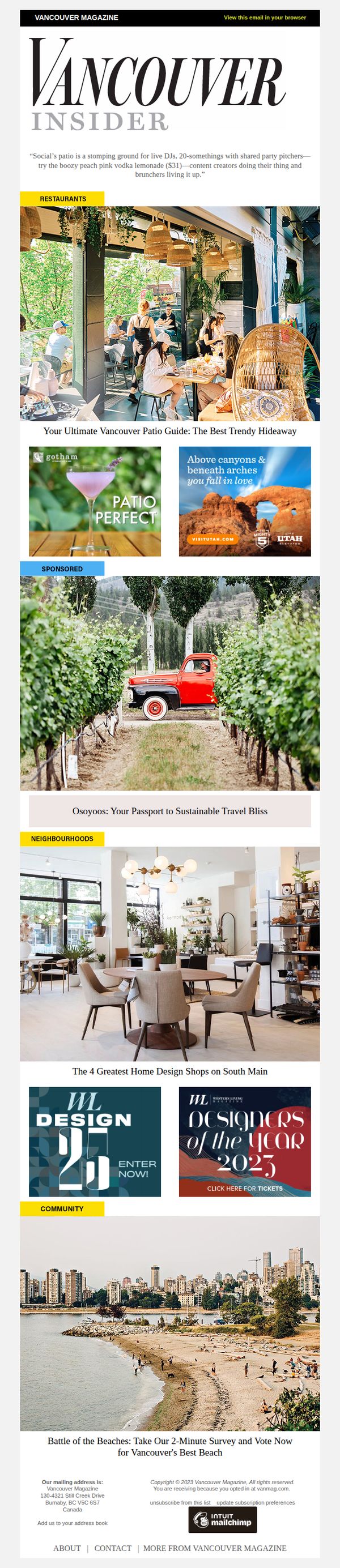
8. Vancouver Magazine: The Trendiest Rooftop Patio in Vancouver ☀️🍹
Objective
To engage readers with curated local lifestyle content while promoting Vancouver Magazine’s authority on trending venues and community events. The email aims to drive clicks to featured guides, sponsored content, and interactive surveys to boost engagement and brand loyalty.
Why this works
The email masterfully blends editorial storytelling with visual allure, using a sun-drenched rooftop patio image to immediately evoke FOMO and position the guide as essential summer reading for locals and visitors alike.
How to implement
By integrating sponsored content seamlessly between editorial sections, like placing a Utah tourism ad beside a patio cocktail feature, the email maintains credibility while monetizing without disrupting the reader’s experience or trust.
Pro Tip
Add a countdown timer or urgency cue next to the ‘Designers of the Year 2023’ CTA to boost ticket sales by leveraging time-sensitive FOMO, especially since event promotion is a key revenue driver. • Reposition the ‘Patio Perfect’ sponsored ad directly beneath the hero image to reinforce thematic continuity and increase ad visibility without breaking the editorial flow, since the cocktail image already primes the reader for patio content.
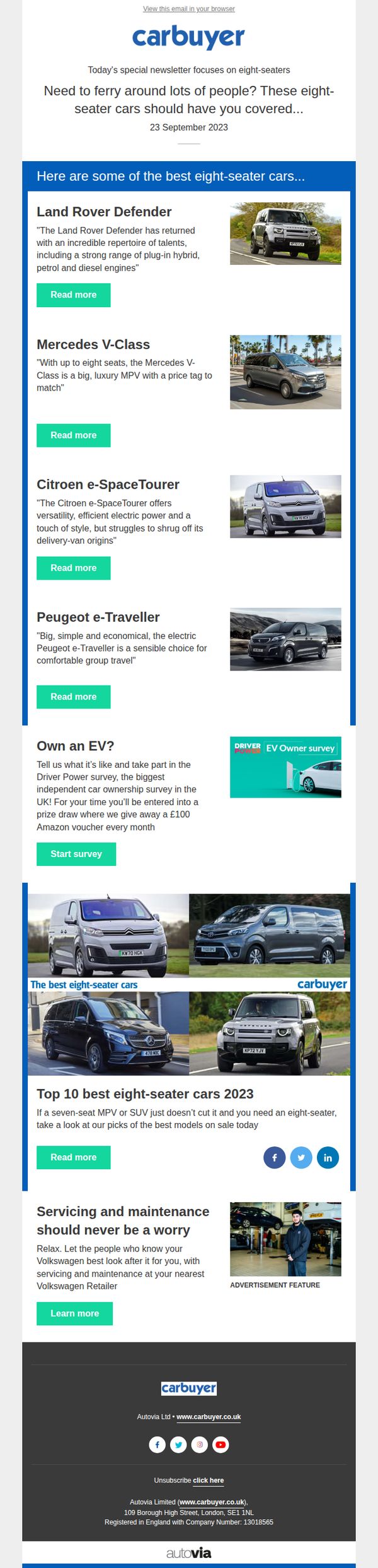
9. EVO: 🚌 SERIOUS eight-seater people-movers
Objective
This email aims to engage readers seeking practical, spacious transportation by spotlighting top-rated eight-seater vehicles, while also driving participation in a survey and promoting service partnerships to build brand trust and user loyalty.
Why this works
The email smartly frames eight-seaters not as niche vehicles but as essential solutions for modern family or group logistics, making the content instantly relatable to busy parents, chauffeurs, or small business owners needing reliable transport.
How to implement
Each car is presented with a concise, personality-driven summary that highlights both technical specs and emotional appeal, such as luxury, efficiency, or ruggedness, helping readers quickly connect with a model that matches their lifestyle or needs.
Pro Tip
The CTA 'Read more' is repeated identically across all product cards, which dilutes urgency and personalization, consider tailoring CTAs per model (e.g., 'See pricing for V-Class' or 'Explore Defender’s hybrid tech') to better match user intent. • The EV survey section feels disconnected from the eight-seater theme; either reframe it as 'How do EVs fit into your family transport?' or move it to a separate email to maintain thematic focus and reduce cognitive friction.
10. Fortune: Employees call baloney on ESG goals

Objective
This email aims to inform corporate leaders and board members about employee skepticism toward ESG claims, urging them to take authentic, accountable action on sustainability. It positions Fortune as a trusted source for governance insights while driving engagement with its analytics platform and newsletter.
Why this works
Fortune effectively leverages employee sentiment data to create urgency among board members, framing ESG skepticism not as noise but as a governance risk that demands immediate, transparent leadership action.
How to implement
By embedding expert commentary from CB Bhattacharya and linking to external research, the email builds credibility and positions Fortune as a curator of authoritative, board-level intelligence rather than just a news source.
Pro Tip
The primary CTA 'Go global with Fortune Analytics today' lacks specificity, adding a time-bound incentive or clearer value proposition (e.g., 'Unlock the 2023 Global 500 dataset, limited access for subscribers') would strengthen conversion intent. • The email’s dense text blocks and lack of visual hierarchy could overwhelm readers; incorporating subheadings, pull quotes, or iconography to break up sections would improve scannability and retention of key governance takeaways.