The complete Technology NPS email collection
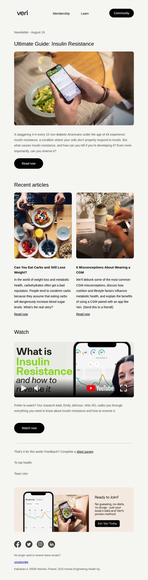
1. veri: Ultimate Guide: Insulin Resistance
Objective
This email aims to educate subscribers about insulin resistance by offering a comprehensive guide, recent articles, and a video explainer, all designed to position Veri as a trusted authority while gently guiding readers toward membership enrollment.
Why this works
The email opens with a startling statistic, 4 in 10 non-diabetic Americans under 44 have insulin resistance, immediately creating urgency and relevance, which primes the reader to engage with the educational content that follows.
How to implement
By offering multiple content formats, a written guide, recent articles, and a video explainer, the campaign accommodates different learning preferences, increasing the likelihood that each subscriber finds a format they’ll consume and trust.
Pro Tip
Add a progress bar or 'X% of readers completed this guide' social proof near the hero section to increase perceived value and completion motivation for the 'Read now' CTA. • Include a short testimonial quote from a real user who reversed insulin resistance using Veri, placed just before the 'Join Veri Today' CTA to strengthen emotional persuasion and reduce perceived risk.
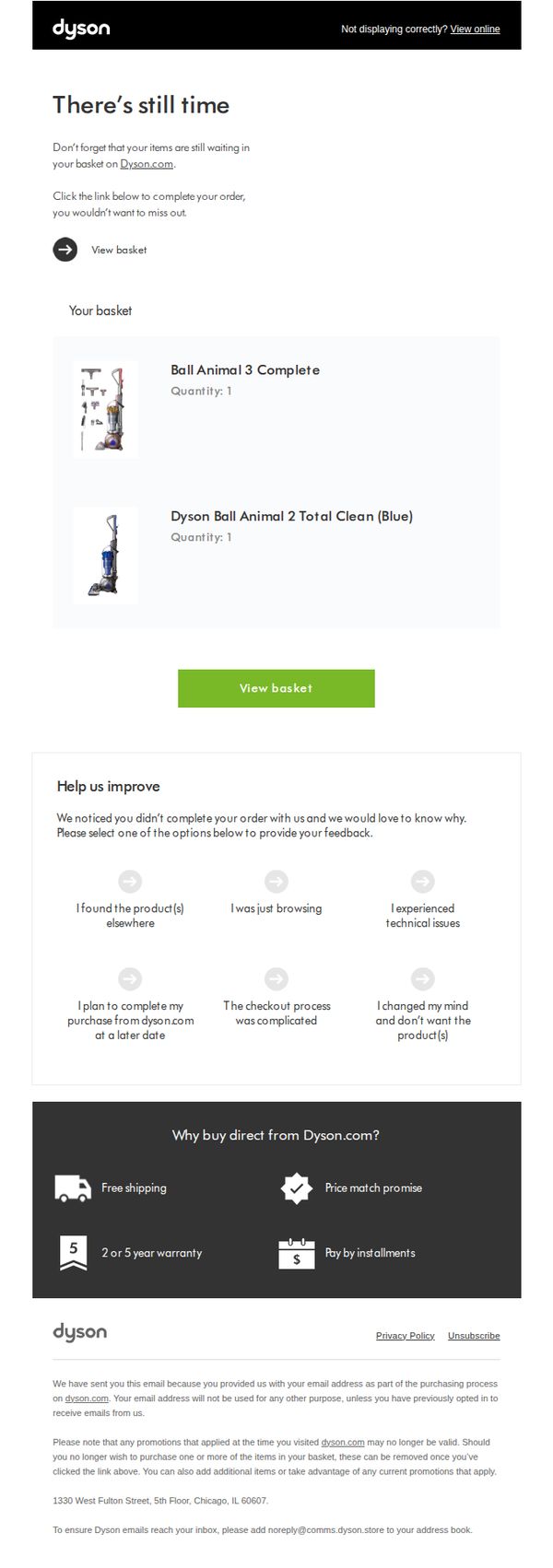
2. Dyson: Your opinion matters to us
Objective
This email aims to recover abandoned cart revenue by reminding customers of items left in their basket and encouraging them to complete their purchase. It also seeks to gather actionable feedback to improve the checkout experience and reduce future cart abandonment.
Why this works
The email opens with urgency and personalization by reminding the recipient that their items are still waiting, which taps into psychological ownership and reduces the friction of returning to complete the purchase.
How to implement
Including a feedback section with six specific, easy-to-select reasons for abandonment turns a recovery attempt into a customer experience diagnostic tool, building trust while gathering data to refine the funnel.
Pro Tip
Add a countdown timer or limited-time offer badge near the 'View basket' CTA to increase urgency, since the current 'There’s still time' headline lacks temporal pressure that could nudge immediate action. • Reorder the feedback options to place 'The checkout process was complicated' and 'I changed my mind and don’t want the product(s)' higher in the list, as these are likely the most common friction points and should be surfaced first for faster insight.
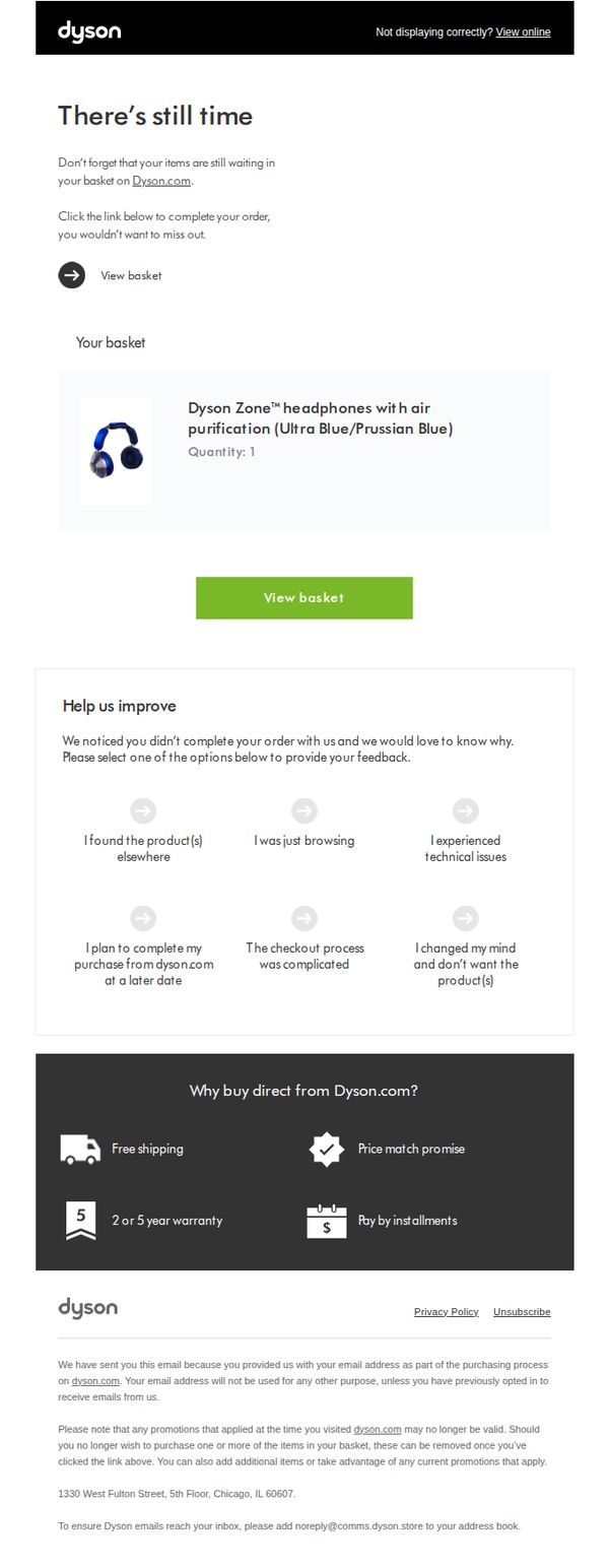
3. Dyson: Your opinion matters to us
Objective
This email aims to recover abandoned cart conversions by reminding users of items left in their basket and inviting them to complete their purchase, while also gathering feedback to improve the checkout experience.
Why this works
The email cleverly frames cart abandonment not as a failure but as an opportunity to reconnect, using a gentle reminder that items are still waiting, creating emotional urgency without pressure.
How to implement
By embedding a feedback loop directly into the recovery email, Dyson turns a potential loss into valuable customer insight, subtly reinforcing that the brand listens and adapts based on user experience.
Pro Tip
Add a countdown timer near the 'View basket' CTA to create time-sensitive urgency, especially since the email implies items are still reserved, this could boost immediate action. • Reposition the feedback section below the product image and CTA, so users first see the product and are prompted to act before being asked to explain why they didn’t buy, improving conversion flow.
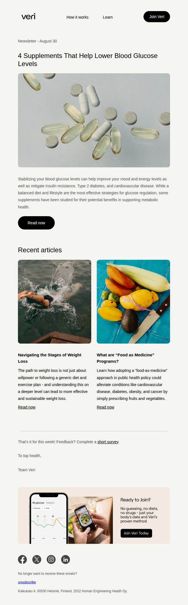
4. veri: 4 Supplements That Lower Blood Sugar
Objective
This email aims to educate subscribers on evidence-based supplements that support healthy blood glucose levels while subtly guiding them toward joining Veri’s personalized health platform. It blends scientific credibility with lifestyle relevance to nurture trust and encourage conversion.
Why this works
The email opens with a highly specific, benefit-driven headline that immediately signals relevance to readers concerned about metabolic health, making it easy to justify continued reading without overwhelming them with jargon or sales pressure.
How to implement
By positioning supplements as supportive tools rather than miracle cures, the email maintains scientific integrity while still creating desire, a smart balance that builds credibility and reduces skepticism among health-conscious audiences who value evidence over hype.
Pro Tip
Add a brief testimonial or user result snippet under the hero section to humanize the science, for example, ‘One user saw a 15% drop in post-meal glucose spikes within 3 weeks’, to bridge education with social proof and increase perceived efficacy. • Include a subtle urgency element near the CTA, such as ‘Join 10,000+ users tracking their glucose today’ or a limited-time offer for first-time sign-ups, to reduce hesitation and nudge procrastinators toward immediate action.
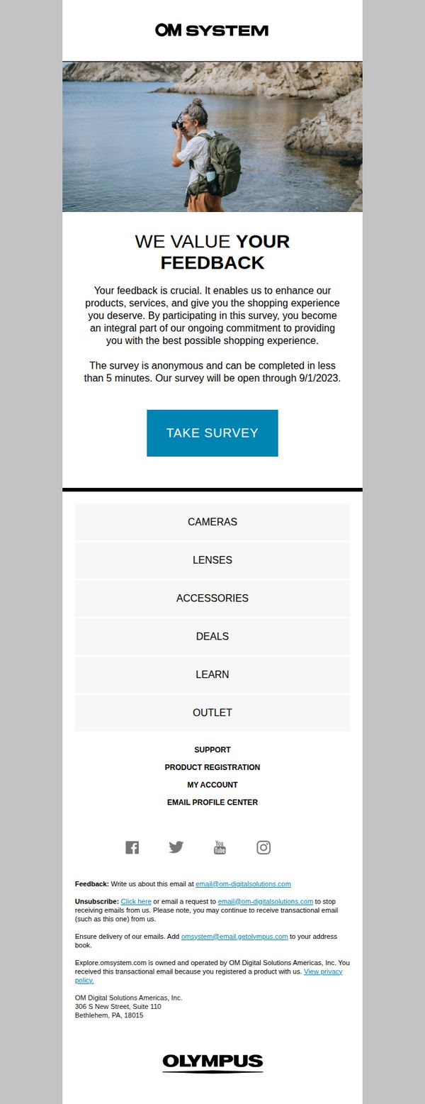
5. OM System (Olympus camera) - US: Your Experience Matters: Take Our 5-Minute Survey
Objective
This email aims to encourage OM System customers to participate in a short, anonymous survey to gather feedback that will help improve products, services, and the overall shopping experience. It positions the recipient as a valued partner in the brand’s continuous improvement journey.
Why this works
The email frames customer feedback not as a chore but as a meaningful contribution to product and service evolution, making recipients feel like co-creators rather than passive consumers.
How to implement
By emphasizing the survey’s brevity (under 5 minutes) and anonymity, the email reduces psychological barriers to participation, increasing the likelihood of completion without overwhelming the reader.
Pro Tip
Add a subtle visual cue or icon next to the CTA button (e.g., a checkmark or clock) to reinforce the '5-minute' promise and reduce perceived effort, increasing click-through rates. • Include a brief testimonial or stat (e.g., '92% of past respondents said their feedback led to real product changes') to build credibility and motivate participation by showing tangible impact.
6. veri: Metabolic Flexibility: The Key to Optimal Energy and Well-Being
Objective
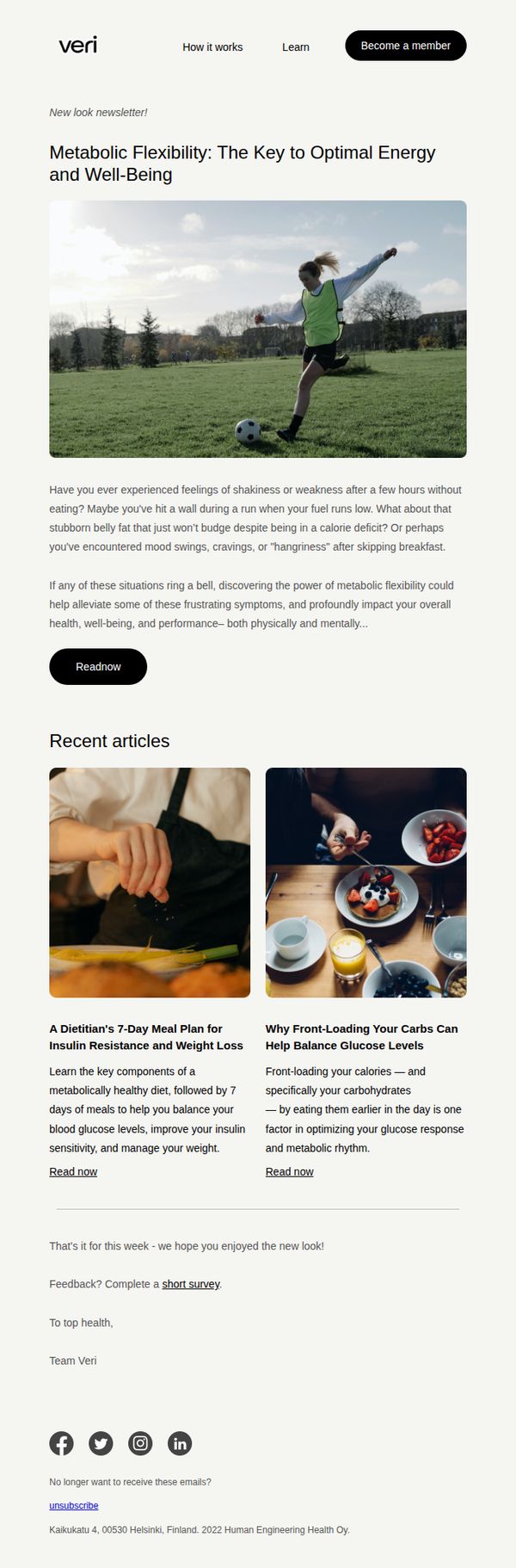
This email aims to educate subscribers on metabolic flexibility as a pathway to improved energy and well-being, while subtly encouraging deeper engagement through article reads and membership sign-ups. It positions Veri as a trusted authority on metabolic health and nudges users toward becoming members for personalized insights.
Why this works
The email opens with a relatable, symptom-based hook that mirrors real-life struggles with energy crashes and stubborn fat, making the science of metabolic flexibility feel personal and immediately relevant to the reader’s daily experience.
How to implement
By framing metabolic flexibility as a solution to both physical performance and mental well-being, the campaign successfully bridges health and lifestyle, appealing to a broader audience beyond just fitness enthusiasts or weight-loss seekers.
Pro Tip
Add a secondary CTA button beneath the hero image that says 'Explore How It Works' to guide readers who aren’t ready to join yet, reducing friction and increasing engagement with the product’s value proposition before the membership ask. • Incorporate a subtle visual cue or micro-CTA next to each article preview, like 'Read next: 5 min' or 'Popular with members', to boost click-through rates by signaling time commitment and social proof, enhancing perceived value without cluttering the layout.
7. veri: 🩸 The truth about drugs for insulin resistance
Objective
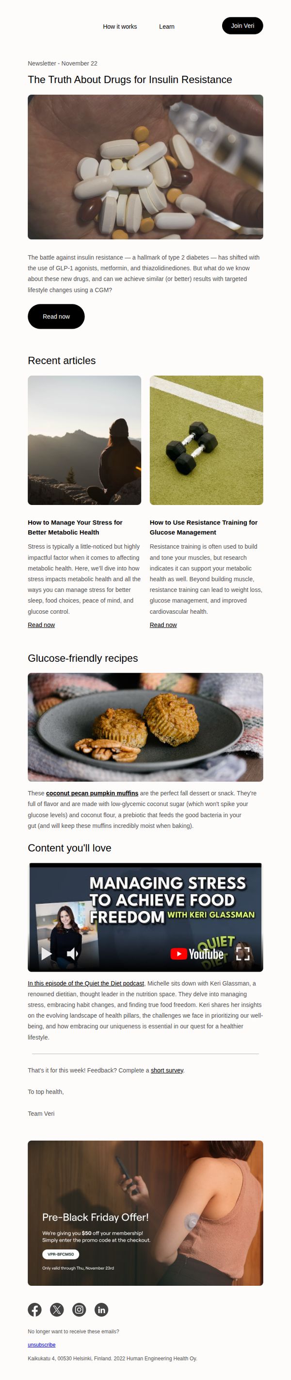
This email aims to educate subscribers on the evolving landscape of pharmaceutical treatments for insulin resistance while positioning Veri’s continuous glucose monitoring (CGM) as a viable, lifestyle-driven alternative. It also seeks to drive membership sign-ups by offering a time-sensitive discount.
Why this works
The email opens with a provocative, clinically grounded headline that immediately signals depth and authority, positioning Veri not just as a product but as a trusted guide in a complex medical conversation around insulin resistance and drug alternatives.
How to implement
By embedding a recipe and stress-management content alongside clinical discussion, the email subtly reinforces that metabolic health is holistic, not just about pills or numbers, but daily choices, making the CGM feel like a natural companion to real-life wellness.
Pro Tip
The primary CTA 'Join Veri' appears only in the header and lacks visual reinforcement near the bottom where readers are most primed to act, adding a sticky or floating CTA button after the educational content would capture more conversions. • The 'Read now' button under the hero section is visually underwhelming and lacks urgency; replacing it with a more compelling micro-CTA like 'Discover the Science Behind Your Glucose' would better align with the email’s educational tone and drive deeper engagement.
8. veri: Special: Women's Health Month Edition
Objective
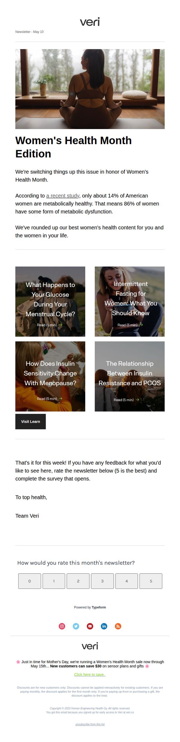
This email aims to engage subscribers by delivering curated, educational content tailored to Women’s Health Month while subtly promoting Veri’s metabolic health offerings. It also seeks to drive new customer acquisition through a time-sensitive discount tied to Mother’s Day and sensor plans.
Why this works
The email smartly anchors its content to a cultural moment, Women’s Health Month, making the educational material feel timely, relevant, and emotionally resonant rather than purely promotional, which builds trust before the sales ask.
How to implement
By leading with a startling statistic about metabolic health in women, the email immediately creates curiosity and urgency, positioning Veri as a knowledgeable guide rather than just a product seller, which strengthens authority and engagement.
Pro Tip
The primary CTA 'Click here to save' is buried in the footer and lacks visual prominence; it should be repeated above the fold, ideally as a button next to the hero image or after the education grid, to align with the campaign’s conversion goal. • The email misses an opportunity to personalize the educational content, adding a dynamic line like 'Based on your interest in [topic], you might also like…' would increase relevance and encourage deeper engagement with the content grid.
9. veri: 🩸 Why glucose levels after eating matter
Objective
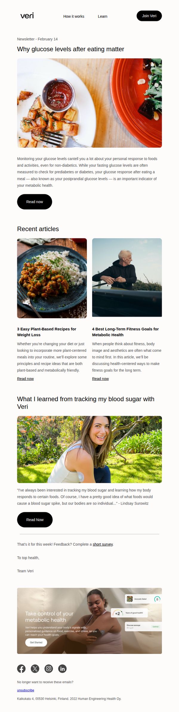
This email aims to educate subscribers on the importance of tracking post-meal glucose levels as a key indicator of metabolic health, while subtly encouraging engagement with Veri’s platform through article reads and a final CTA to get started.
Why this works
The email opens with a visually appetizing food image paired with a science-backed hook about postprandial glucose, immediately grounding the reader in a relatable, everyday context while establishing credibility through metabolic health framing.
How to implement
By featuring real user testimonials alongside digestible article previews, the campaign builds trust through social proof while offering low-friction educational content that gently guides readers toward deeper platform engagement without overt sales pressure.
Pro Tip
Add a subtle countdown or urgency element near the 'Get Started' CTA, such as 'Join 10,000+ users tracking their metabolic health this month', to nudge hesitant readers toward immediate action without compromising the educational tone. • Include a mini-FAQ or 'What to Expect' bullet list under the testimonial section to preemptively address common concerns about using the Veri device, reducing friction for first-time users considering the platform.
10. fluidfreeride: RiderCoin Feedback: Your Input Matters⭐
Objective
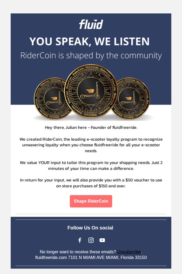
This email aims to gather customer feedback on the RiderCoin loyalty program by positioning the brand as community-driven and rewarding participation with a $50 voucher for qualifying purchases, thereby strengthening engagement and program relevance.
Why this works
The email opens with a powerful community-centric headline, 'You Speak, We Listen', immediately validating the recipient’s voice and framing feedback as a co-creation opportunity, not just a survey request, which boosts psychological ownership and response rates.
How to implement
By attaching a tangible, high-value incentive, a $50 voucher for $150+ purchases, the brand transforms feedback from a favor into a mutually beneficial exchange, making the ask feel less like a chore and more like a rewarding transaction for loyal customers.
Pro Tip
Add a progress bar or estimated time counter (e.g., '2 min → 0:45 left') near the CTA to reduce perceived effort and increase completion rates by visually reinforcing how quick and easy the feedback process is. • Include a brief testimonial or quote from a past participant who helped shape RiderCoin, placed just above the CTA, to build social proof and show real impact from previous feedback, making the ask feel more meaningful and credible.