Proven Made By Sunday personal care email designs you can use

1. stubborn bumps? textured skin?
Objective
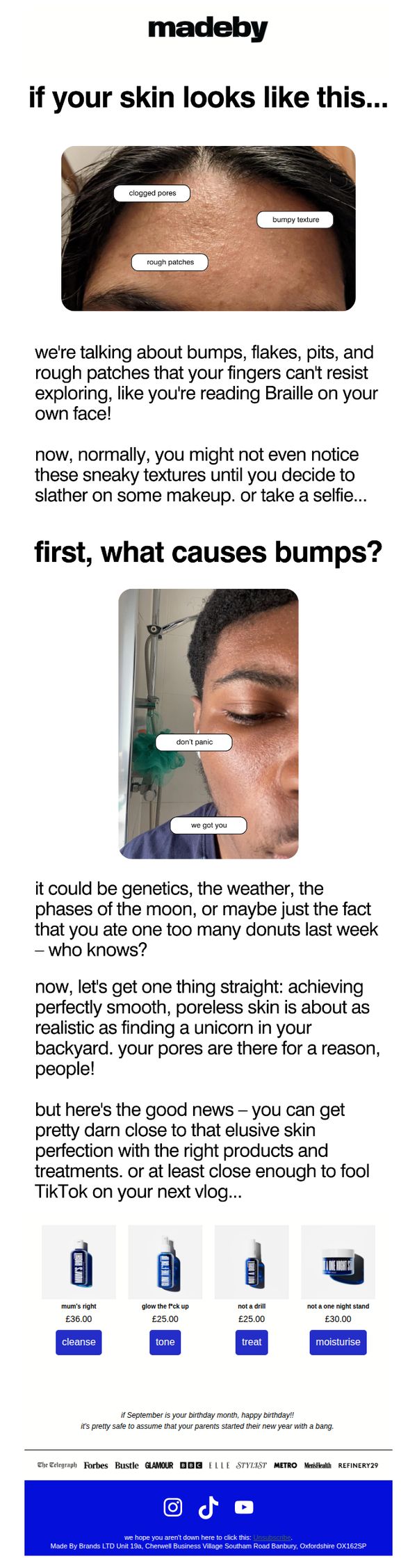
This email aims to resonate with users experiencing textured or bumpy skin by validating their concerns and positioning Made By Sunday’s products as realistic, effective solutions, without promising perfection, while driving product discovery and purchase through a relatable, humorous tone.
Why this works
The email opens with a brutally honest, visually labeled skin texture photo that instantly validates the reader’s experience, making them feel seen before any product is even mentioned, this emotional hook is far more powerful than generic skincare promises.
How to implement
Instead of overpromising flawless skin, the copy leans into realism with phrases like 'pretty damn close to that elusive skin perfection', this manages expectations while still creating desire, making the brand feel trustworthy and refreshingly human.
Pro Tip
Add a short testimonial or user-generated photo beneath the product grid to reinforce social proof, since the email leans into realism, showing real results (even imperfect ones) would strengthen credibility and reduce perceived risk. • Include a subtle urgency element like 'Only 3 left in stock' or 'Limited edition scent' under one product to nudge immediate action, since the current layout lacks any time- or scarcity-based motivation despite the strong emotional hook.
2. Time flies...
Objective
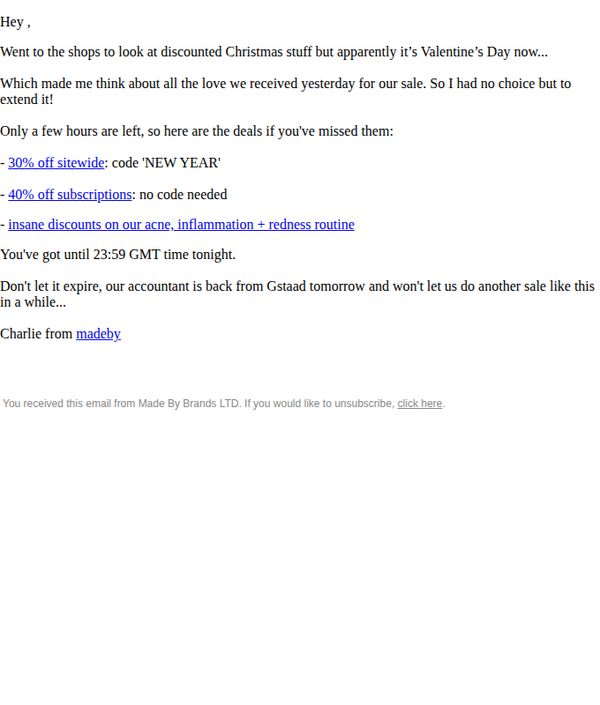
To create urgency and drive last-minute sales by extending a limited-time Valentine’s Day promotion, leveraging emotional storytelling and a personal tone to re-engage customers who may have missed the original sale window.
Why this works
The email opens with a relatable, conversational hook that ties seasonal shopping confusion to emotional nostalgia, making the promotion feel personal rather than transactional and increasing reader connection.
How to implement
By framing the sale extension as a rare, behind-the-scenes favor from the brand’s personality, ‘our accountant is back from Gstaad’, it injects humor and exclusivity, making the offer feel like a privilege, not just a discount.
Pro Tip
Add a visual countdown timer near the CTA to reinforce urgency beyond text, since the current email relies solely on time mentioned in prose, which may not register as strongly with distracted readers. • Include a small product grid or hero image of the acne/inflammation/redness routine products mentioned, currently, the offer lacks visual anchors, reducing conversion potential for customers unfamiliar with those product lines.
3. why is my skin always dry?
Objective
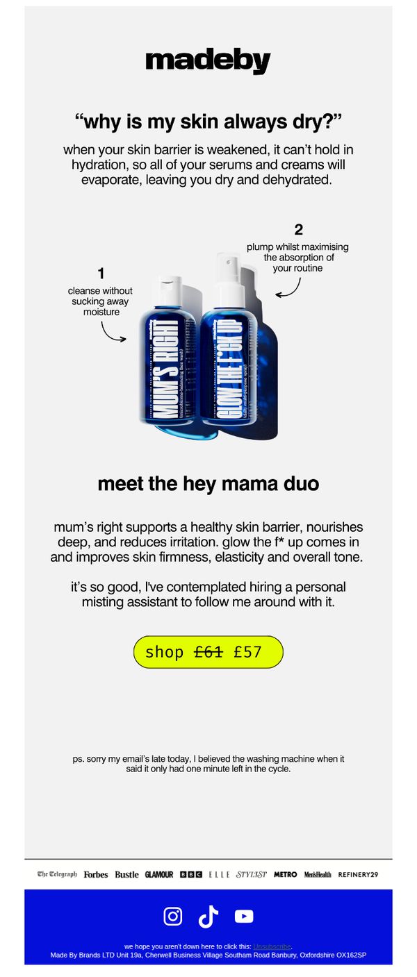
To educate subscribers on the root cause of dry skin and position Made By Sunday’s 'Hey Mama Duo' as the solution by highlighting its dual benefits for barrier repair and hydration. The email aims to drive immediate purchases through a limited-time discount.
Why this works
The email opens with a relatable, conversational question that immediately resonates with the target audience’s pain point, making the educational content feel personal rather than promotional.
How to implement
By visually numbering the dual benefits of the product duo and pairing them with playful yet precise language, the brand transforms functional skincare claims into an engaging, easy-to-digest narrative that builds trust.
Pro Tip
Add a subtle countdown timer near the CTA to create urgency around the £57 discount, leveraging FOMO without disrupting the email’s minimalist aesthetic. • Include a short customer testimonial or star rating beneath the product description to reinforce social proof, especially since the email’s tone already invites personal connection.
4. Are you coming?
Objective
This email aims to drive urgency-driven purchases by promoting a limited-time autumn sale on Made By Sunday’s acne-focused skincare line, while reinforcing product efficacy through customer testimonials and visual transformation proof.
Why this works
The email brilliantly ties seasonal change to pricing psychology, using 'autumn means leaves are falling and so our prices' to create an intuitive, emotionally resonant reason to buy now without sounding forced or salesy.
How to implement
By breaking the skincare routine into four clearly labeled steps with vivid product visuals and benefit-driven copy, the email educates while selling, making complex skincare feel approachable and scientifically grounded for hesitant buyers.
Pro Tip
The CTA 'gobble up the savings' is clever but vague, replace it with a more action-oriented phrase like 'Grab Your Autumn Bundle Now' to better align with the product grid and reduce cognitive friction for conversion. • The testimonial section lacks a visible star rating or badge indicating 'verified buyer' near the quote, adding a small icon or label would amplify credibility and reduce perceived risk for first-time customers.
5. £34 off (the right link!)
Objective
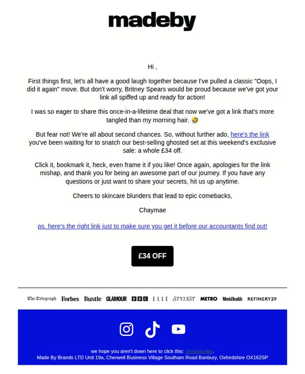
To re-engage subscribers with a humorous, self-aware apology for a broken link while delivering a time-sensitive £34 discount on best-selling products, encouraging immediate click-through and purchase.
Why this works
The brand turns a technical mishap into a relatable, personality-driven moment by comparing the broken link to Britney Spears’ infamous hair moment, instantly humanizing the brand and building emotional connection through humor.
How to implement
By repeating the correct link in both the body and postscript, the email reduces friction for the user while subtly reinforcing urgency, making it harder to ignore or lose the offer even if distracted by the playful tone.
Pro Tip
Add a countdown timer or 'limited stock' indicator near the CTA to heighten urgency, since the email references a 'weekend exclusive sale' but doesn’t visually reinforce time sensitivity. • Include a small product image or grid preview of the 'best-selling ghosted set' to give visual context to the offer, currently, the email relies entirely on text, which may reduce conversion for visual shoppers.
6. our gift to you...
Objective
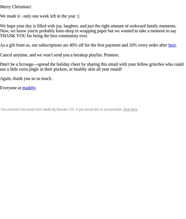
To express gratitude to the community while incentivizing subscription sign-ups with a limited-time holiday discount, encouraging immediate action and social sharing to expand reach.
Why this works
The email brilliantly frames the discount as a heartfelt gift rather than a sales pitch, making the offer feel personal and emotionally resonant during the holiday season.
How to implement
By tying the promotion to a time-sensitive holiday moment, 'only one week left in the year', it creates urgency without sounding pushy, aligning perfectly with seasonal consumer behavior.
Pro Tip
The CTA 'here' is too vague and underwhelming, replace it with a more action-driven, benefit-focused button like 'Claim Your 40% Holiday Gift' to improve conversion clarity and emotional pull. • Add a visual element like a festive banner or product image to break up the text-heavy layout, making the email more engaging and reinforcing the brand’s aesthetic and product value.
7. Are you coming?

Objective
This email aims to drive immediate purchases by positioning Made By Sunday’s skincare bundle as a limited-time autumn sale opportunity, leveraging urgency, social proof, and a step-by-step product education to convert readers into buyers.
Why this works
The email brilliantly ties seasonal change to pricing psychology, using autumn’s falling leaves as a metaphor for falling prices, making the discount feel timely, natural, and emotionally resonant rather than just transactional.
How to implement
Each product is framed as a step in a skincare ritual, not just an item for sale, this transforms the bundle into a guided journey, reducing decision fatigue and increasing perceived value through educational storytelling and purpose-driven sequencing.
Pro Tip
Add a countdown timer near the '£34 off now or never' CTA to amplify urgency, the current 'supply is limited' message is strong but lacks temporal pressure, which could increase conversion rates by creating a clearer deadline for action. • Reposition the 'get it before it’s over!' CTA higher in the flow, ideally after the testimonial and before the before/after images, to capture momentum when trust is highest, rather than burying it after the visual proof where attention may have already drifted.
8. stubborn bumps? textured skin?
Objective
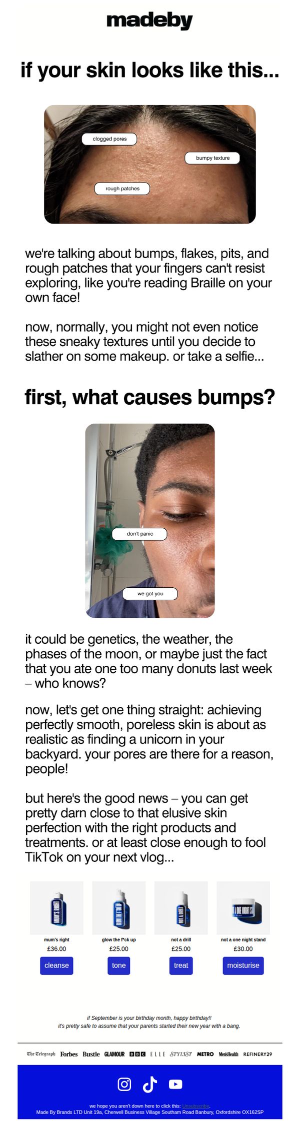
This email aims to resonate with users struggling with textured skin by validating their concerns and positioning Made By Sunday’s products as the realistic, effective solution to achieve smoother, more confident skin, not perfection, but noticeable improvement that looks great on camera.
Why this works
The email opens with a brutally honest, visually relatable image of textured skin, immediately validating the reader’s experience and building trust by acknowledging a problem many feel too embarrassed to name, a powerful hook for skincare audiences.
How to implement
Instead of promising impossible perfection, the copy leans into realism, comparing smooth skin to finding a unicorn, which disarms skepticism and makes the brand feel authentic, approachable, and refreshingly honest in a saturated beauty market.
Pro Tip
Add a short testimonial or user-generated content snippet near the product grid to reinforce social proof, seeing real results from others would strengthen the credibility of the 'pretty darn close to perfection' claim. • Include a micro-CTA or directional arrow after the education section that says 'See the products that fix this' to guide the reader’s eye toward the product grid and reduce friction in the conversion path.
9. you really thought I'd forget?
Objective
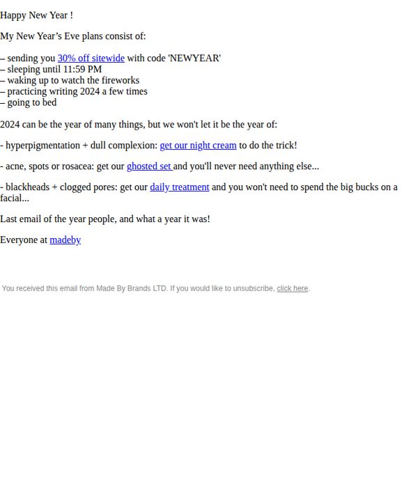
To celebrate the end of the year with a playful, personal tone while driving immediate sales through a time-sensitive 30% off promotion, encouraging recipients to treat their skin before 2024 begins.
Why this works
The email brilliantly blends humor and urgency by framing the discount as a personal New Year’s Eve plan, making the promotion feel like an inside joke rather than a sales pitch, which builds emotional connection and increases open-to-action conversion.
How to implement
By linking specific skin concerns, like hyperpigmentation or acne, to targeted product solutions within the same sentence, the email educates while selling, reducing friction for customers who may not know which product solves their exact problem.
Pro Tip
Add a visual product grid or hero image showcasing the 'night cream,' 'ghosted set,' and 'daily treatment' to reinforce product appeal and reduce cognitive load, currently, the email relies entirely on text links, which may lower conversion for visual shoppers. • Include a countdown timer or urgency indicator (e.g., 'Offer expires Jan 1st at midnight') near the CTA to amplify FOMO, since the current copy implies urgency but doesn’t visually enforce it, potentially reducing last-minute conversions.
10. Time flies...
Objective
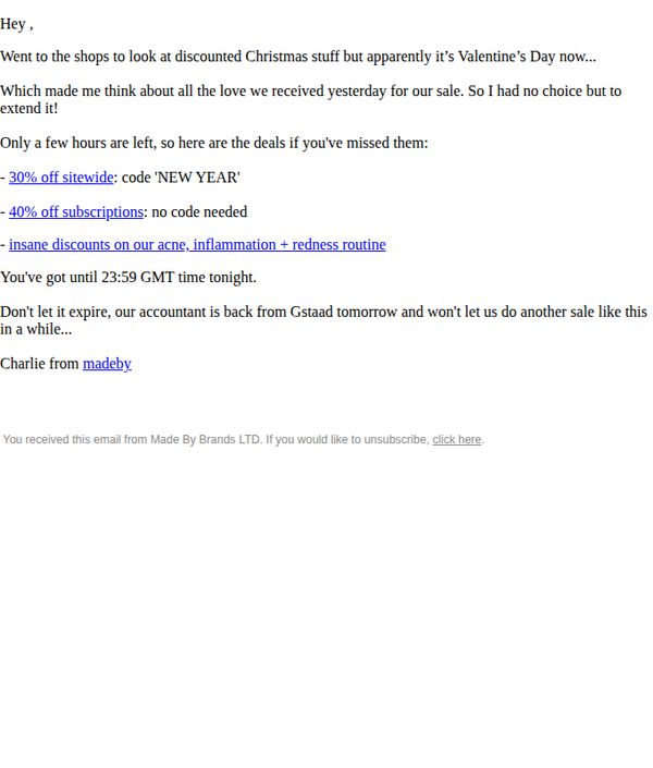
To create urgency and drive last-minute sales by extending a limited-time Valentine’s Day promotion, leveraging emotional storytelling and a personal tone to re-engage customers who may have missed the original sale window.
Why this works
The email opens with a relatable, conversational hook that ties seasonal shopping confusion to emotional nostalgia, making the promotion feel personal rather than transactional and increasing reader connection.
How to implement
By framing the sale extension as a rare, internally negotiated exception, citing the accountant’s return from vacation, the brand injects scarcity and authenticity, making the offer feel exclusive and time-sensitive without sounding forced.
Pro Tip
Add a visual countdown timer or bold deadline indicator near the CTA to reinforce urgency beyond text, since the current design relies entirely on copy and lacks visual cues that trigger immediate action. • Include a small hero image or product thumbnail next to each discount tier to visually anchor the offer, helping customers quickly associate the discount with tangible products rather than abstract percentages.