How Personal Care Brands Do Single Day Email Campaigns

1. 4.5.6 Skin: Say Bye to Oily Skin - Say Hi to Healthy Skin 💫
Objective
This email aims to convert subscribers into customers by introducing and promoting 'Day Hack,' a moisturizer designed to balance oily or combination skin, while highlighting its clinically backed results and natural formulation to build trust and urgency.
Why this works
The email brilliantly positions Day Hack not just as a moisturizer but as a daily hack for skin balance, this framing makes it feel indispensable and lifestyle-integrated rather than just another skincare product.
How to implement
By pairing clinical claims like '40% sebum reduction after 2 weeks' with real customer stats and media logos, the campaign builds credibility without sounding overly technical or salesy, making science feel accessible and trustworthy.
Pro Tip
Add a subtle countdown timer near the CTA to create urgency around limited-time benefits or first-purchase discounts, which would reinforce the 'daily hack' positioning as an immediate, must-try solution. • Include a short FAQ or myth-busting section addressing common concerns about mattifying moisturizers (e.g., 'Will this dry out my skin?') to preempt objections and reduce friction before the user reaches the checkout.
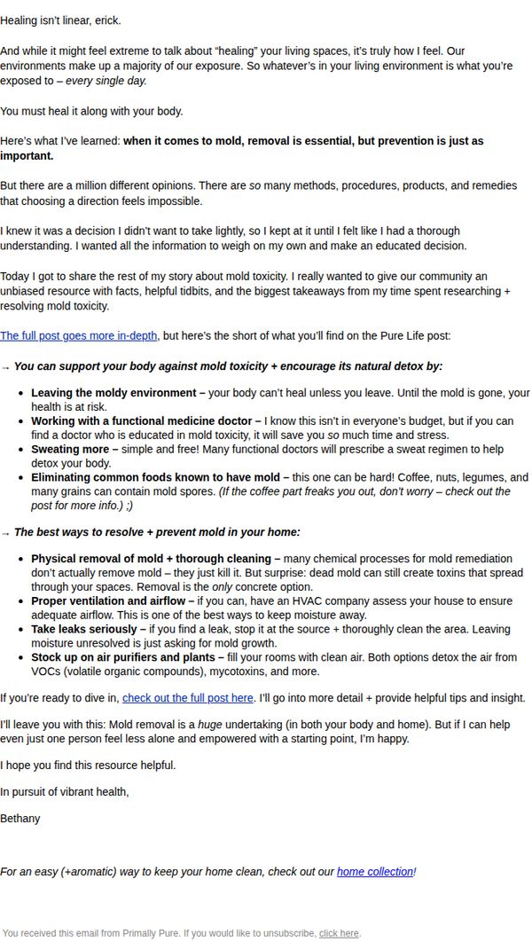
2. Primally Pure Skincare: Why you MUST address mold 🌿 Our founder tells all + shares her insight
Objective
This email aims to educate subscribers on the critical link between mold exposure and health, positioning Primally Pure as a trusted authority while gently guiding readers toward their home wellness products as a natural solution for cleaner living spaces.
Why this works
The email masterfully blends personal storytelling with scientific insight, making a complex health topic feel urgent yet approachable, a powerful technique for building trust and authority without sounding clinical or salesy.
How to implement
By framing mold as both a physical and environmental toxin, the brand subtly aligns its home collection with holistic wellness, allowing readers to naturally connect product use with deeper health outcomes rather than just surface-level cleaning.
Pro Tip
Add a visual element, even a simple icon or divider, between the educational bullet points to improve scannability and reduce text density, helping readers digest complex advice without feeling overwhelmed. • Reinforce the CTA by adding a brief testimonial or customer result near the 'home collection' link, for example, '92% of users report fresher air within 3 days', to bridge the gap between education and conversion.
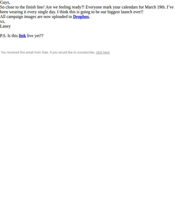
3. Saie: << Internal Only >> Our Biggest Launch
Objective
This internal email aims to build excitement and alignment among team members ahead of Saie’s biggest product launch, encouraging calendar blocking and confirming asset readiness via Dropbox.
Why this works
The email creates urgency and team-wide ownership by framing the launch as a collective milestone, using phrases like 'our biggest launch ever' to foster emotional investment and accountability across departments.
How to implement
By mentioning personal use, 'I’ve been wearing it every single day', the sender builds authentic credibility and subtly signals product confidence, which can be mirrored in customer-facing campaigns to boost trust.
Pro Tip
Add a visual timeline or countdown graphic to the email to reinforce urgency and help team members visualize launch prep milestones, increasing internal alignment and reducing last-minute confusion. • Include a brief bullet list of next steps or owner assignments (e.g., 'Marketing: finalize social assets by 3/15') to transform enthusiasm into executable tasks, ensuring cross-functional readiness.
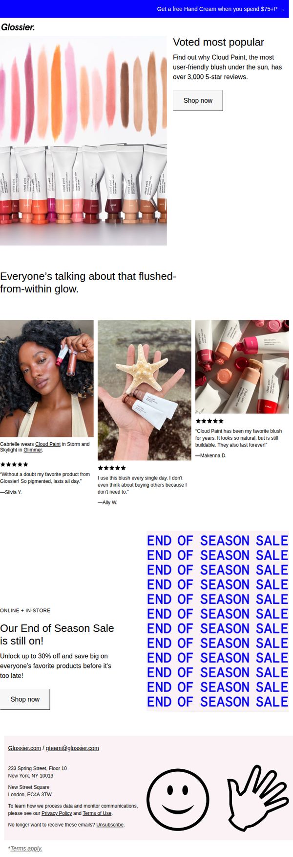
4. Glossier: “Without a doubt my favorite product”
Objective
This email aims to drive immediate sales by highlighting Glossier’s most popular product, Cloud Paint, while leveraging social proof and urgency through an ongoing end-of-season sale. It encourages customers to act before discounts expire by combining testimonials, visual appeal, and a clear promotional offer.
Why this works
The email brilliantly anchors its message around a single hero product, Cloud Paint, using real customer photos and quotes to build trust and emotional connection, making the product feel both aspirational and attainable.
How to implement
By repeating 'END OF SEASON SALE' in bold, stacked typography, the campaign creates visual urgency without being aggressive, subtly nudging readers to act before the window closes while maintaining Glossier’s minimalist aesthetic.
Pro Tip
Add a countdown timer or 'X hours left' indicator near the CTA to amplify urgency, especially since the sale is framed as time-sensitive but lacks a visible deadline to trigger immediate action. • Include a small visual cue or icon next to the 'Shop now' button, like a shopping bag or arrow, to subtly guide the eye and reinforce the action, improving click-through rates without disrupting the clean design.
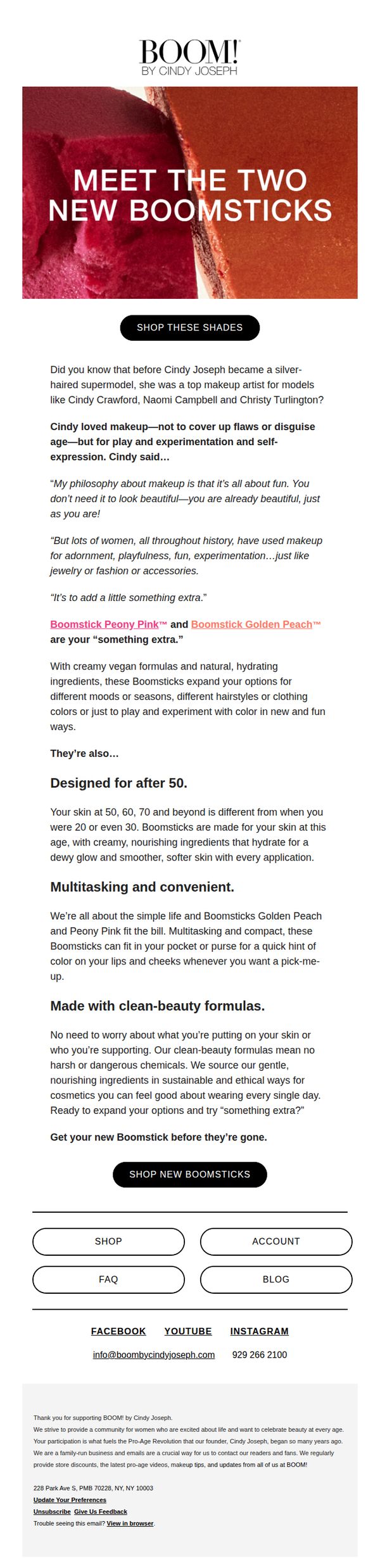
5. BOOM by Cindy Joseph: Did you know this about Cindy Joseph?
Objective
This email aims to introduce and drive sales of two new Boomsticks by connecting them to Cindy Joseph’s personal philosophy and professional background, while reinforcing the brand’s pro-age, clean-beauty values to resonate with mature consumers.
Why this works
The email brilliantly ties product launch to founder storytelling, using Cindy Joseph’s transition from makeup artist to silver-haired icon to position Boomsticks as tools for joyful self-expression, not concealment, making the product feel personal and purposeful.
How to implement
By explicitly stating the products are 'Designed for after 50,' the brand validates its core audience’s unique skincare needs, creating instant relevance and trust while differentiating from mass-market beauty products that ignore age-specific concerns.
Pro Tip
Add a visual comparison or side-by-side swatch of Peony Pink and Golden Peach on mature skin tones to help customers visualize the shades in context, reducing hesitation and increasing conversion confidence. • Include a short customer testimonial or user-generated photo near the CTA to reinforce social proof, especially since the brand targets a community-driven, pro-age audience that values peer validation.
6. Sienna Naturals: An unforgettable year.

Objective
This email aims to express heartfelt gratitude to subscribers for their loyalty over the past year while teasing upcoming product launches and growth initiatives to build anticipation and maintain engagement heading into the new year.
Why this works
The email opens with a warm, personal note from a named team member, which humanizes the brand and transforms a routine year-end message into an emotional connection that fosters loyalty and trust.
How to implement
By hinting at future product launches without revealing details, the brand creates intrigue and urgency, encouraging subscribers to stay engaged and anticipate what’s next without overwhelming them with premature information.
Pro Tip
Add a visual product grid or hero image showcasing best sellers mentioned in the 'Best Sellers & Gifts' section to make the offer more tangible and reduce the cognitive load of imagining products from text alone. • Reposition the 'JOIN NOW' CTA higher in the email, perhaps after the thank-you message, to capitalize on peak emotional engagement and increase conversion before the reader’s attention drifts to the footer.
7. May Lindstrom Skin: Every. Day. Care. 🌱

Objective
To encourage daily use of The Blue Cocoon moisturizer by showcasing its transformative results and positioning it as an essential, consistent part of skincare routines, while driving immediate purchase through a compelling gift-with-purchase offer.
Why this works
The email brilliantly reframes a luxury skincare product as a daily necessity by highlighting real user testimonials that emphasize dramatic, consistent results, turning emotional trust into a persuasive, repeatable ritual.
How to implement
By anchoring the campaign around the phrase 'Every. Day. Care.', the brand creates a gentle but powerful behavioral nudge that positions The Blue Cocoon not as a treat, but as a non-negotiable self-care practice woven into daily life.
Pro Tip
Add a visual countdown timer or limited-quantity indicator near the gift offer to create urgency and prevent the incentive from feeling perpetually available, which could reduce immediate conversion pressure. • Include a short FAQ or 'How to Use' snippet near the CTA to address potential hesitation, for example, clarifying frequency, skin types, or how it replaces other products, to reduce friction for first-time buyers.
8. Tonymoly: $11 off your order
Objective
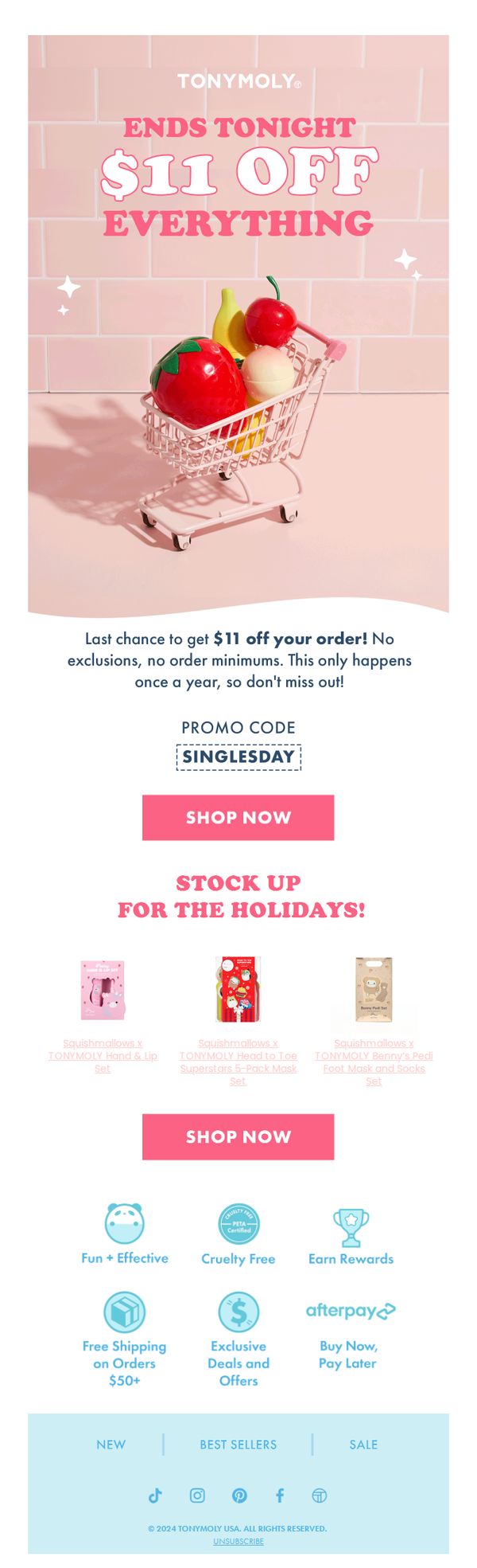
This email aims to drive immediate sales by promoting a limited-time $11 discount on all products, leveraging urgency with 'Ends Tonight' messaging and encouraging customers to take advantage of a rare annual offer before it expires.
Why this works
The email masterfully combines urgency and inclusivity by announcing a universal discount with no exclusions or minimums, making every customer feel personally invited to save, a powerful psychological trigger for immediate action.
How to implement
By featuring playful, product-themed visuals like a shopping cart filled with fruit-shaped beauty items, the brand reinforces its whimsical identity while subtly showcasing bestsellers, making the promotion feel fun and visually engaging rather than purely transactional.
Pro Tip
Add a countdown timer near the CTA to visually reinforce the 'Ends Tonight' urgency, which could increase conversion by creating real-time pressure without requiring users to mentally calculate the deadline. • Include a short customer testimonial or star rating beneath the product grid to build social proof, especially since the products shown are collaborations, this would help validate quality and reduce hesitation for first-time buyers.
9. Sand & Sky: 11.11 Sale is live — 20% off everything

Objective
This email aims to drive immediate sales by promoting Sand & Sky’s 11.11 sitewide sale with 20% off all products, encouraging subscribers to redeem the discount code before the offer ends. It also highlights top-performing skincare items to guide purchasing decisions and reinforce brand trust through social proof and editorial features.
Why this works
The email leverages urgency and simplicity by front-loading the 20% off sitewide offer with a bold headline and clear discount code, making it instantly actionable for time-sensitive shoppers without requiring navigation or decision fatigue.
How to implement
By curating a product grid of top-performing items with benefit-driven micro-copy, like ‘brightens in 10 minutes’ or ‘clinically proven to boost collagen’, the brand turns a generic sale into a personalized discovery experience that speaks directly to customer skincare goals.
Pro Tip
Add a countdown timer near the hero section to visually reinforce urgency and encourage immediate action, since the 11.11 sale implies a limited-time window that isn’t currently emphasized beyond the headline. • Include a brief testimonial or user review snippet under the hero section to humanize the offer, for example, ‘Over 27K customers say this mask transformed their skin’, to strengthen social proof before the product grid.
10. Tonymoly: LAST CHANCE: Singles Day Special
Objective
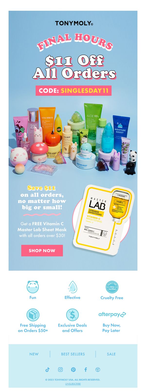
This email aims to drive immediate purchases by creating urgency around a limited-time Singles Day discount, encouraging customers to use a promo code for $11 off any order while also incentivizing higher spend with a free sheet mask on orders over $30.
Why this works
The email brilliantly leverages FOMO with 'FINAL HOURS' and a bold discount headline, making the urgency feel personal and time-sensitive without overwhelming the reader with clutter or conflicting messages.
How to implement
By pairing a flat $11 discount with a free high-value sheet mask on orders over $30, the campaign smartly encourages cart expansion while making the offer feel accessible to both small and big spenders.
Pro Tip
Add a countdown timer near the 'FINAL HOURS' headline to visually reinforce urgency and trigger faster decision-making, especially since the offer is time-bound and the current design lacks real-time pressure cues. • Reposition the 'SHOP NOW' CTA button closer to the top of the email or duplicate it below the product grid, since the current single placement may get missed on mobile or after scrolling past the hero image.