Personal Care email designs from top brands


1. You're invited: Black Friday Live Shopping Event
Objective
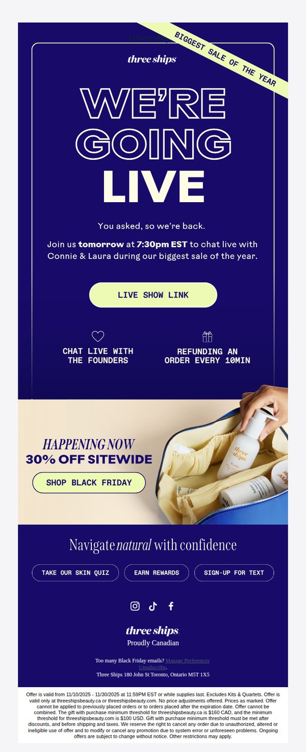
The email aims to drive immediate engagement and sales by inviting subscribers to a live Black Friday shopping event featuring the brand’s founders, while also promoting a sitewide 30% discount to create urgency and reward early participation.
Why this works
The email brilliantly combines live event FOMO with founder access, turning a sale into an exclusive experience that feels personal and urgent, which significantly boosts emotional engagement beyond a standard discount announcement.
How to implement
By anchoring the promotion to a specific time and featuring real-time incentives like 'refunding an order every 10 minutes,' the campaign transforms passive browsing into active participation, leveraging scarcity and surprise to drive conversions.
Pro Tip
Add a countdown timer above the CTA to visually reinforce the urgency of the live event, helping users internalize the time-sensitive nature of the offer and reducing hesitation before clicking. • Include a brief testimonial or social proof near the 'Chat Live with the Founders' section to validate the value of attending the live show, such as 'Over 5,000 customers joined our last live event, don’t miss out!'
2. NEW: Morning & Night Bundles
Objective
This email aims to drive immediate sales of Three Ships’ new Morning and Night skincare bundles by highlighting their simplicity, effectiveness, and 20% discount, while also promoting mini kits for trial and gifting at 50% off to expand customer reach.
Why this works
The email brilliantly simplifies skincare decision fatigue by packaging AM and PM routines into two clear, benefit-driven bundles, making it effortless for customers to adopt a complete, effective regimen without guesswork.
How to implement
By anchoring each bundle to a specific time of day and outcome, dewy mornings and elastic, smooth nights, the messaging creates emotional resonance and functional clarity that turns features into compelling lifestyle promises.
Pro Tip
Add a subtle countdown timer near the CTA to create urgency around the 20% bundle discount, leveraging FOMO to boost conversion without disrupting the clean layout. • Include a short customer testimonial or star rating beneath each bundle to reinforce social proof, especially since the email lacks real-user validation despite promoting award-winning ingredients.
3. What you missed in April
Objective
This email aims to re-engage subscribers by recapping April’s key brand moments, new product launches, Mother’s Day promotions, sustainability updates, and award wins, while driving traffic to specific product pages and encouraging immediate purchases through targeted CTAs.
Why this works
The email smartly frames April’s updates as a curated ‘highlight reel’ rather than a sales pitch, making the content feel editorial and trustworthy while still driving conversion through strategically placed CTAs beneath each product story.
How to implement
By tying new product launches to emotional triggers like Mother’s Day gifting and sustainability values, the campaign transforms functional updates into relatable lifestyle moments that resonate with the brand’s conscious consumer base.
Pro Tip
Add a countdown timer or urgency cue next to the Mother’s Day bundle offer to nudge procrastinators, since the promotion is time-sensitive, visual urgency would reinforce the 20% savings and drive faster action. • Reorder the sections to lead with the award-winning Superfruit Mask, placing the most socially validated product first to capture attention immediately and build trust before introducing newer, less-proven items like the Harmony Cleanser.
4. Your Black Friday Free Gifts ($62 value)
Objective
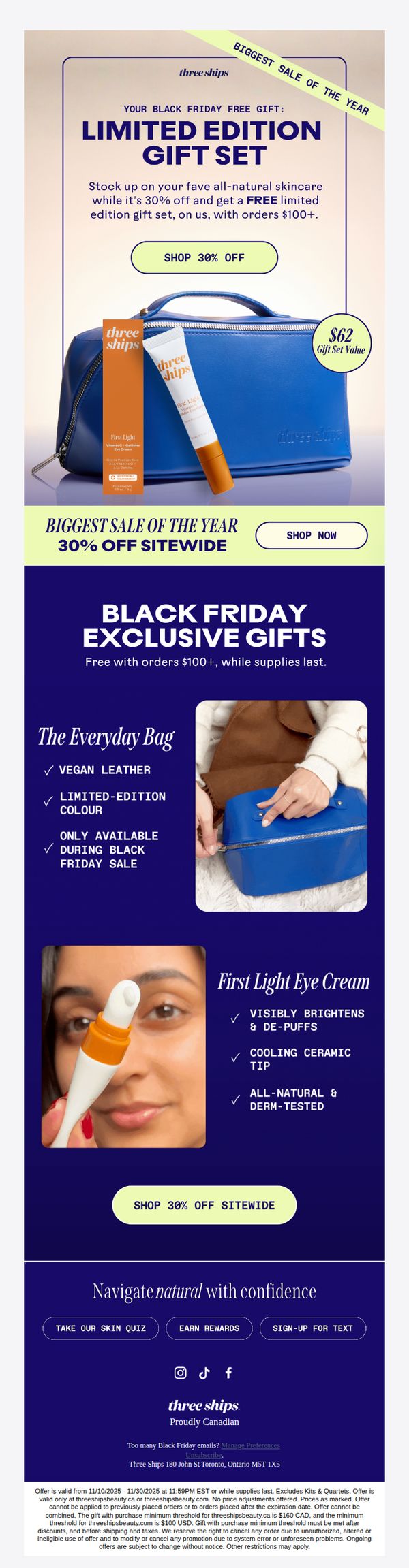
This email aims to drive urgency and conversions during Black Friday by promoting a limited-time 30% sitewide discount paired with a high-value free gift set for orders over $100, leveraging scarcity and perceived value to incentivize immediate purchases.
Why this works
The email brilliantly combines a time-sensitive discount with a tangible, high-perceived-value free gift to create irresistible urgency, making the customer feel they’re not just saving money but gaining exclusive, limited-edition luxury they can’t get anywhere else.
How to implement
By visually anchoring the $62 gift set value next to the actual products and using a bold color contrast, the campaign transforms a generic promotion into a concrete, emotionally compelling deal that feels personalized and worth acting on immediately.
Pro Tip
Add a countdown timer beneath the 'BIGGEST SALE OF THE YEAR' banner to visually reinforce urgency and scarcity, which would increase conversion pressure without adding clutter or distracting from the core offer. • Include a short customer testimonial or star rating next to the First Light Eye Cream to build social proof and credibility, especially since the product is being positioned as a premium, results-driven item in the gift set.
5. ☀️Easy AM Routine ☀️
Objective
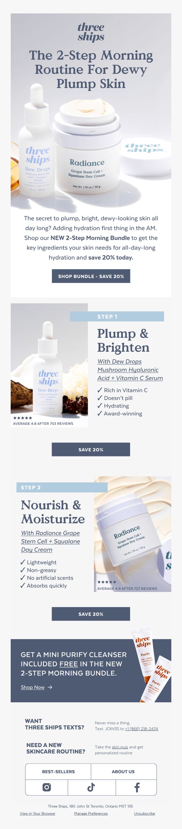
This email aims to drive immediate sales of the new 2-Step Morning Bundle by positioning it as the essential solution for achieving dewy, plump skin through a simplified AM routine, while incentivizing purchase with a 20% discount and a free mini cleanser.
Why this works
The email brilliantly frames the skincare solution as a two-step ritual rather than a product list, making the routine feel effortless and accessible while subtly reducing perceived complexity for the customer.
How to implement
By highlighting real-time social proof with star ratings and review counts directly beside each product, the campaign builds instant credibility and reduces hesitation, encouraging faster conversion through peer validation.
Pro Tip
Add a countdown timer next to the 'SAVE 20%' CTA to create urgency and encourage immediate action, especially since the discount is framed as a limited-time offer tied to the new bundle launch. • Reposition the 'Shop Now' CTA under the free mini cleanser offer to create a stronger visual and psychological link between the bonus and the purchase, increasing perceived value and conversion likelihood.
6. Squeaky Clean Ingredients

Objective
To announce and celebrate the EWG verification of Two Ships’ Brighter Days and Replenish products, reinforcing brand trust by highlighting clean, safe ingredients and encouraging immediate purchase through social proof and clear CTAs.
Why this works
By anchoring the campaign around EWG verification, Three Ships transforms a regulatory milestone into an emotional trust signal, making safety feel personal and urgent rather than bureaucratic or technical.
How to implement
The inclusion of real customer quotes tied directly to product visuals creates an irresistible blend of social proof and sensory appeal, turning testimonials into mini-product demonstrations that drive conversion without sounding salesy.
Pro Tip
Add a subtle countdown timer or limited-time badge near the 'Shop Clean Beauty' CTA to create urgency around the EWG verification launch, encouraging immediate action instead of passive browsing. • Include a short FAQ or tooltip near the EWG badge explaining what the verification means in plain language, many consumers recognize the logo but may not understand its significance without context.
7. Trend Alert: Multi-Use Skincare

Objective
To introduce and promote Three Ships’ multi-use skincare products by highlighting their versatility and space-saving benefits, encouraging customers to simplify their routines while discovering new ways to use each product.
Why this works
The email brilliantly frames each product not just as a skincare item but as a customizable tool for personal beauty rituals, making the customer feel empowered to innovate with their routine rather than just follow instructions.
How to implement
By showcasing three distinct multi-use applications per product, the campaign transforms functional versatility into an emotional benefit, helping customers visualize how these products fit seamlessly into their real, busy lives without adding complexity.
Pro Tip
Add a short customer testimonial or social proof snippet under each product to reinforce trust and validate the multi-use claims, since users may hesitate to experiment without seeing others’ success stories. • Include a visual icon or badge next to each product’s usage bullet points (e.g., ‘For Face’, ‘For Hair’, ‘For Bath’) to make the multi-use benefits instantly scannable and reduce cognitive load for mobile viewers.
8. Need An Easier Nighttime Routine? 👀
Objective
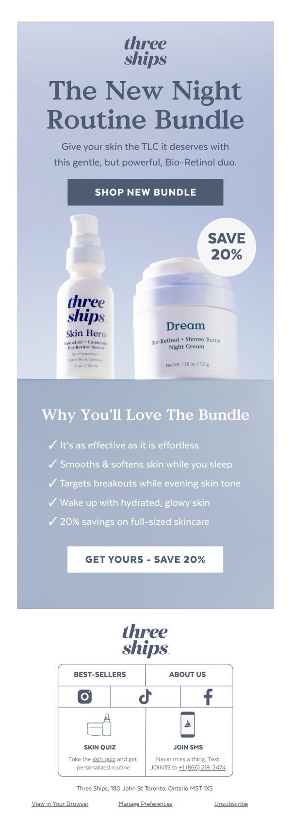
This email aims to drive immediate purchases of Three Ships’ new Night Routine Bundle by positioning it as an effortless, results-driven solution for nighttime skincare, while emphasizing a 20% savings to incentivize urgency and value perception.
Why this works
The email brilliantly frames the bundle as a ‘TLC’ moment for skin, tapping into emotional self-care language that resonates with busy consumers seeking gentle yet powerful nighttime solutions without added complexity.
How to implement
By listing five specific, benefit-driven bullet points under ‘Why You’ll Love The Bundle,’ the campaign transforms abstract product features into tangible, desirable outcomes, like waking up with glowing skin, that directly address customer pain points and desires.
Pro Tip
Add a subtle countdown timer or urgency indicator near the CTA to reinforce the limited-time nature of the 20% savings, which could nudge hesitant shoppers toward immediate action without disrupting the clean layout. • Include a mini testimonial or star rating beneath the product images to build social proof at the point of visual engagement, helping to validate the ‘effortless yet effective’ claim before the reader even scrolls to the benefits section.
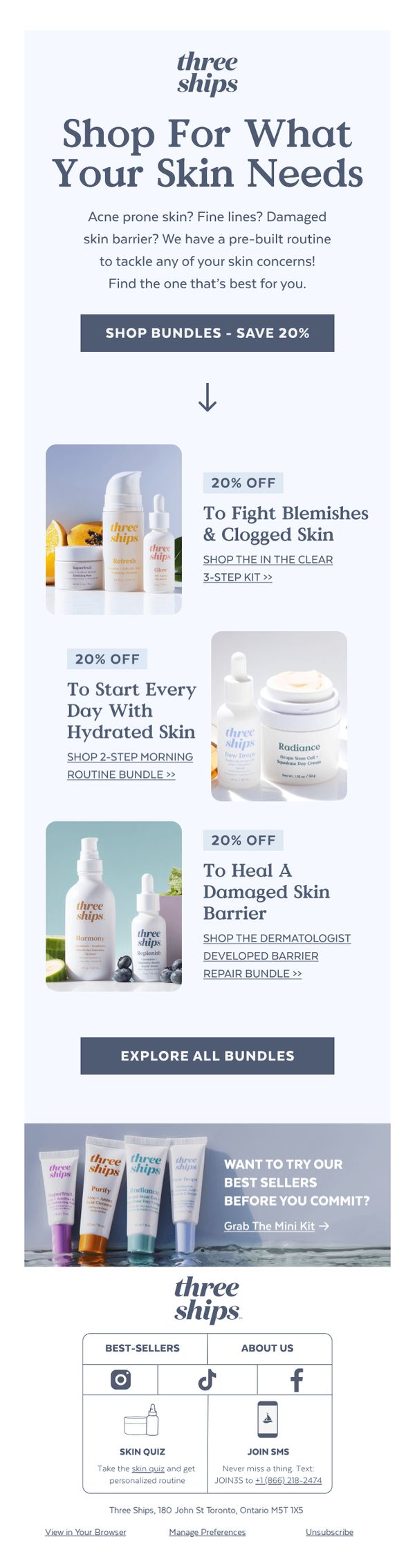
9. Which Pre-Built Routine Is Right For You?
Objective
This email aims to guide subscribers toward selecting a pre-built skincare routine tailored to their specific skin concerns, while incentivizing immediate purchase through a 20% discount on bundles. It also encourages exploration of bestsellers via a mini kit offer to reduce purchase hesitation.
Why this works
By framing skincare solutions around specific, relatable concerns like blemishes or dryness, the email creates immediate emotional resonance and positions each bundle as a targeted remedy rather than a generic product set.
How to implement
The consistent 20% discount across all bundles removes friction by making every option feel equally valuable, encouraging exploration without forcing the subscriber to compare prices or perceive one bundle as inferior.
Pro Tip
Add a visual progress bar or skin concern selector above the bundles to personalize the experience, this would guide users to their ideal routine faster and increase perceived relevance without requiring extra clicks. • Reposition the 'Grab The Mini Kit' CTA to appear after the first bundle instead of at the bottom, capitalizing on initial interest and offering an immediate alternative before the user scrolls past the main offers.
10. Popular in July...

Objective
This email aims to re-engage subscribers by showcasing July’s most popular and newly verified products, while driving traffic to key product pages through curated highlights and social proof. It also promotes new bundles and upcycling ideas to encourage repeat purchases and brand loyalty.
Why this works
By leading with EWG verification, the email immediately builds trust and positions the brand as transparent and health-conscious, which resonates deeply with eco-aware skincare shoppers seeking safe, science-backed formulations.
How to implement
The strategic use of customer testimonials paired with product visuals creates authentic social proof that feels personal and relatable, subtly guiding readers to envision themselves using the product in real-life scenarios like wedding prep or daily routines.
Pro Tip
The CTA buttons are visually consistent but lack urgency or benefit-driven language, adding phrases like 'Get 20% Off Today' or 'Limited Stock' to the 'Shop Bundles' and 'Shop Glow' CTAs could significantly boost conversion by creating perceived scarcity. • The email lacks a clear visual hierarchy guiding the eye from top to bottom, adding subtle dividers, numbered sections, or directional arrows between product blocks would improve flow and help users digest content more efficiently without feeling overwhelmed.