Accessories product highlight email examples & ideas



1. Voluspa: The Mother's Day Gift Guide is Here! 🌷
Objective
This email aims to drive Mother’s Day gift purchases by showcasing curated, emotionally resonant product collections that align with the sentiment of honoring mothers. It encourages immediate action through limited-time offers and gift-with-purchase incentives.
Why this works
The email masterfully ties product selection to emotional storytelling, using phrases like 'A mother’s love knows no bounds' to elevate gifting from transactional to sentimental, making recipients feel they’re honoring love, not just buying candles.
How to implement
By segmenting products into intuitive categories like 'Most Gifted' and 'To Relax & Unwind,' the email reduces decision fatigue and guides shoppers toward proven favorites, increasing conversion likelihood through curated confidence rather than overwhelming choice.
Pro Tip
Add a countdown timer near the gift-with-purchase offer to amplify urgency, since Mother’s Day is date-sensitive and time-bound incentives significantly boost conversion for holiday-driven campaigns. • Include a short customer testimonial or review snippet under one of the top-selling products to build social proof, especially since the 'Most Gifted' section implies popularity but lacks third-party validation to reinforce trust.
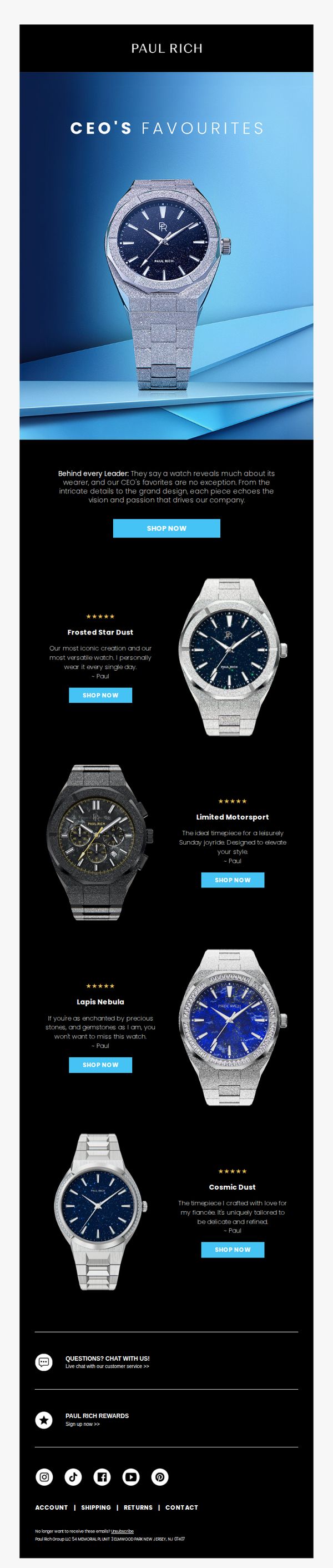
2. Paul Rich: CEO's favorites: The watches that don't just tell time
Objective
This email aims to drive sales by showcasing the CEO’s personally selected luxury watches, positioning them as symbols of leadership and refined taste while encouraging immediate purchase through direct CTAs.
Why this works
The email leverages the CEO’s personal endorsement to build trust and emotional connection, transforming product features into stories of passion and leadership that resonate with aspirational buyers.
How to implement
Each watch is presented with a unique narrative and five-star rating, turning technical specs into lifestyle statements that appeal to identity-driven purchasing decisions rather than just functionality.
Pro Tip
Add a subtle countdown timer or limited-availability indicator near the hero section to create urgency, since the email positions these as exclusive CEO picks rather than evergreen inventory. • Include a short testimonial or social proof snippet from a real customer beneath each watch description to reinforce credibility beyond the CEO’s personal endorsement.
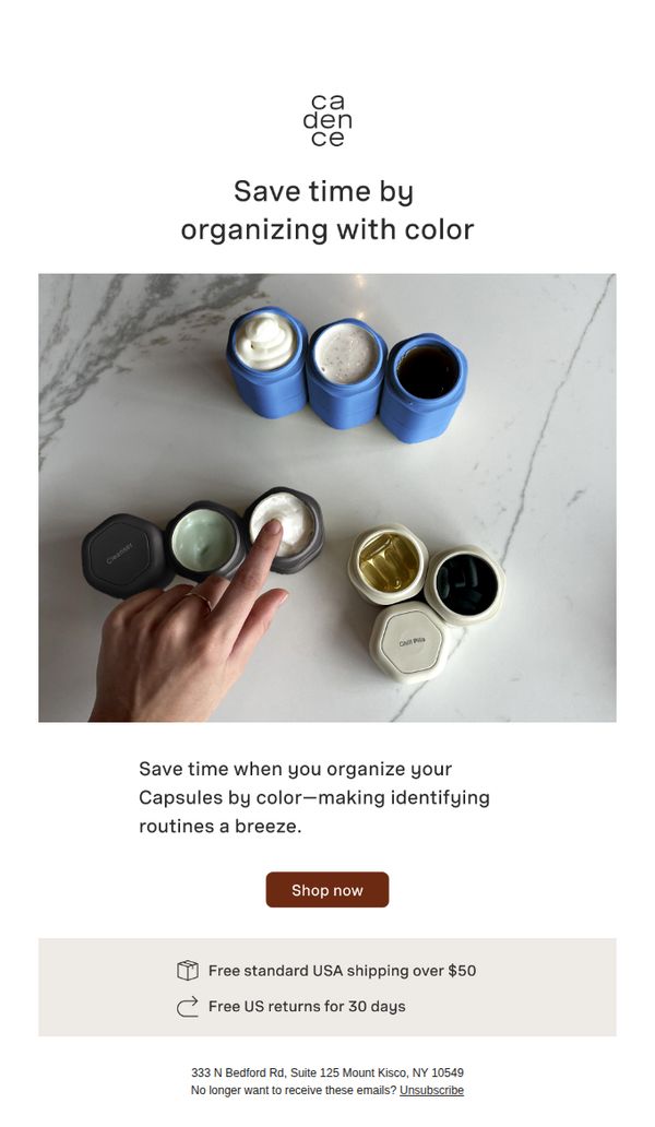
3. Cadence: Your routine, on speed mode ⚡⚡
Objective
The email aims to drive immediate product purchases by positioning Cadence Capsules as a time-saving, color-coded organizational solution for daily routines. It targets efficiency-minded consumers seeking simplicity and visual clarity in their personal care systems.
Why this works
The email brilliantly frames the product not as a container but as a time-saving ritual enhancer, making the organizational benefit feel personal and immediately valuable to busy routines.
How to implement
Using a top-down visual of hands interacting with color-coded capsules creates an intuitive, tactile connection that subtly communicates ease of use and visual clarity without needing extra explanation.
Pro Tip
Add a micro-testimonial or social proof near the CTA, such as 'Join 10,000+ customers who streamlined their routines', to reinforce credibility and urgency without cluttering the clean layout. • Introduce a subtle visual hierarchy by making the CTA button slightly larger or adding a soft shadow to draw more attention, since the current placement risks blending into the minimalist design.
4. Voluspa: Meet Everyone's Favorite Gift Set
Objective
This email aims to drive immediate purchases of Voluspa’s limited-edition Advent Calendar by positioning it as a must-have holiday gift, while also promoting a high-value seasonal fragrance comeback and encouraging payment flexibility through Klarna.
Why this works
The email brilliantly frames the Advent Calendar not just as a product but as a ‘season-long celebration,’ transforming a transaction into an experiential gift that keeps giving, perfect for holiday shoppers seeking emotional resonance over mere utility.
How to implement
By featuring a glowing customer testimonial directly beneath the hero image, Voluspa leverages social proof to validate the product’s desirability and elegance, subtly reassuring hesitant buyers that this isn’t just another calendar, it’s a coveted holiday staple.
Pro Tip
The Klarna payment option is buried below the main CTA; move it higher or integrate it as a sub-headline under the primary CTA to reduce friction for price-sensitive shoppers who may abandon if they don’t immediately see flexible payment options. • The ‘Copper Clove’ cross-sell section lacks visual hierarchy, it competes with the main product instead of complementing it; reposition it as a sidebar or floating banner with a ‘Limited Stock’ badge to enhance urgency without diluting the primary campaign focus.
5. Voluspa: Noble Fir Garland: #1 Holiday Fragrance
Objective
This email aims to drive last-minute holiday sales by positioning the Noble Fir Garland fragrance as the top seasonal scent, while creating urgency through shipping deadlines and showcasing multiple product formats to encourage immediate purchase.
Why this works
The email masterfully combines emotional storytelling with tactical urgency by framing the fragrance as 'Christmas in a candle' while anchoring the offer to specific shipping cutoffs, making the purchase feel both sentimental and time-sensitive.
How to implement
By showcasing six distinct product formats under one scent umbrella, the campaign reduces decision fatigue while increasing perceived value, customers can choose their preferred size or type without abandoning the core holiday aroma they’re drawn to.
Pro Tip
Add a visual countdown timer next to the shipping deadlines to reinforce urgency more dynamically than text alone, especially since the email targets last-minute shoppers who respond to real-time scarcity cues. • Reposition the 'EXPLORE ALL 13 OPTIONS' CTA to appear directly beneath the product grid instead of after it, reducing friction for users who want to browse more variants without scrolling past unrelated content.
6. uncommon goods: Advent calendars to make the Christmas countdown uncommon

Objective
This email aims to drive holiday sales by showcasing a curated selection of unique, experience-driven advent calendars that align with Uncommon Goods’ brand identity of offering extraordinary, thoughtful gifts. It also promotes seasonal bestsellers and a charitable partnership to deepen customer engagement.
Why this works
The email brilliantly leverages the emotional ritual of advent calendars by framing each product as a daily experience, not just a gift, which transforms shopping into storytelling and taps into the nostalgia and anticipation of the holiday season.
How to implement
By integrating a cause-driven promotion with Breastcancer.org, the campaign elevates brand purpose without overshadowing commerce, creating a dual incentive for customers to buy while feeling they’re contributing to something meaningful beyond their own holiday plans.
Pro Tip
The hero section’s CTA ‘shop now’ is visually underwhelming and lacks urgency; adding a time-sensitive phrase like ‘Limited Stock’ or ‘Ends Soon’ would better motivate immediate clicks aligned with holiday shopping psychology. • The ‘Better to Give’ section, while emotionally compelling, interrupts the product flow; relocating it to the footer or converting it into a collapsible banner would preserve the shopping momentum while still honoring the charitable message.
7. uncommon goods: Gifts trending *right* now

Objective
This email aims to drive immediate gift purchases by showcasing the top 10 trending items with playful, story-driven descriptions that highlight emotional or humorous appeal, while encouraging membership sign-ups for free shipping benefits.
Why this works
The email brilliantly pairs each trending gift with a witty, emotionally resonant tagline that transforms a simple product into a memorable story, making the buyer feel like they’re not just shopping, but curating meaningful moments for loved ones.
How to implement
By numbering the top 10 gifts with bold, colorful typography, the campaign creates a sense of urgency and authority, subtly guiding the reader through a curated journey that feels like a trusted friend’s gift guide rather than a sales pitch.
Pro Tip
Add a subtle countdown timer or ‘Only X left in stock’ indicator next to top-ranked items to amplify urgency, especially since the email’s goal is to drive immediate gift purchases during a trending window. • Reposition the ‘Unlimited free shipping’ offer higher in the email, perhaps just below the hero section, to immediately incentivize membership sign-up before the reader scrolls past, aligning with the campaign’s dual goal of conversion and retention.
8. Pura Vida Bracelets: PV styles to match your favorite Thanksgiving Dish

Objective
This email aims to drive engagement and sales by playfully connecting Thanksgiving food favorites with matching Pura Vida jewelry styles, encouraging recipients to discover and shop personalized accessories that reflect their holiday personality.
Why this works
The email brilliantly ties seasonal food nostalgia to product discovery, making the shopping experience feel personal and fun rather than transactional, which increases emotional connection and click-through likelihood.
How to implement
Each food category is paired with a distinct style descriptor, like 'Classic and Neutral' or 'Bold and Fun', which helps customers self-identify and simplifies decision-making by aligning products with personality traits.
Pro Tip
Add a subtle countdown timer or urgency cue near the CTA to encourage immediate action, since the Thanksgiving theme implies a time-sensitive opportunity that’s currently under-leveraged. • Include a short testimonial or social proof snippet under one or two food categories to reinforce trust and validate the style pairings, especially for first-time buyers unsure about the match.
9. uncommon goods: It's a holiday favorites roundup!!

Objective
This email aims to drive holiday gift purchases by showcasing curated, popular items across categories while encouraging new sign-ups for perks like free shipping. It leverages seasonal urgency and personalized recommendations to convert browsers into buyers.
Why this works
The email brilliantly uses playful, category-specific headlines like 'Wrangle her a winner' and 'Rope in a gift he’ll love' to create emotional resonance and guide shoppers by recipient, making gift selection feel intuitive and fun rather than overwhelming.
How to implement
By embedding personalized product recommendations under 'We Found These For You,' the campaign transforms generic browsing into a tailored experience, subtly increasing perceived relevance and reducing decision fatigue for time-pressed holiday shoppers.
Pro Tip
Add a visible countdown timer near the hero section to amplify holiday urgency, since the email promotes 'favorites,' implying limited availability or seasonal demand, a timer would strengthen FOMO and nudge faster decisions. • Reposition the 'Shop for Women' and 'Shop for Men' CTAs directly beneath their respective product grids instead of above, this reduces cognitive load by aligning action buttons with the content they represent, improving conversion flow.
10. uncommon goods: Fame isn’t easy: UG bestsellers exposed

Objective
This email aims to drive traffic and sales by spotlighting 20 top-selling Uncommon Goods products, leveraging social proof and curiosity to encourage browsing and purchasing. It also promotes membership perks and personalized gift discovery to increase customer retention and lifetime value.
Why this works
The email brilliantly uses the phrase 'Fame isn’t easy: UG bestsellers exposed' to create intrigue and position popular products as exclusive discoveries, making customers feel like insiders rather than just shoppers.
How to implement
By organizing bestsellers in a clean, two-column grid with clear product names and images, the email reduces decision fatigue and makes browsing effortless, encouraging users to click through multiple items without feeling overwhelmed.
Pro Tip
Add a subtle countdown timer or 'limited stock' indicator next to top-performing products in the bestseller grid to create urgency and nudge immediate action without disrupting the clean layout. • Reposition the 'Unlimited free shipping' perk banner higher in the email, perhaps just below the hero section, to reinforce value before users scroll to product listings, increasing perceived benefit before decision-making.