How top ecommerce brands do educational product highlight campaigns



1. Lightdash: What if your analysts had 10 extra hours a week?
Objective
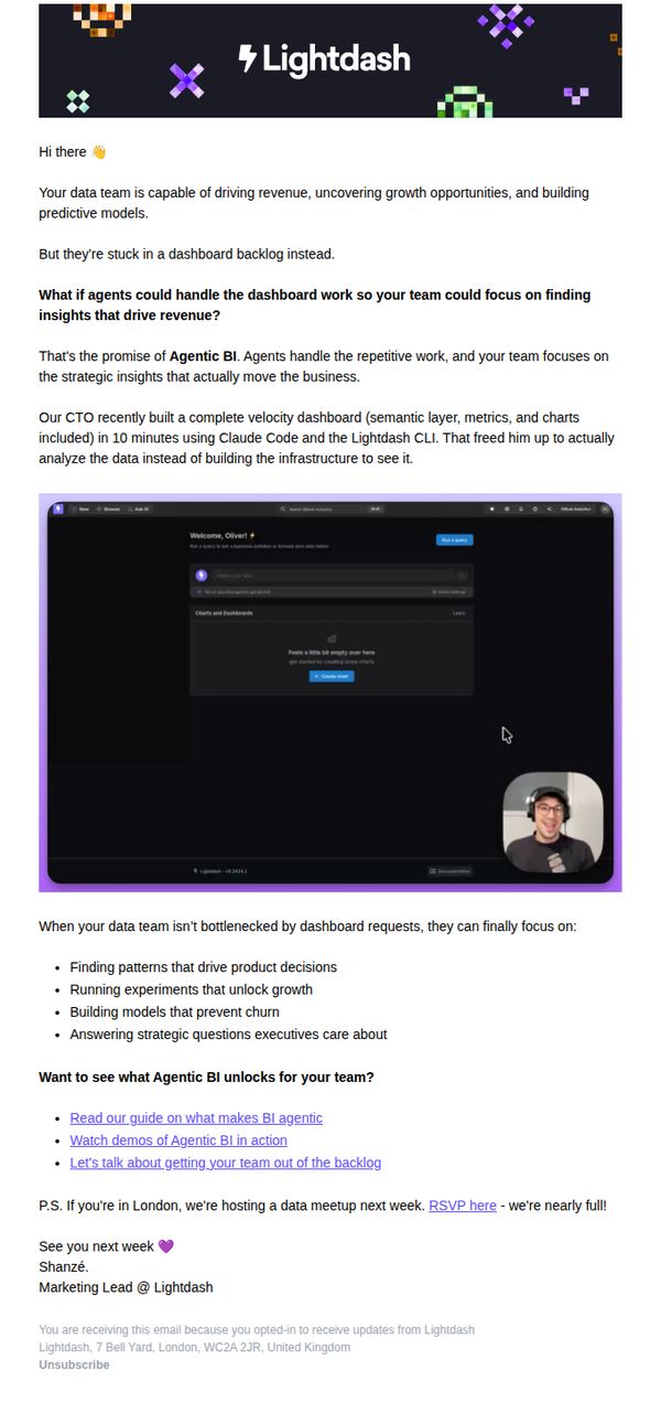
The email aims to position Lightdash’s Agentic BI as a solution that frees data teams from dashboard-building bottlenecks, enabling them to focus on high-impact strategic work that drives revenue and growth.
Why this works
The email opens with a provocative, benefit-driven question that immediately reframes the reader’s pain point, not as a technical limitation, but as a lost revenue opportunity waiting to be unlocked by automation.
How to implement
By spotlighting a real CTO’s 10-minute dashboard win using Claude Code and the Lightdash CLI, the email delivers social proof that’s both technical and time-bound, making the promise feel achievable and urgent for data leaders.
Pro Tip
Add a visual progress bar or time-saving counter next to the CTO’s 10-minute dashboard claim to quantify the efficiency gain and make the benefit more tangible at a glance. • Reposition the 'Let’s talk about getting your team out of the backlog' CTA higher in the email, perhaps after the CTO story, to capture interest while momentum is highest, rather than burying it after bullet points.
2. Stance Socks: Stance Performance: Customise Your Cushioning Level
Objective
This email aims to educate customers on Stance’s customizable cushioning levels across their performance sock lineup while driving direct product engagement through targeted CTAs. It positions Stance as a tech-forward, user-centric brand that empowers athletes to choose the perfect fit for their activity.
Why this works
The email brilliantly turns a technical feature, cushioning levels, into a customer-centric benefit by framing it as 'freedom of choice,' making a functional detail feel empowering and personalized rather than clinical or confusing.
How to implement
Each cushioning tier is paired with a specific activity and visual example, helping shoppers instantly self-identify with the right product, a smart way to reduce decision fatigue while reinforcing product utility through context.
Pro Tip
Add a small visual icon or badge next to each cushioning level (e.g., 'Light', 'Mid') to reinforce the tiering system at a glance, this would improve scannability and help users quickly compare options without reading full descriptions. • Include a short testimonial or athlete quote near the cushioning breakdown to add social proof, for example, 'Pro runner Maria Lopez: 'I switch between Light and Mid depending on my training day', to humanize the tech and build trust.
3. Minnesota Monthly: Daily: How Minnesota Helps Lead the Fight Against Breast Cancer
Objective
This email aims to inform readers about Minnesota’s leadership in breast cancer awareness and research during October, while also engaging them with local lifestyle content and community events to reinforce regional pride and keep them subscribed.
Why this works
The email smartly anchors its message in a timely, emotionally resonant cause, Breast Cancer Awareness Month, while tying it directly to local expertise, making readers feel informed and connected to their community’s impact.
How to implement
By blending hard-hitting health content with lighthearted lifestyle picks like pumpkin recipes and fall events, the email maintains reader interest without overwhelming them, striking a balance between purpose and pleasure.
Pro Tip
Add a secondary CTA button beneath the main article headline, such as 'Watch Our Breast Cancer Q&A Video' or 'Download Screening Checklist', to give readers an immediate, actionable next step beyond just 'Read More'. • Reposition the 'Discover St. Louis Park' ad to appear after the 'Trending' section instead of interrupting the editorial flow, so the content feels more cohesive and less disrupted by promotional material.
4. Cool Crutches: Party season ready ✨ Sparkle, confidence & comfort
Objective
This email aims to position Cool Crutches as a stylish, confidence-boosting solution for festive occasions, encouraging users to shop for holiday-ready walking aids that blend comfort with glamour. It targets both self-purchase and gifting audiences during the peak party season.
Why this works
The email brilliantly reframes mobility aids as fashion accessories by placing them alongside holiday decor and glamorous outfits, making users feel they’re not just buying support, they’re investing in festive confidence and personal style.
How to implement
By featuring real customers in elegant party settings using the crutches, the campaign builds emotional resonance and social proof, subtly communicating that these products don’t just assist, they empower users to fully participate in life’s celebratory moments.
Pro Tip
Add a visual countdown timer near the 'last order delivery dates' section to heighten urgency and reduce cognitive load, users should instantly grasp how much time remains to order before deadlines. • Include a short video or animated GIF in the hero section showing someone moving gracefully with the crutches at a party, reinforcing the 'shine with every move' message through motion rather than static imagery alone.
5. Blue Sense Digital: The best performing ad type of 2026
Objective
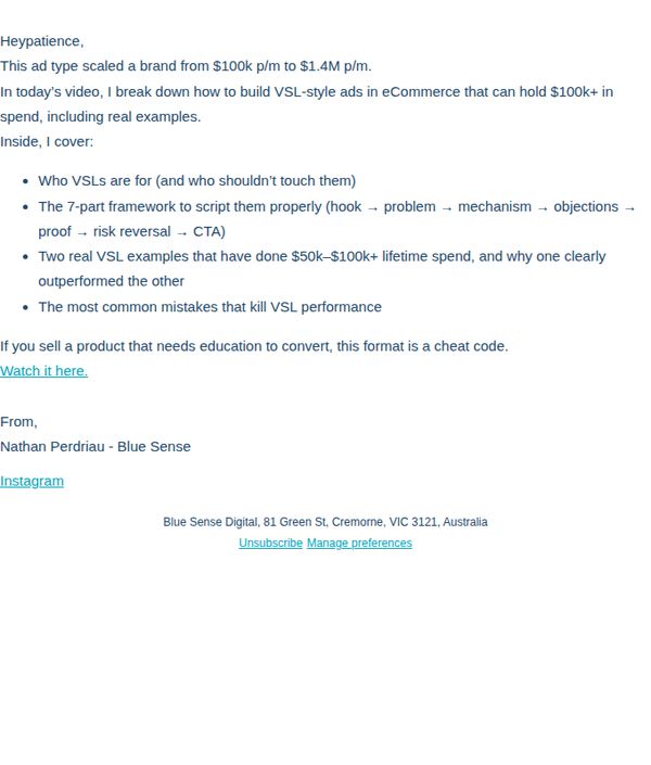
This email aims to drive engagement with a video tutorial on building high-performing VSL-style ads for eCommerce, positioning the sender as an authority while targeting marketers who need educational content to convert. It also subtly promotes the effectiveness of this ad format as a scalable growth lever.
Why this works
The email opens with a bold, results-driven hook that immediately establishes credibility by showcasing a real revenue jump, from $100k to $1.4M, making the reader feel this isn’t theory, but battle-tested strategy they can’t afford to ignore.
How to implement
It structures value upfront by listing exactly what the video covers using bullet points that mirror a marketer’s decision-making journey, from audience fit to scripting framework to real-world examples, creating a sense of completeness and reducing perceived risk before clicking.
Pro Tip
Add a visual thumbnail or embedded video preview above the CTA to reduce cognitive load and increase click-through by giving recipients a preview of the content’s production quality and relevance before committing to watch. • Include a short social proof element, like a quote or stat from a past viewer who scaled using this framework, near the CTA to reinforce credibility and reduce hesitation for those unfamiliar with the sender’s track record.
6. ShipBob: ShipBob Newsletter: What’s New, What’s Next
Objective
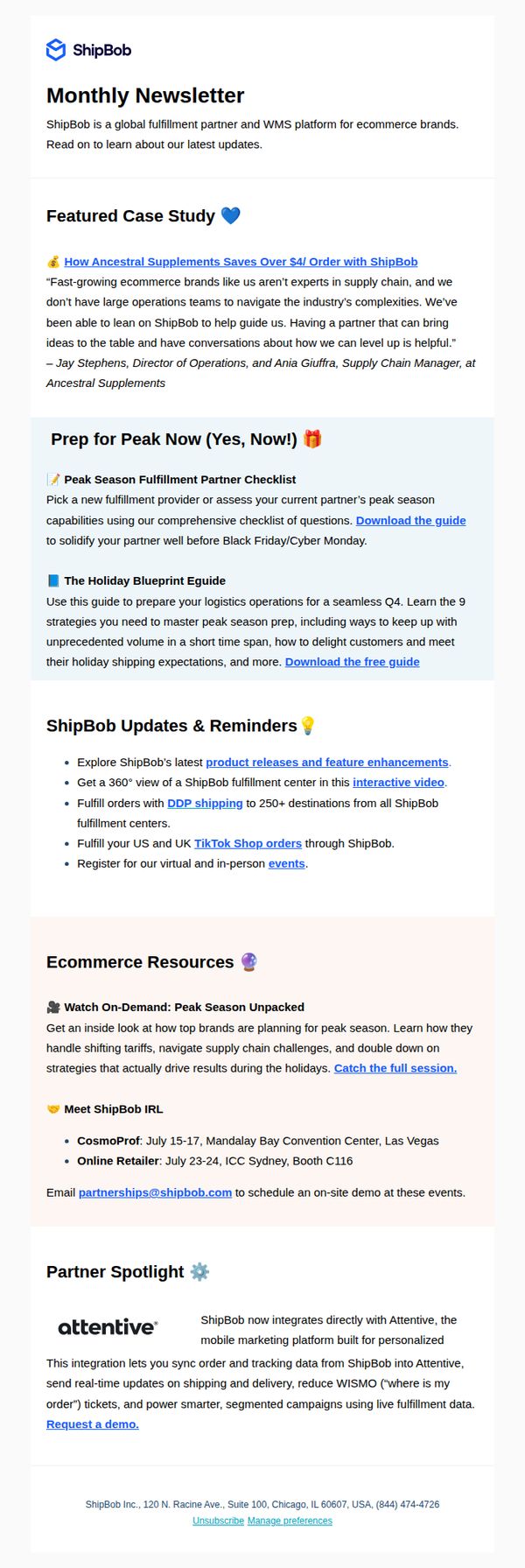
This email aims to inform existing and prospective ecommerce clients about ShipBob’s latest platform updates, peak season readiness tools, and strategic partnerships, positioning ShipBob as a proactive, value-driven logistics partner that helps brands scale efficiently during high-demand periods.
Why this works
The email smartly opens with a real-world case study that quantifies value, showing how a brand saved over $4 per order, which immediately builds credibility and speaks directly to the financial pain points of ecommerce operators.
How to implement
By embedding time-sensitive, action-oriented resources like the ‘Peak Season Fulfillment Partner Checklist’ and ‘Holiday Blueprint Eguide,’ the email transforms passive reading into proactive preparation, aligning content with the reader’s urgent Q4 operational needs.
Pro Tip
The primary CTA ‘Download the guide’ appears twice but lacks visual hierarchy or urgency, adding a contrasting button color, a countdown timer for peak season prep, or a benefit-driven subheading would increase conversion likelihood. • The ‘ShipBob Updates & Reminders’ section lists features without clear prioritization or user benefit, reordering items by impact (e.g., ‘DDP shipping to 250+ destinations’ first) and adding short benefit-driven blurbs would improve scannability and perceived value.
7. Sunday: Essential tips for a water-wise summer inside ➡️

Objective
This email aims to educate homeowners on water-efficient lawn care during summer while subtly promoting Sunday’s products as solutions to heat stress and water shortages. It positions the brand as a trusted advisor while driving engagement through educational content and product discovery.
Why this works
The email opens with a relatable pain point, heat stress and water shortages, immediately creating emotional resonance and positioning the brand as a problem-solver before any product is mentioned.
How to implement
Each educational section is paired with a clear, action-oriented CTA like 'Teach me' or 'Learn how,' which transforms passive reading into active engagement while maintaining a helpful, non-salesy tone.
Pro Tip
Add a subtle countdown or urgency indicator near the 'Read more' CTA in the hero section to encourage immediate engagement, especially since Smart Irrigation Month is time-sensitive. • Include a short customer testimonial or stat (e.g., '87% of users reduced water use by 30%') under the 'Audit your irrigation system' section to reinforce credibility and motivate action.
8. Rotary: Father's Day Gift Guide 🎁

Objective
This email aims to drive Father’s Day watch purchases by curating a gift guide tailored to different dad personas, encouraging timely orders for delivery before June 18th while showcasing Rotary’s diverse collection across styles and price points.
Why this works
The email brilliantly segments watches by dad archetypes, like 'Globetrotter Dad' or 'Racing Dad', making gift selection emotionally intuitive and personally relevant, which reduces decision fatigue and increases conversion likelihood.
How to implement
By anchoring the campaign to a hard deadline, 'Order by 2pm on the 15th June for delivery before the 18th', the email creates urgency without being pushy, leveraging time sensitivity to nudge procrastinators into action.
Pro Tip
Add a subtle countdown timer near the hero section to visually reinforce the June 15th deadline, increasing urgency without disrupting the clean layout or requiring extra clicks. • Include a short testimonial or customer review snippet under 1–2 top-selling watches to build social proof and reduce perceived risk for first-time buyers.
9. Jupiter Magazine: At Home with CNN’s Randi Kaye | Barks and Brews for Big Dog Ranch Rescue | Halloween Fun at The Gardens Mall

Objective
This email aims to engage local readers by spotlighting community events, charitable causes, and lifestyle features while driving subscriptions and ad revenue through curated content and clear calls to action.
Why this works
The email brilliantly blends human-interest storytelling with community-driven events, making readers feel personally connected to local happenings while subtly positioning the magazine as the essential guide to Jupiter’s social calendar.
How to implement
By featuring high-impact visuals of real people and events, like Randi Kaye at home and dogs at a charity fundraiser, the campaign creates emotional resonance that drives clicks without feeling overly promotional or salesy.
Pro Tip
Add a countdown timer or urgency cue next to the 'Bourbon & BBQ' event to encourage immediate ticket purchases, since the event date is only two weeks away and social proof is already present. • Reposition the 'Relocation Guide' ad higher in the email, perhaps after the first event, to capture attention from new residents who may be more likely to convert than long-time locals.
10. Loganix: Explore analytics alternatives today

Objective
This email aims to position Loganix as a thought leader in SEO and analytics by offering practical, data-driven insights while subtly guiding readers toward booking a strategy call. It balances educational content with a soft promotional nudge to convert curious readers into leads.
Why this works
The email opens with a relatable pain point, juggling reputation, visibility, and performance, then immediately offers value by framing the content as practical solutions, which builds trust before any ask is made.
How to implement
By embedding a data-rich comparison between Google and ChatGPT traffic metrics, the email leverages hard numbers to validate its positioning, making the argument for alternative analytics tools feel objective and urgent rather than salesy.
Pro Tip
Add a brief testimonial or client result near the CTA to reinforce social proof, readers are more likely to book a call if they see others have benefited from similar strategy sessions. • Include a short, bolded summary bullet or takeaway box after the data comparison to help skimmers grasp the key insight without reading the full paragraph, improving retention and clarity.