Proven fashion product highlight email designs you can use




1. Pepper: Peppercorn is back!
Objective
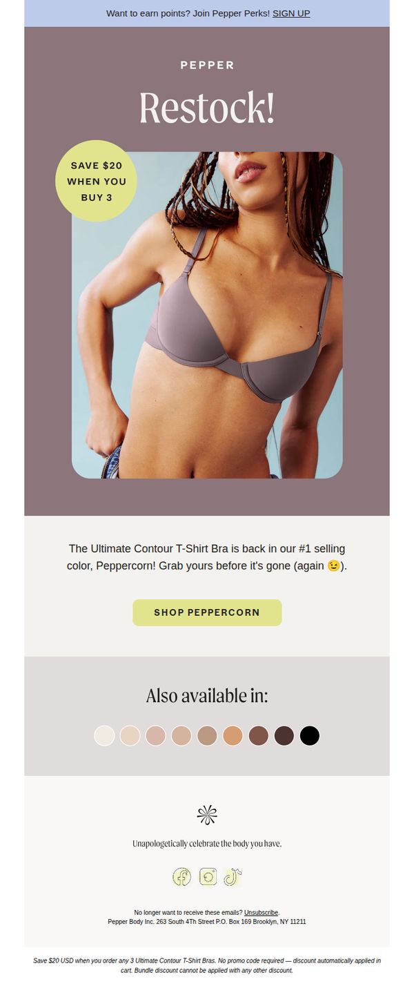
This email aims to drive immediate sales by announcing the restock of the popular Peppercorn color of the Ultimate Contour T-Shirt Bra, leveraging urgency and a bundled discount to encourage quick purchases before inventory runs out again.
Why this works
The email brilliantly combines scarcity and social proof by calling out the Peppercorn color as the #1 selling shade and hinting it sold out before, a psychological trigger that makes readers feel they’re joining a popular, exclusive group by acting now.
How to implement
Instead of burying the discount in fine print, the campaign leads with a bold, circular badge that says 'SAVE $20 WHEN YOU BUY 3', making the value instantly visible and turning a simple restock into a compelling deal-driven event.
Pro Tip
Add a small countdown timer or 'Low Stock' indicator near the CTA to amplify urgency, the current 'before it’s gone (again)' line is effective but could be strengthened with a visual scarcity cue to reduce hesitation. • Include a micro-testimonial or star rating beneath the product description to reinforce social proof, since this is a bestseller, even a short quote like 'My go-to bra for everyday wear!' would boost credibility and conversion.
2. TWOTHIRDS: The Essential Summer Colour Palette
Objective
This email aims to drive pre-orders for TWOTHIRDS’ new summer collection by highlighting its essential color palette, blues, mustards, and greens, while emphasizing eco-friendly values and a 20% discount to incentivize immediate action.
Why this works
The email masterfully ties seasonal aesthetics to sustainability by framing the summer color palette not just as fashion, but as a lifestyle choice that aligns with eco-conscious values, making the purchase feel purposeful and timely.
How to implement
By using evocative, location-based imagery, like coastal towns and ocean views, the brand creates an emotional escape that connects the product to aspirational summer living, subtly reinforcing the ‘carefree’ lifestyle it promises.
Pro Tip
Add a countdown timer near the CTA to create urgency around the pre-order discount, since the current offer lacks time sensitivity and may reduce conversion momentum. • Include a small testimonial or customer quote near the product grid to build social proof, as the current email relies solely on visual storytelling without third-party validation.
3. ModCloth: Get Schooled In Style
Objective
This email aims to drive back-to-school fashion sales by showcasing popular styles and encouraging immediate browsing, while also promoting customer loyalty through the ModSquad rewards program and restock alerts for sold-out items.
Why this works
The email brilliantly taps into back-to-school nostalgia with a notebook-paper design and handwritten doodles, making the fashion offer feel personal, youthful, and emotionally resonant rather than purely transactional.
How to implement
By highlighting 'Voted Most Popular' styles upfront, the campaign leverages social proof to reduce decision fatigue and subtly pressures readers to join the trend, increasing conversion likelihood without aggressive sales language.
Pro Tip
Add a countdown timer or urgency indicator near the 'Shop the Styles' CTA to amplify FOMO, especially since back-to-school is a time-sensitive event and the email currently lacks temporal pressure. • Reposition the 'Sold Out, Still Loved' section higher or integrate it into the hero area to capitalize on scarcity and desire before users scroll past, rather than burying it after the product grid where attention may have waned.
4. Fjällräven: Daypacks big and small
Objective
This email aims to guide customers toward selecting the right daypack by showcasing top-selling models and highlighting their real-world use cases, while also introducing technical trekking backpacks to deepen engagement with adventure-focused buyers.
Why this works
The email smartly bridges product specs with real-life utility by showing how each daypack fits into daily routines or adventures, helping customers visualize ownership and reducing decision paralysis through relatable context.
How to implement
By featuring both compact and technical backpacks in the same flow, the campaign subtly upsells by positioning the brand as a one-stop solution for casual and serious outdoor enthusiasts without overwhelming the reader.
Pro Tip
Add a visual comparison chart or size guide near the product grid to help customers quickly differentiate between daypack capacities and use cases, reducing friction in the selection process. • Reposition the 'Shop daypacks' CTA button higher in the email or repeat it after the product grid to capture attention from scroll-heavy users who may miss the initial call-to-action.
5. Nike: Nike Experts’ 7 style essentials ✨
Objective
This email aims to drive app engagement and sales by showcasing seven expert-curated style essentials while promoting a limited-time 25% discount available exclusively through the Nike App. It positions Nike Experts as trusted style advisors to build credibility and urgency.
Why this works
Nike brilliantly leverages internal experts to humanize product recommendations, turning generic product highlights into trusted, personality-driven style advice that feels personal and credible rather than salesy.
How to implement
The email strategically layers urgency with dual incentives, a time-bound sale and app-exclusive discount, creating a compelling reason to act now while simultaneously driving users toward the preferred platform for higher conversion and retention.
Pro Tip
The hero section’s headline 'THE ULTIMATE ESSENTIALS' lacks specificity, adding a sub-headline like '7 Expert-Approved Staples for Every Wardrobe' would immediately clarify value and improve scroll retention. • The CTA 'Shop' at the bottom is generic and visually disconnected from the sale banner, replacing it with 'Claim 25% Off Now' would reinforce the offer, create stronger visual hierarchy, and reduce friction for conversion.
6. Kate Spade: See how a bestseller gets creative
Objective
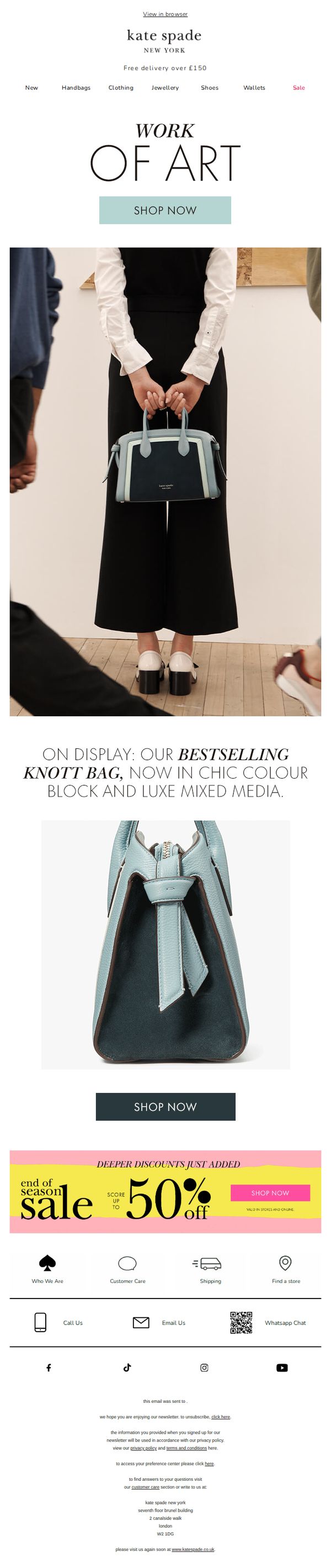
This email aims to showcase the creative evolution of Kate Spade’s bestselling Knott bag through artistic presentation and new colorways, while driving immediate purchases by highlighting a limited-time end-of-season sale with up to 50% off.
Why this works
The email brilliantly reframes a product refresh as an artistic exhibition, elevating the Knott bag from accessory to collectible by positioning it as a ‘work of art’ displayed in a curated gallery setting.
How to implement
By spotlighting the bag’s new color-block and mixed-media design, the campaign taps into emotional storytelling, making customers feel they’re acquiring not just a bag, but a statement piece with creative pedigree.
Pro Tip
Add a subtle countdown timer beneath the ‘up to 50% off’ banner to heighten urgency and reduce decision latency, especially since the sale is time-sensitive and positioned as ‘just added.’ • Include a micro-testimonial or customer review snippet near the product close-up to build social proof, especially effective since the bag is labeled ‘bestselling’ and could benefit from real-user validation.
7. Crockett & Jones: The Last Word by Jonathan Jones

Objective
To reinforce brand heritage and manufacturing integrity by sharing a personal message from the Managing Director, Jonathan Jones, while cultivating emotional loyalty among customers who value British craftsmanship and tradition.
Why this works
The email masterfully humanizes the brand by centering the narrative around the Managing Director’s personal reflections, transforming corporate messaging into an intimate, values-driven conversation that resonates with discerning customers who care about legacy and authenticity.
How to implement
By weaving historical context with present-day operations, from 19th-century shoemaking to modern factory imagery, the campaign builds a compelling story of continuity, subtly reinforcing that quality isn’t just claimed, but lived and preserved across generations within the same physical space.
Pro Tip
Add a subtle secondary CTA near the end of the message, such as 'Explore Our Heritage Collection', to gently guide readers toward product engagement without disrupting the narrative tone, turning emotional resonance into measurable action. • Integrate a short, embedded video clip or animated timeline showing the shoe-making process, enhancing the education section with dynamic visual storytelling that complements the text and deepens the perceived value of craftsmanship.
8. Everlane: Season-Proof Style Essentials

Objective
This email aims to drive engagement and sales by showcasing Everlane’s Fall '23 capsule collection as versatile, seasonless essentials that blend timeless design with sustainable materials, encouraging customers to invest in long-wearing wardrobe staples.
Why this works
Everlane brilliantly positions its Fall collection not as seasonal trends but as enduring wardrobe investments, subtly shifting consumer mindset from fast fashion to thoughtful, long-term ownership through the phrase 'seasonless style' and 'timeless staples'.
How to implement
The email strategically pairs full-look imagery with individual product tiles, allowing customers to visualize styling possibilities while also enabling direct product discovery, this dual approach caters to both inspiration-seekers and task-driven shoppers.
Pro Tip
Add a subtle countdown timer or limited-availability tag near the 'Shop the Collection' CTA to create urgency, especially since the collection is labeled 'Fall '23', this would encourage faster decision-making without compromising the brand’s calm aesthetic. • Include a short customer testimonial or review snippet under one of the product grids to reinforce social proof, particularly for high-ticket items like the $350 boots or $285 blazer, helping reduce perceived risk for new buyers.
9. TWOTHIRDS: Jackets For Every Occasion

Objective
This email aims to drive pre-orders for TWOTHIRDS’ new jacket collection by positioning the garments as versatile, eco-conscious essentials for outdoor adventures, while leveraging seasonal urgency and brand values to inspire immediate action.
Why this works
The email brilliantly ties product utility to lifestyle aspiration by showing jackets in scenic, active contexts, not just as clothing, but as enablers of memorable outdoor moments, which emotionally primes the customer to see value beyond price.
How to implement
By anchoring the campaign in eco-consciousness with clear visual cues like the 'Nature-approved fibres & fabrics' badge and origin storytelling, TWOTHIRDS transforms sustainability from a buzzword into a tangible brand differentiator that builds trust and justifies premium positioning.
Pro Tip
Add a subtle countdown timer next to the 'PRE-ORDER 20% OFF' CTA to amplify urgency and reduce decision latency, especially since the offer is time-sensitive and tied to seasonal relevance. • Include a mini testimonial or user-generated photo beneath the product grid to reinforce social proof, currently, the emotional appeal is strong, but adding real customer validation would bridge the gap between aspiration and trust.
10. Rowing Blazers: The Best Sweater We’ve Ever Made

Objective
To drive immediate sales of the new 'Down East' Cable-Knit Sweater by positioning it as the brand’s best-ever sweater, while promoting the broader Summer '23 collection through aspirational lifestyle imagery and a strong CTA.
Why this works
The email brilliantly leverages aspirational lifestyle photography to sell not just a sweater, but a curated, sun-drenched East Coast aesthetic that resonates emotionally with the target customer’s self-image and desires.
How to implement
By declaring this the 'best sweater we’ve ever made,' the brand creates instant perceived value and urgency without relying on discounts, instead trusting the product’s craftsmanship and storytelling to convert.
Pro Tip
Add a subtle countdown timer or limited-edition badge near the CTA to reinforce scarcity and urgency, especially since the email positions the sweater as a standout, must-have item. • Include a short bullet-point list beneath the product description highlighting key features like 'garment-dyed for vintage softness' or 'unisex fit' to improve scannability and decision-making for hesitant shoppers.