How finance brands do product highlight campaigns in email

1. Gerber Life: Future proofing with the Grow-Up® Plan
Objective
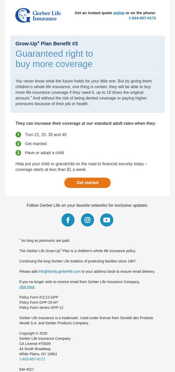
To encourage parents and grandparents to secure their child’s long-term financial protection by highlighting the Grow-Up® Plan’s unique benefit of guaranteed future coverage at standard adult rates, regardless of health or job changes. The email aims to drive immediate action through a simple, low-cost entry point.
Why this works
The email smartly frames life insurance not as a grim necessity but as a forward-thinking gift, positioning the Grow-Up® Plan as a loving, proactive step parents can take to lock in lifelong security for their child without worrying about future health or employment hurdles.
How to implement
By specifying exact life milestones, turning 21, 25, 30, 40, getting married, or having a child, the email makes abstract future needs feel tangible and timely, helping recipients visualize exactly when and why this coverage will matter most to their growing family.
Pro Tip
Add a brief testimonial or quote from a parent who used the Grow-Up® Plan to ease anxiety about their child’s future, social proof would strengthen emotional resonance and credibility without cluttering the layout. • Include a small visual icon or badge next to the 'Get started' button indicating 'No medical exam required' or 'Guaranteed approval' to reduce perceived friction and reinforce the key selling point visually.
2. Gerber Life: This Grow-Up® Plan benefit builds over time...
Objective
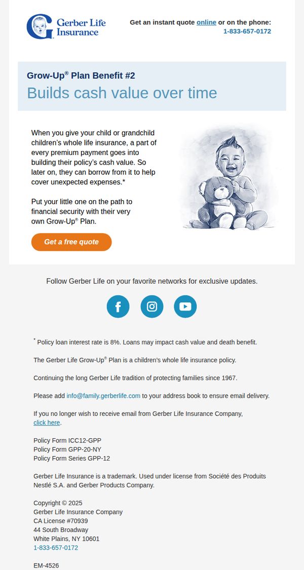
This email aims to educate parents and grandparents about the long-term financial benefits of Gerber Life’s Grow-Up® Plan, specifically how it builds cash value over time to help cover future expenses. It encourages immediate action by prompting recipients to get a free quote.
Why this works
The email smartly frames the insurance policy not just as protection, but as a growing financial asset for the child, making it emotionally resonant and practically appealing to forward-thinking parents.
How to implement
By pairing a warm, hand-drawn illustration of a happy child with a clear benefit explanation, the email creates an instant emotional connection while delivering complex financial value in simple, digestible terms.
Pro Tip
Add a brief testimonial or real-life example near the CTA to reinforce trust, for instance, a parent sharing how the cash value helped cover college or medical costs, making the benefit feel tangible. • Include a subtle countdown or urgency trigger (e.g., 'Limited-time enrollment window') near the CTA to nudge procrastinators, since the current design lacks time-sensitive motivation despite the financial nature of the offer.
3. CRC Benefits (formerly BenefitMall): Countdown to Open Enrollment: Get Your Clients Ready Now
Objective
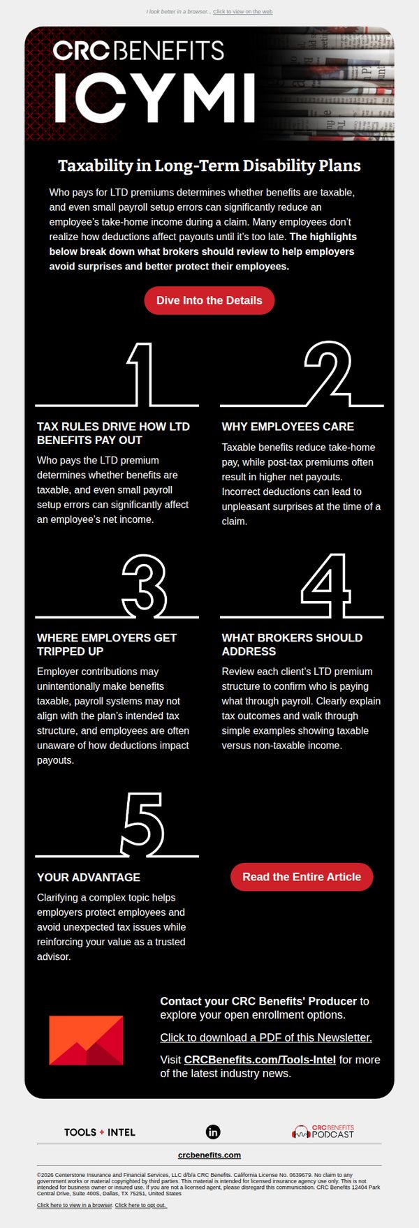
This email aims to educate brokers on the tax implications of long-term disability plans to help them better advise employers and avoid payroll surprises during open enrollment. It positions CRC Benefits as a trusted advisor by offering actionable insights and resources.
Why this works
By breaking down complex tax rules into five digestible numbered sections, the email transforms a dense financial topic into an approachable, scannable guide that empowers brokers to act confidently with their clients.
How to implement
The email strategically positions the brand not as a sales entity but as a trusted advisor, using educational content to build credibility and reinforce the value of proactive planning before open enrollment begins.
Pro Tip
Add a subtle countdown timer near the CTA to reinforce urgency around open enrollment, visually anchoring the subject line’s ‘Countdown’ promise and encouraging immediate action. • Include a short testimonial or client quote under the ‘Your Advantage’ section to humanize the value proposition and demonstrate real-world impact of CRC Benefits’ advisory role.
4. Greystone : Greystone’s Top 10 Agency Lender Recognition and 2026 Outlook
Objective
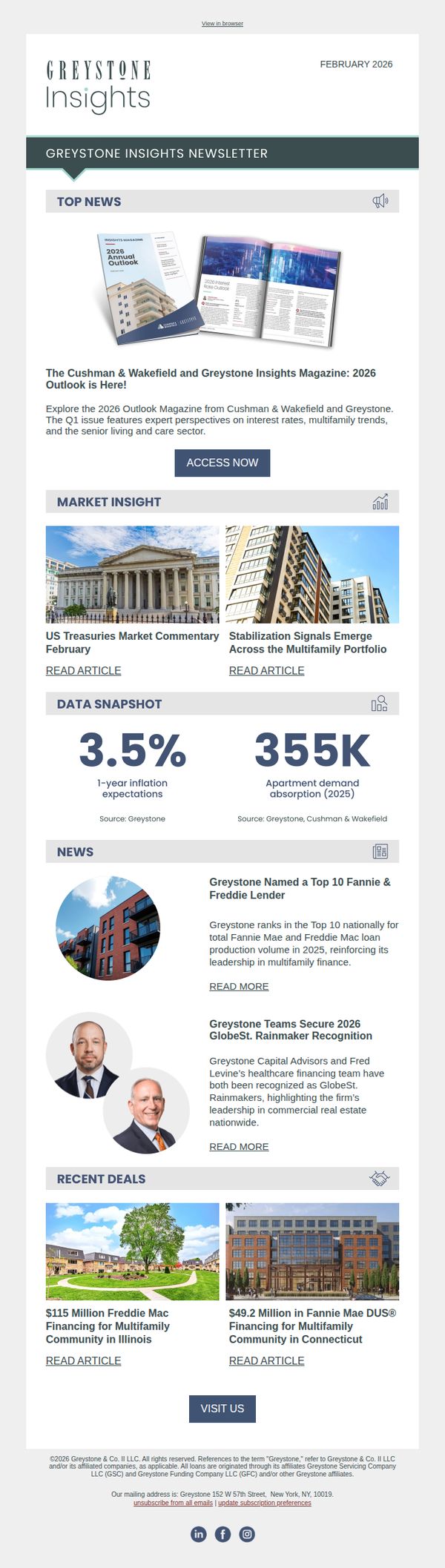
To position Greystone as a thought leader and top-tier lender in multifamily and commercial real estate by showcasing industry recognition, market insights, and recent deal activity, while encouraging engagement with their 2026 Outlook Magazine.
Why this works
Greystone effectively leverages third-party validation by highlighting its Top 10 Fannie & Freddie lender ranking, which builds credibility and positions the brand as an industry authority without sounding self-promotional.
How to implement
The email strategically combines macroeconomic data with specific deal announcements to create a narrative of market leadership, helping readers connect high-level trends to tangible outcomes Greystone has delivered for clients.
Pro Tip
Add a secondary CTA beneath the 'Recent Deals' section inviting readers to 'Explore Our Deal Portfolio' or 'Schedule a Deal Strategy Session,' which would capture interest from deal-focused audiences who may not engage with the magazine. • Incorporate a brief testimonial or quote from a client or partner in the 'News' section to humanize the recognition and add emotional credibility to the achievements, making them more relatable to the reader.
5. CRC Benefits (formerly BenefitMall): Tools + Intel | Where brokers are finding leverage right now
Objective
This email aims to position CRC Benefits as a thought leader by delivering timely, strategic insights to brokers navigating complex employer benefit landscapes, while driving engagement with deeper content and educational resources to nurture long-term trust and authority.
Why this works
The email smartly frames industry complexity as an opportunity for brokers to lead with strategy, not just react, turning pain points into positioning power by focusing on ICHRA, cannabis policy, and federal shifts that demand proactive guidance.
How to implement
By anchoring content in real data like the 43% worker interest in cash-for-coverage, the campaign builds credibility and urgency, helping brokers speak confidently to employers with evidence-backed talking points that align with employee sentiment and business goals.
Pro Tip
The 'By the Numbers' section could be more visually dynamic, adding a subtle animation or hover effect to the 43% stat would draw attention and reinforce its importance without disrupting the clean layout. • The webinar CTA uses red, which competes with the brand’s primary red accent; consider using a secondary color or a neutral tone to reduce visual noise and let the primary CTA ('View the Breakdown') stand out more clearly.
6. Gerber Life: Grow-Up® Plan 101
Objective
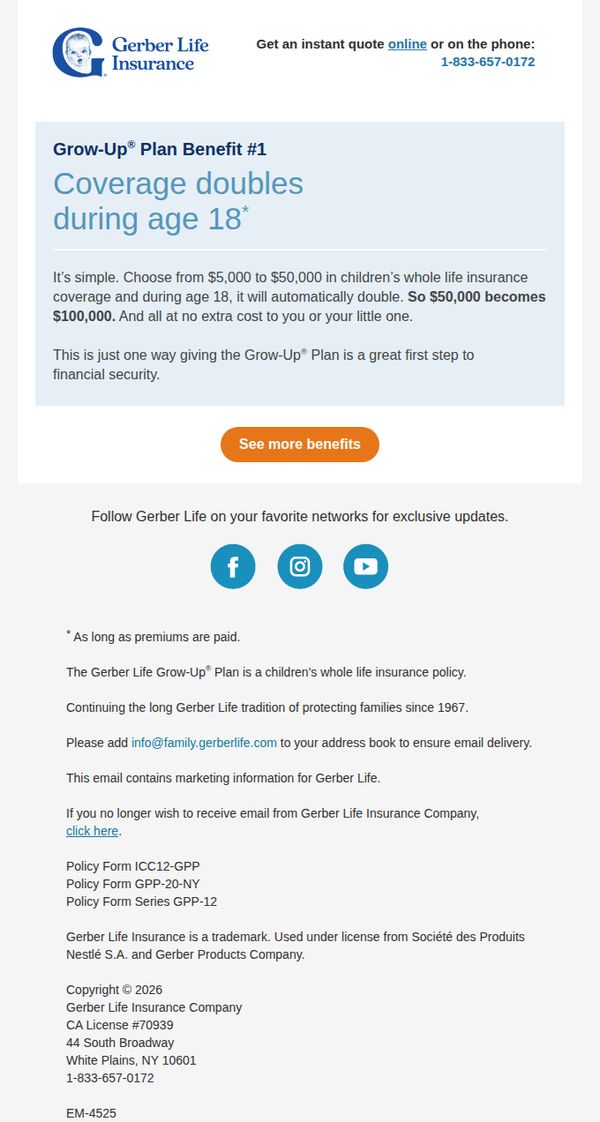
To educate parents about the Gerber Life Grow-Up® Plan’s key benefit, coverage doubling at age 18, and encourage them to explore more benefits or request a quote, positioning the plan as a smart, cost-free step toward long-term financial security for their child.
Why this works
The email smartly anchors its message around a single, emotionally resonant benefit, coverage doubling at age 18, making a complex insurance product feel simple, valuable, and perfectly timed for parents thinking ahead about their child’s future.
How to implement
By explicitly stating that the coverage increase happens at no extra cost, the campaign removes a major psychological barrier for hesitant parents, reframing the policy not as an expense but as a free upgrade that grows with the child’s life stage.
Pro Tip
Add a short testimonial or quote from a parent who benefited from the coverage doubling feature to build social proof and emotional resonance in the hero section, making the benefit feel more real and relatable. • Include a visual element like a simple timeline graphic or milestone icon next to the 'age 18' benefit to help parents visualize the policy’s long-term value and reinforce the idea of growth alongside their child.
7. Gerber Life: Inside: Whole life child insurance that grows with them
Objective
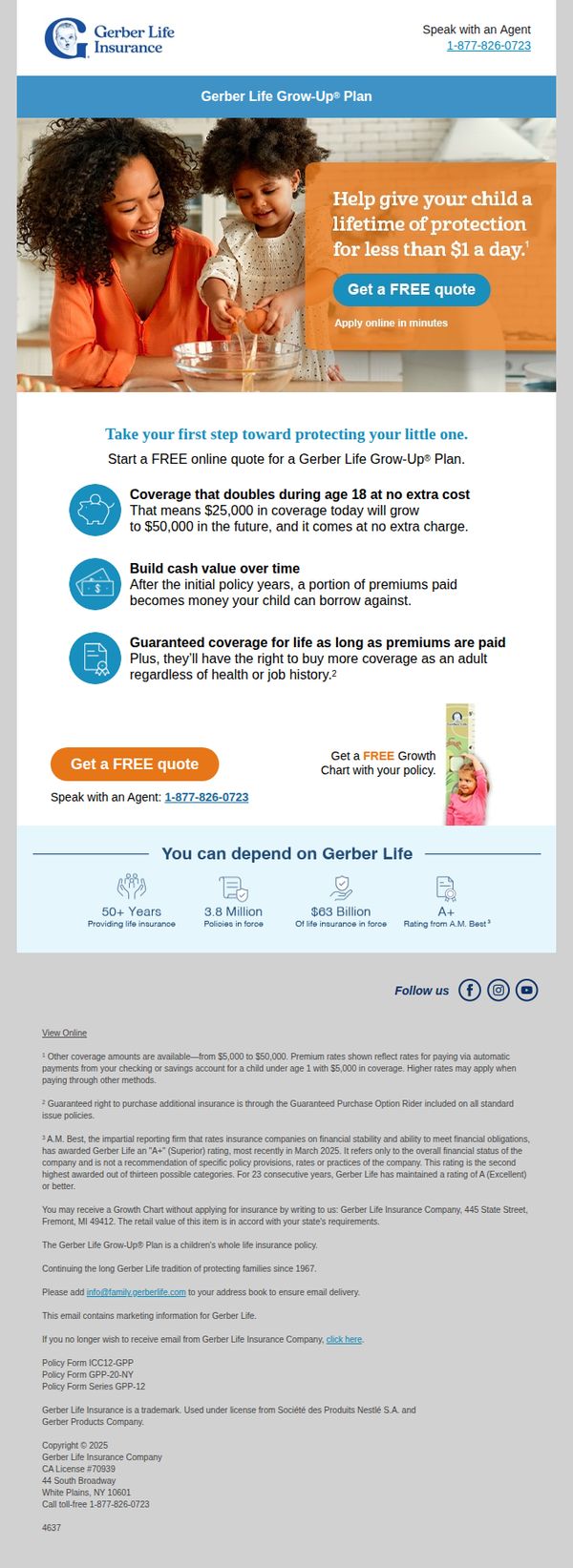
The email aims to encourage parents to secure lifelong insurance coverage for their children by highlighting affordable, scalable protection that grows with them, while emphasizing trust and financial stability through Gerber Life’s long-standing reputation.
Why this works
Positioning child insurance as an investment that doubles in value by age 18 frames protection as a smart financial decision, not just an emotional one, which appeals to pragmatic parents seeking long-term value.
How to implement
Using a warm, relatable image of a mother and child baking together humanizes the brand and subtly ties insurance to everyday family moments, making the abstract concept of future security feel immediate and personal.
Pro Tip
Add a subtle countdown timer or urgency indicator near the CTA to encourage immediate action, since the offer of 'less than $1 a day' benefits from perceived scarcity to overcome procrastination. • Reposition the 'Get a FREE Growth Chart' offer closer to the primary CTA or integrate it visually into the hero section to increase perceived value and incentivize quote requests without adding friction.
8. Mode Mobile : Dow Builds on Record High Above 50,000 as Relief Rally Gathers Pace 🚀

Objective
This email aims to engage subscribers with timely market insights and investor sentiment following the Dow’s historic surge past 50,000, while also promoting a premium private credit investment opportunity and a free educational guide on AI’s limitations in leadership. It blends financial news with strategic product placement to drive both education and conversion.
Why this works
The email masterfully ties breaking market milestones, like the Dow crossing 50,000, to a compelling narrative that positions private credit as the next smart allocation, making complex finance feel timely and accessible to everyday investors.
How to implement
By embedding a free educational resource, '5 Traits AI Can’t Replace', within a market update, the campaign subtly shifts focus from pure data to human-centric value, building trust and positioning the brand as a thought leader beyond just financial performance.
Pro Tip
The primary CTA 'Download Free Guide' is buried under multiple sections; relocating it immediately after the hero image or as a sticky banner would increase conversion by reducing friction for users already primed by the emotional headline. • The private credit offer lacks urgency or scarcity, adding a countdown timer or limited availability note (e.g., 'First 500 downloads get bonus portfolio analysis') would amplify perceived value and drive faster action.
9. Chase: Gold silver and staying focused amid the noise

Objective
This email aims to educate high-net-worth investors on the strategic role of gold and silver in portfolios amid geopolitical and economic uncertainty, while positioning J.P. Morgan Wealth Management as a trusted advisor for long-term financial planning.
Why this works
The email masterfully frames gold not as a speculative asset but as a disciplined anchor during volatility, using data-driven narratives to transform emotional market reactions into rational, long-term portfolio decisions that align with investor psychology.
How to implement
By embedding macroeconomic context, like central bank gold purchases and tariff impacts, alongside clear visuals and digestible survey data, the campaign transforms complex financial trends into actionable insights without overwhelming the reader or diluting credibility.
Pro Tip
Add a dynamic countdown or progress bar near the 'New 529 Plan Rules' section to create urgency around year-end planning deadlines, since the content references expiring provisions and time-sensitive tax advantages that could motivate immediate action. • Reposition the primary CTA 'Invest on your own' to appear earlier, perhaps after the first key insight, and pair it with a secondary CTA like 'Schedule a Portfolio Review' to better segment audiences by intent and reduce friction for those seeking advisory support.
10. Varo: A better bank account is just a few mins away💪
Objective
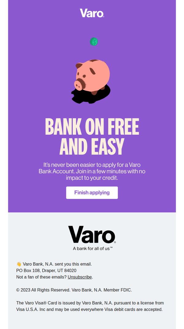
This email aims to convert partially completed applications into fully opened Varo Bank accounts by emphasizing speed, simplicity, and zero credit impact. It reassures users that finishing the process takes only minutes and reinforces brand trust with a clean, encouraging tone.
Why this works
The email leverages urgency and simplicity by framing account creation as a quick, credit-neutral task, a powerful psychological nudge for hesitant users who fear time commitment or financial risk.
How to implement
Using a friendly piggy bank illustration with a floating dollar coin subtly communicates savings and financial ease without overwhelming the user with complex banking jargon or data-heavy visuals.
Pro Tip
Add a progress bar or step indicator above the CTA to visually reinforce how little remains to complete the application, reducing perceived effort and boosting completion rates. • Include a micro-testimonial or social proof element near the CTA, such as 'Over 2M people bank with Varo', to build trust and reduce friction for users still evaluating the brand.