Product Highlight email designs from top brands using Get Social


1. Farm Boy : Sneak Peek: Fresh Pork Ribs, Beef Brisket, and more!
Objective
This email aims to drive immediate in-store and online traffic by highlighting time-sensitive weekly savings on fresh meat and produce, while also promoting Valentine’s Day meal kits and community engagement through a local athlete grant program.
Why this works
The email masterfully blends urgency with abundance by front-loading a visually rich flyer preview that showcases high-impact savings on proteins and produce, making the value proposition instantly digestible and impossible to ignore for budget-conscious shoppers.
How to implement
By embedding a Valentine’s Day dinner-for-two promotion within the weekly savings flow, Farm Boy transforms a routine grocery email into an emotional occasion driver, subtly encouraging larger basket sizes through curated meal experiences rather than just item-level discounts.
Pro Tip
The 'Share the Love' Valentine’s Day section lacks a clear visual hierarchy, the 'Order Now' CTA is buried beneath four plated dishes, reducing conversion potential; repositioning the button directly under the headline with a contrasting color would significantly improve click-through rates. • The product grid section lists prices without emphasizing savings or comparisons (e.g., 'Save $1.50'), which weakens perceived value; adding a small 'You Save $X' tag next to each price would reinforce the 'Weekly Savings' promise and trigger more impulsive purchases.
2. Happy Tuesdays: Why DJ worshipping needs to end
Objective
The email aims to challenge the cultural obsession with DJs in rave culture while subtly positioning Happy Tuesdays as a brand that supports the true spirit of rave, community, music, and wellness, and converts readers into customers with a time-sensitive discount offer.
Why this works
The email brilliantly uses cultural commentary as a hook, not just to entertain, but to align the brand with a deeper value system that resonates with its audience’s identity, making the product feel like a natural extension of their beliefs.
How to implement
By framing the discount as a reward for readers who agree with the brand’s cultural stance, the offer feels less like a sales tactic and more like a membership perk, turning a transaction into a statement of shared values.
Pro Tip
Add a subtle countdown timer or stock indicator near the CTA to reinforce urgency, since the top banner mentions low stock, this would create psychological pressure without disrupting the editorial tone. • Include a short testimonial or user quote from a raver who switched to Happy Tuesdays after feeling disillusioned with DJ-centric events, this would strengthen social proof and bridge the cultural argument to product validation.
3. HubSpot: When you're the only marketer 📚
Objective
This email aims to educate solo marketers on sustainable, low-budget social media strategies by sharing real-world lessons from promoting music-related books, while positioning HubSpot as a trusted resource for practical marketing wisdom.
Why this works
The email brilliantly reframes the struggle of being a solo marketer as a relatable, human challenge, not a weakness, which builds instant rapport and positions the advice as battle-tested, not theoretical.
How to implement
By anchoring the entire piece in a personal story about promoting a niche book, the writer transforms abstract marketing principles into tangible, memorable lessons that feel earned rather than lectured.
Pro Tip
The CTA 'Subscribe to our other newsletters' is too generic and buried; it should be more benefit-driven (e.g., 'Get more solo-marketer hacks like this') and placed above the footer for higher visibility. • The email lacks a clear visual hierarchy to guide readers through the key takeaways; adding subheadings with icons or bold color accents would help solo marketers quickly scan and retain core strategies.
4. WAA Ultra: Benefit from our BACK TO SCHOOL offers 💥
Objective
This email aims to drive immediate traffic and conversions by promoting time-sensitive back-to-school discounts of up to 50% off across men’s, women’s, and accessory categories, leveraging urgency and visual product appeal to encourage quick purchases.
Why this works
The email strategically uses bold, high-contrast yellow headers to segment product categories, making it effortless for shoppers to scan and locate their preferred gender or accessory section without visual fatigue.
How to implement
By prominently displaying discount percentages directly on product images, the campaign instantly communicates value and reduces cognitive load, helping customers make faster purchasing decisions without needing to click through.
Pro Tip
Add a countdown timer near the CTA to visually reinforce urgency and reduce the mental effort required to calculate how much time remains before the offer expires. • Include a short testimonial or social proof snippet near the top to build trust and validate the quality of discounted items, especially since deep discounts can sometimes trigger skepticism about product value.
5. Ikon Pass: Benefit More with Peak Perks
Objective
This email aims to drive conversions for the 25/26 Ikon Pass by highlighting the expanded benefits and perks available to passholders, encouraging recipients to compare perks and shop passes before the season begins.
Why this works
The email brilliantly ties emotional payoff to functional benefits by using phrases like '(JOY) MORE' and imagery of exhilarating skiing, making the perks feel less like discounts and more like curated life-enhancing experiences.
How to implement
By organizing perks into visually distinct, icon-led categories like 'Discounts,' 'Experiences,' and 'Travel & Perks,' the email simplifies complex offerings into digestible, scannable value pillars that cater to different customer motivations.
Pro Tip
Add a countdown timer or seasonal urgency indicator near the CTA to create FOMO, since the email promotes a time-sensitive product tied to the upcoming ski season. • Include a testimonial or user quote near the 'Stoke Events' or 'Payment Plan' section to build social proof and reinforce trust in the value proposition beyond just features.
6. Farm Boy : Restaurant-Quality Valentine’s Dinner, Ready at Home

Objective
This email aims to drive pre-orders for Farm Boy’s Valentine’s Day 'Dinner for Two' by positioning it as a luxurious, restaurant-quality experience that can be enjoyed at home without the hassle of reservations or cooking. It also subtly reinforces brand values through community and athlete sponsorships.
Why this works
The email brilliantly frames a pre-made meal as a romantic, chef-curated experience by using rich visuals and elevated language like 'restaurant-quality' and 'luxurious four-course meal,' making convenience feel indulgent rather than lazy.
How to implement
By embedding athlete sponsorships and community messaging within the same email, Farm Boy reinforces its brand purpose without derailing the primary offer, a smart way to build emotional equity while driving conversions.
Pro Tip
The 'Feed the Dream' section interrupts the Valentine’s narrative flow, consider moving it below the main CTA or replacing it with a Valentine’s-themed testimonial or recipe tip to maintain thematic consistency and conversion focus. • The hero section’s menu list is visually cluttered and hard to scan, simplify by using icons or bullet spacing, and consider adding a price or value comparison (e.g., 'Worth $75, now $49') to strengthen perceived value.
7. Heights: 5 Christmas foods for your gut 🎄
Objective
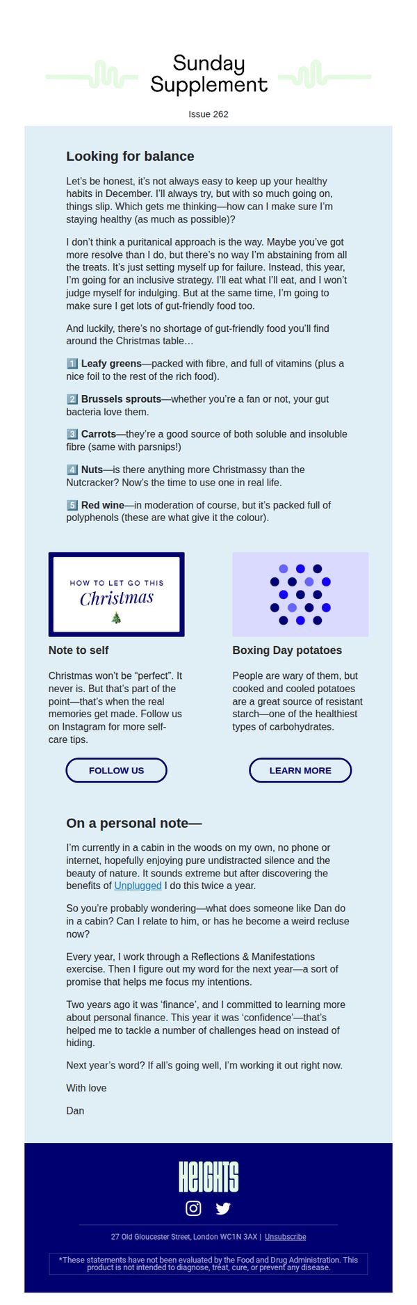
This email aims to help subscribers maintain gut health during the holiday season by offering practical, inclusive food choices that align with festive indulgence, while subtly reinforcing brand values around balance and self-compassion.
Why this works
The email reframes holiday eating not as a test of willpower but as an opportunity to nourish the gut with festive, real foods, making healthy choices feel celebratory rather than restrictive, which builds emotional alignment with the reader.
How to implement
By blending personal storytelling with science-backed food tips, the brand creates a warm, trustworthy tone that positions itself as a companion through seasonal challenges, not just a product seller, deepening subscriber loyalty and engagement.
Pro Tip
Add a secondary CTA button like 'Shop Gut-Friendly Supplements' near the product grid or education section to bridge content value with conversion, leveraging the reader’s interest in gut health without disrupting the tone. • Include a small visual icon or badge next to each food item (e.g., a gut microbiome graphic) to reinforce the gut-health benefit visually, making the educational content more scannable and memorable for mobile readers.
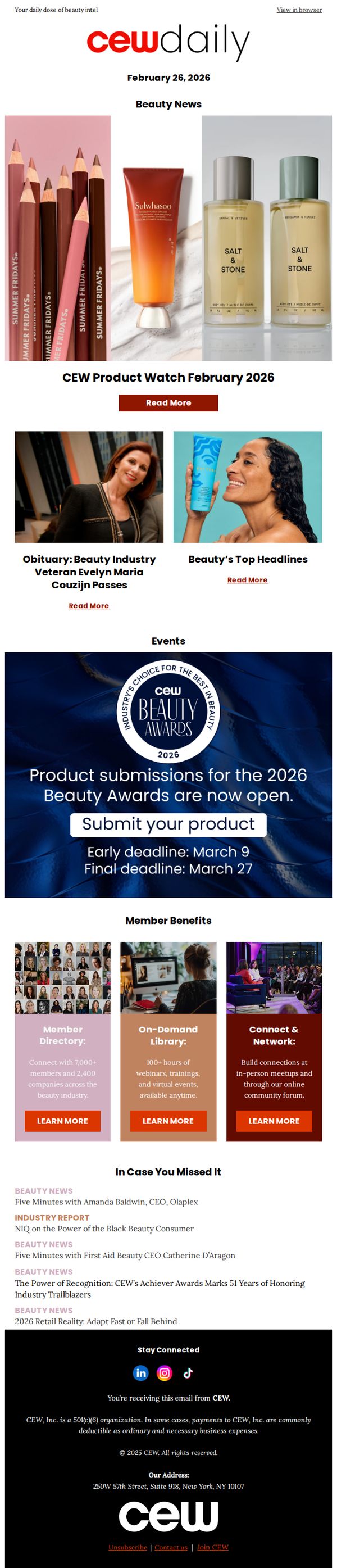
8. CEW: Top Headlines: Remembering Evelyn Maria Couzijn; CEW Product Watch February 2026
Objective
This email aims to inform beauty industry professionals about recent news, product launches, and upcoming events while encouraging engagement with CEW’s membership benefits and award submissions. It balances industry updates with strategic calls to action to drive participation and retention.
Why this works
The email masterfully balances emotional resonance with industry relevance by leading with a heartfelt obituary for a respected veteran, immediately establishing trust and cultural authority before transitioning into commercial content.
How to implement
By embedding the award submission CTA within a visually distinct, deadline-driven banner, the campaign creates urgency without overwhelming the reader, making it easy to act while reinforcing CEW’s role as an industry gatekeeper.
Pro Tip
The hero section’s product images lack descriptive context or pricing; adding brief value propositions or ‘why it matters’ blurbs beneath each product would help readers quickly grasp relevance and drive clicks. • The ‘In Case You Missed It’ section lists headlines without visual thumbnails or engagement metrics; including small preview images or ‘most read’ tags would increase click-through by signaling content popularity and visual appeal.
9. M.M. LaFleur: Building a wardrobe? Start here.

Objective
This email aims to guide new or undecided customers toward building a foundational wardrobe using M.M. LaFleur’s best-selling Quintessentials, while incentivizing first-time purchases with a 20% discount and introducing complementary services like pre-loved shopping and stylist appointments.
Why this works
The email brilliantly frames wardrobe-building as a journey rather than a transaction, using the ‘Quintessentials’ concept to position core pieces as essential, trusted investments that every woman should own, making the purchase feel both aspirational and practical.
How to implement
By embedding a time-sensitive 20% discount directly in the hero section with a clear promo code, the campaign reduces friction for first-time buyers while subtly reinforcing the value of full-price items, turning hesitation into immediate action without devaluing the brand.
Pro Tip
The CTA 'Shop Quintessentials' appears twice but lacks visual hierarchy or urgency; adding a subtle countdown timer or 'Limited Stock' indicator near the second CTA would reinforce scarcity and motivate faster clicks. • The 'Shop with a Stylist' section features four store images but no clear visual cue or icon to distinguish virtual vs. in-person options, adding small badges like 'Online' or 'In-Store' would improve user navigation and reduce decision fatigue.
10. Rochalia: [Last Unit] Fully Furnished Modern Series Home
![10. Rochalia: [Last Unit] Fully Furnished Modern Series Home](https://nudge-growth-experimental.s3.amazonaws.com/nudge/email-screenshots/708795.jpg)
Objective
This email aims to create urgency and drive immediate inquiries for the last available fully furnished modern home by highlighting its move-in-ready luxury and seamless indoor-outdoor design. It targets high-intent buyers ready to act quickly on a premium, turnkey property.
Why this works
The email masterfully leverages scarcity by leading with '1 LAST UNIT' in the subject and body, instantly triggering FOMO while positioning the home as a premium, exclusive opportunity rather than just another listing.
How to implement
It blends aspirational lifestyle imagery with concrete specs, like square footage and room count, so buyers can emotionally visualize living there while still getting the hard data needed to justify a high-ticket decision.
Pro Tip
Add a countdown timer or 'Last viewed X hours ago' indicator near the CTA to amplify urgency visually, since the 'last unit' claim loses impact without real-time social proof or time pressure. • Include a short testimonial or client quote from a previous buyer who loved the 'move-in ready' aspect, this builds trust and answers the unspoken question: 'Is this as good as it sounds?'