The complete Health Product Highlight email collection



1. Cool Crutches: It's That Time To Sparkle With Every Step! ✨
Objective
This email aims to drive holiday season sales by showcasing the Glitter Collection of crutches and walking sticks, positioning them as festive, stylish accessories that empower users to feel confident and glamorous during celebrations.
Why this works
The campaign brilliantly reframes medical aids as fashion statements by tying them to holiday sparkle, transforming a functional need into a joyful, seasonal self-expression that resonates emotionally with users seeking confidence during recovery.
How to implement
By featuring real customers in celebratory settings, from weddings to Christmas trees, the email builds authentic social proof that these products aren’t just practical, but empowering, helping users visualize themselves living fully and stylishly despite mobility challenges.
Pro Tip
Add a limited-time holiday discount or free gift offer within the Hero Section to create urgency and incentivize immediate action, since the current CTA lacks a compelling reason to act now beyond seasonal relevance. • Integrate a subtle countdown timer or 'Only X left in stock' indicator under popular glitter colors to enhance scarcity and drive conversions, especially since the product grid lacks real-time inventory or urgency cues.
2. Cool Crutches: They're Bestsellers For A Reason!
Objective
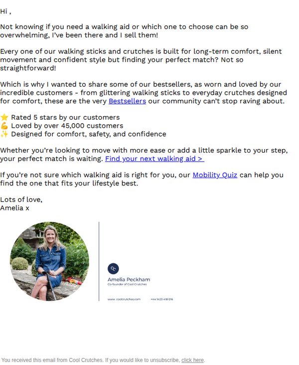
To guide overwhelmed customers toward selecting the right walking aid by showcasing bestsellers and offering a personalized quiz, ultimately driving product discovery and conversion through trusted social proof and empathetic messaging.
Why this works
The email opens with empathy, acknowledging customer overwhelm around mobility aids, this emotional hook instantly builds trust and positions the brand as a helpful guide rather than just a seller.
How to implement
By spotlighting bestsellers backed by specific social proof, 'Rated 5 stars' and 'Loved by over 45,000 customers', the campaign leverages credibility to reduce decision paralysis and encourage confident purchasing.
Pro Tip
Add a visual hero image or product carousel of top-rated crutches near the headline to immediately illustrate the 'bestsellers' mentioned, enhancing emotional connection and reducing cognitive load for visual learners. • Reposition the 'Find your next walking aid >' CTA higher in the email or repeat it after the testimonial bullet points to reinforce urgency and ensure users don’t miss the primary conversion path.
3. Beyond Organic Doctors: Automatic Nail Trimmers / Ingrown Toenail Treatment / Nail & Toenail Softener
Objective
This email aims to drive immediate sales by promoting a limited-time discount on a curated selection of nail and ingrown toenail care products, targeting customers seeking professional-grade, pain-free solutions for foot health and grooming.
Why this works
The email strategically leads with a time-sensitive discount and promo code to create urgency, immediately signaling value and encouraging quick decision-making before the offer expires.
How to implement
Each product is presented with a clear visual, benefit-driven headline, and concise copy that speaks directly to pain points, like pain-free trimming or ingrown nail relief, making it easy for readers to self-identify with the solution.
Pro Tip
Add a countdown timer near the top to visually reinforce the urgency of the limited-time discount, which could increase conversion by creating real-time pressure to act. • Include a short testimonial or customer rating beneath each product to build social proof, especially since many of these are medical-grade tools that benefit from third-party validation.
4. Bayer : Bayer welcomes Solicitor General support for U.S. Supreme Court review
Objective
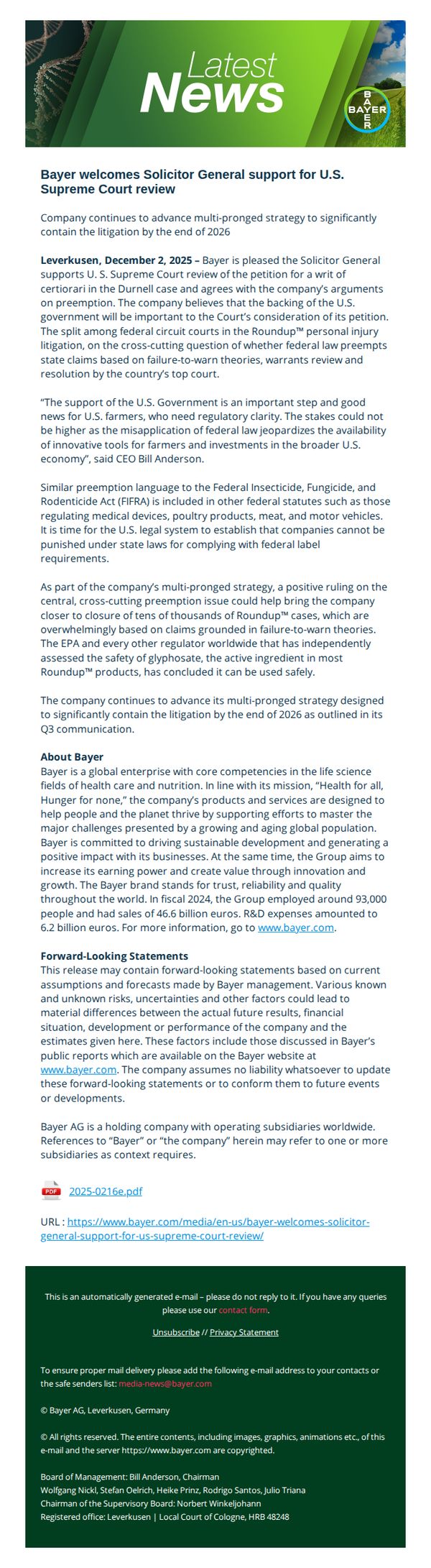
This email aims to inform stakeholders and the public that Bayer has received support from the U.S. Solicitor General for Supreme Court review in the Roundup™ litigation, reinforcing the company’s legal strategy and positioning the case as critical to regulatory clarity for U.S. farmers and the broader economy.
Why this works
Bayer strategically frames legal developments as public interest victories, linking the Solicitor General’s support to broader economic and regulatory stability for U.S. farmers, a powerful emotional and logical appeal that elevates the case beyond corporate defense.
How to implement
The email anchors its message in authoritative voices, quoting the CEO and referencing EPA and global regulators, to build credibility and subtly counteract public skepticism by aligning with trusted institutions rather than relying solely on internal messaging.
Pro Tip
The primary CTA is buried in the footer and offers no action beyond unsubscribing; adding a prominent, value-driven CTA like 'Read the Full Legal Brief' or 'Learn How This Impacts Farmers' would better serve the objective of educating and engaging stakeholders. • The email lacks visual hierarchy to guide readers through the legal complexity; adding a simple timeline graphic or bullet-point summary of the case’s significance would improve comprehension and retention for non-legal audiences.
5. Bayer : Bayer receives Breakthrough Therapy Designation in the U.S. and China for sevabertinib as a first-line treatment for patients with HER2-mutant non-small cell lung cancer
Objective
This email aims to inform stakeholders, investors, and the medical community about Bayer’s regulatory milestone: receiving Breakthrough Therapy Designation in the U.S. and China for sevabertinib as a first-line treatment for HER2-mutant NSCLC, reinforcing Bayer’s innovation leadership in oncology.
Why this works
The email strategically anchors its message in regulatory validation, highlighting Breakthrough Therapy Designation in both the U.S. and China, to immediately signal global credibility and accelerate stakeholder confidence in the drug’s clinical potential.
How to implement
By weaving in clinical trial data, mechanism of action, and patient need context, the email transforms a regulatory update into a compelling narrative of scientific progress, making complex oncology developments accessible and emotionally resonant for non-specialist readers.
Pro Tip
Add a visual timeline or infographic in the Education Section to illustrate the drug’s development journey, from discovery to Breakthrough Designation, to help readers quickly grasp the significance of this milestone without wading through dense text. • Reposition the primary CTA higher in the email, perhaps as a clickable button beneath the headline, to reduce friction for readers seeking immediate access to clinical data or press materials, especially since the current link is buried in the footer.
6. Marek Health: Last Month's Health Highlights

Objective
This email aims to educate subscribers on testosterone health through expert content and scientific research while positioning Marek Health as a trusted authority. It also drives engagement by promoting a podcast, supplement protocol, and upcoming event with a clear path to book a consultation.
Why this works
The email masterfully blends scientific credibility with personal storytelling by anchoring the supplement protocol in a real podcast conversation, making complex hormone science feel accessible and trustworthy to the reader.
How to implement
Instead of pushing products, it leads with education, highlighting a peer-reviewed study and actionable takeaways, which builds authority and gently guides readers toward professional services without sounding salesy or transactional.
Pro Tip
The 'Supplement Spotlight' section could benefit from visual icons or color-coded labels next to each supplement to improve scannability and reinforce key benefits at a glance, especially since the list is dense and text-heavy. • The 'Study of the Month' section uses a red downward arrow to emphasize decline, but adding a small footnote or tooltip explaining the statistical significance or sample size would strengthen credibility and reduce skepticism among data-savvy readers.
7. Cool Crutches: Don't Miss Out 🎄 Last Call For Made-To-Order Collection

Objective
This email aims to drive urgency and last-minute holiday purchases by promoting Cool Crutches’ made-to-order collections, emphasizing pre-Christmas delivery deadlines and personalized gifting options for mobility aids.
Why this works
The email brilliantly leverages holiday urgency by anchoring the entire campaign around a specific December 5th cutoff, turning a functional product into a time-sensitive, emotionally resonant gift option for the season.
How to implement
By showcasing crutches as fashion-forward, customizable accessories, complete with glitter, crystals, and personal uploads, the brand reframes mobility aids as expressions of identity, not just medical tools, which expands their emotional appeal and market reach.
Pro Tip
Add a visual countdown timer near the hero section to reinforce urgency in real time, making the December 5th deadline feel more immediate and emotionally compelling than static text alone. • Include a short customer testimonial or social proof near the bespoke section to validate the personalization experience, helping hesitant buyers overcome perceived complexity or uncertainty about custom orders.
8. Cool Crutches: 🖤 Meet the Collection That Changed Everything

Objective
This email aims to introduce and drive conversions for Cool Crutches’ Classic Black Collection by positioning it as a stylish, confidence-boosting alternative to traditional medical aids, appealing to customers who value design, comfort, and everyday versatility.
Why this works
The email brilliantly reframes crutches from medical necessity to fashion accessory by showcasing real users in casual, confident settings, turning a functional product into a lifestyle statement that resonates emotionally with style-conscious buyers.
How to implement
Customer testimonials are strategically placed alongside product visuals, not just as social proof but as emotional anchors, each quote highlights a unique benefit like comfort, confidence, or style, making the value proposition feel personal and authentic rather than salesy.
Pro Tip
Add a subtle countdown timer or limited-availability tag near the 'SHOP CLASSIC BLACK' CTA to create urgency, especially since the collection is positioned as transformative, scarcity would amplify the 'you’ll never go back' messaging. • Include a small 'Style Guide' or 'How to Wear' visual tip beneath each product image in the grid to help customers visualize pairing options, reinforcing the 'pairs effortlessly with every wardrobe' claim and reducing purchase hesitation.
9. Beyond Organic Doctors: Charge Faster, Move Easier, Relax Better - New Arrivals @ 55%OFF

Objective
This email aims to drive immediate sales by promoting a limited-time discount event across a wide range of trending products, encouraging recipients to browse and purchase using a special promo code for added savings.
Why this works
The email leverages urgency and exclusivity by combining a limited-time discount range with a bonus promo code, creating a dual incentive that motivates quick action without overwhelming the reader with too many offers.
How to implement
Each product is presented with a clear, benefit-driven headline and supporting visual cues, like icons or callouts, that instantly communicate value, helping shoppers scan and self-select based on their immediate needs or pain points.
Pro Tip
Add a countdown timer beneath the headline to visually reinforce the urgency of the limited-time offer, which would increase conversion pressure without requiring additional text or cluttering the layout. • Reposition the promo code 'M3DEAL19' closer to the primary CTA buttons or highlight it with a contrasting color banner, since its current placement above the product grid risks being overlooked by users scrolling quickly.
10. Marek Health: This “Productivity Trick” Has a Price..
Objective
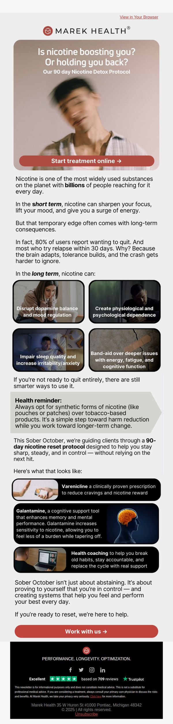
This email aims to reframe nicotine use as a productivity trap rather than a performance enhancer, positioning Marek Health’s 90-day detox protocol as the smart, science-backed solution for those seeking sustainable focus and control without dependency. It targets users who want to optimize performance but are struggling with nicotine’s long-term downsides.
Why this works
The email brilliantly flips the script on nicotine by framing it as a deceptive productivity tool, not a helper, which instantly creates cognitive dissonance and primes the reader to reconsider their habits through a performance lens rather than just a health one.
How to implement
By breaking down long-term nicotine consequences into four visually distinct, emotionally resonant tiles, like disrupted dopamine and cognitive decline, the email transforms abstract risks into tangible, relatable outcomes that feel urgent and personal to high-performers.
Pro Tip
Add a countdown timer or progress bar near the CTA to create urgency around the ‘Sober October’ protocol, since the campaign is time-bound and would benefit from visual scarcity cues to boost conversion. • Include a short testimonial or client result snippet (e.g., ‘I gained 2 hours of focused work daily after week 3’) near the product grid to humanize the protocol’s outcomes and reinforce credibility beyond clinical claims.