Healthcare product highlight campaign ideas that work


1. Aged Care Guide : Nurse swaps scrubs for high-vis to support fire-affected communities
Objective
This email aims to inform aged care professionals and families about real-world care responses during crises, highlight major policy changes like Support at Home, and guide decision-making between private and agency care options through compelling human stories and expert resources.
Why this works
The email opens with a powerful human-interest story of a nurse volunteering during bushfires, immediately grounding the brand in empathy and action, this emotional hook makes policy updates feel personally relevant rather than bureaucratic.
How to implement
By pairing urgent policy changes like Support at Home with real family concerns around cost and accountability, the email transforms complex reforms into relatable decision-making moments, helping readers feel supported rather than overwhelmed.
Pro Tip
The primary CTA 'Read more' is repeated identically across all sections, diluting urgency and intent, customizing CTAs per section (e.g., 'See how Support at Home affects you' or 'Compare care options now') would better align with each content’s goal. • The hero image of the nurse in high-vis is compelling but visually disconnected from the rest of the email’s tone, adding a subtle color overlay or border matching the brand’s orange theme would unify the visual hierarchy and reinforce brand identity.
2. Sleep Doctor: Explore Our Top CPAP Bundles
Objective
This email aims to drive sales of CPAP bundles by showcasing curated, cost-saving packages that simplify the purchasing process for customers seeking better sleep solutions. It emphasizes convenience, savings, and eligibility for HSA/FSA reimbursement to reduce friction and encourage immediate action.
Why this works
The email brilliantly reduces decision fatigue by bundling CPAP essentials into pre-selected packages, allowing customers to skip the overwhelm of piecing together components and instead focus on saving time and money with trusted combinations.
How to implement
By prominently displaying HSA/FSA eligibility and specific dollar savings for each bundle, the campaign taps into financial motivation and reimbursement confidence, making the purchase feel not just beneficial but also financially responsible and accessible.
Pro Tip
Add a subtle countdown timer or limited-availability indicator near the bundle CTAs to create urgency, since the current design lacks time-sensitive cues that could nudge hesitant buyers toward immediate action. • Include a short testimonial or satisfaction stat (e.g., '92% of customers report better sleep within 2 weeks') near the top of the product grid to build social proof and reinforce trust before users evaluate individual bundles.
3. Fridays : Your Post Game Day Routine 🏈
Objective
This email aims to convert post-game day viewers into GLP-1 patients by positioning weight management as a stress-free extension of celebration, using time-sensitive discounts and real patient transformations to reduce hesitation and drive immediate sign-ups.
Why this works
The email brilliantly ties the emotional high of game day to post-event self-care, reframing weight loss not as deprivation but as a reward, making the offer feel timely, relatable, and psychologically aligned with the audience’s current mindset.
How to implement
By showcasing three diverse patient transformations with clear 'before and after' visuals and specific pound-loss numbers, the campaign builds instant credibility and emotional resonance, turning abstract medical care into tangible, aspirational outcomes that feel achievable.
Pro Tip
Add a small countdown timer near the 'GET STARTED' CTA to reinforce the urgency of the offer, especially since the discount expires on 2/28/2026, this would visually anchor the time-sensitive nature of the deal and reduce procrastination. • Include a brief FAQ or 'How It Works' section after the testimonials to preemptively address common concerns like prescription requirements or insurance coverage, reducing friction for users who may be curious but hesitant to click without more clarity.
4. Aged Care Guide : Lessons in living well at 102 — Brian Barry on brain health and ageing well
Objective
To engage readers with inspiring, research-backed stories about ageing well while subtly promoting aged care services and resources. The email aims to position Aged Care Guide as a trusted authority by blending personal narratives with data-driven insights and expert guidance.
Why this works
The email masterfully opens with a human-centered story of a 102-year-old’s life lessons, immediately creating emotional resonance while anchoring the content in credible research from UNSW’s Centre for Healthy Brain Ageing, making the message both touching and trustworthy.
How to implement
By weaving in real-world data on Victorian ED wait times and home-based care trends, the campaign transforms abstract concerns into tangible, relatable insights that empower families to make informed decisions without feeling overwhelmed or pressured.
Pro Tip
Add a countdown timer or urgency indicator near the 'Read more' CTAs for time-sensitive content (e.g., 'Brian Barry’s reflections are only available this week') to boost click-through rates by creating perceived scarcity. • Integrate a micro-survey or quick poll (e.g., 'What’s your biggest concern about ageing at home?') directly below the hero section to increase engagement and collect qualitative data for future personalization.
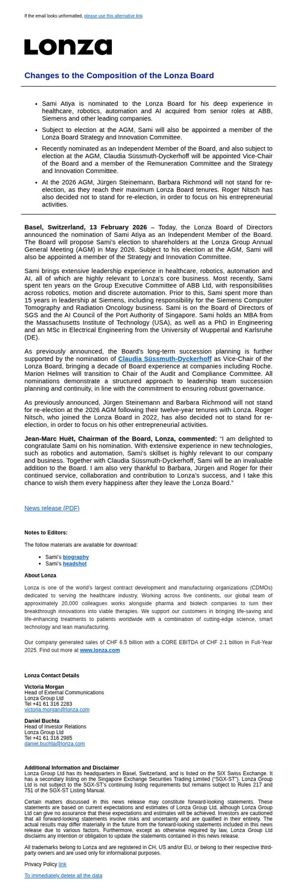
5. Lonza: Changes to the Composition of the Lonza Board
Objective
This email aims to formally inform stakeholders and the public about key leadership changes to the Lonza Board, emphasizing continuity, strategic alignment, and governance strength while introducing new members with relevant expertise in healthcare and technology.
Why this works
Lonza strategically frames board changes not as disruption but as evolution, highlighting how new members’ expertise in robotics, AI, and healthcare directly aligns with the company’s core mission and future innovation roadmap.
How to implement
The inclusion of a direct quote from the Chairman adds credibility and emotional resonance, transforming a routine corporate announcement into a narrative of gratitude, transition, and forward momentum that reassures stakeholders.
Pro Tip
The primary CTA 'To immediately delete all the data' is confusing and misaligned with the email’s purpose, it should be replaced with a clear, action-oriented link such as 'Download the Full Press Release' or 'Learn More About Our Leadership'. • The email lacks visual hierarchy and engagement elements, adding a simple graphic of the new board members or a timeline of transitions would improve readability and help readers quickly grasp the scope of changes.
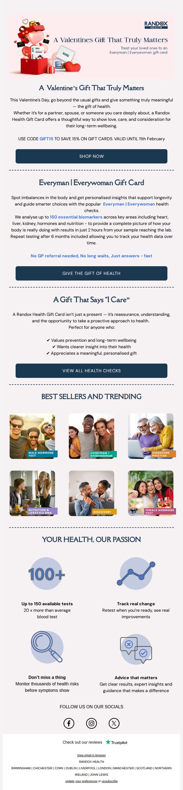
6. Randox Health : A Valentine’s Gift That Truly Matters
Objective
This email aims to position Randox Health’s gift cards as emotionally resonant Valentine’s Day presents by framing health as a meaningful, caring gesture. It encourages immediate purchase by highlighting time-sensitive savings and the personal, proactive value of gifting health insights.
Why this works
By reframing health testing as a Valentine’s gift, the campaign taps into emotional gifting psychology, transforming a clinical service into a heartfelt expression of care, which makes the offer feel both timely and deeply personal.
How to implement
The email smartly uses social proof and aspirational imagery in the product grid, showing diverse, happy people enjoying life after their health checks, subtly implying that gifting this service leads to better, more connected relationships.
Pro Tip
Add a countdown timer near the CTA to visually reinforce the urgency of the 11th February deadline, increasing conversion by making the time sensitivity more visceral and immediate. • Include a short customer testimonial or quote under the ‘A Gift That Says “I Care”’ section to strengthen emotional credibility, showing real people who’ve gifted or received the card and felt its impact.
7. Bloom Pharmacy: Indulge Yourself This Valentine's! 💖

Objective
This email campaign aims to reframe Valentine’s Day as an occasion for self-love, encouraging customers to treat themselves with discounted skincare and fragrance products. It drives both online and in-store sales by positioning self-care as a luxurious, deserved reward.
Why this works
By reframing Valentine’s Day around self-love, the campaign taps into emotional resonance while sidestepping traditional romance tropes, making the promotion feel inclusive, empowering, and personally relevant to a broader audience.
How to implement
The product grid strategically pairs well-known brands with specific, easy-to-understand discounts, like ‘Buy 1 Get 40% Off 2nd’, which reduces decision fatigue and encourages bundle purchases by clearly communicating value without overwhelming the customer.
Pro Tip
Add a subtle countdown timer near the promo code section to create urgency, since Valentine’s Day is date-sensitive and time-bound offers increase conversion likelihood for last-minute shoppers. • Include a short testimonial or customer quote near the hero section to reinforce the ‘self-love’ message with social proof, making the emotional appeal more credible and relatable for hesitant buyers.
8. Novo Nordisk - US : Novo Nordisk takes legal action against Hims & Hers to protect patients from unsafe, knock-off Wegovy® and Ozempic®

Objective
To inform the public and stakeholders that Novo Nordisk is taking legal action against Hims & Hers for marketing unsafe, unapproved versions of Wegovy® and Ozempic®, emphasizing patient safety and the company’s commitment to protecting FDA-approved treatments.
Why this works
Novo Nordisk strategically frames its legal action not as a corporate dispute but as a moral defense of patient safety, directly linking Hims & Hers’ practices to life-threatening risks like immune responses and overdoses to evoke urgency and public sympathy.
How to implement
By citing authoritative voices like the FDA, AMA, and Endocrine Society, the email leverages third-party credibility to reinforce its claims, transforming a legal notice into a public health warning that resonates with both consumers and medical professionals.
Pro Tip
Add a visual element such as a warning icon or red banner near the headline to immediately signal urgency and danger, helping readers grasp the critical nature of the message before diving into text-heavy paragraphs. • Include a short, bolded summary box at the top that distills the legal action, key risks, and patient safety message into 3 bullet points, improving scannability for time-constrained readers and reinforcing the core message.
9. Children's Hospital Los Angeles: Celebrating American Heart Month

Objective
This email aims to raise awareness and drive donations during American Heart Month by sharing inspiring patient stories and highlighting a Valentine’s Day card campaign that converts community support into direct financial contributions for pediatric heart care at CHLA.
Why this works
The email masterfully ties emotional patient narratives to a time-sensitive, actionable campaign, using Valentine’s Day as a thematic bridge to turn goodwill into measurable donations through a matching gift incentive from a corporate partner.
How to implement
By spotlighting real children who’ve overcome heart conditions, the campaign humanizes complex medical achievements and builds trust, making donors feel personally connected to the impact of their contribution rather than just supporting an abstract cause.
Pro Tip
Add a progress bar or countdown timer near the Valentine’s Day card donation section to create urgency and social proof, encouraging faster participation before the Feb. 13 deadline and the $50K match cap. • Include a short video thumbnail or animated GIF in the ‘Promising Results’ section to visually demonstrate the Minima stent procedure or patient recovery, making complex medical innovation more digestible and emotionally resonant.
10. Cencora: February Newsletter: Digital twins, global policy shifts, and EU innovation

Objective
This email aims to position Cencora as a thought leader in pharmaceutical innovation by delivering timely, expert-driven insights on regulatory trends, digital transformation, and global policy shifts, while encouraging engagement through content downloads, webinars, and event attendance.
Why this works
By anchoring each article to a named expert with title and photo, Cencora builds instant credibility and humanizes complex regulatory topics, making dense industry content feel approachable and trustworthy for time-strapped professionals.
How to implement
The strategic use of dual CTAs under webinar tiles, one for immediate registration, another for on-demand viewing, caters to different audience behaviors while maintaining momentum without forcing a hard commitment upfront.
Pro Tip
Add a brief summary or teaser paragraph above the 'In this issue' section to quickly orient readers on why these topics matter now, helping busy executives decide whether to invest time in reading further. • Integrate subtle visual cues like icons or badges next to each content tile (e.g., 'New', 'Expert Interview', 'On-Demand') to help users instantly categorize content type and prioritize based on their needs.