The complete Product Highlight Email email collection for magazine brands
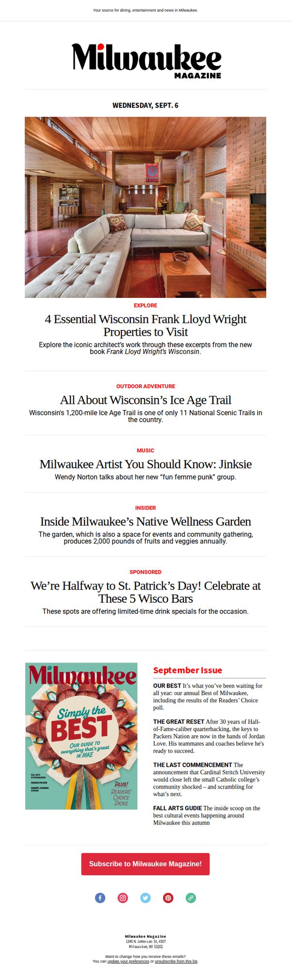

1. Milwaukee: Exploring Frank Lloyd Wright’s Wisconsin
Objective
This email aims to engage local readers by highlighting culturally rich content about Frank Lloyd Wright’s Wisconsin legacy, while also promoting Milwaukee Magazine’s September issue and encouraging subscriptions through curated local experiences and community stories.
Why this works
The email masterfully blends cultural storytelling with local pride by spotlighting Frank Lloyd Wright’s Wisconsin properties, turning architectural history into an inviting exploration that resonates with readers’ sense of place and curiosity.
How to implement
By organizing content into clearly labeled thematic sections, from outdoor adventures to music and wellness, the email creates a magazine-like rhythm that guides readers effortlessly through diverse local experiences without overwhelming them.
Pro Tip
Add a subtle countdown or urgency indicator near the subscription CTA, such as 'Subscribe by Sept 15 for early access to our Best of Milwaukee guide', to nudge procrastinators toward immediate action without compromising the editorial tone. • Include a small visual icon or badge next to the 'SPONSORED' section to subtly distinguish promotional content from editorial, preserving reader trust while still honoring advertiser partnerships.
2. Wine Enthusiast: Top 100 Best Buys of 2023
Objective
This email aims to drive sales and engagement by showcasing Wine Enthusiast’s curated list of the Top 100 Best Buys of 2023, high-scoring, affordable wines under $20, while encouraging readers to explore, learn more, and purchase featured bottles directly.
Why this works
The email brilliantly leverages social proof and authority by anchoring each wine to a specific point score and detailed tasting note, making the selection feel expertly curated and trustworthy for both novice and seasoned wine drinkers.
How to implement
By explicitly highlighting that 32 of the 100 wines cost $15 or less, the campaign smartly frames affordability as a premium feature, appealing to budget-conscious consumers without sacrificing perceived quality or prestige.
Pro Tip
Add a countdown timer or limited-time badge near the top to create urgency around the 'Top 100 Best Buys' list, since the email implies exclusivity but lacks a time-sensitive hook to drive immediate action. • Include a brief testimonial or user review snippet next to 2–3 top-ranked wines to reinforce credibility and emotional appeal, especially for wines with high scores but less recognizable brand names.
3. Traverse: New Year's Eve dinner reservations worth making
Objective
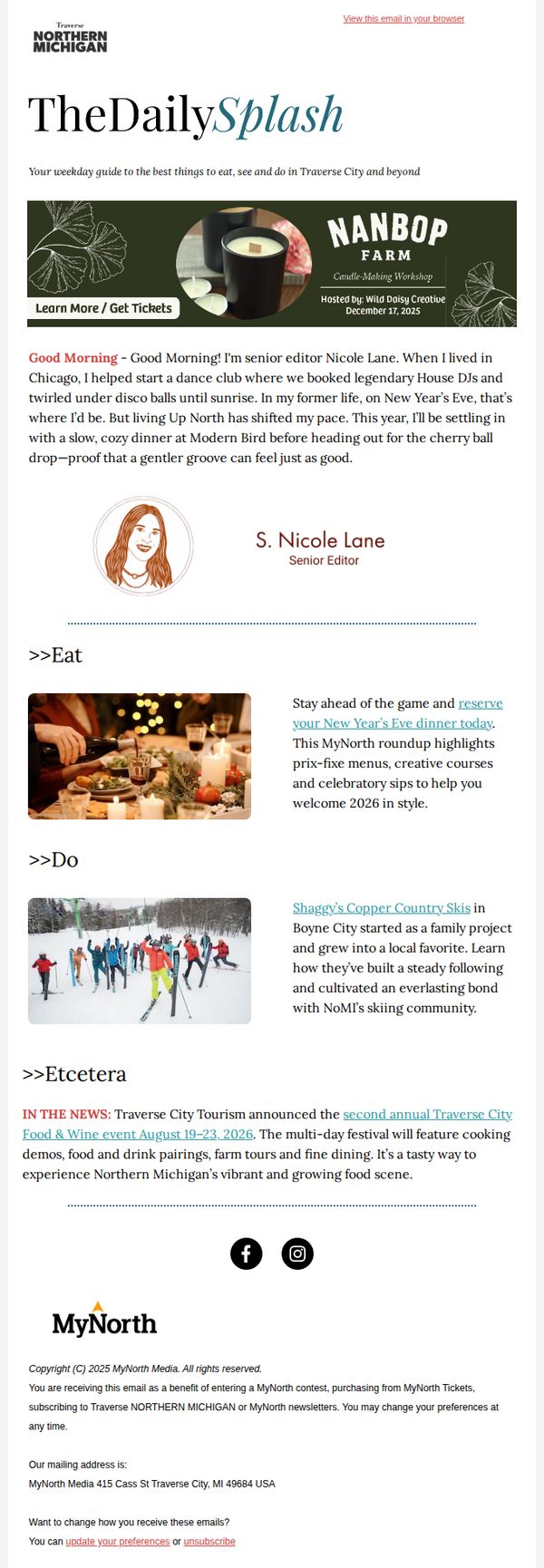
This email aims to inspire readers to plan their New Year’s Eve experience in Northern Michigan by highlighting curated dining options and local activities, while subtly promoting engagement with the MyNorth brand through event awareness and newsletter loyalty.
Why this works
The email opens with a warm, personal narrative from the senior editor that humanizes the brand and creates emotional resonance, making readers feel like they’re getting insider advice rather than a sales pitch.
How to implement
By framing the New Year’s Eve dinner reservation as a proactive lifestyle choice, ‘stay ahead of the game’, the copy positions the action as smart and socially desirable, not just transactional or obligatory.
Pro Tip
Add a visual countdown timer next to the CTA to create urgency around reservations, especially since New Year’s Eve is a time-sensitive event and readers may procrastinate without a tangible deadline. • Include a small map pin or store locator link near the restaurant mention to reduce friction, readers should be able to instantly see where Modern Bird is located without searching elsewhere.
4. TIME: Inside the fallout from Trump's Ukraine intel pause
Objective
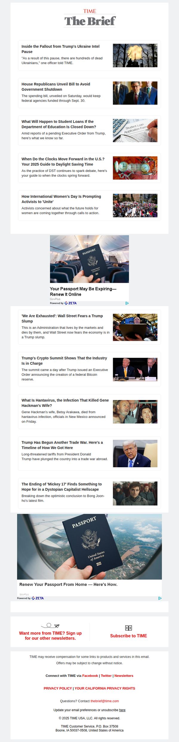
This email aims to inform subscribers about urgent political developments, particularly the consequences of Trump’s pause on Ukraine intelligence, while maintaining engagement through a curated mix of breaking news and cultural commentary. It also seeks to drive newsletter signups and subscriptions by positioning TIME as an essential source for context-rich reporting.
Why this works
The email leads with a high-stakes, emotionally resonant headline about human cost, 'hundreds of dead Ukrainians', which immediately anchors the reader in moral urgency and justifies the need for deeper coverage, making the newsletter feel indispensable rather than optional.
How to implement
By interspersing hard news with cultural and lifestyle hooks, like a film review or passport renewal ad, the email avoids fatigue and sustains attention across a long scroll, subtly teaching readers that TIME delivers both gravity and breadth without sacrificing either.
Pro Tip
The ad for passport renewal appears twice with nearly identical creative, which dilutes impact, consolidate into one stronger placement above the fold with a clearer value proposition like 'Avoid travel delays: Renew in 5 minutes' to reduce redundancy and increase conversion intent. • The CTA 'Subscribe to TIME' is visually underwhelming and buried at the bottom, elevate it with a contrasting button color, add urgency ('Join 2M+ readers before the next briefing drops'), and repeat it after the first 3 news items to capture early scroll abandoners.
5. Harper's Bazaar: The Culture of Fashion, Delivered to Your Mailbox
Objective
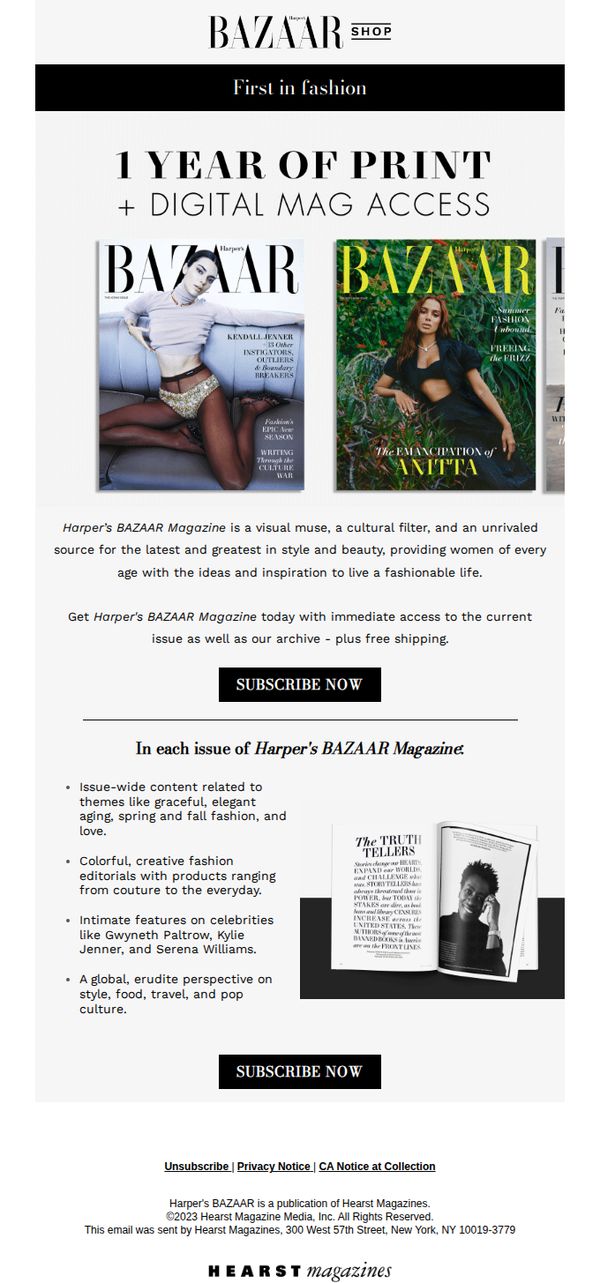
This email aims to convert readers into subscribers by highlighting the cultural and aesthetic value of Harper’s BAZAAR Magazine, emphasizing both print and digital access as a lifestyle enhancement for fashion-forward women.
Why this works
The email positions the magazine not just as a fashion publication but as a cultural filter and visual muse, elevating its perceived value beyond trends to lifestyle and identity for its audience.
How to implement
By showcasing real magazine covers with bold typography and celebrity features, the campaign visually reinforces editorial prestige and immediacy, making the subscription feel like an exclusive cultural membership.
Pro Tip
Add a limited-time discount or bonus (e.g., 'First 100 subscribers get a free digital archive') to create urgency and incentivize immediate action beyond the existing 'free shipping' offer. • Include a short testimonial or subscriber quote near the CTA to build social proof, for example, 'Over 500,000 readers trust BAZAAR to define their style', to strengthen credibility and emotional resonance.
6. Men's Health: Don't Miss This Special Offer From Men's Health!
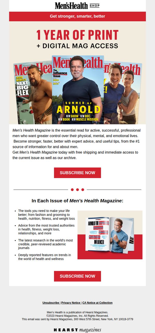
Objective
This email aims to convert readers into subscribers by promoting a bundled offer of one year of print plus digital access to Men’s Health Magazine, emphasizing expert-backed content that helps men improve their physical, mental, and emotional well-being.
Why this works
The email effectively positions Men’s Health as a trusted authority by highlighting content from top experts and peer-reviewed research, which builds credibility and appeals to men seeking reliable, science-backed lifestyle guidance.
How to implement
By showcasing celebrity covers like Arnold Schwarzenegger and Jason Momoa, the campaign leverages aspirational imagery to emotionally connect with its audience, subtly implying that subscribing brings them closer to the strength and success these icons represent.
Pro Tip
Add a limited-time countdown timer near the CTA to create urgency, since the current design lacks any temporal pressure that could nudge hesitant subscribers to act immediately. • Include a short customer testimonial or subscriber quote near the second CTA to reinforce social proof, as the current version relies solely on authority and features without real-user validation.
7. House Beautiful: See inside this ‘Glee’ alum’s elevated yet comfortable home.

Objective
To drive engagement and clicks by showcasing celebrity home tours and home improvement content that blends aspirational design with practical advice, encouraging readers to explore more stories and shop curated products.
Why this works
Leveraging celebrity appeal with a relatable, emotionally resonant quote, 'The windows refract rainbows onto the walls midday', creates instant intrigue and humanizes high-end design, making it feel accessible and emotionally rewarding to explore.
How to implement
Strategically placing product-driven content like the Country Living bedding ad at the bottom capitalizes on reader momentum, turning passive browsing into potential conversion by aligning aesthetic inspiration with shoppable comfort.
Pro Tip
The primary CTA 'READ MORE' is repetitive and lacks urgency or specificity; varying CTAs per section (e.g., 'See Her Kitchen,' 'Get the Look') would better guide user intent and improve click-through rates. • The ad placement for Mediacom interrupts the editorial flow and feels jarring; integrating native-style sponsored content or placing ads after the final article would preserve reader immersion and reduce bounce risk.
8. The Economist: Inside Norway’s spytown

Objective
This email aims to engage readers with a gripping espionage narrative from Norway while subtly encouraging subscription by showcasing the depth and global reach of The Economist’s long-form journalism. It also promotes additional content and exclusive subscriber offerings to deepen audience loyalty.
Why this works
The email opens with a cinematic, real-life spy story that immediately hooks the reader by blending geopolitical intrigue with human vulnerability, a masterclass in using narrative tension to drive engagement before any sales pitch appears.
How to implement
By placing the subscription CTA directly beneath the article’s emotional climax, the campaign leverages peak reader investment to convert curiosity into commitment, making the ask feel like a natural next step rather than an interruption.
Pro Tip
The subscription CTA could be strengthened by adding social proof, such as 'Join 1.5M+ global readers', to increase perceived value and reduce hesitation, especially since the offer is priced in Philippine pesos, which may confuse non-local audiences. • The 'Also from 1843 magazine' and 'From the archive' sections lack visual hierarchy; adding subtle badges like 'Editor’s Pick' or 'Most Read' would guide attention and increase click-through by signaling editorial curation rather than just random placement.
9. TIME: September Is Stressful for Parents, Too
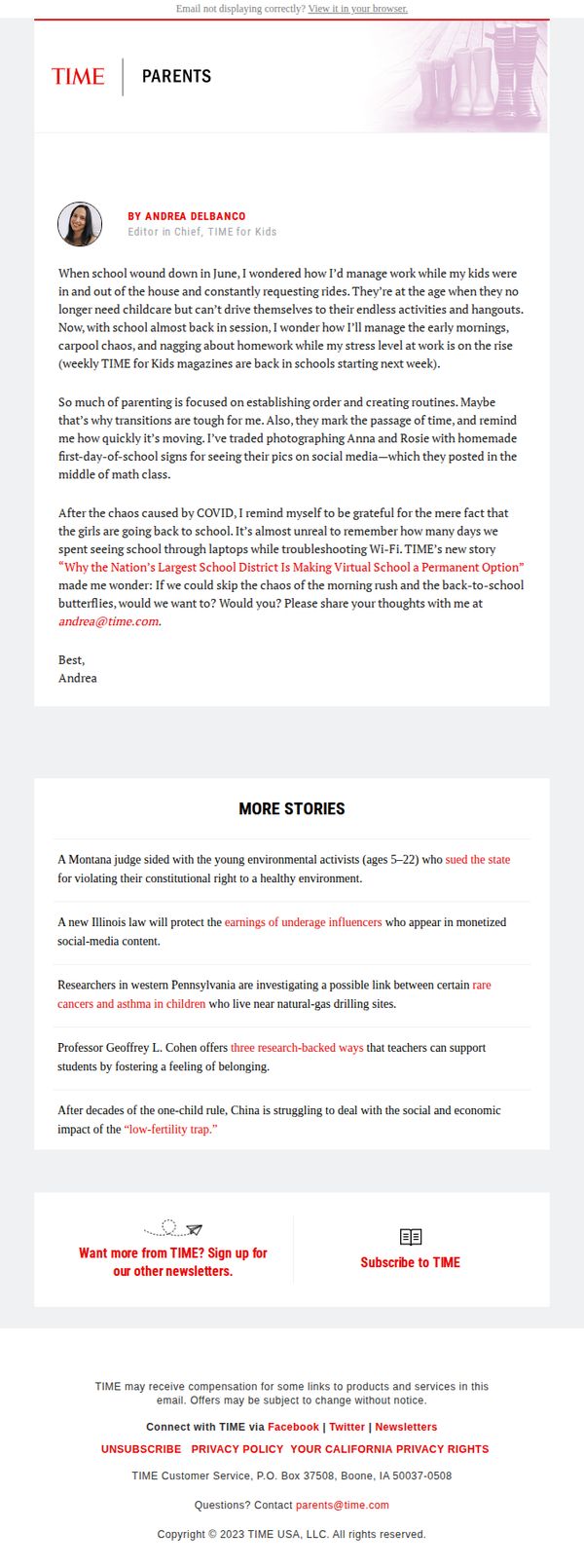
Objective
This email aims to emotionally connect with parents by validating their back-to-school stress while subtly reinforcing TIME’s relevance as a trusted voice in parenting. It invites engagement through personal reflection and newsletter sign-ups, nurturing long-term reader loyalty.
Why this works
The email opens with a vulnerable, first-person narrative that mirrors the reader’s own back-to-school overwhelm, instantly building trust and emotional resonance without resorting to salesy language or forced solutions.
How to implement
By weaving in a reference to a related TIME story about virtual school, the email positions itself as part of a larger, ongoing conversation, encouraging readers to see TIME as a consistent source of insight, not just a one-off newsletter.
Pro Tip
Add a subtle visual cue, like a small icon or colored underline, next to the CTA ‘Sign up for our other newsletters’ to draw the eye and increase click-through without disrupting the email’s calm, editorial tone. • Include a short, relatable quote or statistic from the referenced TIME story about virtual school to reinforce credibility and give readers a reason to click through, rather than just mentioning it in passing.
10. Architectural Digest: These 35 Kitchen Cabinet Colors Will Stand the Test of Time

Objective
This email aims to drive engagement with Architectural Digest’s premium content by highlighting visually compelling, design-forward stories that appeal to interior design enthusiasts, while also promoting a limited-time subscription offer to convert readers into paying subscribers.
Why this works
The email strategically leads with high-impact, emotionally resonant imagery from iconic homes to immediately capture attention and establish credibility, making readers feel they’re being granted exclusive access to world-class design stories.
How to implement
By embedding a bold, time-sensitive subscription offer mid-email, Architectural Digest capitalizes on peak reader interest, right after they’ve been hooked by stunning visuals, turning passive scrollers into potential paying customers without disrupting the editorial flow.
Pro Tip
The subscription CTA is visually buried within a pink banner that clashes with the editorial tone; repositioning it as a sticky footer bar or floating button would increase visibility without compromising the aesthetic cohesion of the design. • The repeated use of identical 'CONTINUE READING' CTAs for every article reduces urgency and personalization; tailoring the button text to each story (e.g., 'See the Cabinet Colors Designers Swear By') would better align with user intent and boost click-through rates.