Product Highlight Email email gallery from real marketing brands



1. Pilothouse : 📦 - Michelin Star Cred
Objective
This email aims to educate marketers on how to convert authority-based creative, like celebrity or expert collaborations, into actual sales, using IQBar’s chef partnership as a case study. It breaks down what works, what doesn’t, and how to replicate the strategy for better conversion.
Why this works
The email brilliantly reframes a chef collaboration not as a celebrity endorsement but as a credibility bridge, showing exactly why the chef chose the product, which transforms prestige into a functional reason to buy, not just a flashy headline.
How to implement
By spotlighting a real user, private chef Taelor Rankin, the campaign shifts from abstract authority to identity-level positioning, making the product feel essential to a specific, aspirational community: hospitality workers as performance athletes, not just snack buyers.
Pro Tip
Add a specific, benefit-driven CTA like 'Get the Chef’s Choice Kit' instead of generic 'Shop Now' to reinforce the authority-to-performance narrative and increase conversion intent. • Include a short, bolded summary box after each ad breakdown that highlights the single most actionable takeaway, this would help readers retain and apply the lessons without re-reading dense paragraphs.
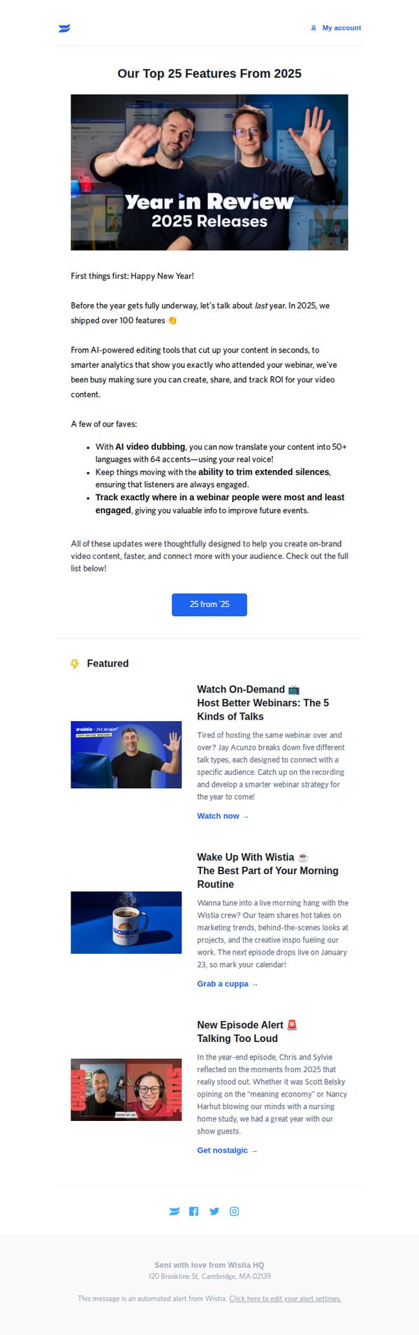
2. Wistia : We dropped 100+ features last year—here's our top 25!
Objective
To celebrate Wistia’s product innovation in 2025 by highlighting their top 25 features, reinforcing brand trust through transparency, and encouraging engagement with both new tools and existing content like webinars and podcasts.
Why this works
Wistia brilliantly frames product updates as customer wins, emphasizing tangible outcomes like faster creation, smarter analytics, and deeper audience connection rather than just listing technical features, which makes innovation feel personal and valuable.
How to implement
The email uses a warm, conversational tone paired with bold visual hierarchy to turn a feature dump into an engaging story, proving that even technical product updates can be delivered with personality and emotional resonance without losing clarity.
Pro Tip
Add a subtle countdown or urgency cue near the CTA button (e.g., 'Explore before Jan 31') to nudge users toward immediate action, since the current static button lacks temporal motivation despite referencing a past year’s releases. • Include a short testimonial or usage stat beneath the featured list (e.g., '87% of users say AI dubbing cut localization time by half') to reinforce social proof and convert feature interest into perceived value before users scroll away.
3. Pilothouse : 📦 - Heated Rivalries 🔥
Objective
This email aims to position Pilothouse as a thought leader in DTC marketing by analyzing Game Day ad performance and AI-driven brand visibility, while driving registrations for a Triple Whale webinar and promoting sponsor tools.
Why this works
The email brilliantly ties cultural moments like Game Day ads to strategic marketing lessons, making complex topics like AI visibility feel timely, relatable, and urgent for DTC brands looking to stay ahead of the curve.
How to implement
By spotlighting both winning campaigns and spectacular fails, the email creates a compelling narrative that teaches through contrast, showing readers not just what works, but why certain approaches backfire in the age of AI-driven discovery.
Pro Tip
The CTA 'Register Now' appears twice but lacks visual hierarchy; consider using contrasting color or animation on the primary CTA button to guide attention more effectively toward conversion. • The 'Brand Battles' section includes strong visuals but could benefit from a brief summary bullet or icon to quickly signal the key takeaway before diving into text, improving scannability for time-poor readers.
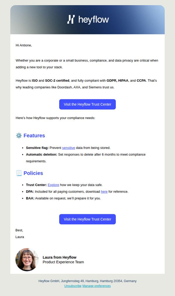
4. Heyflow: Stay compliant with ISO, SOC-2, GDPR & more
Objective
This email aims to reassure potential and existing customers that Heyflow meets major compliance standards like ISO, SOC-2, GDPR, HIPAA, and CCPA, thereby reducing friction in the decision-making process for security-conscious businesses. It positions Heyflow as a trustworthy tool for enterprises and SMBs alike.
Why this works
The email opens with a personalized greeting and immediately addresses a universal pain point, compliance, making the message feel relevant and urgent to both enterprise and small business audiences.
How to implement
Instead of vague claims, it lists specific certifications and standards (ISO, SOC-2, GDPR, HIPAA, CCPA) and backs them with recognizable customer logos, turning abstract trust into tangible social proof that reassures skeptical buyers.
Pro Tip
Add a visual compliance badge or trust seal near the top of the email to immediately signal credibility, since many readers scan quickly and may overlook text-only claims about certifications. • Include a short testimonial or quote from one of the named companies (e.g., Doordash or Siemens) about how Heyflow helped them meet compliance, which would strengthen social proof beyond just name-dropping.
5. Pilothouse : 📦 - Don’t Make Creatives From Scratch
Objective
This email aims to help Amazon brand managers extend the lifecycle of their existing creative assets by reframing them for spring, avoiding costly full reshoots. It positions Pilothouse as the strategic partner for seasonal creative pivots that maintain conversion without starting from scratch.
Why this works
The email brilliantly reframes creative fatigue as a strategic opportunity, teaching brands to pivot existing assets with emotional and visual tweaks rather than costly reshoots, turning a common pain point into a scalable growth lever.
How to implement
By using real client examples like Dr. Fuhrman and For Wellness, the email grounds abstract marketing theory in tangible before-and-after transformations, making the playbook feel actionable and proven rather than theoretical or generic.
Pro Tip
The primary CTA 'Get connected →' is buried in a light beige box and lacks urgency or benefit-driven language; reposition it as a bold button below the hero section with text like 'Start Your Spring Refresh Today' to align with the email’s core promise. • The 'Steal This' section offers tactical steps but doesn’t visually differentiate them from surrounding content; adding numbered icons or a bordered card layout would improve scannability and reinforce the actionable nature of the advice.
6. Kit: Kit Product Updates: February 2026

Objective
This email aims to inform Kit users about new product features and integrations released in February 2026, encouraging adoption through clear CTAs while reinforcing brand value by showcasing strategic partnerships and educational opportunities.
Why this works
The email leads with a high-impact integration, Kajabi, that solves a real pain point for course creators, immediately signaling value by showing how automation reduces manual work while increasing student engagement and revenue potential.
How to implement
Each new feature is presented with a clean visual icon, a benefit-driven headline, and a direct CTA, making it effortless for users to understand what’s new and take action without scrolling or searching for next steps.
Pro Tip
The 'Save your seat' CTA for the webinar is visually underwhelming compared to the primary 'Connect Kajabi to Kit' button; increasing its size or using a contrasting color would better reflect its strategic importance in driving user education and platform stickiness. • The feedback section at the bottom uses radio buttons without a submit button, which may confuse users; adding a clear 'Submit Feedback' CTA or converting it to a one-click rating system would improve completion rates and data quality.
7. Loganix: Make your ads work harder 🎯
Objective
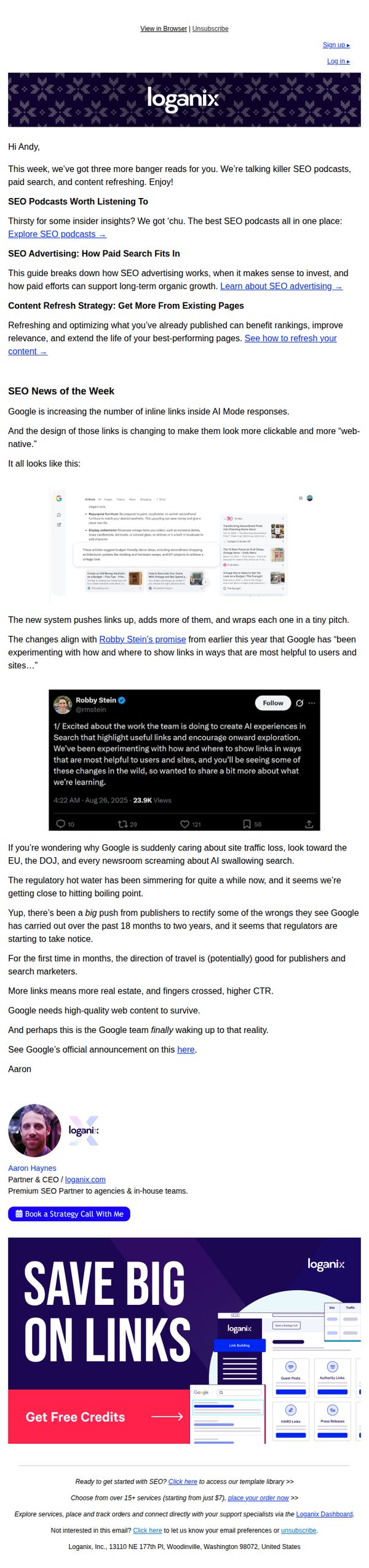
This email aims to engage subscribers with timely, high-value SEO insights while subtly promoting Loganix’s services by positioning them as industry authorities. It encourages readers to book a strategy call or explore service offerings through embedded CTAs.
Why this works
The email opens with a personalized greeting and immediately delivers value by curating three relevant, high-impact SEO topics, making the reader feel the content was handpicked just for them, which boosts engagement and trust.
How to implement
By embedding a tweet from a Google insider and referencing real-time algorithm shifts, the email leverages social proof and urgency to position Loganix as a forward-thinking, authoritative source, not just a service provider but a strategic partner in navigating industry change.
Pro Tip
Add a brief testimonial or client result snippet near the CTA to reinforce credibility, readers are more likely to book a call if they see others have achieved success with Loganix’s strategy sessions. • Include a micro-timeline or progress bar under the 'SEO News of the Week' section to visually emphasize how quickly Google’s changes are evolving, which would heighten urgency and justify immediate action.
8. Pilothouse : 📦 - High-LTV > Cheap Clicks

Objective
This email aims to educate DTC marketers on advanced Meta advertising strategies that prioritize high-lifetime-value customers over cheap clicks, while also promoting Pilothouse’s expertise and podcast content to build authority and drive engagement.
Why this works
Pilothouse effectively reframes Meta’s value rules as a strategic lever for long-term profitability, not just a technical setting, this shifts the reader’s mindset from cost-per-click to customer lifetime value, which is essential for sustainable DTC growth.
How to implement
The case study format, showing real results like a 47.5% ROAS lift after targeting 25–44-year-olds, builds credibility through tangible outcomes, making abstract ad strategies feel actionable and trustworthy for time-strapped marketers.
Pro Tip
The primary CTA 'Talk to our team to learn more' is buried in the sponsor section; it should be elevated to the hero or education section with a more benefit-driven headline like 'Unlock High-LTV Audiences with Our Meta Strategy' to align with the email’s core message. • The 'Quick Hits' section feels disconnected from the main theme; instead of listing unrelated brand tactics, it could highlight quick wins from the Meta value rules case study to reinforce the email’s central thesis and maintain thematic continuity.
9. Echelonn: Product page vs. Sale page: Which works better for Shopping Ads?

Objective
This email aims to educate e-commerce marketers on optimizing Shopping Ads by comparing product pages versus dedicated sales pages, and to drive engagement by offering a free landing page playbook and audit for qualified brands.
Why this works
The email brilliantly reframes a technical SEO question into a customer-centric narrative by focusing on the cold shopper’s overwhelm, making the case for sales pages feel intuitive rather than tactical, which builds instant credibility with time-strapped marketers.
How to implement
Instead of just stating a recommendation, the email provides clear, situational triggers, like selling higher-ticket items or operating in skeptical markets, that help readers self-qualify, turning abstract advice into actionable, personalized strategy they’re more likely to implement.
Pro Tip
The CTA 'Grab our Landing Page Playbook' is buried mid-email and lacks visual emphasis; moving it above the fold with a contrasting button and adding urgency (e.g., 'Download before Friday') would increase conversion rates for cold traffic. • The email lacks social proof or data points to back up the claim that sales pages 'perform way better', adding a short stat (e.g., 'Clients saw 37% higher ROAS') or a mini testimonial would strengthen credibility and reduce skepticism.
10. Stan Ventures: How to Set Realistic SEO Expectations (and Actually See Results)
Objective
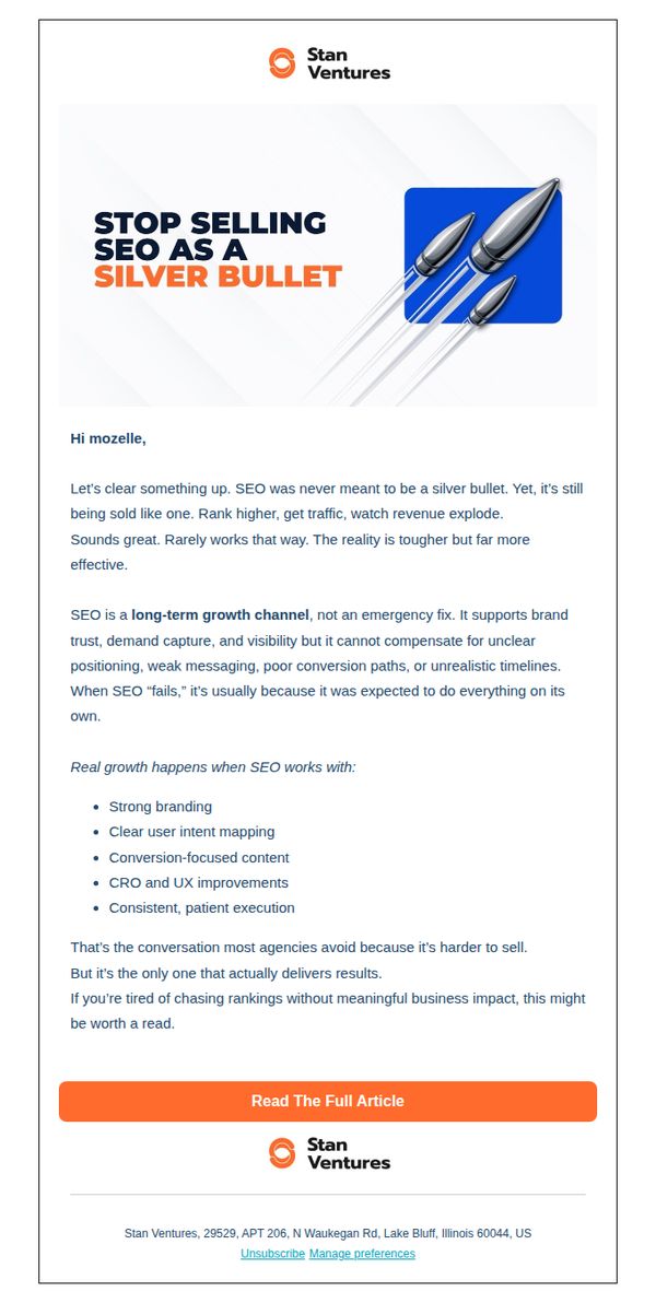
This email aims to reset client expectations around SEO by positioning it as a long-term growth strategy rather than a quick fix, while building trust in Stan Ventures as a transparent, results-driven partner who prioritizes sustainable business outcomes over vanity metrics.
Why this works
The email brilliantly reframes SEO not as a magic solution but as a strategic growth engine that demands alignment with branding, user intent, and conversion architecture, a truth many agencies avoid but clients desperately need to hear.
How to implement
By calling out the industry’s tendency to oversell SEO as a ‘silver bullet,’ the message instantly builds credibility and positions Stan Ventures as a refreshingly honest partner who values long-term client success over short-term sales.
Pro Tip
Add a subtle visual hierarchy or iconography next to each bullet point in the education section to increase scannability and reinforce the importance of each supporting factor for SEO success. • Include a micro-testimonial or client result snippet just above the CTA to bridge the gap between educational content and social proof, making the ‘Read The Full Article’ action feel more outcome-driven and less abstract.