Proven Media product highlight email designs you can use



1. Connecticut Magazine: CT students are helping Stanford researchers seeking to cure diabetes
Objective
To engage Connecticut residents with locally relevant news and stories while promoting a limited-time digital subscription offer that positions CT Insider as an essential source for regional updates and exclusive content.
Why this works
The email opens with a human-centered story about Connecticut students collaborating with Stanford researchers, immediately establishing emotional resonance and local pride while subtly reinforcing the value of staying informed through CT Insider.
How to implement
Strategically repeating the end-of-year sale twice, once near the top and again at the bottom, creates urgency without being pushy, leveraging psychological scarcity to nudge readers toward conversion while keeping the focus on access rather than price alone.
Pro Tip
Add a brief testimonial or quote from a current subscriber near the second CTA to reinforce social proof and reduce perceived risk for new users considering the 99¢ trial. • Integrate a small countdown timer next to the 'SALE ENDS DEC. 28' text to visually amplify urgency and encourage immediate action without requiring extra clicks or scrolling.
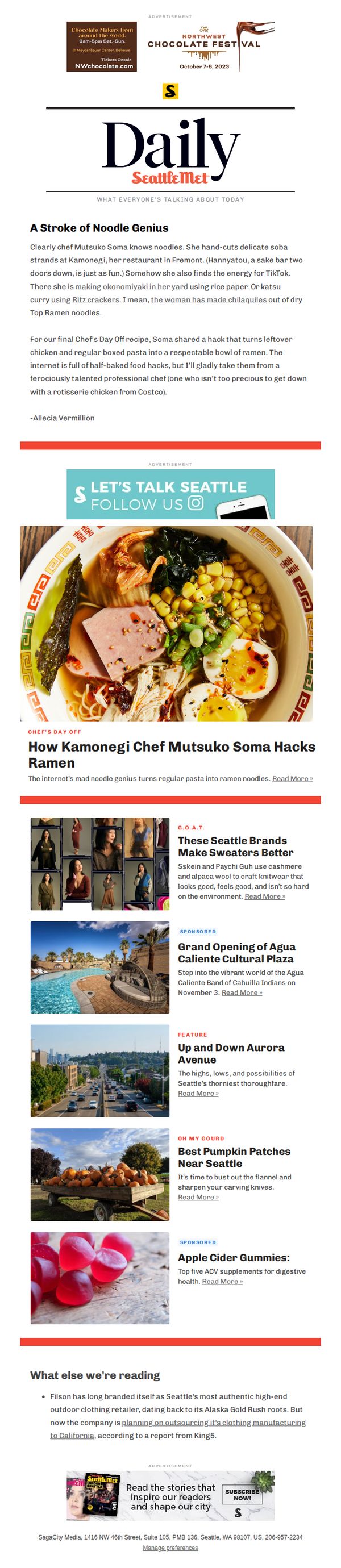
2. Seattle Met: 🍜 Inside the Mind of a Ramen Genius
Objective
This email aims to engage readers with a compelling food story centered on a local chef’s creative ramen hack, while also promoting Seattle Met’s broader content ecosystem through curated articles and sponsored features. It seeks to position the brand as a cultural curator of Seattle’s food and lifestyle scene.
Why this works
The email brilliantly humanizes a chef by spotlighting quirky, relatable hacks, like turning Costco rotisserie chicken into ramen, making gourmet creativity feel accessible and fun for everyday home cooks.
How to implement
By weaving in TikTok energy and backyard experiments, the campaign taps into Gen Z and millennial food culture, positioning Seattle Met as a bridge between professional culinary art and viral, DIY food trends.
Pro Tip
The primary CTA 'Read More »' is visually underwhelming and buried beneath the hero image; it should be larger, bolder, or button-styled to create stronger visual hierarchy and drive more clicks to the main story. • The email lacks a clear visual or textual transition between the main feature and the 'What else we’re reading' section, which could confuse readers, adding a subtle divider or subheader like 'More Stories You’ll Love' would improve flow.
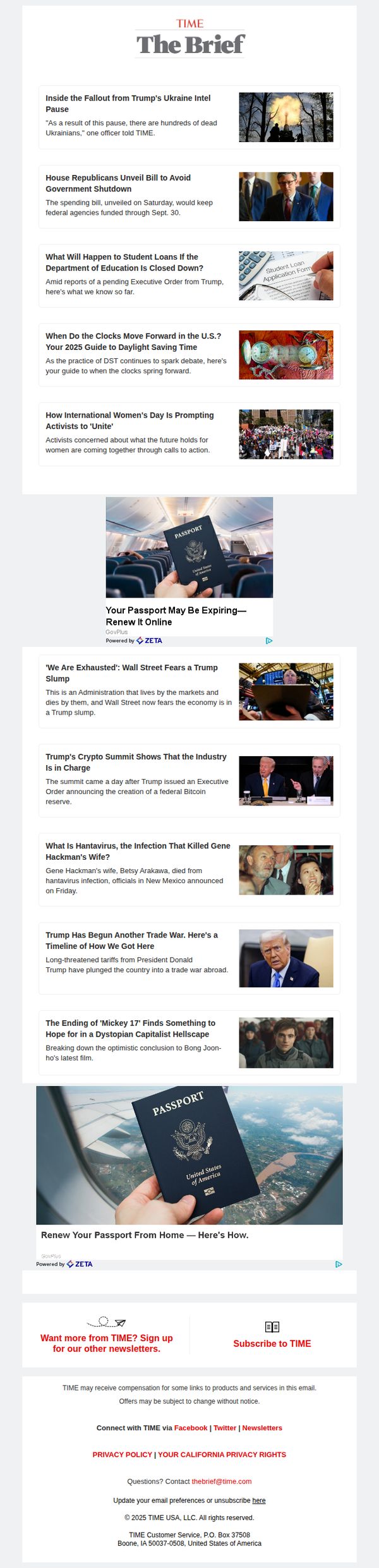
3. TIME: Inside the fallout from Trump's Ukraine intel pause
Objective
This email aims to inform subscribers about urgent political developments, particularly the consequences of Trump’s pause on Ukraine intelligence, while maintaining engagement through a curated mix of breaking news and cultural commentary. It also seeks to drive newsletter signups and subscriptions by positioning TIME as an essential source for context-rich reporting.
Why this works
The email leads with a high-stakes, emotionally resonant headline about human cost, 'hundreds of dead Ukrainians', which immediately anchors the reader in moral urgency and justifies the need for deeper coverage, making the newsletter feel indispensable rather than optional.
How to implement
By interspersing hard news with cultural and lifestyle hooks, like a film review or passport renewal ad, the email avoids fatigue and sustains attention across a long scroll, subtly teaching readers that TIME delivers both gravity and breadth without sacrificing either.
Pro Tip
The ad for passport renewal appears twice with nearly identical creative, which dilutes impact, consolidate into one stronger placement above the fold with a clearer value proposition like 'Avoid travel delays: Renew in 5 minutes' to reduce redundancy and increase conversion intent. • The CTA 'Subscribe to TIME' is visually underwhelming and buried at the bottom, elevate it with a contrasting button color, add urgency ('Join 2M+ readers before the next briefing drops'), and repeat it after the first 3 news items to capture early scroll abandoners.
4. The Economist: The war against PDFs is heating up
Objective
The email aims to engage subscribers with curated daily journalism while promoting app adoption and a limited-time subscription discount, blending editorial value with conversion-driven marketing to strengthen reader loyalty and revenue.
Why this works
The email masterfully balances editorial depth with commercial intent by embedding a compelling discount offer within a richly curated content digest, making the promotion feel like a natural extension of the reader’s daily ritual rather than an interruption.
How to implement
By leading with a provocative, AI-related headline about PDFs, a universally relatable pain point, the campaign immediately hooks tech-savvy and professional readers, then leverages that curiosity to funnel them toward app downloads and subscription upgrades.
Pro Tip
The 'Get offer' CTA button lacks visual hierarchy, it should be larger, more colorful, or positioned above the fold to compete with the editorial content and reduce the risk of being overlooked by skimming readers. • The 'Editor’s picks' section could benefit from a brief editorial rationale or curator note for each article to increase perceived authority and guide readers toward high-value content, rather than relying solely on headlines and thumbnails.
5. Glossy: Why L’Oréal Groupe is investing in P2 Science, the ingredient company quietly working with Rare Beauty, Living Proof and The Ordinary
Objective
To inform industry insiders and beauty professionals about P2 Science’s strategic importance and L’Oréal Groupe’s investment, while positioning Glossy as a trusted source for behind-the-scenes beauty and fashion business intelligence.
Why this works
Glossy masterfully frames a niche ingredient company’s funding news as a major industry signal, turning B2B chemistry into compelling narrative by linking it to consumer-favorite brands like Rare Beauty and The Ordinary.
How to implement
By leading with a provocative question in the headline and immediately naming powerhouse parent companies like LVMH and Unilever, the email instantly establishes credibility and relevance for executives scanning for strategic insights.
Pro Tip
Add a clear, visually distinct CTA button above the fold, such as 'Read the Full Interview', to drive engagement beyond the headline and reduce reliance on the buried footer link. • Integrate a short, punchy pull quote from the L’Oréal or P2 execs directly under the hero image to humanize the story and reinforce the strategic value proposition for time-poor readers.
6. Architectural Digest: These 35 Kitchen Cabinet Colors Will Stand the Test of Time

Objective
This email aims to drive engagement with Architectural Digest’s premium content by highlighting visually compelling, design-forward stories that appeal to interior design enthusiasts, while also promoting a limited-time subscription offer to convert readers into paying subscribers.
Why this works
The email strategically leads with high-impact, emotionally resonant imagery from iconic homes to immediately capture attention and establish credibility, making readers feel they’re being granted exclusive access to world-class design stories.
How to implement
By embedding a bold, time-sensitive subscription offer mid-email, Architectural Digest capitalizes on peak reader interest, right after they’ve been hooked by stunning visuals, turning passive scrollers into potential paying customers without disrupting the editorial flow.
Pro Tip
The subscription CTA is visually buried within a pink banner that clashes with the editorial tone; repositioning it as a sticky footer bar or floating button would increase visibility without compromising the aesthetic cohesion of the design. • The repeated use of identical 'CONTINUE READING' CTAs for every article reduces urgency and personalization; tailoring the button text to each story (e.g., 'See the Cabinet Colors Designers Swear By') would better align with user intent and boost click-through rates.
7. WIRED: A Revelation About Trees Is Messing With Climate Calculations

Objective
This email aims to engage science enthusiasts by delivering a curated weekly roundup of compelling science stories while subtly promoting WIRED’s subscription through strategic placement of a discounted offer at the bottom. It balances editorial value with conversion intent.
Why this works
The email opens with a bold, curiosity-driven headline that immediately hooks readers by suggesting a paradigm shift in climate science, leveraging urgency and mystery to drive clicks without resorting to clickbait clichés.
How to implement
Each article preview is paired with a vivid, thematically relevant image and a concise, benefit-driven summary that tells the reader exactly what they’ll learn, turning abstract science into digestible, emotionally resonant stories.
Pro Tip
The subscription offer section could benefit from a countdown timer or limited-time badge to create urgency, since the $5 price point is already compelling but lacks temporal pressure to drive immediate action. • The 'More from WIRED Science' section could be restructured with a 'Recommended for You' label or personalized tagline based on past reading behavior to increase relevance and click-through rates for non-subscribers.
8. Food Network: Costco Issued a Recall on a Fan-Favorite Product

Objective
To inform subscribers about a Costco product recall while engaging them with timely, festive content around New Year’s Eve, encouraging clicks and brand interaction through health-conscious recipes and snack alternatives.
Why this works
The email opens with urgent, curiosity-driven news tied to a major retailer and holiday context, immediately capturing attention by implying personal relevance for readers who may have purchased the recalled item.
How to implement
Each content block is paired with a clear, benefit-focused CTA button that mirrors the section’s promise, like ‘Easy Swaps You Can Make’, making it effortless for readers to take the next step without decision fatigue.
Pro Tip
Add a visual indicator (e.g., red alert banner or icon) near the top to emphasize the urgency of the recall, ensuring even skimmers recognize the critical nature of the message before scrolling to recipe content. • Reposition the 'Shop With Us' product grid higher in the flow, perhaps after the first two content blocks, to capitalize on early engagement and convert interest into commerce before users lose momentum.
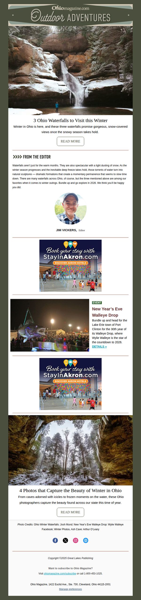
9. Ohio: 3 Waterfalls to Visit This Winter ❄️
Objective
This email aims to inspire winter travel within Ohio by highlighting scenic waterfalls and seasonal events, encouraging readers to explore local outdoor adventures and engage with curated content. It also promotes tourism partnerships and drives traffic to external booking sites and event pages.
Why this works
The email masterfully ties seasonal beauty to local exploration by showcasing winter waterfalls as frozen natural sculptures, transforming ordinary hikes into must-see visual experiences that feel both rare and urgent to witness before the thaw.
How to implement
Including a personal editor’s note adds credibility and warmth, making the content feel curated rather than automated, a subtle but powerful trust-building tactic that invites readers to see the brand as a knowledgeable local guide.
Pro Tip
Add a countdown timer or seasonal urgency cue near the waterfall section to emphasize the fleeting nature of winter scenery, encouraging immediate clicks and visits before snow melts or ice formations disappear. • Include a small map or clickable location pins beneath each waterfall photo to help readers visualize proximity and plan routes, enhancing practical utility and reducing friction between inspiration and action.
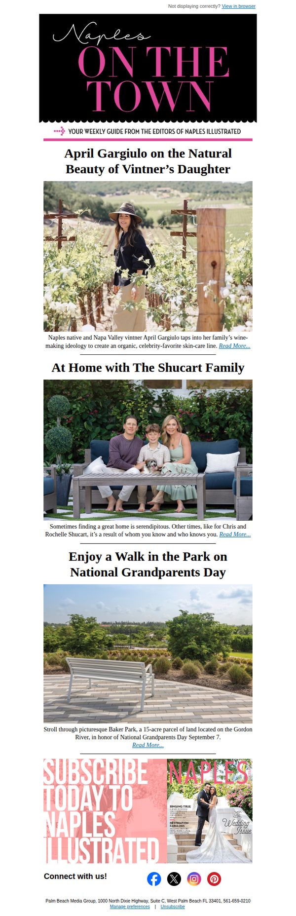
10. Naples Illustrated: Natural Beauty with April Gargiulo of Vintner’s Daughter | At Home with The Shucart Family | Enjoy a Stroll on National Grandparents Day
Objective
This email aims to engage readers with curated local lifestyle content while subtly promoting brand affinity and subscription to Naples Illustrated. It blends storytelling with community-focused features to position the publication as a trusted guide to Naples living.
Why this works
The email masterfully blends local personalities with lifestyle moments, turning interviews and family features into relatable, emotionally resonant stories that deepen reader connection without overt sales pressure.
How to implement
By anchoring content to real-world events like National Grandparents Day, the campaign creates timely relevance that encourages immediate engagement while reinforcing the publication’s role as a community curator.
Pro Tip
Add a subtle countdown or urgency cue near the subscription CTA, such as 'Limited-time access to exclusive content', to nudge readers toward immediate action without compromising the editorial tone. • Include a short testimonial or subscriber quote beneath the CTA to reinforce social proof, helping hesitant readers feel confident that subscribing delivers real value aligned with the content they just enjoyed.