New Year’s Day product highlight email examples & ideas


1. Rock Paradise : Capricorn Season ✦ Crystals for Strength, Focus & Grounded Energy ♑
Objective
This email aims to drive sales by aligning crystal product offerings with the astrological energy of Capricorn season, positioning each stone as a tool for strength, focus, and grounding during the new year. It also encourages social engagement through live sales and incentivizes purchases with a free gift.
Why this works
The email brilliantly ties product selection to astrological timing, making each crystal feel personally relevant and emotionally resonant for Capricorn season, which transforms a simple product list into a meaningful ritual for the recipient.
How to implement
By grouping crystals under thematic emotional benefits, like 'Motivation and Confidence' or 'Protection and Grounding', the campaign speaks directly to the customer’s inner desires, turning stones into solutions rather than just merchandise.
Pro Tip
Add a subtle countdown timer near the 'FREE GIFT WITH PURCHASE' offer to heighten urgency and encourage faster decision-making, especially since the gift is tied to a weekly rotating stone. • Reposition the Instagram Live banner higher in the email, perhaps after the hero section, to capture attention earlier and convert curious readers into live viewers before they scroll to product grids.
2. Picture Polish: Restock News Inside 💅
Objective
To inform subscribers about product restocks, shop updates, and shipping changes while maintaining brand warmth and managing expectations around delays. The email aims to retain customer trust despite supply chain setbacks.
Why this works
The brand gracefully turns a negative update, delayed brush arrivals, into a positive by immediately pivoting to approved color batches, keeping customers emotionally engaged and focused on what’s coming soon.
How to implement
By embedding hyperlinks directly within bullet points, the email reduces friction for users seeking more details, making it easy to act on updates without scrolling or hunting for buttons, which boosts conversion potential.
Pro Tip
Add a visual indicator like a small icon or color-coded badge next to each bullet point (e.g., green for restock, blue for shop changes) to help users quickly scan and prioritize information based on their interests. • Include a secondary CTA button or bolded text beneath the primary link, such as 'See What’s Back in Stock →', to increase click-through rates by reinforcing the action and making it more visually prominent than plain hyperlinked text.
3. Allrecipes: 31 Days of Crocktober
Objective
To engage home cooks during the fall season by promoting a month-long slow cooker recipe campaign called 'Crocktober,' encouraging users to explore, save, and cook featured dishes while driving traffic to Allrecipes’ recipe hub.
Why this works
The email leverages seasonal urgency with '31 Days of Crocktober' to frame recipe discovery as a fun, time-bound challenge that motivates daily engagement and recipe saving across multiple meal categories.
How to implement
Each recipe card includes a real user testimonial and star rating, which builds social proof and trust, making the content feel personally recommended rather than just algorithmically curated.
Pro Tip
Add a visual countdown timer near the 'GET RECIPES' CTA to reinforce the limited-time nature of Crocktober and create urgency for immediate action. • Include a small 'Most Popular This Week' badge on top-rated recipes to highlight trending content and guide users toward high-engagement dishes without overwhelming them.
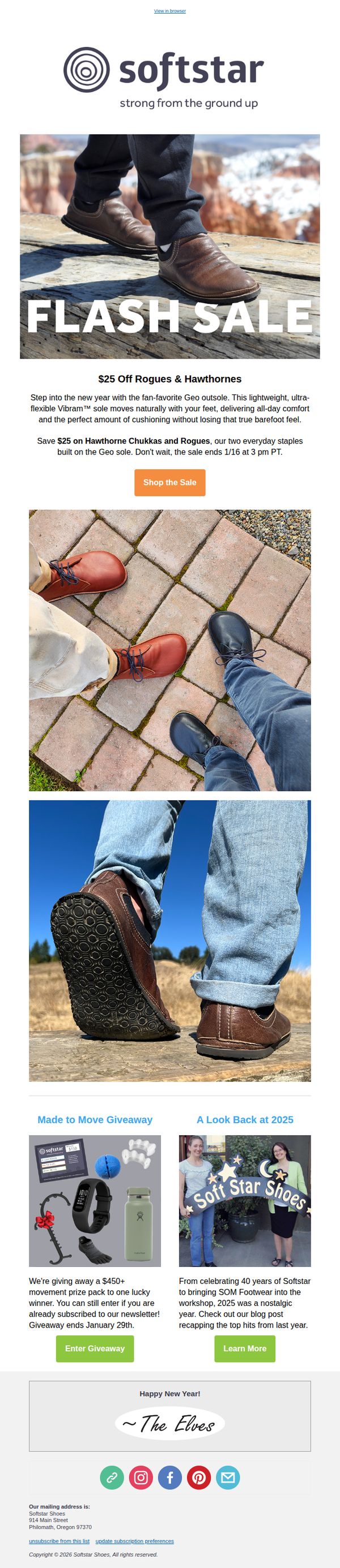
4. Softstar : $25 Off Rogues & Hawthorne Chukkas
Objective
This email aims to drive immediate sales by promoting a limited-time $25 discount on two popular shoe styles, the Rogues and Hawthorne Chukkas, while leveraging urgency with a clear end date and highlighting the comfort benefits of the Geo sole to appeal to everyday wearers.
Why this works
The email brilliantly ties the product’s technical benefit, the Vibram Geo sole, to an emotional lifestyle promise: all-day comfort without sacrificing the barefoot feel, making the functional feature feel personal and desirable to everyday wearers.
How to implement
By anchoring the discount to two specific, fan-favorite styles and adding a hard deadline, the campaign creates scarcity without being pushy, turning a simple price drop into a must-act-now moment for loyal customers already familiar with the products.
Pro Tip
Add a small countdown timer or urgency badge near the CTA to visually reinforce the 1/16 3 PM PT deadline, increasing perceived scarcity and reducing the chance subscribers will delay clicking. • Reposition the giveaway and year-in-review sections above the main CTA or integrate them as secondary CTAs within the hero or offer section to prevent visual drop-off and keep the primary sale message from being buried.
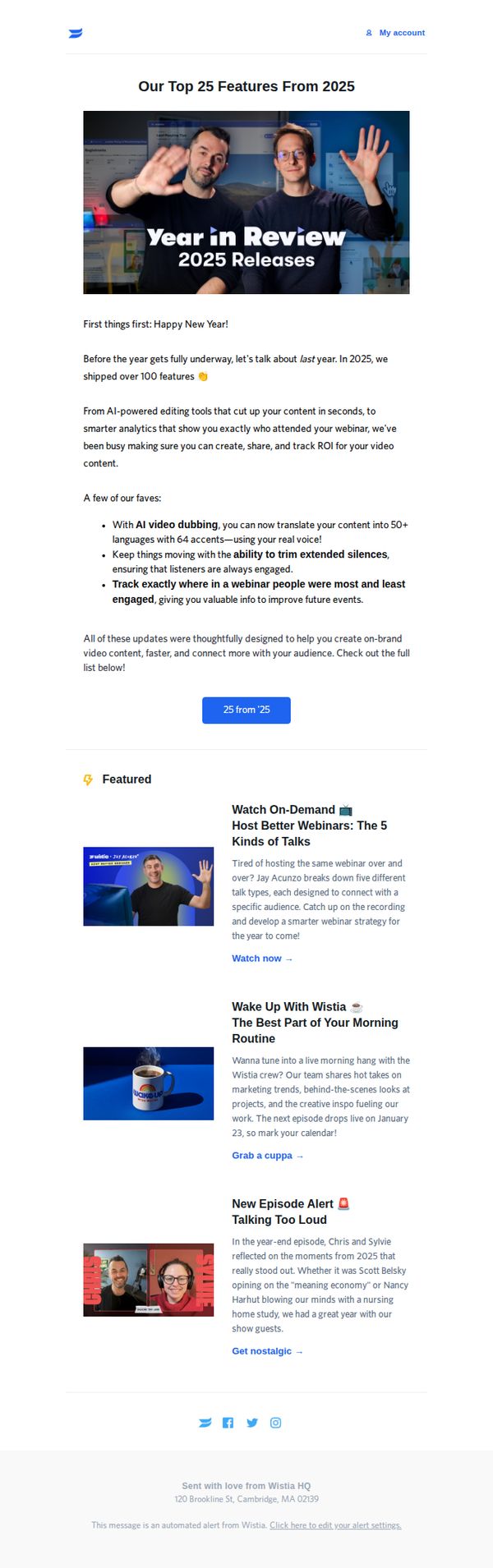
5. Wistia : We dropped 100+ features last year—here's our top 25!
Objective
To celebrate Wistia’s product innovation in 2025 by highlighting their top 25 features, reinforcing brand trust through transparency, and encouraging engagement with both new tools and existing content like webinars and podcasts.
Why this works
Wistia brilliantly frames product updates as customer wins, emphasizing tangible outcomes like faster creation, smarter analytics, and deeper audience connection rather than just listing technical features, which makes innovation feel personal and valuable.
How to implement
The email uses a warm, conversational tone paired with bold visual hierarchy to turn a feature dump into an engaging story, proving that even technical product updates can be delivered with personality and emotional resonance without losing clarity.
Pro Tip
Add a subtle countdown or urgency cue near the CTA button (e.g., 'Explore before Jan 31') to nudge users toward immediate action, since the current static button lacks temporal motivation despite referencing a past year’s releases. • Include a short testimonial or usage stat beneath the featured list (e.g., '87% of users say AI dubbing cut localization time by half') to reinforce social proof and convert feature interest into perceived value before users scroll away.
6. Calm : Jan 6, 2026: featured and trending sessions
Objective
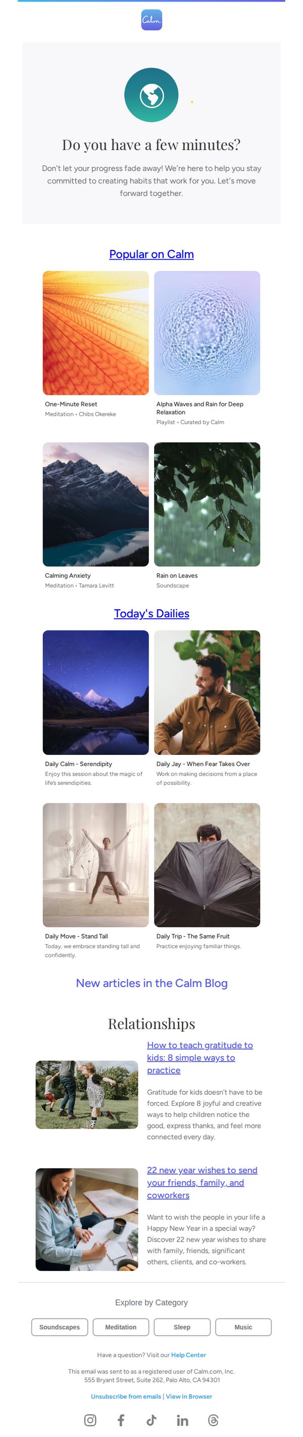
This email aims to re-engage users by reminding them to maintain their mindfulness habits through curated, timely content that aligns with their personal growth journey, while subtly reinforcing Calm’s value as a daily companion for mental well-being.
Why this works
The email opens with a gentle, time-sensitive question, 'Do you have a few minutes?', that lowers the barrier to engagement by framing meditation as a micro-commitment, not a chore, which is psychologically smart for busy users.
How to implement
By organizing content into clearly labeled sections like 'Popular on Calm' and 'Today’s Dailies,' the email creates a sense of editorial curation and daily rhythm, making users feel like they’re returning to a trusted, evolving resource rather than just a static app.
Pro Tip
Add a visual or text-based progress indicator near the top (e.g., 'You’ve meditated 3x this week, keep going!') to personalize the re-engagement message and leverage behavioral momentum, making the 'Don’t let your progress fade away!' line more impactful. • Reposition the 'Popular on Calm' CTA to be a button with higher contrast and placement directly under the hero text, currently it’s a hyperlink that blends in, reducing its effectiveness as the primary action driver for returning users.
7. Decathlon - US: Changes at Decathlon

Objective
This email aims to inform Decathlon’s U.S. customers about a strategic shift in 2024 toward outdoor product categories, while encouraging immediate action to purchase remaining sports items before they’re discontinued. It also seeks to build anticipation for new outdoor products and maintain customer loyalty through transparency and gratitude.
Why this works
Decathlon smartly frames its product category shift as a customer benefit, focusing on high-performance outdoor gear while creating urgency around limited-time sports deals, which turns potential churn into a final opportunity for value-driven engagement.
How to implement
By anchoring the message in gratitude for customer support since 2016, Decathlon humanizes its strategic pivot, transforming a business decision into a shared journey that reinforces emotional connection and brand loyalty despite product discontinuations.
Pro Tip
Add a visual product grid or thumbnail carousel in the Offer Section to showcase the ‘incredible deals on sports gear’, this would increase click-through by making the urgency tangible and reducing cognitive load for shoppers. • Include a countdown timer or ‘Limited Stock’ indicator near the ‘Shop deals here’ CTA to amplify urgency and convert hesitation into immediate action, especially since the email’s core message hinges on a time-sensitive transition.
8. Organic Matters: 🌿 2026: Building Healthy Habits with Organic Food

Objective
This email aims to inspire subscribers to adopt sustainable, health-conscious habits in 2026 by highlighting Organic Matters’ ethically sourced wellness products and connecting personal nutrition choices to broader environmental impact. It positions the brand as a thoughtful partner in intentional living.
Why this works
The email brilliantly ties New Year intentions to everyday food choices, reframing wellness as a series of small, meaningful acts that collectively support planetary health, a narrative that resonates deeply with conscious consumers seeking purpose in their purchases.
How to implement
By spotlighting specific ingredients like sea veggies and wild rice with origin stories and ethical sourcing details, the brand transforms commodity products into compelling narratives, building trust and emotional connection without relying on discounts or hype.
Pro Tip
Add a subtle countdown or urgency cue near the 'View All Boosters' CTA to encourage immediate exploration, since the New Year theme naturally lends itself to time-sensitive behavior without needing a hard sale. • Include a short testimonial or user quote near the product grid to reinforce social proof, especially since the email emphasizes community and shared values, a real customer voice would strengthen credibility and emotional resonance.
9. The Pi Hut: 📢 New products from The Pi Hut

Objective
This email aims to announce and showcase The Pi Hut’s latest product lineup for 2026, driving traffic to the store while simultaneously promoting discounted older inventory to clear stock and boost sales.
Why this works
The email strategically pairs new product launches with a subtle nudge toward discounted older inventory, creating dual motivation for users to explore both innovation and value without feeling pressured into a single decision.
How to implement
Each product is introduced with a vivid, benefit-driven description that speaks directly to the maker’s workflow, highlighting practical features like tool-free assembly, GPIO access, or thermal management, making technical specs feel immediately useful and desirable.
Pro Tip
Add a visual countdown timer or urgency indicator near the 'To the store!' CTA to reinforce limited-time discounts and encourage immediate action, especially since the email mentions clearing hundreds of lines. • Include a brief testimonial or user quote under 1–2 flagship products to build social proof, especially for new or complex items like the TRMNL OG or Cardputer Adv, which benefit from peer validation.
10. Hiut Denim : A Year of Makers. A New Year of Possibility.

Objective
This email aims to reconnect subscribers with Hiut Denim’s 'Workshop Wisdom' series by celebrating the craftsmanship and philosophies of featured makers from 2025, while inviting readers to explore more stories and deepen their engagement with the brand’s values around intentional making and everyday beauty.
Why this works
By spotlighting diverse makers with authentic quotes and personal photos, this email transforms abstract values like ‘craft’ and ‘care’ into tangible human stories that resonate emotionally and build deeper brand loyalty.
How to implement
The strategic placement of dual CTAs, one after the intro and another near the end, gently guides readers through the narrative without forcing urgency, creating a natural rhythm that supports exploration over conversion pressure.
Pro Tip
Add a subtle visual cue or icon next to each maker’s name to indicate their craft type (e.g., pottery, baking, textiles), helping readers quickly scan and connect with makers whose work aligns with their interests. • Integrate a short video clip or animated GIF beneath the hero section showing a maker in motion, even just 3 seconds, to add dynamic energy and immediately convey the tactile, hands-on nature of the content before scrolling begins.