Product Highlight Email gallery from real brands using NPS
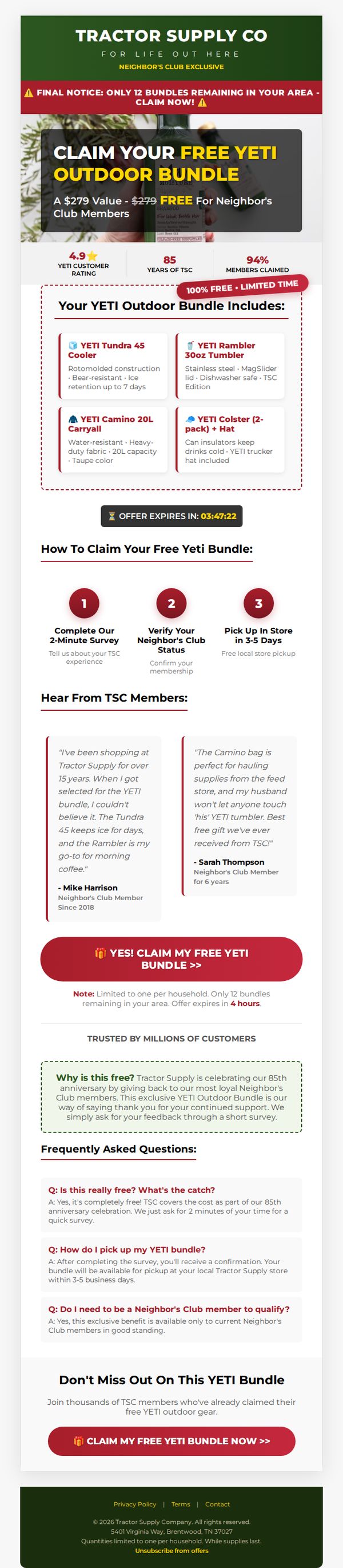

1. MapMyRide : Your YETI Entry Is Almost Complete
Objective
This email aims to drive immediate action from Tractor Supply Co.’s Neighbor’s Club members by offering a limited-time free YETI outdoor bundle in exchange for completing a short survey and verifying membership, creating urgency through scarcity and social proof.
Why this works
The email brilliantly leverages urgency by highlighting a countdown timer and limited regional availability, turning passive readers into active claimers by making them feel they’re racing against time to secure a high-value, exclusive reward.
How to implement
By featuring real customer testimonials that specifically name products and describe personal use cases, the campaign builds authentic social proof that reassures prospects the offer is legitimate and the gear is genuinely loved by long-term members.
Pro Tip
Add a visual progress bar or checkmark animation next to each of the three claim steps to reinforce completion momentum and reduce drop-off during the survey and verification phase. • Include a small map pin or store locator link near the 'Pick Up In Store' step to help users instantly identify their nearest location, reducing friction for those unfamiliar with local Tractor Supply Co. branches.
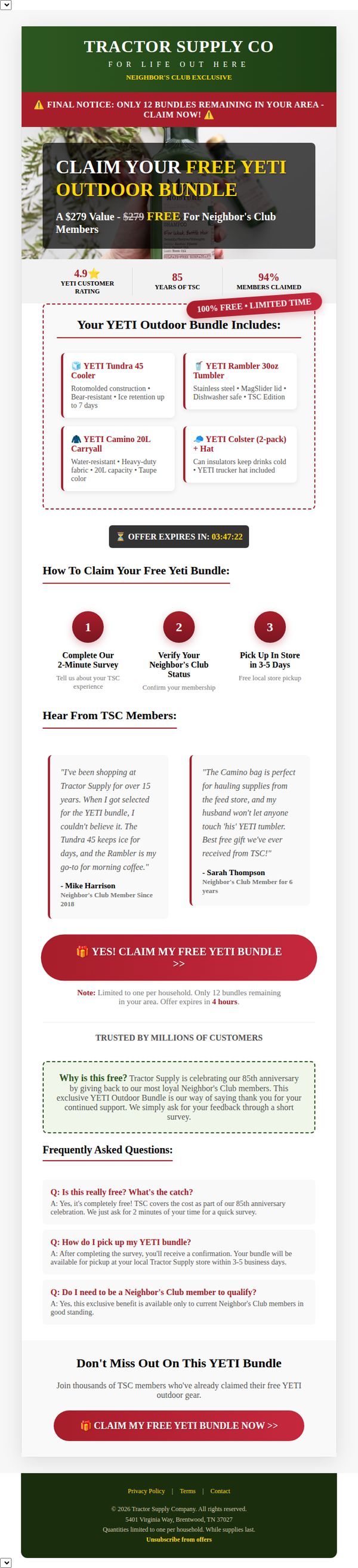
2. MapMyRun : You Were Just Moved to Priority
Objective
This email aims to drive immediate action from Tractor Supply Co.’s Neighbor’s Club members by offering a high-value, time-sensitive free YETI bundle in exchange for completing a short survey and verifying membership, leveraging exclusivity and social proof to boost conversion.
Why this works
The email brilliantly frames a free product bundle as a reward for loyalty, not a sales tactic, making members feel valued rather than targeted, a subtle but powerful psychological shift that increases perceived fairness and reduces skepticism.
How to implement
By including real member testimonials that highlight specific product benefits and emotional attachment, the campaign builds authentic social proof that reassures new claimers they’re not just getting a random freebie but a coveted, community-approved prize.
Pro Tip
Add a visual progress bar or step indicator after the user clicks the CTA to show where they are in the 3-step claiming process, reducing drop-off by managing expectations and reinforcing momentum. • Include a small map pin or store locator link near the pickup instructions to help users quickly identify their nearest Tractor Supply location, reducing friction in the final redemption step.
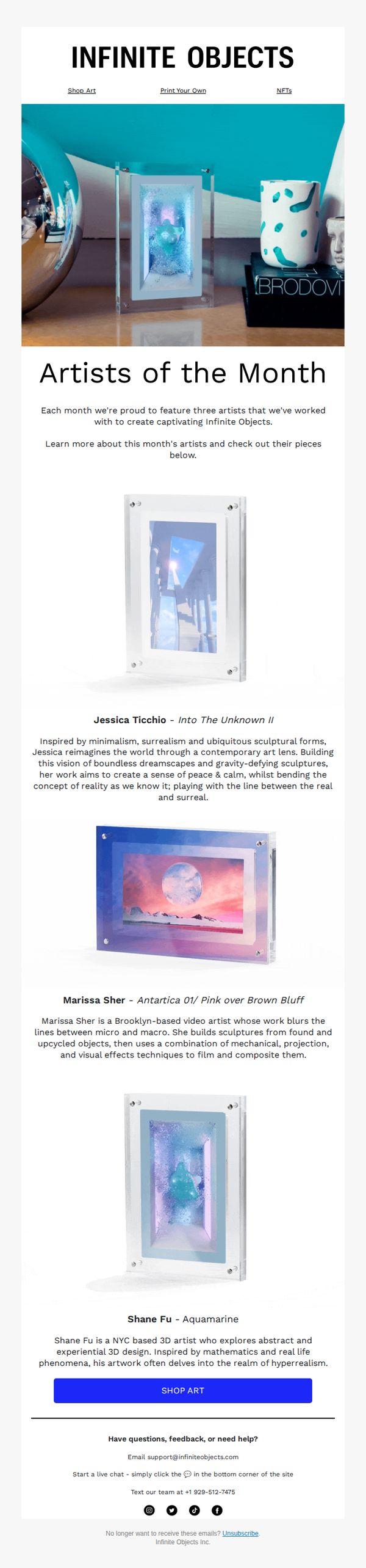
3. Infinite Objects: IO Artists of the Month 🖼️
Objective
To spotlight and celebrate three featured artists who collaborated with Infinite Objects, driving engagement and encouraging recipients to explore and purchase their limited-edition art pieces through a compelling visual and narrative presentation.
Why this works
The email brilliantly humanizes the brand by spotlighting artists with rich, personality-driven bios that connect emotionally while subtly reinforcing the premium, curated nature of the Infinite Objects collection.
How to implement
Each artist’s work is presented with a clean, gallery-style layout that lets the art breathe visually, making the product feel exclusive and museum-worthy without overwhelming the viewer with clutter or sales pressure.
Pro Tip
Add a subtle visual cue or hover effect on each artist’s image to indicate interactivity, encouraging clicks to their individual product pages without relying solely on the final CTA button. • Include a short testimonial or social proof snippet under each artist’s bio, such as ‘Featured in Vogue’ or ‘Limited edition sold out in 48 hours’, to build urgency and credibility around each piece.
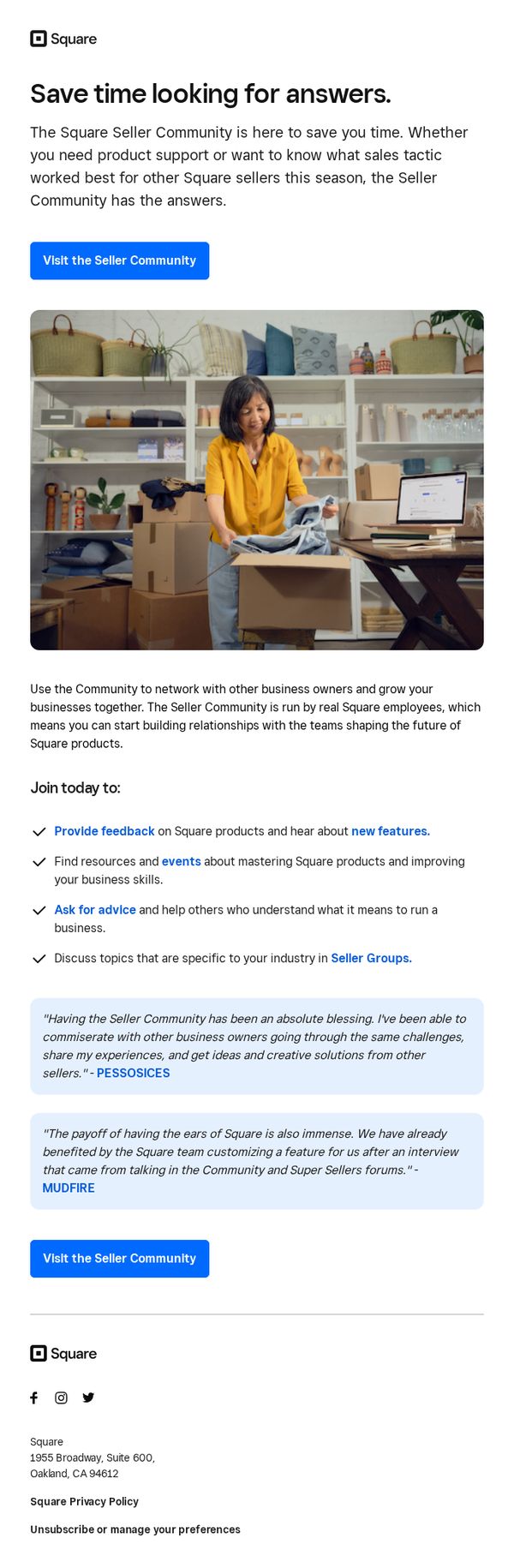
4. Square: Answers to all of your Square questions
Objective
This email aims to drive engagement with Square’s Seller Community by positioning it as a time-saving, peer-supported resource for product help and sales strategy insights, encouraging sellers to join and contribute to a collaborative ecosystem.
Why this works
The email brilliantly frames the Seller Community not just as a support channel but as a peer-driven growth engine, making users feel they’re joining a movement rather than just accessing help, which increases emotional buy-in and participation.
How to implement
By featuring real testimonials from recognizable business names like PESSOSICES and MUDFIRE, the email builds instant credibility and social proof, showing tangible outcomes that motivate sellers to believe their own challenges can be solved through community engagement.
Pro Tip
Add a subtle countdown or urgency cue near the CTA, such as 'Join 10,000+ sellers this month,' to nudge procrastinators and reinforce the community’s active, growing nature. • Include a brief visual icon or mini-illustration next to each bullet point (e.g., a speech bubble for 'Ask for advice') to improve scannability and reinforce each benefit with intuitive visual cues.
5. beehiiv : 🔴 The $100K creator playbook
Objective
This email aims to position beehiiv as an essential partner for creators aiming to monetize and scale beyond content production by sharing data-driven insights and real-world case studies from top-earning creators. It seeks to convert readers into subscribers or customers by demonstrating the platform’s value in audience ownership, revenue generation, and community building.
Why this works
The email brilliantly frames monetization not as a side hustle but as a strategic business function, using hard data from 427 creators to validate that audience ownership, team collaboration, and B2B positioning are the true levers of six-figure success, making the insights feel both urgent and actionable.
How to implement
By spotlighting real creators like Lex Roman, Sydney Graham, and Brandon Smithwick, the email transforms abstract strategies into tangible playbooks, allowing readers to mentally map their own path to revenue by emulating proven tactics, a powerful psychological nudge that builds trust and reduces perceived risk.
Pro Tip
The primary CTA 'Subscribe today...' is buried at the bottom and lacks urgency or direct alignment with the email’s core theme of monetization, it should be repositioned above the fold with stronger value framing like 'Get the $100K Creator Playbook + Weekly Monetization Tactics' to match reader intent. • While the email features strong case studies, it misses an opportunity to personalize the value by adding a dynamic line like 'Creators like you earned $31K+ by owning their audience, here’s how you can too,' which would bridge data with individual aspiration and increase emotional resonance.
6. ActiveCampaign : New to ActiveCampaign: Your February updates

Objective
This email aims to inform existing and potential users about ActiveCampaign’s latest product updates for February, emphasizing AI enhancements and new automation capabilities to drive engagement and encourage trial sign-ups. It positions the brand as innovative and user-centric by showcasing real-world applications and community support.
Why this works
The email brilliantly frames product updates as strategic business accelerators, not just feature drops, by tying each innovation directly to user outcomes like smarter agents, higher accuracy, and verified trust, making technical upgrades feel personally valuable.
How to implement
By embedding video previews and conversational UI examples, the campaign transforms abstract AI capabilities into tangible, relatable workflows, helping users visualize how they’d use the tools without needing to navigate away or decode jargon.
Pro Tip
The CTA 'Start your free trial' appears only once near the bottom, adding a secondary, sticky CTA button after the first major product highlight would capture early interest before users scroll past key value propositions. • While the email explains AI features well, it lacks a clear visual hierarchy or progress indicator showing how updates build on each other; adding numbered sections or a mini roadmap would help users mentally map the evolution of capabilities.
7. Mbition: Your Career Inspiration for July Inside
Objective
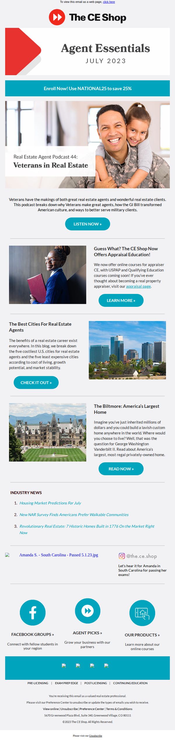
This email aims to inspire and educate real estate professionals by delivering curated industry content, promoting educational courses, and highlighting career-relevant stories, all while encouraging immediate engagement through CTAs that drive traffic to podcasts, blogs, and course pages.
Why this works
The email opens with a powerful emotional hook, featuring a veteran and child, which instantly humanizes the brand and connects career growth with personal values, making the content feel purpose-driven rather than purely promotional.
How to implement
Each content block is paired with a visually distinct CTA button that matches the section’s intent, whether it’s listening, learning, or reading, which reduces decision fatigue and guides the reader smoothly through multiple conversion paths without overwhelming them.
Pro Tip
Add a countdown timer or urgency indicator near the 'Enroll Now!' CTA to reinforce the limited-time discount and increase immediate conversion, especially since the offer is time-sensitive and tied to a national promotion. • Reorder the content blocks to lead with the most high-intent offer, the appraisal education, after the hero section, since it’s the only direct revenue driver, and move the blog-style content lower to maintain momentum toward conversion.
8. Bon Appétit: The entire shopping team is obsessed with this kitchenware

Objective
This email aims to drive engagement and sales by showcasing kitchenware and pantry essentials personally vetted by Bon Appétit’s shopping team, leveraging editorial credibility and product obsession to inspire purchases. It also seeks to grow the subscriber base for ongoing shopping guidance.
Why this works
By spotlighting products the entire shopping team is personally obsessed with, Bon Appétit transforms editorial endorsement into emotional persuasion, making readers feel they’re getting insider access to curated, trusted finds rather than just another product list.
How to implement
The email smartly blends lifestyle imagery with product context, like cupcakes and colorful enamelware, creating an aspirational yet approachable mood that invites readers to imagine these items in their own kitchens, thereby increasing perceived value and purchase intent.
Pro Tip
Add a subtle countdown or limited-availability indicator near the 'SHOP OUR PICKS' CTA to create urgency, since the email highlights trending or editor-favorite items that could benefit from perceived scarcity to boost immediate conversions. • Integrate a small visual cue or icon next to each product in the 'Recently Put to the Test' section to indicate whether it’s a bestseller, editor’s pick, or new arrival, this adds instant context and helps readers prioritize what to explore first.
9. Thareja: Apple Makes Its Second-Largest Acquisition Ever With Q.Ai To Advance “Silent Speech” Ai Technology

Objective
This email aims to engage AI enthusiasts by delivering timely, high-value industry news and insights while subtly promoting Thareja AI’s platform through educational content and a targeted subscription offer. It seeks to position Thareja as a thought leader and drive conversions via a limited-time bundle deal.
Why this works
The email brilliantly blends breaking industry news with practical AI education, making complex topics like procedural generation accessible through relatable examples like cooking recipes, which keeps readers engaged while subtly showcasing the platform’s capabilities.
How to implement
By embedding a time-sensitive, value-driven offer within a content-rich newsletter, the campaign avoids sounding salesy and instead positions the product as a natural next step for readers already invested in the educational journey, increasing conversion likelihood without disrupting the experience.
Pro Tip
The CTA 'Try Thareja AI Chat' appears multiple times but lacks visual hierarchy, consider using a contrasting color or larger button size in the offer section to make it stand out more prominently against the white background and increase click-through rates. • The 'AI Training: AI Tutorial of the Day' section is rich in detail but could benefit from a short video or animated GIF demonstrating the recipe-to-algorithm transformation, which would reduce cognitive load and increase engagement for visual learners.
10. Architectural Digest: These 35 Kitchen Cabinet Colors Will Stand the Test of Time

Objective
This email aims to drive engagement with Architectural Digest’s premium content by highlighting visually compelling, design-forward stories that appeal to interior design enthusiasts, while also promoting a limited-time subscription offer to convert readers into paying subscribers.
Why this works
The email strategically leads with high-impact, emotionally resonant imagery from iconic homes to immediately capture attention and establish credibility, making readers feel they’re being granted exclusive access to world-class design stories.
How to implement
By embedding a bold, time-sensitive subscription offer mid-email, Architectural Digest capitalizes on peak reader interest, right after they’ve been hooked by stunning visuals, turning passive scrollers into potential paying customers without disrupting the editorial flow.
Pro Tip
The subscription CTA is visually buried within a pink banner that clashes with the editorial tone; repositioning it as a sticky footer bar or floating button would increase visibility without compromising the aesthetic cohesion of the design. • The repeated use of identical 'CONTINUE READING' CTAs for every article reduces urgency and personalization; tailoring the button text to each story (e.g., 'See the Cabinet Colors Designers Swear By') would better align with user intent and boost click-through rates.