Proven Product Highlight email designs you can use from Our Place



1. Early access to wonder(ful) Lavender 💜
Objective
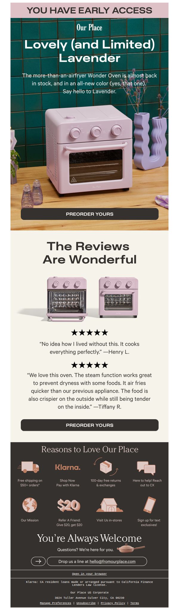
This email aims to drive early preorders for the limited-edition Lavender Wonder Oven by creating urgency and social proof through customer reviews and exclusive access messaging. It positions the product as both desirable and scarce to motivate immediate action.
Why this works
The email brilliantly leverages scarcity and exclusivity by announcing early access to a limited-edition color, turning a product restock into a VIP event that compels immediate action from loyal customers.
How to implement
Customer testimonials are strategically placed with star ratings and real names to build trust and credibility, transforming social proof into a persuasive tool that reassures buyers about performance and value.
Pro Tip
Add a countdown timer or stock indicator near the CTA to amplify urgency, since the 'limited' claim lacks tangible proof of scarcity in the current layout. • Include a brief bullet list of key features or benefits under the hero section to quickly answer 'why buy now' before the user scrolls to reviews.
2. Sunday Scaries anyone?
Objective
This email aims to drive urgency and conversion by positioning the end of summer as a moment to seize deep discounts on popular and new cookware bundles. It encourages immediate browsing and purchasing by framing the sale as the season’s final major event.
Why this works
The email brilliantly ties seasonal emotion, 'Sunday Scaries' and 'Goodbye Summer', to a limited-time sale, making the discount feel like a comforting ritual rather than just a transactional offer, which deepens psychological resonance with the audience.
How to implement
By showcasing savings as bold dollar amounts above each product instead of percentages, the campaign makes value instantly tangible and emotionally compelling, helping shoppers visualize real money saved rather than abstract discounts that require mental math to appreciate.
Pro Tip
Add a countdown timer near the hero section to reinforce urgency, since the sale end date (Sept 6) is buried in the footer and not visually prominent enough to drive immediate action. • Reorder the product grid to lead with the highest-value bundles (e.g., Save $304) at the top, since the current layout buries the most compelling offers beneath smaller savings, potentially reducing conversion momentum.
3. Trisha, Your Black Friday Savings Are Waiting
Objective
This email aims to drive immediate Black Friday purchases by highlighting limited-time discounts and personalized loyalty rewards, while encouraging account logins to unlock additional savings. It positions the sale as the brand’s biggest of the year to create urgency and exclusivity.
Why this works
The email brilliantly personalizes the offer by addressing the recipient by name and tying loyalty rewards directly to the sale, making the discount feel exclusive and earned rather than generic, which boosts emotional engagement and conversion likelihood.
How to implement
By segmenting products into intuitive gift categories like 'For The Taste Maker' and 'For The Multitasker,' the email simplifies decision-making for shoppers overwhelmed by choice, turning browsing into targeted gifting with clear emotional resonance and purpose.
Pro Tip
Add a countdown timer near the hero section to visually reinforce the urgency of the Black Friday sale, which could increase conversion by creating real-time scarcity that complements the 'biggest sale of the year' messaging. • Include a brief testimonial or social proof snippet under the product grid (e.g., 'Over 10,000 customers bought this set last week') to build trust and reduce hesitation for first-time buyers considering high-ticket items like cookware sets.
4. Very-special, very-limited.
Objective
This email aims to drive immediate Black Friday purchases by highlighting limited-edition cookware sets at deeply discounted prices, while leveraging urgency and exclusivity to convert holiday shoppers into buyers before inventory runs out.
Why this works
The email brilliantly frames each product set as a holiday lifesaver, not just cookware, but curated solutions for stress-free hosting, which emotionally aligns with the recipient’s seasonal pain points and makes the purchase feel necessary, not optional.
How to implement
By showcasing real price slashes with strikethroughs and bold new prices, the campaign visually reinforces value perception, making the discounts feel tangible and urgent, a tactic that transforms passive browsing into decisive buying behavior during high-competition sales periods.
Pro Tip
Add a visible countdown timer near the hero section to reinforce urgency, since the sale ends December 3, a dynamic timer would heighten FOMO and push procrastinators toward immediate action. • Include a short customer testimonial or social proof beneath each product set to build trust, for example, a quote like 'This duo saved my Thanksgiving!' would validate the product’s real-world utility and reduce purchase hesitation.
5. This Is It
Objective
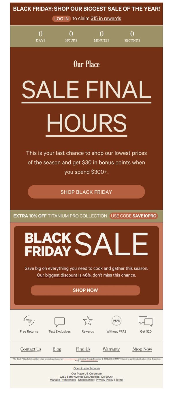
This email aims to drive urgency and last-minute Black Friday purchases by highlighting final sale hours, exclusive discounts, and bonus rewards for spending thresholds, encouraging immediate action before the sale ends.
Why this works
The email masterfully combines urgency with reward by framing the final hours as a last chance to unlock both deep discounts and bonus points, turning time pressure into a dual incentive that motivates immediate spending.
How to implement
By spotlighting a specific product collection with an extra discount code, the campaign creates a sense of exclusivity and targeted value, making shoppers feel they’re accessing a special tier of savings beyond the general sale.
Pro Tip
Add a countdown timer directly above the primary CTA to visually reinforce urgency, the current static '0 days' display doesn’t convey real-time pressure, which could reduce conversion momentum. • Include a small product grid or hero image of top-selling items under the 'Shop Now' button to help shoppers instantly visualize what’s on sale, reducing decision friction and increasing click-through rates.
6. See what our customers have to say.
Objective
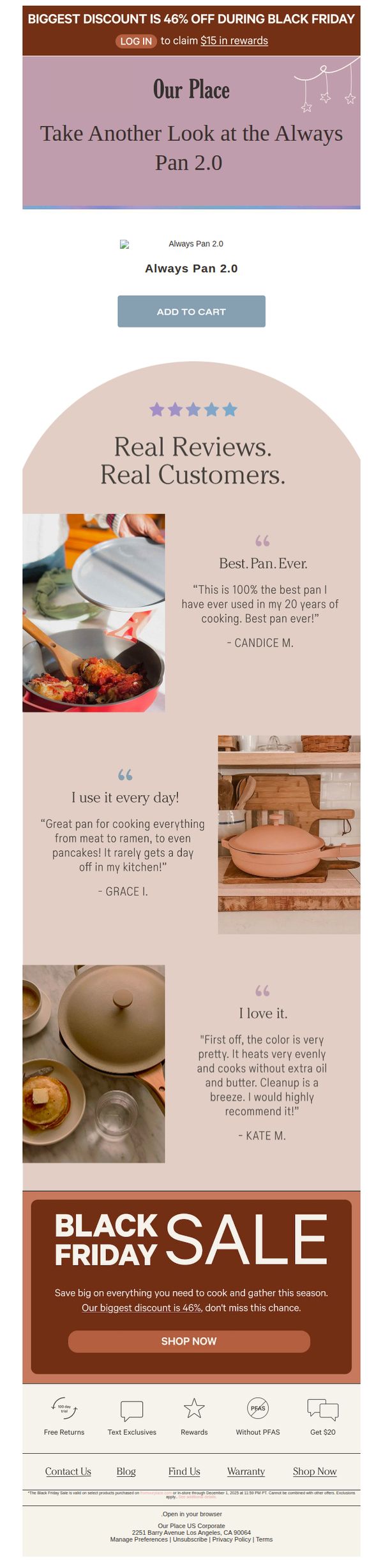
This email aims to re-engage potential buyers by showcasing authentic customer testimonials for the Always Pan 2.0 while reinforcing urgency with a Black Friday discount, encouraging immediate purchase through social proof and limited-time savings.
Why this works
The email brilliantly leverages real, emotionally resonant customer quotes that highlight specific use cases, like cooking ramen or pancakes, making the product feel indispensable in everyday life rather than just another kitchen gadget.
How to implement
By placing the Black Friday discount banner at both the top and bottom of the email, the campaign creates a visual bookend that reinforces urgency without overwhelming the reader, keeping the sale top-of-mind throughout the scroll.
Pro Tip
The 'Add to Cart' button under the product image is visually underwhelming and lacks urgency; it should be redesigned to match the bold 'SHOP NOW' CTA in the Black Friday section to create visual consistency and stronger conversion intent. • The testimonial section lacks a clear visual hierarchy, adding star ratings or customer photos next to each quote would increase credibility and make the social proof more scannable for time-pressed readers.
7. Almost summertime sadness
Objective
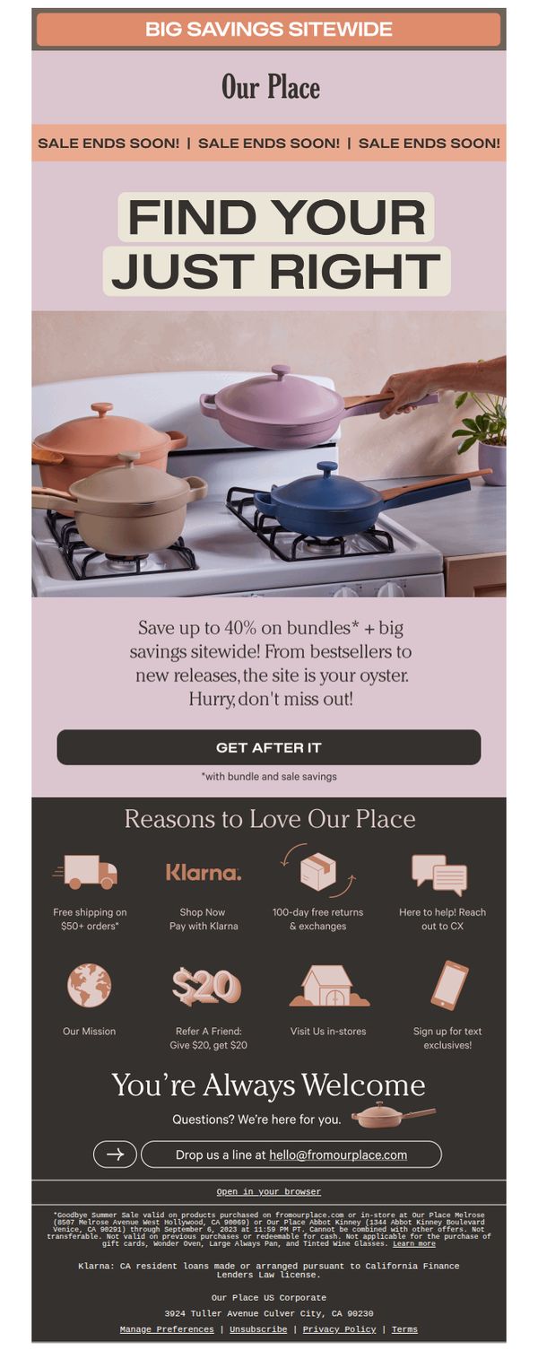
The email aims to drive urgency and conversions by promoting a limited-time sitewide sale with up to 40% off bundles, encouraging customers to shop before the sale ends while reinforcing brand trust through customer benefits and social proof.
Why this works
The email brilliantly leverages emotional timing with 'Almost summertime sadness' to create a nostalgic, relatable hook that primes shoppers to act before the season slips away, turning seasonal sentiment into sales momentum.
How to implement
By featuring a lifestyle-driven hero image with multiple colorful cookware pieces in use, the email visually communicates versatility and joy in cooking, making the products feel essential rather than optional for everyday home chefs.
Pro Tip
Add a visible countdown timer near the CTA to reinforce urgency beyond the repeated 'SALE ENDS SOON!' text, which currently feels generic and lacks real-time pressure to act immediately. • Reposition the 'GET AFTER IT' CTA button higher in the flow, ideally directly under the hero image, to reduce scroll friction and align with the emotional peak of the visual and headline, increasing click-through likelihood.
8. Once-a-Year Prices

Objective
This email aims to drive immediate Black Friday purchases by highlighting limited-time discounts and encouraging loyalty members to redeem $15 in rewards. It positions the sale as the brand’s biggest of the year to create urgency and maximize conversion during the holiday shopping season.
Why this works
The email brilliantly ties loyalty rewards to the Black Friday event, making members feel personally rewarded while subtly nudging them to log in, turning a generic sale into a personalized, high-conversion moment that feels exclusive and urgent.
How to implement
By featuring bestsellers in a clean, grid-based layout with clear product names and benefit-driven subheads, the email reduces decision fatigue and lets shoppers instantly recognize value, turning browsing into buying without overwhelming them with options or jargon.
Pro Tip
Add a visible countdown timer near the hero section to amplify urgency, since the sale ends December 1, a dynamic timer would make the limited-time nature more visceral and reduce procrastination among hesitant shoppers. • Include a small customer testimonial or social proof badge next to the 'Biggest Discount is 46%' claim to build trust, a short quote like 'Saved $50 on my cookware set!' would validate the offer and reduce perceived risk for first-time buyers.
9. 3x the brilliance 🎉
Objective
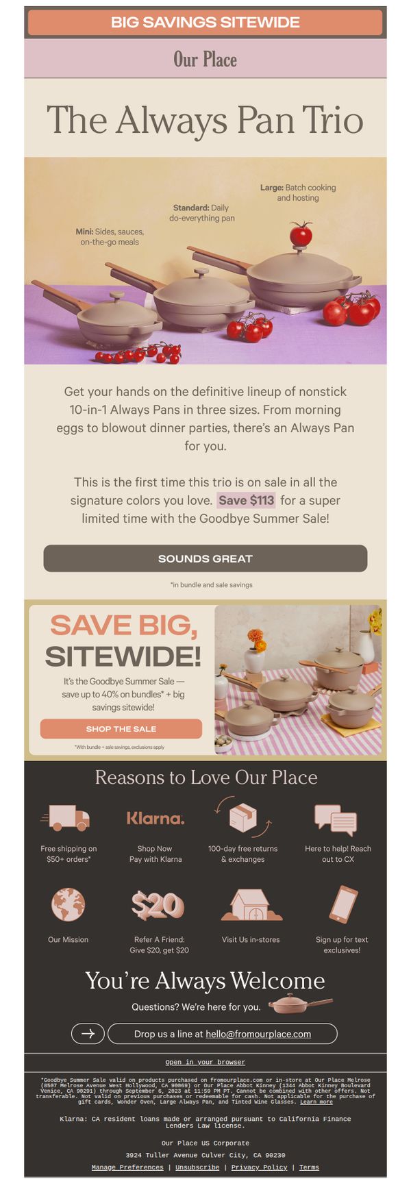
This email aims to drive immediate purchases of the Always Pan Trio by highlighting a limited-time discount and positioning the bundle as a must-have for versatile cooking. It leverages urgency and value perception to convert interest into sales during the Goodbye Summer Sale.
Why this works
The email brilliantly frames the Always Pan Trio as a lifestyle essential by mapping each size to real-world cooking scenarios, from quick sides to dinner parties, making the purchase feel intuitive and necessary rather than optional.
How to implement
By anchoring the discount to a seasonal event, the Goodbye Summer Sale, the campaign creates urgency without sounding desperate, encouraging quick decisions while tying savings to a natural consumer rhythm of seasonal transitions.
Pro Tip
The primary CTA 'SOUNDS GREAT' is vague and emotionally detached, replacing it with action-oriented text like 'Grab My Trio Before It’s Gone' would better align with the urgency and value proposition of the limited-time offer. • The hero section visually underwhelms by placing product imagery beneath the headline, flipping the layout to lead with the trio image and overlaying the headline would immediately capture attention and reinforce product desirability.
10. ⏰ Not-to-miss savings end tonight
Objective
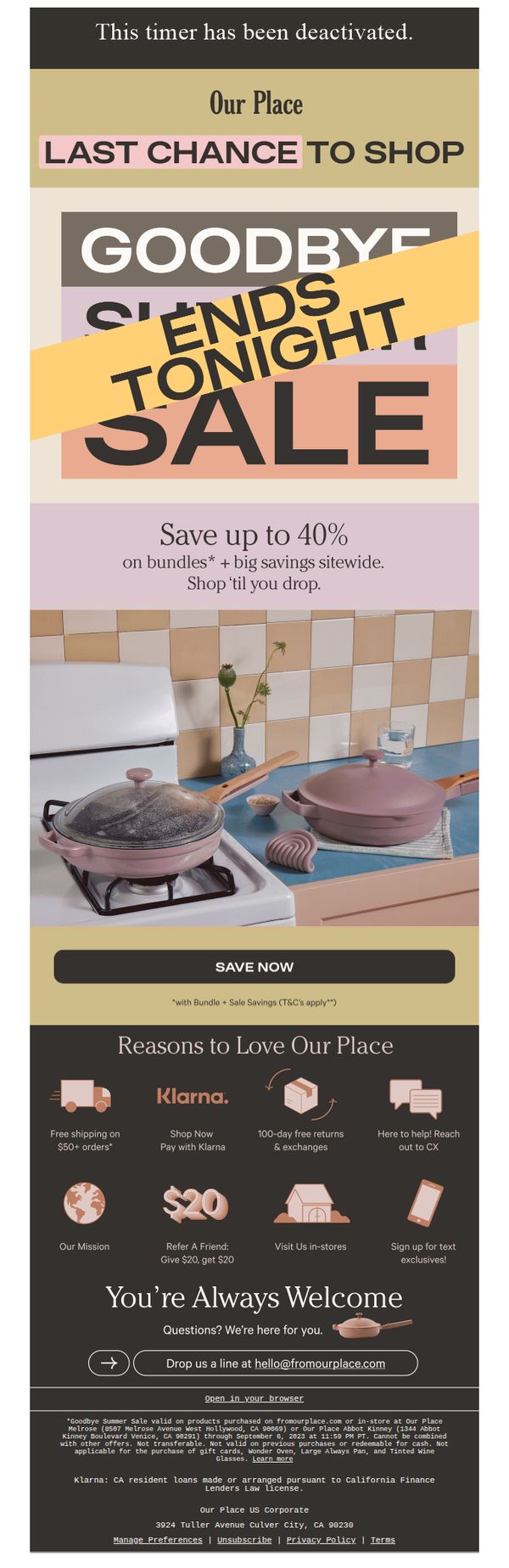
This email aims to drive immediate purchases by creating urgency around a limited-time sale ending tonight, while reinforcing brand trust through customer benefits and social proof. It encourages users to act before the discount expires by highlighting savings and seamless shopping options.
Why this works
The email masterfully combines urgency with visual hierarchy by placing a bold 'ENDS TONIGHT' banner over the sale headline, ensuring the time-sensitive message dominates the viewer’s attention without cluttering the layout.
How to implement
Instead of generic perks, it strategically lists concrete customer benefits like Klarna payments, free shipping thresholds, and 100-day returns, turning trust signals into persuasive conversion drivers that reduce purchase hesitation.
Pro Tip
The hero section’s timer is deactivated and visually misleading, replace it with a live countdown or remove it entirely to avoid eroding trust; a static 'ENDS TONIGHT' is sufficient if no real-time timer is functional. • The 'Reasons to Love Our Place' section buries the most compelling offer, '$20 Refer a Friend', among less impactful icons; reposition it as a standalone visual or highlight it with a contrasting color to boost referral conversions.