Product Highlight email gallery from real brands



1. Kalahari Resorts: Harvest the Fun: Fall Activities at Kalahari!
Objective
To drive immediate bookings and event attendance by highlighting Kalahari’s October-specific seasonal activities and exclusive fall offers, encouraging families and couples to plan a getaway before the season ends.
Why this works
The email brilliantly ties seasonal excitement to concrete offers, like the Fall for Adventure Rate, making the emotional pull of autumn fun actionable with clear financial incentives that drive urgency.
How to implement
By visually segmenting each activity with its own image, headline, and CTA, the email respects the reader’s scanning behavior while allowing them to self-select what resonates most, increasing conversion potential across diverse audience segments.
Pro Tip
Add a countdown timer next to the Fall for Adventure Rate offer to amplify urgency, since the deadline (November 14) is specific and time-sensitive, this visual cue can nudge hesitant bookers to act faster. • Reposition the Spa Kalahari section higher in the email or visually balance it with Gorilla Grove, currently, the spa content feels secondary despite being a high-margin, relaxing experience that could appeal to adult-focused travelers.
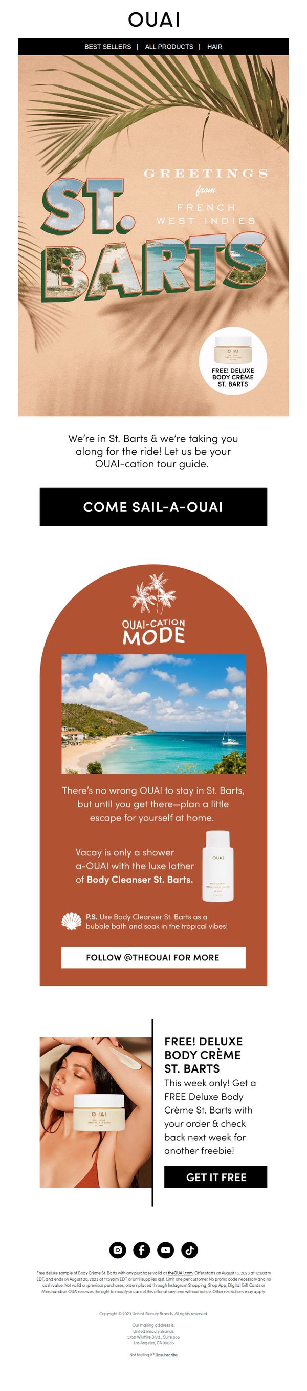
2. OUAI - UK: FREE! Deluxe Body Crème St. Barts
Objective
This email aims to drive immediate purchases by offering a free deluxe sample of Body Crème St. Barts with any order, while evoking a tropical escape to emotionally engage customers and reinforce brand lifestyle appeal.
Why this works
The email brilliantly ties the product to a destination fantasy, St. Barts, making the free sample feel like a vacation souvenir rather than just a promotional giveaway, which elevates perceived value and emotional resonance.
How to implement
By framing the offer as a limited-time ‘this week only’ perk with a teaser of ‘another freebie next week,’ the campaign creates urgency while also encouraging repeat engagement, turning a single transaction into a potential customer journey.
Pro Tip
Add a countdown timer near the CTA to visually reinforce the ‘this week only’ urgency, which could increase conversion by making the time-sensitive nature of the offer more tangible and immediate. • Include a small visual icon or badge next to the product image indicating ‘Free with any order’ to reduce cognitive load and ensure the offer’s condition is instantly understood without reading the full text.
3. Charlotte Tilbury - UK: 9X More VOLUME After Just ONE Coat 🖤
Objective
This email aims to drive immediate purchases of Charlotte Tilbury’s new Exagger-Eyes Volume Mascara by highlighting its dramatic, one-coat volume effect and long-wear performance, while leveraging social proof and Hollywood-inspired allure to build desire and trust.
Why this works
The email opens with a bold, emotionally charged headline, 'IT’S NOT AN EXAGGERATION, IT’S EXAGGER-EYES!', that instantly grabs attention by turning the product name into a playful, memorable promise of transformation, making the benefit feel personal and undeniable.
How to implement
Instead of just listing features, the campaign translates technical specs like '9X more volume' and 'smudge-proof formula' into vivid, benefit-driven visuals and punchy checkmark bullets that make the science feel luxurious, trustworthy, and effortlessly glamorous, perfect for beauty shoppers seeking Hollywood-level results.
Pro Tip
Add a subtle countdown timer or limited-edition badge near the 'SHOP NOW' CTA to create urgency, since the email currently lacks any time-sensitive incentive despite promoting a 'NEW' product, which could boost conversion rates. • Reposition the second 'SHOP NOW' button higher in the email, ideally after the first three benefit bullets, to reduce scroll friction, as users may disengage before reaching the CTA buried below multiple sections.
4. Made In: Last Call for Delivery by Labor Day
Objective
This email aims to drive last-minute purchases of grilling gear by creating urgency around Labor Day delivery cutoffs, while also positioning Made In as the go-to brand for high-quality, chef-tested tools and recipes to elevate summer cookouts.
Why this works
The email brilliantly ties product utility to a cultural moment, Labor Day grilling, making the purchase feel timely, relevant, and emotionally resonant rather than just transactional.
How to implement
By pairing each product with a specific cooking benefit, like ‘crispy, flavorful sears’ or ‘flame-kissed flavor’, the copy transforms features into sensory experiences that help customers visualize success on their own grill.
Pro Tip
Add a visible countdown timer near the hero section to reinforce urgency around the Labor Day delivery cutoff, making the time-sensitive offer more visceral and harder to ignore. • Include a short customer testimonial or social proof snippet under each product to build trust and reduce hesitation, especially since high-ticket kitchen gear requires more validation before purchase.
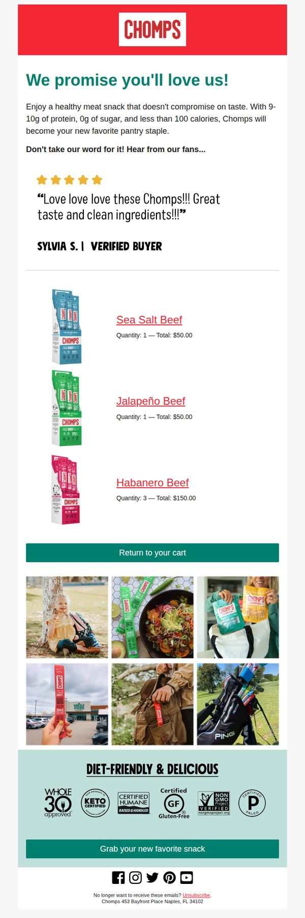
5. Chomps: We Promise You'll Love Us!
Objective
This email aims to reassure potential customers about the quality and taste of Chomps meat snacks by highlighting nutritional benefits and social proof, while encouraging cart completion through a clear return-to-cart CTA.
Why this works
The email opens with a bold, benefit-driven promise, 'We promise you’ll love us!', immediately addressing customer hesitation and building trust before diving into product details or social proof.
How to implement
By featuring a verified buyer testimonial with five stars and enthusiastic language, the campaign leverages authentic social validation to reduce perceived risk and increase conversion likelihood for new customers.
Pro Tip
Add a countdown timer or urgency indicator near the 'Return to your cart' CTA to nudge hesitant shoppers toward immediate action, especially since the cart appears to contain multiple items already. • Reposition the 'Diet-Friendly & Delicious' section higher in the email, perhaps directly after the testimonial, to reinforce key nutritional claims before showcasing product images, strengthening the persuasive flow.
6. Tata Harper: Our Favorite Skincare Ritual

Objective
This email aims to drive sales of Tata Harper’s limited-edition double cleanse bundles by positioning them as essential rituals for achieving fresh, balanced skin, while leveraging seasonal urgency and skin-type personalization to encourage immediate purchase.
Why this works
The email brilliantly frames skincare as a ritual rather than a routine, tapping into emotional self-care desires while subtly elevating the perceived value of the double cleanse bundles as transformative experiences, not just products.
How to implement
By segmenting product bundles by skin type with clear, benefit-driven copy, the email removes decision fatigue and speaks directly to the reader’s unique needs, making the offer feel personalized and highly relevant without requiring user input.
Pro Tip
Add a subtle countdown timer near the CTA or offer section to reinforce the limited-edition nature of the bundles and create urgency without disrupting the serene aesthetic of the email. • Include a short testimonial or user result snippet under each skin-type bundle to build social proof and validate the claimed benefits, especially since the audience may be skeptical of ‘fresh, balanced skin’ claims without third-party validation.
7. June Shine: Vacay mode is always within reach

Objective
This email aims to drive immediate purchases by positioning June Shine beverages as the perfect solution for relaxing, vacation-inspired moments, especially timed around the Memorial Day weekend. It encourages customers to stock up on variety packs and individual flavors to enjoy stress-free sips at home or on the go.
Why this works
The email brilliantly frames the product as an 'instant escape,' tapping into emotional desire for relaxation and vacation vibes, even when customers aren’t traveling, which makes the offer feel urgent and emotionally resonant.
How to implement
By organizing products into themed variety packs and flavor categories like 'Hard Kombucha' and 'Spirits,' the email simplifies decision-making for customers while subtly encouraging larger basket sizes through curated bundles.
Pro Tip
Add a subtle countdown timer or urgency indicator near the CTA to reinforce the Memorial Day Weekend deadline, which would increase perceived scarcity and motivate faster action. • Include a short customer testimonial or social proof beneath the hero section to build trust, especially since the email positions the product as a lifestyle choice, not just a drink.
8. AERIN: 5 Essentials That Make a House a Home

Objective
This email aims to inspire customers to elevate their living spaces by showcasing AERIN’s curated interior essentials that transform a house into a warm, personalized home. It encourages exploration and purchase of lifestyle-driven home decor items through aspirational storytelling and visual elegance.
Why this works
The email masterfully frames home decor as emotional storytelling tools, picture frames, vases, and lighting aren’t just objects, but vessels for memory, warmth, and personal identity, making the purchase feel deeply meaningful rather than transactional.
How to implement
Each product category is introduced with a mini-narrative that ties function to feeling, like how sculptural vases become ‘foundations for flowers’ or ‘sculptural accents’, which elevates perceived value and justifies premium pricing through poetic utility.
Pro Tip
Add a subtle countdown timer or limited-edition badge near the ‘SHOP NOW’ CTA to create urgency, especially since the email promotes timeless essentials that don’t inherently feel time-sensitive, this would nudge hesitation into action. • Include a short testimonial or customer quote under one of the product sections (e.g., ‘Elegant Frames’) to add social proof, currently, the emotional appeal is strong, but real-user validation would deepen trust and reduce perceived risk.
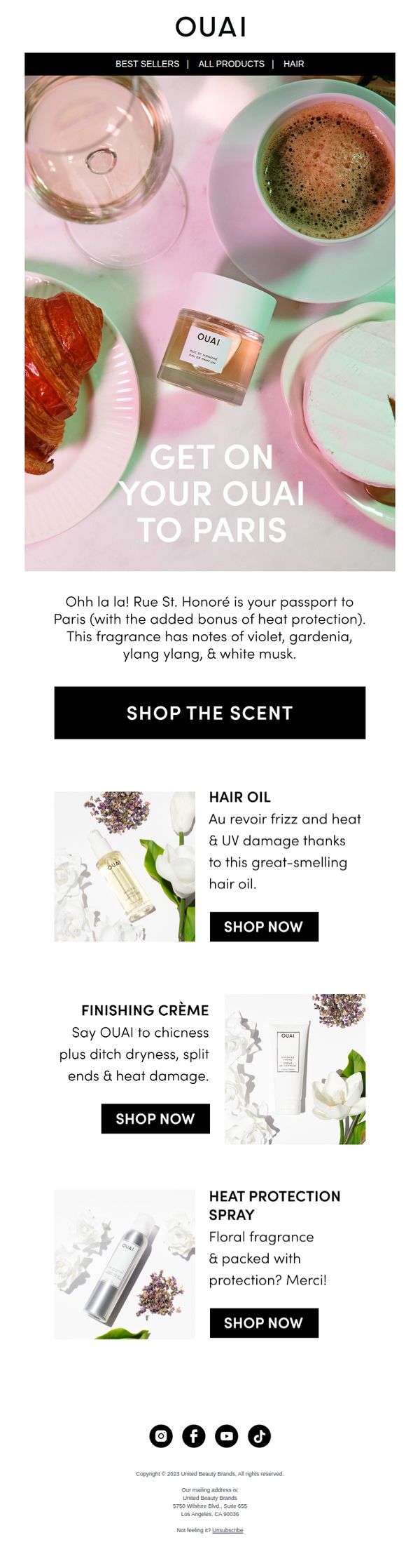
9. OUAI - UK: Your passport to Paris
Objective
This email aims to entice UK customers to explore and purchase OUAI’s Paris-inspired fragrance and complementary hair care products by evoking a luxurious, sensory experience tied to French elegance and heat protection benefits.
Why this works
The email brilliantly ties the product to a destination fantasy, Paris, making the fragrance not just a scent but a sensory escape, which elevates emotional appeal and justifies premium pricing through aspirational storytelling.
How to implement
By embedding heat protection as a bonus benefit within the fragrance’s description, the campaign smartly cross-sells functionality with luxury, appealing to practical buyers while maintaining the brand’s chic, lifestyle-driven tone.
Pro Tip
Add a subtle countdown timer or limited-edition badge near the hero section to create urgency around the Paris-themed scent, encouraging immediate clicks rather than passive browsing. • Include a customer testimonial or UGC photo near the product grid to build social proof, especially since the email leans heavily on aesthetic and sensory appeal without real-user validation.
10. Summersalt: Trending: Your Favorite Color(s) 🌈

Objective
This email aims to drive engagement and sales by showcasing Summersalt’s most popular swimwear colors in a visually appealing, shoppable format while encouraging customers to explore full outfit pairings with cover-ups. It leverages color-based browsing to simplify discovery and inspire purchases.
Why this works
The email brilliantly turns color selection into a playful, branded experience with whimsical names like 'Sea Urchin' and 'Spritz,' making product discovery feel personal and fun rather than transactional, which boosts emotional connection and click-through rates.
How to implement
By pairing each top-selling color with a lifestyle image and a direct 'Shop the Color' CTA, the email removes friction in the customer journey, transforming visual inspiration into immediate, one-click purchasing opportunities without overwhelming the user with choices.
Pro Tip
Add a subtle countdown timer or 'Limited Stock' indicator next to top-selling colors to create urgency and encourage faster decision-making, especially since color-based shopping often hinges on availability and exclusivity. • Include a short customer testimonial or social proof snippet under each color tile (e.g., 'Loved by 2K+ customers') to reinforce social validation and reduce hesitation, especially for shoppers unsure about color fit or style.