The complete retail product highlight email collection

1. The Productivity Method: Just 8 minutes to feel more organised
Objective
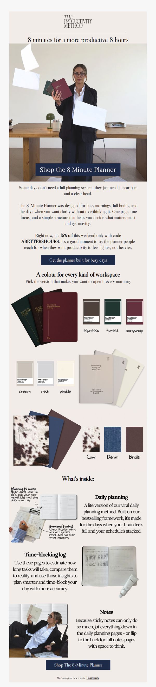
This email aims to convert overwhelmed professionals into customers by positioning the 8-Minute Planner as a simple, time-efficient solution for regaining daily clarity and productivity, especially during busy mornings or mentally cluttered days.
Why this works
The email brilliantly reframes productivity not as a complex system to master, but as a simple, 8-minute daily ritual that delivers disproportionate returns, making it feel accessible and immediately valuable to time-starved professionals.
How to implement
By showcasing the planner’s interior layout with annotated time allocations, 5 minutes for morning brain dump, 3 for evening reflection, the campaign turns abstract productivity into a tangible, time-bound ritual that builds trust through specificity and structure.
Pro Tip
Add a subtle countdown timer under the 15% off offer to create urgency and reinforce the ‘weekend only’ window, encouraging immediate action rather than deferral. • Include a micro-testimonial or social proof near the CTA, such as ‘Join 12,000+ professionals who start their day with 8 minutes of clarity’, to reduce perceived risk and amplify conversion.
2. Haworth: How can workplaces adapt to people?
Objective
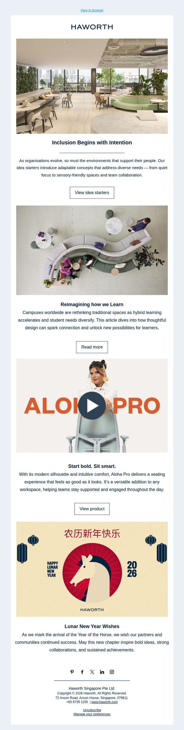
This email aims to position Haworth as a thought leader in human-centered workplace design by showcasing adaptable environments that support inclusion, learning, and well-being, while subtly promoting specific products and fostering brand loyalty through cultural celebration.
Why this works
Haworth masterfully ties workplace design to human outcomes, like inclusion and learning, making their message emotionally resonant and strategically relevant to decision-makers who care about culture, not just furniture.
How to implement
By embedding a product highlight within a broader narrative about learning environments, they avoid sounding salesy and instead position the Aloha Pro chair as a natural solution to a real, evolving workplace challenge.
Pro Tip
The CTA 'View idea starters' is buried under a long paragraph; reposition it immediately after the headline with a contrasting button color to increase click-through and align with the email’s goal of driving engagement with design concepts. • The product section for Aloha Pro lacks social proof, adding a short testimonial or usage stat (e.g., 'Used in 500+ campuses') would strengthen credibility and nudge readers from interest to action without disrupting the email’s tone.
3. France Luxe: The Spring Refresh You’ve Been Waiting For
Objective
To drive immediate engagement and sales by showcasing France Luxe’s new spring collection of hair accessories, positioning them as essential, elevated everyday staples that blend European elegance with modern functionality.
Why this works
The email masterfully frames seasonal accessories as everyday essentials by pairing soft, aspirational photography with practical product names, making luxury feel accessible and necessary for daily life.
How to implement
By featuring curated product groupings like 'Sunny Claw Clip Pack' and 'Daylight Scrunchie Pack,' the campaign encourages bundle purchases while subtly guiding customers toward coordinated, trend-driven styling choices.
Pro Tip
Add a subtle countdown timer or 'Limited Stock' indicator beneath the hero CTA to create urgency, especially since the collection is seasonal and targets trend-conscious shoppers who respond to scarcity cues. • Integrate a short testimonial or user-generated content snippet near the product grid to build social proof, as the current layout relies solely on visuals and lacks third-party validation to reinforce trust in new arrivals.
4. Watches of Switzerland: Discover Grand Seiko
Objective
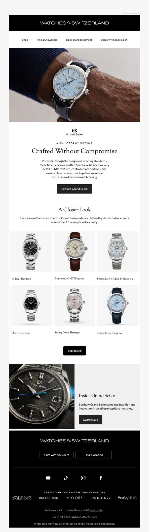
This email aims to introduce and elevate interest in Grand Seiko watches by highlighting their craftsmanship, design philosophy, and precision, while driving traffic to explore the collection online or in-store.
Why this works
The email masterfully frames Grand Seiko not just as a watch brand but as a philosophy of time, using emotionally resonant language that positions each timepiece as a testament to uncompromising craftsmanship and modern elegance.
How to implement
By showcasing six distinct models with clean, minimalist visuals and descriptive names like 'Hi-Beat Heritage' and 'Spring Drive Elegance,' the email educates the reader while subtly guiding them toward personal preference and emotional connection.
Pro Tip
Add a subtle countdown timer or limited-edition badge near the 'Explore Grand Seiko' CTA to create urgency and elevate perceived exclusivity, especially since luxury watch buyers respond well to scarcity cues. • Include a short testimonial or quote from a horology expert or satisfied customer near the product grid to build social proof and credibility, reinforcing the 'exceptional accuracy' claim with third-party validation.
5. Jellycat: They're back (with tales to tell)
Objective
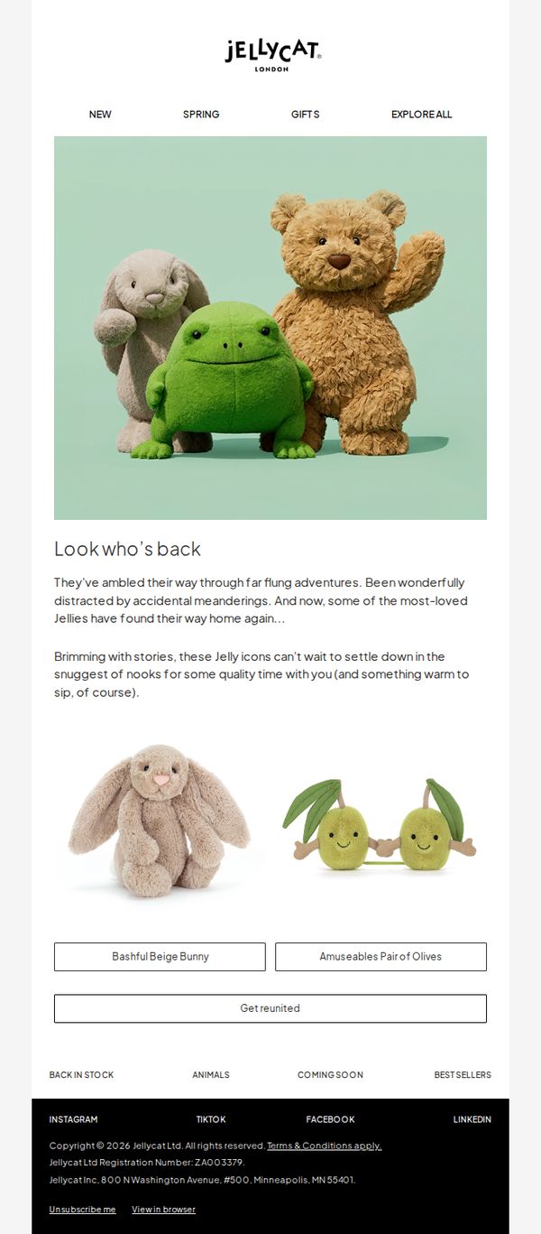
To re-engage customers by announcing the return of popular Jellycat plush toys with a whimsical narrative that evokes nostalgia and emotional connection, encouraging immediate purchase through a clear CTA.
Why this works
The email masterfully personifies the plush toys with a charming backstory of wandering adventures, transforming a simple restock announcement into an emotionally resonant reunion that taps into customer attachment and nostalgia.
How to implement
By using soft, pastel tones and minimalist layout, the design creates a calming, inviting atmosphere that mirrors the comfort and warmth associated with Jellycat toys, subtly reinforcing the brand’s emotional value proposition.
Pro Tip
Add a subtle countdown timer or 'Limited Stock' indicator near the CTA to create urgency, since the email’s narrative implies scarcity through the 'they’re back' framing but doesn’t visually reinforce it. • Include a small testimonial or customer quote beneath the hero image to validate the emotional appeal, e.g., 'My daughter cried when we found Bashful Bunny again!', to strengthen social proof and emotional resonance.
6. Jellycat: Fashion’s most forward accessories
Objective
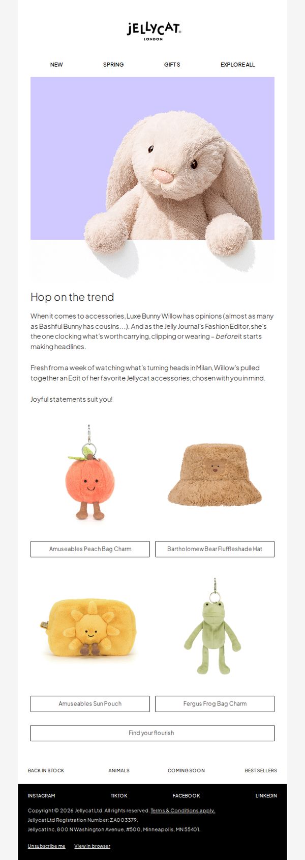
To position Jellycat accessories as fashion-forward must-haves by leveraging a playful editorial persona, encouraging recipients to explore and purchase curated items that blend whimsy with trend relevance.
Why this works
The email brilliantly personifies a plush character as a fashion editor, lending charm and authority to product curation while making the brand feel alive and editorially relevant to trend-conscious shoppers.
How to implement
By framing accessories as fashion statements rather than just toys, the campaign elevates perceived value and broadens appeal to adult collectors and gift-givers who seek playful sophistication in everyday items.
Pro Tip
Add a subtle countdown or limited-edition tag near the CTA to create urgency, since the editorial tone implies exclusivity, reinforcing the 'fashion trendsetter' angle with scarcity psychology. • Include a short testimonial or user-generated photo snippet beneath one product to build social proof, especially since the email targets fashion-savvy audiences who rely on peer validation before purchasing playful accessories.
7. Terrabis: More cheer, less spend! Holiday deals are in. 🎄

Objective
This email aims to drive holiday season sales by promoting limited-time cannabis product deals, daily doorbuster offers, and a PS5 giveaway to incentivize immediate purchases and store visits. It also seeks to build excitement and loyalty through gamified shopping experiences and exclusive product access.
Why this works
The email brilliantly layers urgency and exclusivity by combining time-bound holiday deals with a daily doorbuster calendar, turning routine shopping into a festive, gamified event that rewards early birds and repeat visitors.
How to implement
By anchoring the campaign around a high-value PS5 giveaway with clear, tiered entry mechanics tied to specific brand purchases, the email transforms transactional behavior into a loyalty-building activity that encourages higher basket sizes and brand exploration.
Pro Tip
The PS5 giveaway section repeats entry rules twice with nearly identical wording, consolidating this into one clear, scannable list with visual icons would reduce redundancy and improve message clarity without losing incentive detail. • The 'Penny Item Doorbuster Schedule' lacks visual hierarchy, adding color-coded day labels or a progress bar showing how many days remain would enhance urgency and help users quickly identify which deals are active or upcoming.
8. CPAP.com : Spring Break Essentials: Travel CPAPs Ready to Go
Objective
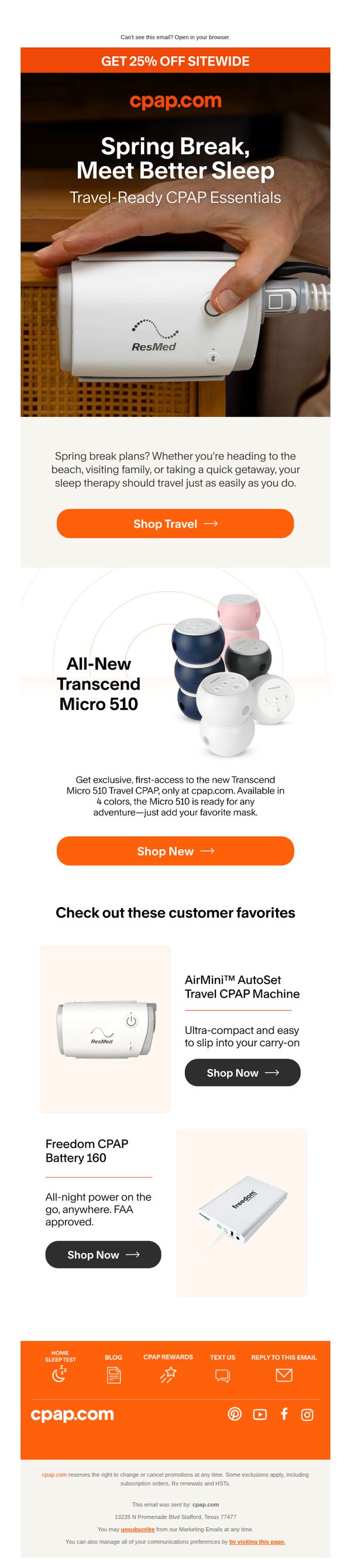
This email aims to drive sales of travel-friendly CPAP devices by aligning with spring break travel plans, encouraging users to prioritize sleep therapy on the go while promoting a site-wide 25% discount to create urgency and value.
Why this works
The email brilliantly ties CPAP usage to seasonal travel by positioning sleep therapy as a non-negotiable travel essential, making the product feel indispensable rather than optional for spring breakers.
How to implement
By spotlighting the new Transcend Micro 510 as an exclusive first-access product, the campaign creates perceived scarcity and novelty, which motivates early adopters and loyal customers to act before competitors catch up.
Pro Tip
Add a visual countdown timer near the CTA to reinforce the urgency of the 25% sitewide discount, making the limited-time offer feel more immediate and actionable for procrastinating buyers. • Include a short customer testimonial or review snippet under each featured product to build social proof and address unspoken concerns about portability, reliability, or battery life before the user clicks away.
9. Vograce: Don’t Hesitate! 🛍️ Your Vograce Exclusive Offer Awaits
Objective
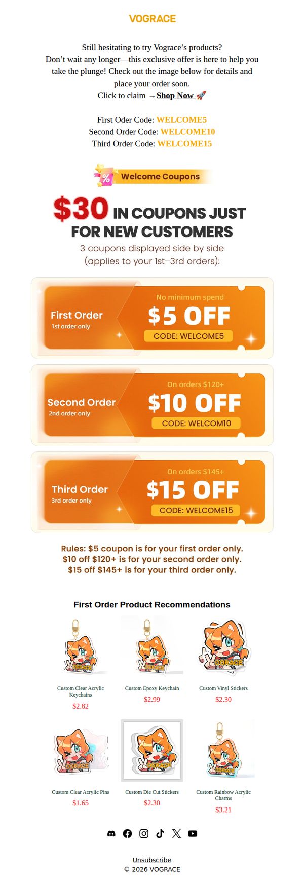
This email aims to convert hesitant first-time shoppers into customers by offering a tiered coupon incentive structure that rewards early purchases and encourages repeat buying within their first three orders.
Why this works
The email brilliantly reduces purchase hesitation by offering escalating discounts across the first three orders, which not only lowers the barrier to entry but also strategically builds customer loyalty through progressive reward tiers.
How to implement
By visually separating each coupon into distinct, colorful banners with clear spending thresholds and order-specific rules, the email makes complex promotional terms instantly digestible and encourages immediate action without confusion.
Pro Tip
Add a countdown timer or urgency indicator near the CTA to reinforce the exclusive nature of the offer and reduce procrastination, especially since the subject line already implies time sensitivity. • Include a brief testimonial or social proof snippet near the product grid to build trust with new customers who may still be skeptical despite the discount incentives.
10. Wholesale Sock Deals : St. Patrick’s Day essentials at prices you’ll love.
Objective
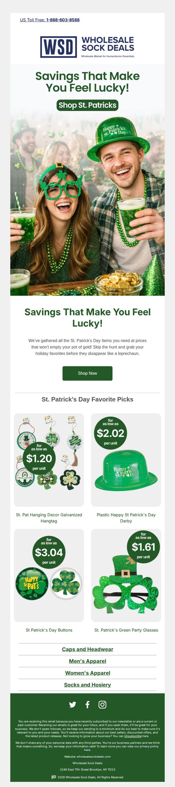
This email aims to drive immediate sales of St. Patrick’s Day-themed party supplies by highlighting bulk pricing and festive visuals, encouraging wholesale buyers to stock up before the holiday rush. It positions the brand as the go-to source for affordable, high-volume holiday essentials.
Why this works
The email brilliantly ties emotional holiday excitement to practical bulk-buying logic by using phrases like 'Savings That Make You Feel Lucky!', turning price sensitivity into festive FOMO that resonates with wholesale buyers planning large events.
How to implement
By showcasing real product visuals with clear per-unit pricing in bold green circles, the campaign removes guesswork for B2B buyers, making it effortless to compare value and justify bulk orders without needing to click through multiple pages.
Pro Tip
Add a subtle countdown timer under the hero section (e.g., 'Sale ends in 48 hours!') to amplify urgency for time-sensitive holiday buyers who need inventory fast, this would reinforce the 'grab before they disappear' message visually. • Include a mini testimonial or social proof badge near the CTA (e.g., 'Trusted by 500+ event planners') to build credibility for new wholesale buyers who may hesitate without third-party validation, especially for bulk holiday orders.