The complete Services product highlight email collection
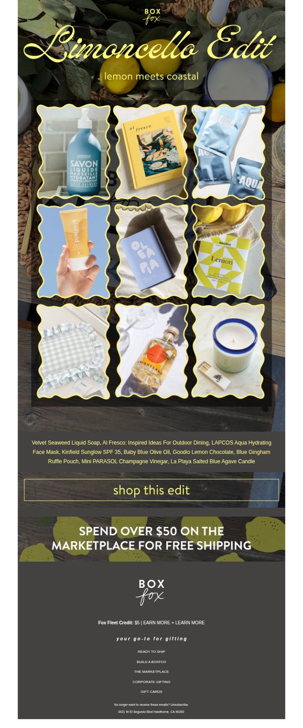
1. BOXFOX: As refreshing as a limoncello 🍋
Objective
To drive sales by showcasing a curated, theme-based product collection that evokes a refreshing, coastal summer vibe, encouraging recipients to shop the 'Limoncello Edit' while leveraging free shipping as an incentive.
Why this works
The email masterfully ties a sensory, seasonal theme, limoncello and coastal vibes, to a curated product edit, creating an emotional hook that transforms browsing into a mood-driven experience rather than a transactional one.
How to implement
By visually clustering nine diverse products within matching scalloped frames against a rustic wood backdrop, the design creates a cohesive, magazine-worthy layout that feels editorial and intentional, not just promotional.
Pro Tip
Add a subtle countdown timer or limited-edition badge near the CTA to create urgency, since the theme is seasonal and the products feel exclusive, this would nudge hesitant shoppers toward immediate action. • Include a single customer testimonial or quote near the product grid to build social proof; for example, 'My favorite summer gift box, everyone raved!' would reinforce the edit’s gifting appeal.
2. Varo: A better bank account is just a few mins away💪
Objective
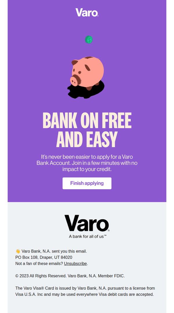
This email aims to convert partially completed applications into fully opened Varo Bank accounts by emphasizing speed, simplicity, and zero credit impact. It reassures users that finishing the process takes only minutes and reinforces brand trust with a clean, encouraging tone.
Why this works
The email leverages urgency and simplicity by framing account creation as a quick, credit-neutral task, a powerful psychological nudge for hesitant users who fear time commitment or financial risk.
How to implement
Using a friendly piggy bank illustration with a floating dollar coin subtly communicates savings and financial ease without overwhelming the user with complex banking jargon or data-heavy visuals.
Pro Tip
Add a progress bar or step indicator above the CTA to visually reinforce how little remains to complete the application, reducing perceived effort and boosting completion rates. • Include a micro-testimonial or social proof element near the CTA, such as 'Over 2M people bank with Varo', to build trust and reduce friction for users still evaluating the brand.
3. Flink FR: Découvrez notre sélection spéciale vacances ☀️ 😎
Objective
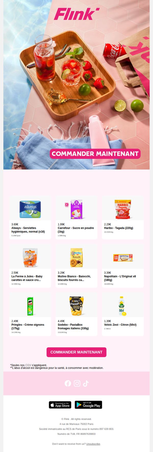
This email aims to drive immediate purchases by showcasing a curated selection of vacation-themed products, leveraging seasonal imagery and a clear call to action to encourage impulse buying during the summer period.
Why this works
The email brilliantly ties product selection to seasonal context, using poolside imagery and summer drinks to emotionally anchor the offer, making everyday items feel like essential vacation companions rather than routine purchases.
How to implement
By placing the primary CTA directly beneath the hero image and repeating it after the product grid, the campaign creates multiple frictionless conversion points, reducing the chance users scroll past without acting, a smart tactic for short-attention audiences.
Pro Tip
Add a subtle countdown timer or 'limited stock' indicator near the CTA to create urgency, especially since the vacation theme implies time-sensitive relevance, this would nudge hesitant shoppers toward immediate action. • Include a short testimonial or social proof snippet (e.g., '10,000+ summer orders delivered this week') near the product grid to build trust and reinforce the idea that others are already enjoying these picks, reducing perceived risk for new users.
4. BOXFOX: What's on your summer bucket list?🏝️
Objective
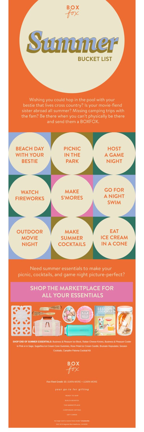
This email aims to inspire customers to maintain meaningful connections during summer by gifting curated BOXFOX packages for shared experiences, while driving traffic to their marketplace for seasonal essentials.
Why this works
The email brilliantly ties emotional nostalgia to product utility by framing gift boxes as solutions for missed summer moments, making the purchase feel meaningful rather than transactional.
How to implement
Using a playful ‘Summer Bucket List’ grid transforms generic product promotion into an interactive, relatable experience that invites customers to visualize their own summer adventures through curated gift ideas.
Pro Tip
Add a subtle countdown timer or limited-time badge near the CTA to create urgency around summer-themed items, since seasonal relevance naturally fades as summer progresses. • Include a mini testimonial or user-generated photo beneath the product grid to reinforce social proof, helping hesitant buyers visualize real people enjoying the featured experiences.
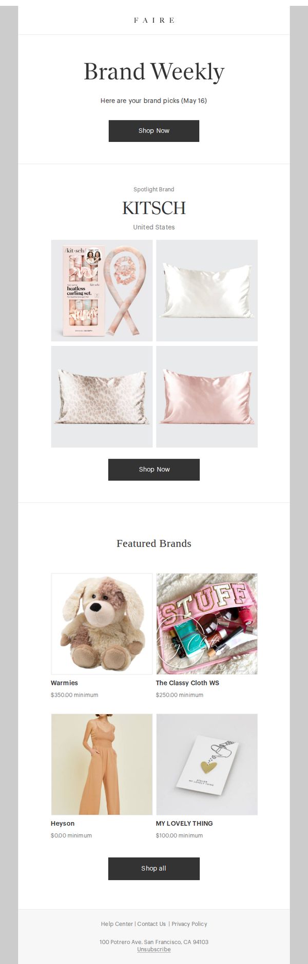
5. Faire.com: Panorama, check out these brands
Objective
This email aims to drive retailer engagement by curating personalized brand recommendations and highlighting a featured brand with visual appeal, encouraging immediate browsing and purchasing through clear CTAs.
Why this works
The email smartly personalizes the experience by addressing the recipient by name and framing the content as curated picks, which builds trust and increases perceived relevance for busy retailers seeking quality brands.
How to implement
By spotlighting one brand with high-quality product imagery and minimal text, the email creates visual focus and emotional appeal, making it easy for retailers to imagine stocking these items without cognitive overload.
Pro Tip
Add a brief value proposition or benefit-driven tagline under the 'Brand Weekly' header to clarify why the recipient should care, e.g., 'Discover new brands that sell fast and delight your customers.' • Introduce a subtle urgency element, such as a limited-time offer badge or 'New this week' label on the Spotlight Brand, to encourage immediate clicks rather than passive browsing.
6. Varo: A better bank account is just a few mins away💪
Objective
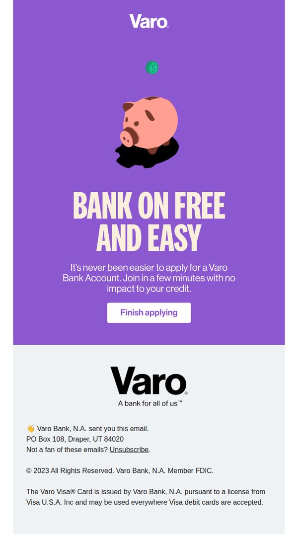
This email aims to convert interested users into Varo Bank account holders by emphasizing the speed, simplicity, and credit-neutral nature of signing up, encouraging immediate action with a low-friction CTA.
Why this works
The email brilliantly reduces perceived risk by explicitly stating that applying has 'no impact to your credit,' which directly addresses a common psychological barrier for potential banking customers and builds instant trust.
How to implement
Using a playful piggy bank illustration with a floating dollar coin visually reinforces the core message of effortless, worry-free banking, making abstract financial benefits feel tangible and emotionally approachable.
Pro Tip
Add a micro-testimonial or social proof near the CTA, such as 'Join 2M+ people banking smarter', to reduce hesitation by showing others have already taken the leap successfully. • Include a subtle progress indicator or time estimate (e.g., 'Takes 90 seconds') above the CTA to further lower perceived effort and reinforce the 'few mins' promise with concrete, reassuring detail.
7. BOXFOX: IT'S BOO MONTH 👻
Objective
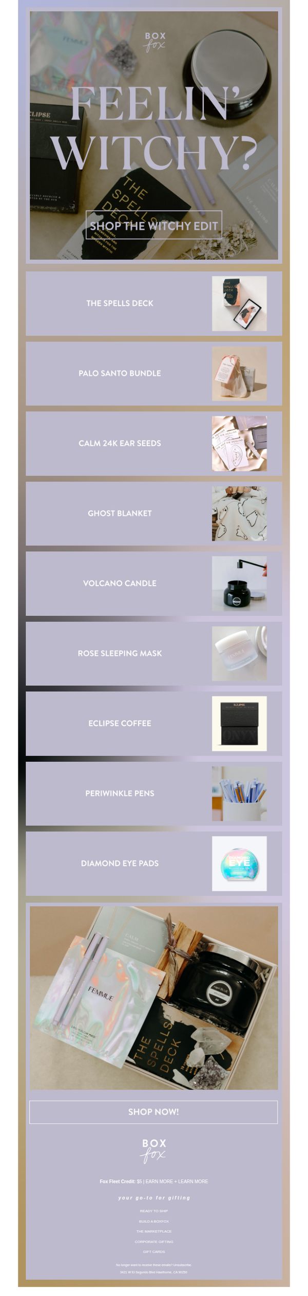
This email campaign aims to drive sales during the Halloween season by promoting a themed 'Witchy Edit' collection that blends spooky aesthetics with self-care and lifestyle products, encouraging immediate purchase through seasonal urgency and visual storytelling.
Why this works
The email masterfully blends seasonal Halloween energy with elevated self-care by curating products that feel both whimsical and luxurious, making the 'witchy' theme accessible and aspirational rather than gimmicky.
How to implement
By using moody, muted tones and soft product photography, the design creates an immersive, editorial feel that elevates everyday items into curated lifestyle moments, encouraging customers to see the collection as a mood-enhancing experience rather than just a sale.
Pro Tip
Add a subtle countdown timer or limited-quantity indicator near the CTA to amplify urgency, since the Halloween theme naturally lends itself to time-sensitive messaging that can boost conversion rates. • Include a short customer testimonial or social proof snippet under the hero section to build trust and validate the curated edit, especially since the theme relies on emotional appeal rather than functional benefits.
8. Fertifa: Explore resources for Men's Health Awareness Month
Objective
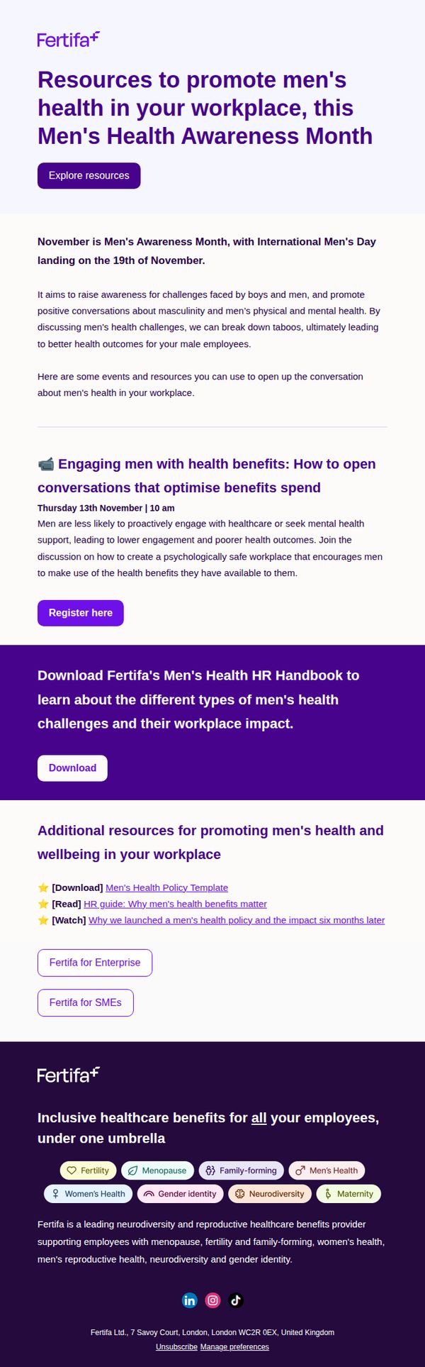
This email aims to position Fertifa as a thought leader in workplace men’s health by offering actionable resources during Men’s Health Awareness Month, encouraging HR professionals to engage with educational content and download tools to support male employees’ wellbeing.
Why this works
The email smartly ties its message to a timely, culturally relevant observance, Men’s Health Awareness Month, creating urgency and relevance that encourages immediate engagement from HR decision-makers looking to align with current workplace wellness trends.
How to implement
By offering a mix of live events, downloadable handbooks, and curated reading materials, the campaign caters to different learning preferences and decision-making styles, making it more likely that recipients will find a resource that resonates and takes action.
Pro Tip
Add a visual countdown or calendar icon next to the event date to create urgency and help recipients mentally prioritize the webinar among competing workplace initiatives. • Include a short testimonial or quote from an HR leader who implemented men’s health resources, to build social proof and reduce perceived risk for new adopters.
9. Legacybox: $9 to see it again for the first time 📼
Objective
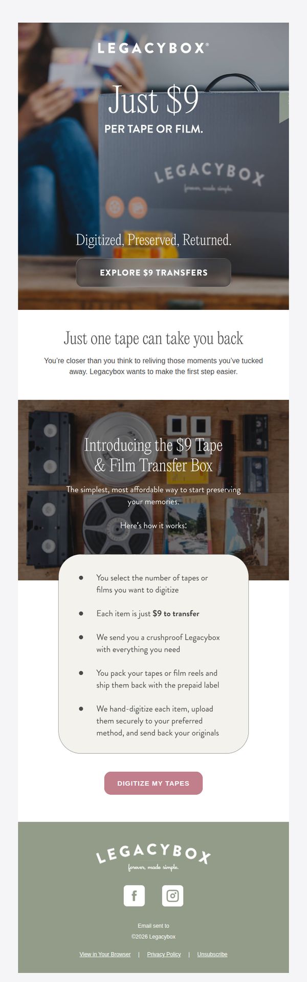
This email aims to convert nostalgic viewers into customers by offering an emotionally resonant, low-barrier entry point to digitize old tapes and films at just $9 per item, making memory preservation feel simple, affordable, and immediate.
Why this works
The email brilliantly taps into emotional nostalgia by framing the service not as a tech transaction but as a portal to relive forgotten moments, making the $9 price point feel like a gift rather than a cost.
How to implement
By breaking down the process into five simple, reassuring steps, the email removes perceived complexity and builds trust, transforming a potentially intimidating task into a welcoming, doable experience anyone can start today.
Pro Tip
Add a subtle countdown timer or limited-availability indicator near the CTA to create urgency without being pushy, leveraging the emotional window when nostalgia is most potent. • Include a short customer testimonial or quote beneath the process steps to reinforce social proof and reduce hesitation, e.g., 'I cried watching my wedding tape again, worth every penny.'
10. Shop Solar Kits: Browse our best sellers and find the solar perfect solar kit
Objective
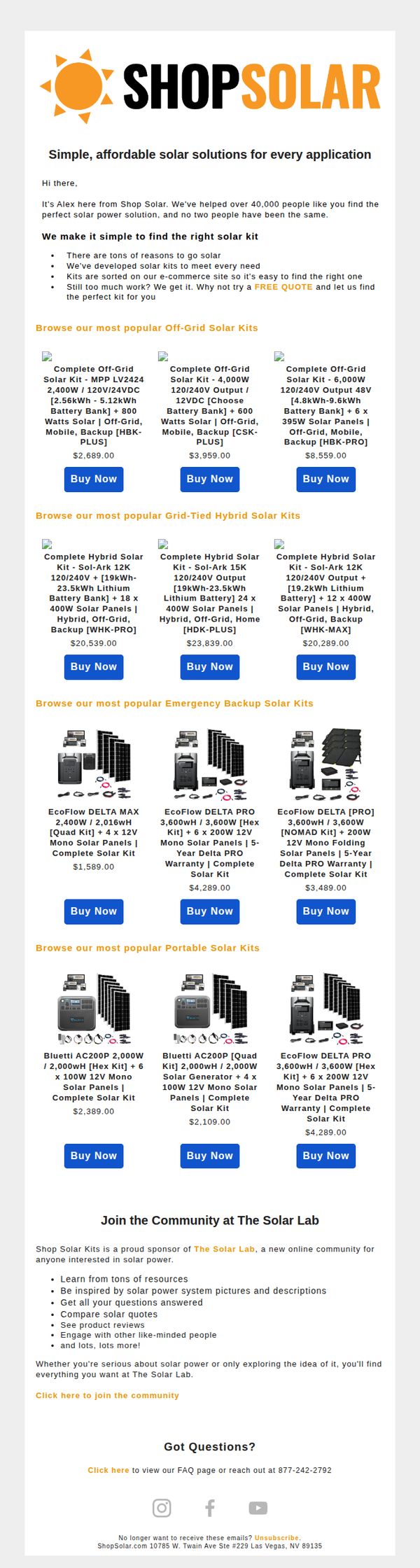
This email aims to drive sales by showcasing Shop Solar Kits’ most popular solar solutions across multiple categories, while positioning the brand as a trusted guide for personalized solar system selection. It also encourages community engagement through The Solar Lab to build long-term customer relationships.
Why this works
The email smartly segments products by use case, Off-Grid, Grid-Tied, Emergency Backup, and Portable, making it effortless for customers to self-identify their needs and reducing decision fatigue with curated, category-specific recommendations.
How to implement
Including real-world pricing and detailed specs like wattage, battery capacity, and panel count builds instant credibility and helps technically minded buyers compare options without leaving the email, accelerating the path to purchase.
Pro Tip
Add a brief customer testimonial or review snippet under each product card to reinforce social proof and reduce perceived risk, especially since solar kits are high-consideration purchases. • Include a visual comparison chart or icon-based feature matrix (e.g., battery life, portability, output) near the product grid to help buyers quickly differentiate between similar kits without reading full specs.