Product Highlight Email gallery from real swimwear brands




1. Frankies Bikinis: TRENDING: Hot Pink Swim
Objective
This email aims to drive immediate traffic to Frankies Bikinis’ website by spotlighting trending hot pink swimwear, leveraging visual appeal and urgency to convert interest into sales. It also promotes brand engagement through app downloads and in-store visits.
Why this works
The email masterfully uses a bold, trend-driven subject line and hero image to instantly capture attention, aligning with seasonal fashion momentum while making the product feel exclusive and must-have.
How to implement
By featuring real influencers and model names beneath each product, the campaign builds social proof and personal connection, turning product shots into aspirational lifestyle moments that encourage emotional purchasing.
Pro Tip
Add a countdown timer or limited-quantity indicator near the 'shop pink swim' CTA to amplify urgency and reduce hesitation, especially since the email promotes trending items that imply scarcity. • Include a short testimonial or customer review snippet under the hero section to reinforce trust and validate the claim that these are 'flattering & ultra-soft pieces like you’ve never seen before.'
2. Cupshe: FALL is just around the corner🍂
Objective
This email aims to drive early fall fashion purchases by showcasing seasonal trends and offering an immediate discount to incentivize urgency. It also encourages app downloads and customer feedback to build loyalty and expand digital engagement.
Why this works
The email brilliantly ties seasonal transition to shopping urgency by positioning fall fashion as a proactive lifestyle upgrade, making customers feel ahead of the curve rather than just reacting to weather changes.
How to implement
Layering visual storytelling with product pricing and styling cues, like pairing blazers with tanks or jumpsuits with accessories, creates aspirational yet achievable looks that drive conversion through relatable styling inspiration.
Pro Tip
Add a countdown timer or urgency indicator next to the $3 OFF offer to amplify perceived scarcity, since the current CTA lacks time-sensitive pressure despite the seasonal theme. • Include a short customer testimonial or star rating near the 'Fall into Jumpsuits' section to build social proof, as product grids alone lack persuasive validation for new shoppers.
3. Cupshe: Fashion Forecast: We Have Your Weather Essentials Covered
Objective
This email aims to drive immediate purchases by aligning fashion recommendations with real-time weather conditions in major cities, while also incentivizing app downloads and SMS sign-ups through layered discounts and gamified rewards.
Why this works
By dynamically pairing weather data with curated outfits, the email creates a highly personalized, context-aware shopping experience that feels less like advertising and more like helpful fashion guidance tailored to the recipient’s location and daily needs.
How to implement
The strategic placement of multiple CTAs, each tied to a distinct value proposition like weather-based styling, party looks, or gamified rewards, creates a frictionless journey that caters to varied customer motivations without overwhelming the user with a single sales push.
Pro Tip
Add a countdown timer to the 'EXTRA 30% OFF' offer in the hero section to create urgency and prevent the promotion from feeling static or indefinite, which could reduce immediate click-through rates. • Integrate micro-testimonials or star ratings directly beneath each product grid section (e.g., 'Smart Commuting Attire') to build social proof at the point of visual consideration, increasing trust and reducing hesitation before clicking 'EXPLORE ALL'.
4. Cupshe: 💸ALL $15.99 Is Backkkkkk!
Objective
This email aims to drive immediate sales by promoting a limited-time flash sale where all items are priced at $15.99, while also encouraging app downloads and customer engagement through reviews and WhatsApp opt-ins.
Why this works
The email brilliantly leverages urgency and simplicity by boldly declaring 'All $15.99' with no code needed, making the offer instantly digestible and irresistible for bargain hunters scanning quickly.
How to implement
By layering a secondary discount with a promo code on top of the main sale, the campaign creates perceived added value without complicating the core message, subtly encouraging higher cart values and code redemption tracking.
Pro Tip
The hero section’s CTA button lacks visual hierarchy, it should be larger, more vibrant, or animated to stand out against the pink-heavy background and ensure immediate click-through intent. • The product grid lacks filtering or category tags beneath each item; adding quick labels like 'Swimwear' or 'Dresses' would help shoppers navigate faster and reduce bounce rates from indecision.
5. Summersalt: Carpool✔️ Office✔️Coffee Run✔️
Objective
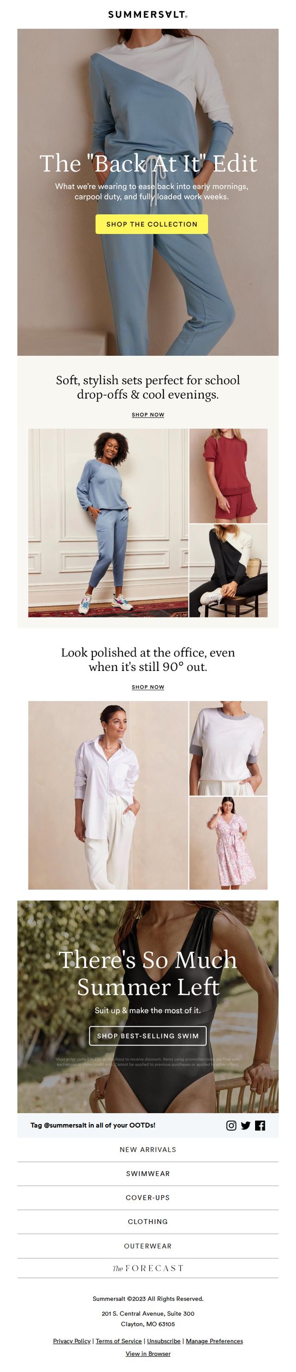
This email aims to re-engage customers by showcasing versatile, everyday wear from Summersalt’s new collection that transitions seamlessly from school drop-offs to office settings and evening outings, encouraging immediate shopping through lifestyle-driven visuals and clear CTAs.
Why this works
The email brilliantly frames clothing as a solution to real-life transitions, school runs, office hours, and evening plans, making the products feel indispensable rather than optional, which builds emotional resonance and urgency.
How to implement
By using relatable, everyday scenarios like 'carpool duty' and '90° out' office wear, Summersalt positions its apparel as the effortless answer to modern multitasking, subtly validating the customer’s busy lifestyle while selling comfort and style.
Pro Tip
Add a subtle countdown timer or limited-time offer badge near the hero CTA to create urgency, since the current design lacks any time-sensitive incentive to drive immediate conversion. • Include a short testimonial or social proof snippet under the 'Look polished at the office' section to reinforce credibility, especially since professional wear is a higher-consideration purchase for many customers.
6. Summersalt: ⚡️Your Favorite Suits < $50 ⚡️
Objective
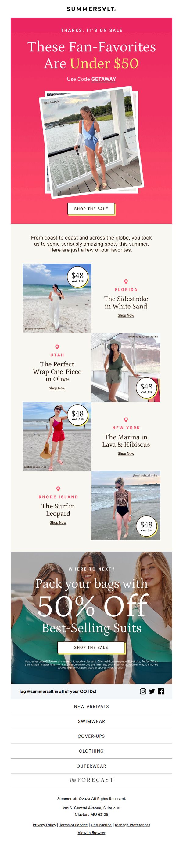
This email aims to drive immediate sales by highlighting popular swimwear styles now available under $50, using social proof and location-based storytelling to create urgency and emotional connection with summer travelers.
Why this works
The email brilliantly leverages real customer photos and geo-tagged locations to transform product listings into aspirational travel stories, making each swimsuit feel like a ticket to a dream destination rather than just a discounted item.
How to implement
By anchoring the sale around fan-favorite styles under a clear price threshold, $50, the campaign instantly communicates value while reducing decision fatigue, encouraging quick clicks from budget-conscious shoppers who already trust the brand’s bestsellers.
Pro Tip
Add a countdown timer near the hero section to amplify urgency, since the sale is time-sensitive, a visible timer would push hesitant shoppers to act before the offer expires. • Include a small 'Bestseller Badge' or 'Top Rated' icon next to each featured product to reinforce social proof beyond just location tags, helping new customers quickly identify crowd-pleasing styles.
7. Summersalt: Trending: Soft & Cozy Styles ☁️
Objective
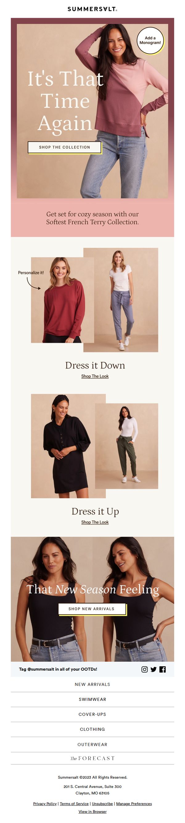
This email aims to drive engagement and sales by reintroducing Summersalt’s cozy French Terry collection, positioning it as the perfect seasonal transition wardrobe staple while encouraging personalization and exploration of new arrivals.
Why this works
The email brilliantly taps into seasonal emotional cues by framing the French Terry collection as a comforting ritual, 'It’s That Time Again', which creates nostalgia and urgency without relying on discounts or scarcity tactics.
How to implement
By visually segmenting styling options into 'Dress it Down' and 'Dress it Up,' the campaign reduces decision fatigue and subtly educates customers on versatility, making the collection feel more valuable and adaptable to their real-life wardrobes.
Pro Tip
The 'Shop The Look' links under 'Dress it Down' and 'Dress it Up' are underwhelming, replace them with bold, color-matched buttons to match the hero CTA’s visual hierarchy and reduce friction for users ready to buy the full outfit. • The footer’s category list lacks visual distinction, add subtle icons or background tints to each category (e.g., swimwear, outerwear) to improve scannability and help users quickly navigate to their preferred section without scrolling back up.
8. Summersalt: The *perfect* cover-up is BACK
Objective
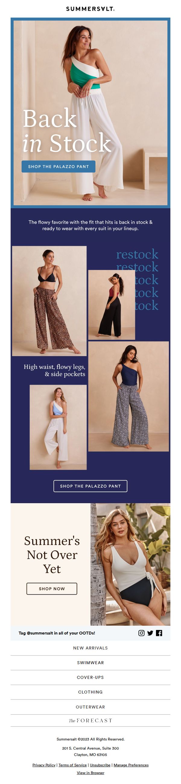
To re-engage customers by announcing the restock of the popular Palazzo Pant, positioning it as the ideal cover-up to pair with existing swimwear, and driving immediate traffic to the product page. The email also subtly extends the summer shopping season to encourage continued purchases.
Why this works
The email brilliantly leverages FOMO by announcing a restock of a beloved item, framing it not just as available again but as the essential pairing for every swimsuit in the customer’s closet, making it feel indispensable rather than optional.
How to implement
By featuring multiple models in varied swimwear pairings, the campaign visually demonstrates versatility and styling options, subtly guiding customers to imagine the product in their own wardrobe and reducing hesitation about fit or coordination.
Pro Tip
Add a subtle countdown timer or limited-quantity indicator near the 'SHOP THE PALAZZO PANT' CTA to amplify urgency and reduce hesitation, especially since the product is newly restocked and likely in high demand. • Include a short testimonial or customer review snippet near the product grid to reinforce social proof, for example, 'Over 5,000 customers love how these flow with every suit', to validate the claim and build trust.
9. Summersalt: In Our *Best Sellers* Era ✨
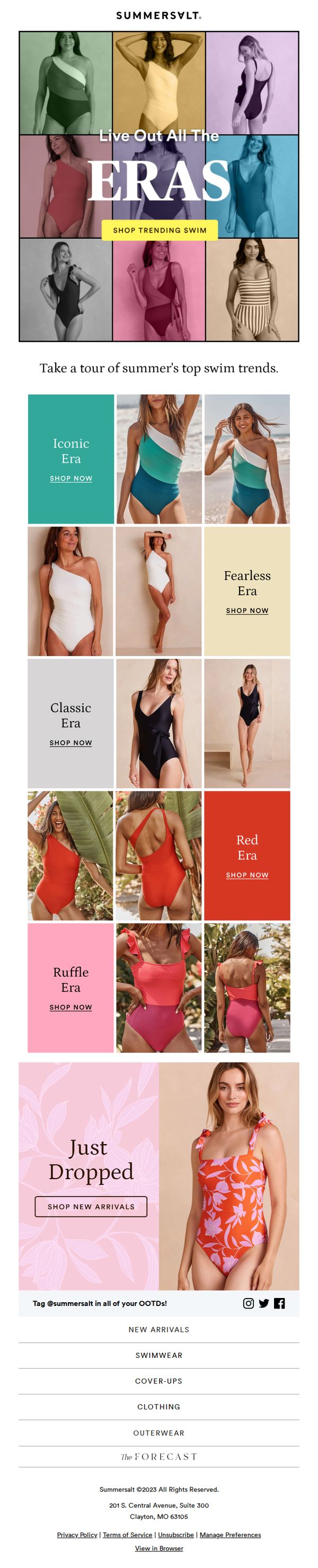
Objective
This email aims to drive engagement and sales by showcasing Summersalt’s best-selling swimwear collections, organized by thematic 'eras' to evoke nostalgia and trendiness, while highlighting new arrivals to encourage immediate browsing and purchasing.
Why this works
By framing swimwear collections as distinct 'eras,' Summersalt transforms product categories into emotionally resonant storytelling moments that tap into customer nostalgia and trend consciousness, making browsing feel like a curated fashion journey rather than a transactional task.
How to implement
The use of bold, contrasting color blocks for each era not only visually separates collections but also creates an intuitive, magazine-style layout that guides the eye naturally from one trend to the next, enhancing scannability and reducing decision fatigue.
Pro Tip
Add a subtle countdown timer or 'Limited Stock' indicator beneath the 'Just Dropped' CTA to heighten urgency and motivate faster clicks, especially since new arrivals are often the most time-sensitive products in swimwear campaigns. • Include one customer testimonial or social proof snippet under each 'Era' section to reinforce credibility and reduce perceived risk, for example, 'Over 10K sold in the Iconic Era' or 'Rated 4.9/5 for comfort & fit', which could boost conversion for hesitant shoppers.
10. Cupshe: Our Bestsellers Are BACK!💖

Objective
This email aims to re-engage customers by announcing the return of popular swimwear and dress styles, while driving immediate sales through limited-time discounts and a clear call to action. It also encourages app downloads and customer feedback to build loyalty and expand reach.
Why this works
The email leverages nostalgia and FOMO by framing bestsellers as a 'comeback,' tapping into emotional attachment while implying scarcity, a smart psychological trigger that motivates quick purchasing decisions without sounding pushy.
How to implement
Each product section pairs high-quality lifestyle imagery with concise, benefit-driven copy and star ratings, creating instant credibility and desire, a formula that turns browsing into buying by making every item feel like a must-have, not just another option.
Pro Tip
The 'Barbie World' hero section lacks a clear value proposition beyond 'surprise', adding a specific benefit like 'Exclusive Early Access' or 'Limited Stock' would strengthen urgency and justify immediate action. • The 50% off section uses generic product images without highlighting what makes each item special, adding short, benefit-driven micro-copy (e.g., 'Perfect for Pool Parties') under each item would increase perceived value and conversion.