Product Highlight email examples & ideas using testimonials
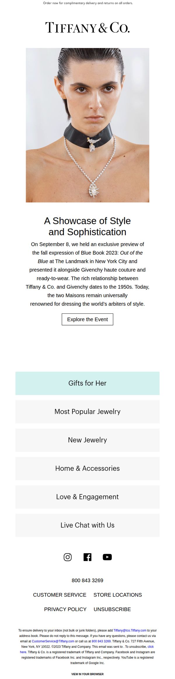


1. Tiffany & Co.: Tiffany & Co. Designs. Givenchy Couture. A Celebration of Savoir Faire.
Objective
This email aims to elevate brand prestige by highlighting Tiffany & Co.’s exclusive collaboration with Givenchy, positioning both houses as timeless arbiters of style while subtly driving traffic to explore the event and associated collections. It reinforces luxury positioning over direct sales.
Why this works
The email masterfully leverages heritage storytelling by anchoring the campaign in a real-world exclusive event, transforming a product showcase into a cultural moment that invites the reader to feel part of an elite, insider experience.
How to implement
By pairing Tiffany’s jewelry with Givenchy’s haute couture, the campaign creates a powerful visual and conceptual synergy that elevates both brands, making the offering feel less like commerce and more like curated artistry worth witnessing.
Pro Tip
Add a secondary CTA beneath the hero image, such as 'Shop the Collection' or 'View Lookbook', to capture immediate purchase intent from readers who are inspired but not yet ready to explore the full event narrative. • Include a small visual carousel or grid of 2–3 key products from the Blue Book 2023 collection directly under the hero section to bridge the storytelling with shoppable moments, reducing friction for interested buyers.
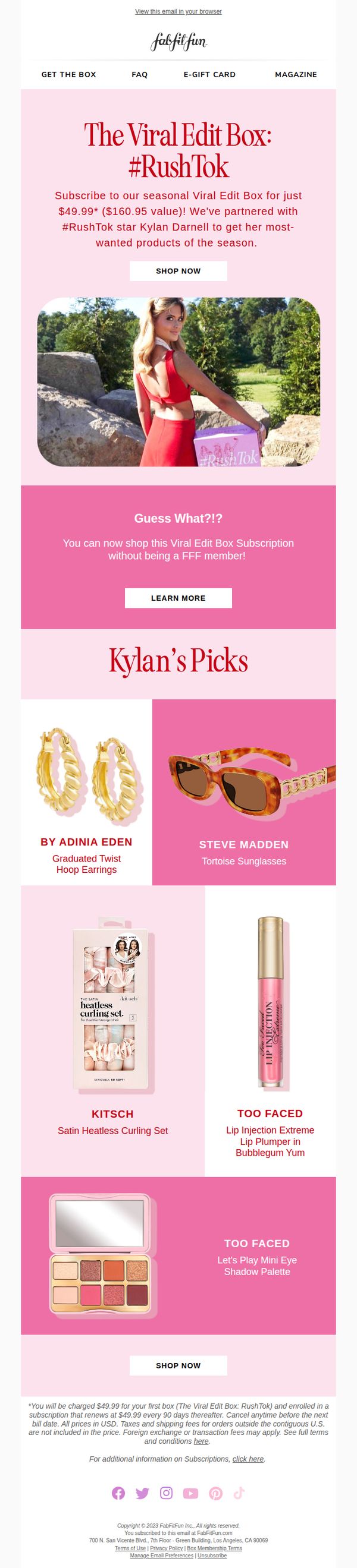
2. FabFitFun: Now trending: The Viral Edit Box: #RushTok 😍
Objective
To drive immediate subscriptions to the limited-edition Viral Edit Box by leveraging influencer appeal and FOMO through the #RushTok trend, while also opening the offer to non-members to expand reach and conversion.
Why this works
The email brilliantly taps into TikTok culture by naming the box after a viral hashtag, making it feel timely and socially validated, which instantly boosts perceived desirability among trend-conscious shoppers.
How to implement
By featuring Kyland Darnell’s curated picks with clear brand labels and product names, the email transforms influencer endorsement into tangible product discovery, helping subscribers visualize exactly what they’re getting and why it’s special.
Pro Tip
Add a subtle countdown timer near the CTA to reinforce urgency, since the #RushTok theme implies limited availability, this would amplify FOMO without cluttering the clean layout. • Include a short testimonial or social proof snippet from a real subscriber who loved Kyland’s picks to build trust and validate the influencer curation beyond just product images.
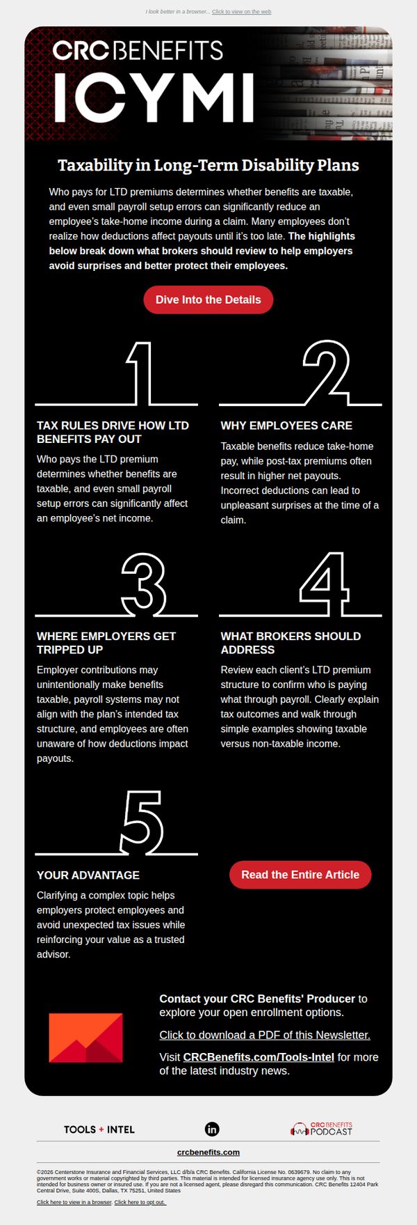
3. CRC Benefits (formerly BenefitMall): Countdown to Open Enrollment: Get Your Clients Ready Now
Objective
This email aims to educate brokers on the tax implications of long-term disability plans to help them better advise employers and avoid payroll surprises during open enrollment. It positions CRC Benefits as a trusted advisor by offering actionable insights and resources.
Why this works
By breaking down complex tax rules into five digestible numbered sections, the email transforms a dense financial topic into an approachable, scannable guide that empowers brokers to act confidently with their clients.
How to implement
The email strategically positions the brand not as a sales entity but as a trusted advisor, using educational content to build credibility and reinforce the value of proactive planning before open enrollment begins.
Pro Tip
Add a subtle countdown timer near the CTA to reinforce urgency around open enrollment, visually anchoring the subject line’s ‘Countdown’ promise and encouraging immediate action. • Include a short testimonial or client quote under the ‘Your Advantage’ section to humanize the value proposition and demonstrate real-world impact of CRC Benefits’ advisory role.
4. Ren Skincare: The reviews are in ⭐⭐⭐⭐⭐
Objective
This email aims to drive immediate purchases of Ren Skincare’s new Evercalm™ Barrier Support Body Balm by leveraging social proof through glowing customer reviews and visual before-and-after results, while also cross-promoting complementary products to increase average order value.
Why this works
The email brilliantly uses real customer testimonials with specific, relatable pain points, like razor bumps and bikini-line irritation, to build instant credibility and emotional resonance, making the product feel like a trusted solution rather than just another skincare item.
How to implement
By visually contrasting 'before' and 'after' skin conditions with a clear 14-day timeline, the campaign transforms abstract claims into tangible, science-backed results, which significantly lowers purchase hesitation for skeptical buyers concerned about efficacy.
Pro Tip
Add a subtle countdown timer or limited-availability badge near the primary CTA to create urgency, since the email currently lacks any time-sensitive incentive that could nudge hesitant shoppers toward immediate conversion. • Include a short FAQ or 'How It Works' snippet under the 'Small Balm, Big Benefits' section to preemptively address common concerns like application frequency or skin type suitability, reducing friction for first-time buyers.
5. Katie Barnes Tool Range & Education: 13+ years of nail expertise in every tool... ✨
Objective
This email aims to position Katie Barnes as a trusted authority in the nail industry by highlighting her 13+ years of award-winning expertise and converting that credibility into sales of her expert-designed tool range. It seeks to build confidence in her brand so professionals feel assured choosing her tools for their daily work.
Why this works
The email brilliantly leverages Katie’s personal brand story by front-loading her 13+ years of award-winning experience, transforming her credentials into a compelling reason to trust her tools over generic competitors in a saturated market.
How to implement
By featuring real product shots alongside clear CTAs and social proof like ‘TikTok #1 Best Selling Nail Product,’ the email creates urgency and credibility without overwhelming the reader, making it easy for nail pros to visualize tools in their own workspace.
Pro Tip
Add a subtle countdown timer or limited-stock indicator near the 'This Week’s Best Sellers' section to create urgency, since the current layout lacks time-sensitive motivation despite promoting top products. • Reposition the 'Order Now. Pay Later' financing options higher in the email, perhaps beneath the hero section, to reduce friction for price-sensitive professionals who may hesitate without upfront payment flexibility.
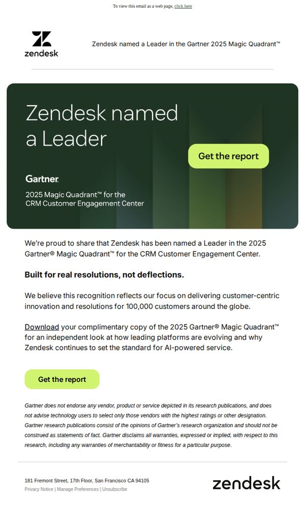
6. Zendesk: Zendesk named a Leader in Gartner 2025 Magic Quadrant™
Objective
To announce Zendesk’s recognition as a Leader in the 2025 Gartner Magic Quadrant for CRM Customer Engagement Center and drive downloads of the full report by positioning the award as validation of their customer-centric, AI-powered innovation.
Why this works
The email leverages third-party credibility by anchoring its message in Gartner’s authoritative Magic Quadrant, instantly signaling industry validation to skeptical enterprise buyers without relying on self-promotion.
How to implement
It frames the award not as a vanity metric but as proof of real-world impact, emphasizing 'resolutions, not deflections', which aligns the recognition with customer outcomes rather than internal accolades.
Pro Tip
Add a brief testimonial or customer quote beneath the hero section to humanize the Gartner recognition and show real users benefiting from the 'customer-centric innovation' mentioned, strengthening emotional resonance. • Include a subtle visual indicator, like a small badge or ribbon, next to the 'Leader' headline to make the award status more instantly scannable and visually sticky for mobile readers.
7. Kuehne+Nagel : Kuehne+Nagel and SWISS strengthen partnership to accelerate more sustainable aviation

Objective
This email aims to announce and position the strategic partnership between Kuehne+Nagel and SWISS as a pivotal step toward scaling sustainable aviation fuel, reinforcing both brands’ leadership in eco-conscious logistics and air travel while building stakeholder confidence in their shared decarbonization roadmap.
Why this works
The email strategically anchors its message in a tangible, future-facing commitment, a five-year offtake agreement, which transforms abstract sustainability goals into a concrete, measurable action that stakeholders can track and trust over time.
How to implement
By featuring direct quotes from both company executives, the email humanizes the partnership, lending credibility and emotional weight to the announcement while subtly signaling internal alignment and top-down prioritization of sustainability across both organizations.
Pro Tip
Add a visual timeline or milestone graphic under the partnership description to illustrate the five-year agreement’s phases, this would make the long-term commitment more digestible and emotionally resonant for readers who skim. • Reposition the 'See all media releases' CTA higher in the email, perhaps as a secondary button beneath the headline, to increase visibility and drive more traffic to the Newsroom without forcing readers to scroll to the footer.
8. Tiffany & Co.: Tiffany & Co. Designs. Givenchy Couture. A Celebration of Savoir Faire.

Objective
To elevate brand prestige by highlighting the exclusive collaboration between Tiffany & Co. and Givenchy, while driving engagement with a past event that reinforces heritage and luxury positioning.
Why this works
The email masterfully frames a past event as an ongoing narrative of legacy, using rich historical context to deepen emotional connection rather than relying on urgency or discounts.
How to implement
By spotlighting a high-fashion collaboration with Givenchy, the campaign positions Tiffany not just as a jeweler but as a cultural curator, aligning with elite audiences who value artistry over transaction.
Pro Tip
Add a subtle countdown or 'Event Recap' badge near the CTA to create a sense of timeliness and exclusivity, even for a past event, encouraging immediate click-through for FOMO-driven viewers. • Include a short testimonial or quote from an attendee or fashion editor to humanize the event and add third-party validation, strengthening credibility beyond brand storytelling alone.
9. beehiiv : someone left you a review

Objective
This email aims to inform existing beehiiv users about the launch of Digital Products v2, highlighting new features like native reviews, global payments, and discount codes to encourage product creation and monetization. It seeks to drive users toward launching their first digital product by showcasing platform advantages and social proof.
Why this works
The email brilliantly leverages social proof by embedding real product reviews and star ratings directly into the product grid, which builds immediate trust and reduces perceived risk for new creators considering launching their first digital product.
How to implement
By visually comparing beehiiv’s 0% platform fee against competitors’ 5–10% cuts, the campaign turns a financial advantage into an emotional win, framing revenue retention as empowerment, which resonates deeply with indie creators and solopreneurs.
Pro Tip
The CTA 'Launch Your First Product' appears repeatedly but lacks urgency or personalization; adding a dynamic element like 'Your First Product Awaits, Start in 3 Minutes' or tying it to the user’s name or past behavior would increase conversion intent. • While the email showcases product reviews, it doesn’t highlight how reviews impact conversion rates or revenue, adding a stat like 'Products with 5+ reviews convert 3x faster' would strengthen the persuasive power of the testimonial section.
10. AllPosters: Looking for trending yet timeless art?
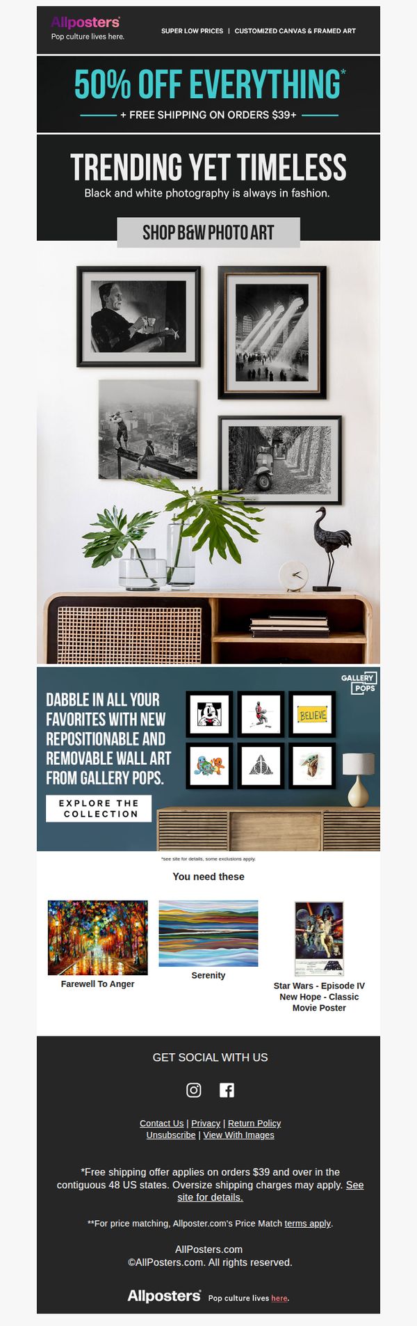
Objective
This email aims to drive immediate sales by promoting a limited-time 50% off discount on all art, while highlighting black-and-white photography as a stylish, enduring choice. It also introduces Gallery Pops as a flexible wall art solution to broaden appeal.
Why this works
The email brilliantly pairs a bold, time-sensitive discount with a curated aesthetic theme, black-and-white photography, to create urgency while subtly guiding taste, making the sale feel both exclusive and culturally relevant.
How to implement
By featuring Gallery Pops as a separate, lifestyle-driven section, the campaign smartly diversifies its appeal beyond traditional framed art, targeting renters and trend-focused buyers without diluting the core promotion.
Pro Tip
Add a subtle countdown timer near the 50% off headline to amplify urgency, since the current design lacks any time-sensitive visual cue that could nudge hesitant shoppers toward immediate action. • Reposition the 'You need these' product grid higher, just below the Gallery Pops section, to maintain visual momentum and prevent the eye from dropping off before reaching the key conversion items.