Jewelry product highlight campaign ideas that work





1. Pandora: Exclusive Online Offer: 40% OFF Disney x Pandora!
Objective
This email aims to drive immediate online sales by promoting a limited-time 40% discount on Disney x Pandora collections, while also encouraging loyalty program engagement through double points for My Pandora members during the Black Friday period.
Why this works
The email brilliantly leverages emotional nostalgia by spotlighting Disney characters in jewelry form, turning a sales promotion into a sentimental experience that resonates deeply with fans of all ages while driving urgency through limited-time exclusivity.
How to implement
By clearly segmenting offers, Disney x Pandora at 40% off for members and site-wide discounts for all, the campaign personalizes value without alienating non-members, subtly incentivizing sign-ups while still converting broader audiences during peak shopping season.
Pro Tip
Add a visible countdown timer near the top of the email to heighten urgency for the 40% Disney x Pandora offer, since the current date range (Nov 19–27) is buried in fine print and doesn’t create immediate pressure to act. • Reposition the 'LOG IN' button under the Double Points banner to be more prominent, currently it’s visually underwhelming and risks being overlooked, potentially missing a key opportunity to convert non-members into engaged shoppers.
2. Ana Luisa: 25% off best sellers ➡️ pass it on!
Objective
This email aims to drive immediate purchases by incentivizing customers to buy multiple best-selling jewelry items with tiered discounts, while reinforcing brand trust through social proof and value-added benefits like free shipping and a warranty.
Why this works
The email brilliantly turns a simple discount into a strategic stacking game, encouraging customers to buy three or more items by framing it as unlocking ‘bestselling stacks’ and ‘big savings’ on 5-star favorites, which taps into both FOMO and perceived value.
How to implement
Each product in the grid is paired with a personalized name and styling tip, like ‘Lev is the perfect eye-catching pendant’, which transforms generic items into curated, personality-driven recommendations that help shoppers visualize ownership and build emotional connection.
Pro Tip
The hero CTA ‘GET 25% OFF’ is visually strong but doesn’t clarify the condition, adding a micro-copy like ‘on 3+ items’ directly on the button would reduce confusion and increase conversion by setting clear expectations upfront. • The ‘Looking for your new go-to hoops?’ section feels disconnected from the main offer; integrating the same 25% off badge or a ‘Shop Hoops with 25% Off’ CTA would unify the message and prevent dilution of the core discount incentive.
3. Koss Design: LAST HOURS 😍💝
Objective
This email aims to drive last-minute purchases by creating urgency around the International Women’s Day sale, encouraging recipients to claim discounted bracelet sets before prices revert at midnight. It also reinforces brand community and emotional connection through personalized messaging.
Why this works
The email masterfully blends emotional storytelling with urgency by referencing a shared celebration, making the sale feel personal and time-sensitive rather than transactional, which deepens customer connection and motivates immediate action.
How to implement
By featuring a curated grid of nine bracelet sets with consistent 'Shop now' buttons, the design simplifies decision-making while visually reinforcing product variety and accessibility, subtly guiding the user toward conversion without overwhelming them.
Pro Tip
Add a visible countdown timer near the CTA to visually reinforce the 'last hours' urgency, which could increase conversion by making the deadline feel more immediate and tangible to hesitant shoppers. • Include a short testimonial or customer quote near the product grid to humanize the offer, this would strengthen social proof and reduce perceived risk for first-time buyers considering a purchase under time pressure.
4. Mejuri: Back to basics
Objective
This email aims to re-engage customers by showcasing Mejuri’s best-selling, versatile jewelry pieces that seamlessly integrate into daily routines, whether for school, work, or casual wear, while encouraging immediate shopping through curated product highlights and a clear call to action.
Why this works
Mejuri smartly frames its bestsellers as essential, routine-friendly accessories by using relatable lifestyle contexts, school, office, everyday life, making the jewelry feel indispensable rather than optional, which builds emotional resonance with practical buyers.
How to implement
The ‘Quick Study Sesh’ headline cleverly borrows academic language to position product selection as research-backed and trustworthy, subtly reassuring customers that these pieces are proven winners, not just trendy picks, which boosts perceived value and reduces purchase hesitation.
Pro Tip
Add a subtle countdown timer or limited-availability tag near the 'Shop Best Sellers' CTA to create urgency, especially since the email positions these as proven essentials, scarcity would nudge hesitant shoppers toward immediate action. • Include a short testimonial or customer review snippet under 1–2 top products to reinforce social proof, since the email’s ‘homework’ framing implies validation, real user voices would strengthen that credibility and reduce perceived risk.
5. Kimaï: Golden Hour with Kimaï
Objective
This email aims to celebrate Earth Day while driving pre-orders for Kimaï’s new customizable ALWAYS bracelet and announcing the fan-voted MOMA bracelet as the winner for Mother’s Day. It blends emotional storytelling with product promotion to encourage immediate action ahead of the holiday.
Why this works
The email masterfully ties Earth Day to Mother’s Day by framing jewelry as a sustainable, meaningful gift, transforming a seasonal promotion into an emotionally resonant moment that aligns with eco-conscious values and personal connection.
How to implement
By revealing the MOMA bracelet as a community-voted winner, Kimaï builds social proof and exclusivity around the product, making customers feel invested in the brand’s creative direction and more likely to act before the item sells out.
Pro Tip
Add a subtle countdown timer near the 'DISCOVER' CTA to create urgency around pre-ordering the ALWAYS bracelet before Mother’s Day, reinforcing the time-sensitive nature of the offer without disrupting the email’s elegant tone. • Include a short customer testimonial or review snippet under the MOMA bracelet section to strengthen social proof, since it’s a fan-voted design, hearing from early adopters would validate its popularity and encourage faster conversion.
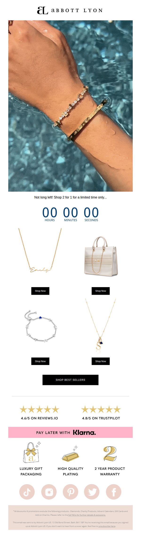
6. Abbott Lyon: Did someone say, 2 FOR 1 🤩
Objective
This email aims to drive immediate sales by promoting a limited-time 2-for-1 offer on luxury jewelry, leveraging urgency and social proof to encourage quick purchasing decisions from subscribers who value premium accessories.
Why this works
The email brilliantly uses a countdown timer right under the headline to create real-time urgency, making the 2-for-1 offer feel exclusive and time-sensitive, which nudges subscribers to act before the deal vanishes.
How to implement
By featuring high-quality lifestyle imagery of jewelry worn in water, the brand evokes luxury, elegance, and emotional connection, subtly suggesting these pieces are perfect for special moments, not just everyday wear.
Pro Tip
The countdown timer shows all zeros, which may confuse or discourage recipients, it should either be dynamically updating or replaced with a clear end date to maintain perceived urgency and trust. • The CTA 'Shop Now' is repeated under each product but lacks visual hierarchy, using a larger, contrasting button for the primary product or adding a 'Shop Best Sellers' CTA above the grid would guide attention more effectively.
7. Astrid & Miyu: New In: Initial Pendants

Objective
To introduce and drive sales of two new initial pendant designs, the sparkling Pavé Pendant and the statement Bold Pendant, while encouraging customers to explore the full A-Z collection and build personalization through stacking and layering.
Why this works
The email brilliantly uses a model’s face to frame the initial pendants as wearable art, turning letters into emotional symbols of identity and pride, a subtle but powerful psychological hook that elevates the product beyond mere jewelry.
How to implement
By visually grouping the A-Z collection in a grid, the campaign transforms a simple product range into a personalized journey, inviting customers to find their letter and imagine layering it with others, a smart way to encourage multiple purchases and deeper engagement.
Pro Tip
Add a brief customer testimonial or social proof near the product grid to reinforce trust, for example, a short quote like 'My initials are my daily reminder of who I am' to emotionally validate the personalization angle. • Include a small visual icon or tag next to the Bold and Pavé pendants indicating metal options (e.g., gold/silver) to reduce friction for customers comparing styles and help them visualize customization before clicking.
8. Kimaï: Elevated everyday basics

Objective
This email aims to position Kimaï’s core jewelry pieces as essential, everyday luxury items that elevate personal style while encouraging immediate exploration and purchase through curated product storytelling and direct CTAs.
Why this works
The email frames each jewelry piece not just as a product but as a lifestyle essential, using emotionally resonant language like 'everyday staple' and 'won’t want to take off' to build attachment before the click.
How to implement
By spotlighting only three hero products with dedicated visuals and micro-stories, the campaign avoids overwhelm and creates a curated, editorial feel that mirrors high-end fashion newsletters while driving focused conversion.
Pro Tip
Add a subtle urgency element like 'Limited stock on bestsellers' or 'Style staples selling fast' near the CTA to nudge hesitation-prone shoppers without compromising the brand’s calm aesthetic. • Include a mini testimonial or social proof snippet under one product, e.g., 'Loved by 2K+ customers for everyday wear', to reinforce trust and reduce perceived risk for first-time buyers.
9. Pandora: Jessie, open if you dare 👻

Objective
This Halloween-themed email aims to drive urgency and excitement by showcasing limited-edition, spooky Pandora charms, especially glow-in-the-dark designs, encouraging recipients to shop before they vanish, while leveraging Disney collaboration appeal to broaden emotional resonance.
Why this works
The email brilliantly uses playful, personalized subject lines like 'Jessie, open if you dare 👻' to create curiosity and emotional connection, turning a routine promotion into a thrilling, interactive experience that aligns perfectly with Halloween’s spirit of fun and fear.
How to implement
By spotlighting glow-in-the-dark charms with a toggle feature, Pandora transforms a static product display into an engaging, interactive demo that visually demonstrates value, making the magic of the product tangible even in a digital format, which boosts perceived uniqueness and desire.
Pro Tip
Add a countdown timer or 'limited stock' indicator near the hero section to amplify urgency, since the email mentions items 'vanish into the night,' visual scarcity cues would reinforce that message and drive faster conversions. • Include a short customer testimonial or social proof near the product grid (e.g., 'Loved by 10K+ Halloween fans') to build trust and reduce hesitation, especially for new or exclusive items that lack reviews.
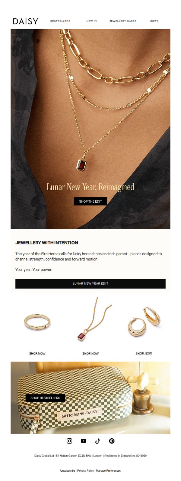
10. Daisy London: Your Lucky Era
Objective
This email aims to drive sales by aligning Daisy London’s jewelry collection with the Lunar New Year theme, encouraging customers to shop symbolic pieces that represent strength and forward motion for the Year of the Fire Horse.
Why this works
The email brilliantly ties cultural symbolism to product storytelling by linking the Year of the Fire Horse with lucky horseshoes and garnet jewelry, making the collection feel personally meaningful rather than just decorative.
How to implement
Using a layered necklace on a model as the hero image creates instant aspiration, while the bold 'SHOP THE EDIT' CTA overlays the image to guide the eye naturally toward conversion without disrupting visual flow.
Pro Tip
Add a subtle countdown timer or urgency cue near the 'SHOP THE EDIT' CTA to leverage FOMO, since Lunar New Year is time-sensitive and customers may delay without a nudge. • Include a short testimonial or social proof snippet under the 'JEWELLERY WITH INTENTION' section to reinforce emotional resonance and trust, especially since the campaign leans into symbolic meaning.