How Art brands do promotional campaign emails that sell


1. The Metropolitan Museum of Art: 15% Off Sitewide Starts Now!
Objective
This email aims to drive immediate sales by promoting a limited-time 15% discount on new arrivals across multiple product categories, while reinforcing The Met’s cultural mission to encourage purchases that support art conservation and education.
Why this works
The email brilliantly ties a time-sensitive discount to a cultural mission, transforming a simple sale into a meaningful act of supporting art conservation, a powerful emotional lever for culturally engaged shoppers.
How to implement
By visually segmenting product categories with bold circular CTAs and curated imagery, the email guides the eye intuitively through diverse offerings without overwhelming the reader, making discovery feel effortless and intentional.
Pro Tip
Add a visible countdown timer near the hero section to reinforce urgency, the current ‘through 10/2’ text is buried in fine print and fails to create real-time pressure for immediate action. • Reposition the ‘Exclusively at The Met’ collaboration section higher in the flow, it’s currently buried and underutilized, despite being a unique selling point that could justify premium pricing and drive curiosity.
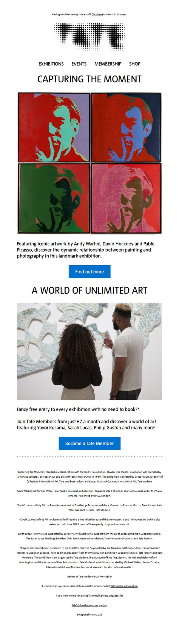
2. Tate: Did photography change art forever? 📸
Objective
This email aims to drive Tate membership sign-ups by highlighting a major photography-and-painting exhibition, positioning membership as the key to unlocking exclusive, book-free access to world-class art experiences.
Why this works
The email brilliantly frames membership not as a transaction but as a gateway to cultural access, using the headline 'Fancy free entry to every exhibition with no need to book?' to immediately communicate tangible, frictionless value that resonates with time-poor art lovers.
How to implement
By anchoring the campaign around a landmark exhibition featuring Warhol, Hockney, and Picasso, the email leverages iconic names to create instant credibility and urgency, making the membership offer feel like a front-row ticket to art history rather than a generic subscription.
Pro Tip
Add a subtle countdown timer or limited-time badge near the 'Become a Tate Member' CTA to create urgency, especially since the exhibition is time-bound and membership offers immediate access, this would nudge hesitant readers to act now rather than later. • Include a short testimonial or quote from a current member about the value of free, no-book entry to exhibitions, this social proof would reinforce the offer’s appeal and reduce perceived risk for new sign-ups.
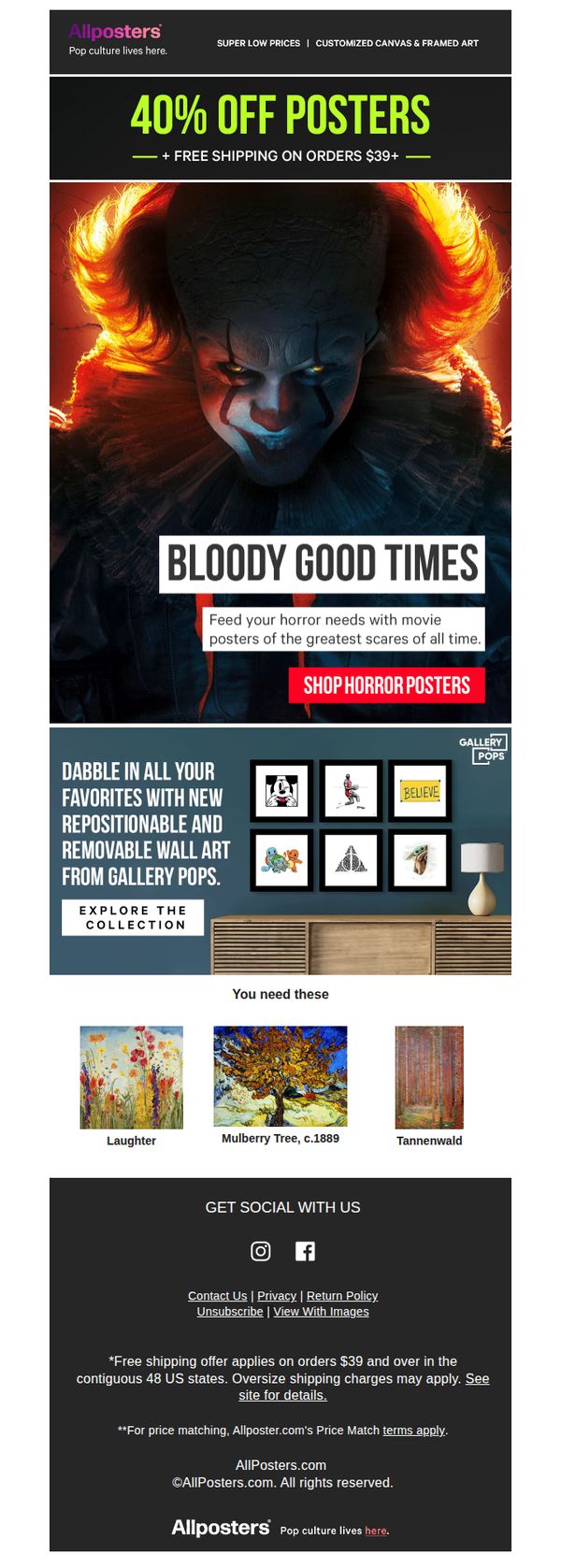
3. AllPosters: 😱 Bloody up your walls
Objective
This email aims to drive immediate sales by capitalizing on seasonal horror interest with a limited-time discount, while also cross-promoting complementary wall art collections to increase average order value.
Why this works
The email brilliantly taps into cultural timing by pairing a high-impact horror visual with a playful pun in the headline, making the promotion feel timely, relevant, and emotionally resonant without being overly salesy.
How to implement
By anchoring the offer around a strong emotional hook, 'Feed your horror needs', the campaign transforms a transactional discount into an experience-driven purchase, subtly validating the customer’s taste and deepening brand connection.
Pro Tip
Add a countdown timer near the CTA to create urgency for the 40% off offer, since the current design lacks temporal pressure despite the Halloween theme implying time sensitivity. • Reposition the Gallery Pops section higher or integrate it visually with the horror poster grid to reduce cognitive friction, currently, it feels disconnected from the main offer and may dilute focus on the primary conversion goal.
4. iCanvas: Art To Keep Your 👁️🗨️ On
Objective
This email aims to re-engage subscribers by showcasing visually striking, trend-driven art collections while promoting a limited-time discount to drive immediate purchases. It also seeks to position iCanvas as a curator of culturally relevant, Pinterest-viral art that aligns with current consumer interests.
Why this works
By anchoring the campaign around Pinterest trends like 'Dance Art' and 'Food Art,' iCanvas taps into existing consumer curiosity, making the email feel timely and socially validated rather than purely promotional.
How to implement
The email smartly uses emotionally evocative visuals paired with minimal, benefit-driven copy, like 'Art To Keep Your 👁️🗨️ On', to create instant visual intrigue and position art as a lifestyle enhancer, not just decor.
Pro Tip
The primary CTA 'SEE TODAY'S TRENDING ART' is visually underwhelming and buried between sections; elevate it with a contrasting button color and position it directly under the hero image to capture attention immediately after the headline. • The discount offer (20% OFF + EXTRA 15% OFF) is mentioned in the header but lacks urgency or visual emphasis; add a countdown timer or badge near the hero section to reinforce scarcity and motivate faster conversions.
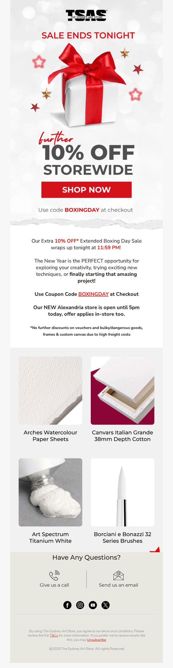
5. The Sydney Art Store: Sale Ends TONIGHT! 🚨
Objective
This email aims to drive immediate sales by creating urgency around a limited-time Boxing Day promotion, encouraging customers to redeem an extra 10% off storewide before the sale ends at 11:59 PM. It also promotes in-store shopping at the new Alexandria location.
Why this works
The email brilliantly leverages time-sensitive urgency by anchoring the sale deadline to a specific hour, 11:59 PM, making procrastination feel risky and prompting immediate action from hesitant buyers.
How to implement
By pairing the promotional discount with an emotional hook about New Year creativity, the message transforms a transactional sale into a personal invitation to begin a meaningful artistic journey, deepening emotional resonance.
Pro Tip
Add a visual countdown timer near the CTA to reinforce urgency in real time, especially since the deadline is tonight, this would reduce cognitive load and increase conversion likelihood. • Include a small testimonial or customer quote near the product grid to build social proof around the featured items, which currently lack third-party validation despite their visual appeal.
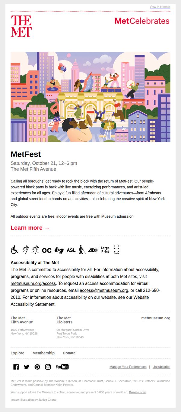
6. The Metropolitan Museum of Art: Save the date! MetFest is back Saturday, October 21
Objective
The email aims to generate excitement and drive attendance for MetFest, a free community block party celebrating New York City’s creative spirit through live music, performances, and hands-on art activities. It emphasizes accessibility and inclusivity to encourage broad public participation.
Why this works
The email brilliantly frames MetFest as a neighborhood block party rather than a museum event, making it feel inclusive, approachable, and rooted in local culture, a smart emotional hook for community engagement.
How to implement
By clearly stating that all outdoor events are free and indoor events require only museum admission, the email removes financial friction and positions the event as accessible to all income levels, which boosts conversion potential.
Pro Tip
Add a visual countdown timer or 'Only X days left!' banner near the CTA to create urgency and nudge procrastinators to act before the event date. • Include a small map or directional graphic near the venue address to reduce friction for first-time visitors unfamiliar with The Met’s location on Fifth Avenue.
7. Whitney Museum of American Art: Next Week: Member Previews
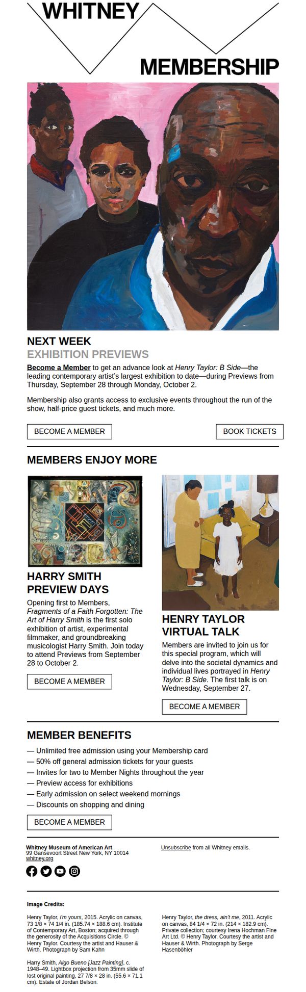
Objective
This email aims to drive membership sign-ups by highlighting exclusive preview access to the Henry Taylor exhibition and other member-only benefits, positioning membership as the key to deeper cultural engagement and early access to major events.
Why this works
The email smartly ties membership to time-sensitive cultural access, using the phrase 'Next Week: Member Previews' to create urgency while positioning the Whitney as a curator of exclusive, must-see experiences for its inner circle.
How to implement
By featuring two distinct member-only events, a physical preview and a virtual talk, the campaign demonstrates breadth of value, appealing to both in-person and remote audiences without diluting the exclusivity of either offering.
Pro Tip
Add a countdown timer or date badge near the 'BECOME A MEMBER' CTA to visually reinforce the urgency of the preview window and nudge immediate action before the September 28 deadline. • Include a short testimonial quote from a current member about their experience at a past preview to humanize the offer and build social proof, especially for those unfamiliar with the value of museum membership.
8. Blick Art Materials: Your one-stop shop for Pen & Ink

Objective
This email aims to drive immediate purchases of pen-and-ink art supplies by highlighting deep discounts and bundling them with a creative challenge to boost engagement. It positions Blick as the go-to destination for artists seeking quality tools at value prices.
Why this works
The email brilliantly pairs urgency with creativity by launching a Pen & Ink Challenge alongside product discounts, turning a simple sale into an inspiring call to action that motivates artists to not just buy, but create and participate.
How to implement
By organizing products into clear, visually distinct blocks with bold discount percentages and consistent 'Shop Now' CTAs, the email reduces decision fatigue and guides the eye naturally from one high-value offer to the next without overwhelming the reader.
Pro Tip
Add a countdown timer or limited-time badge near the 'Pen & Ink Challenge' section to amplify urgency and encourage immediate submission, since the current design doesn’t visually signal that the contest has a deadline. • Reposition the 'Shop All Drawing Pens' and similar category links higher in the email, perhaps right after the hero section, to capture users who want to browse broadly before diving into specific product deals.
9. Early Majority: Underlying Magic

Objective
This email aims to deepen brand connection by sharing a personal, origin-story essay from the founder that ties Early Majority’s values to the legacy of Patagonia and fly fishing. It invites readers to engage emotionally before prompting them to explore the full narrative.
Why this works
The email opens with a compelling, sensory-rich personal anecdote that positions the founder not as a CEO but as a fellow enthusiast, instantly building trust and aligning the brand with authentic outdoor storytelling rather than transactional marketing.
How to implement
By anchoring the brand’s origin to a legendary figure like Yvon Chouinard and a cult classic like The Curtis Creek Manifesto, the email leverages cultural credibility to elevate Early Majority’s identity without ever mentioning products or discounts.
Pro Tip
Add a subtle visual cue or micro-animation to the 'Read the full story' CTA button to increase click-through, since the current static design blends too closely with the background and lacks urgency or interactivity. • Include a short teaser sentence or pull quote from the essay directly above the CTA to reinforce curiosity and give readers a reason to click beyond the headline, for example, 'What I learned from Yvon changed how I build gear forever.'
10. Blick Art Materials: Stock up & save on drawing favorites!

Objective
This email aims to drive immediate purchases by encouraging artists to stock up on essential drawing supplies at discounted prices, while reinforcing brand loyalty through value-driven promotions and curated product bundles.
Why this works
The email masterfully combines urgency with specificity by highlighting exact discount ranges per product line, which builds trust and reduces decision fatigue for artists who want to maximize savings without guesswork.
How to implement
By organizing products into visually distinct, category-based blocks with consistent CTA placement, the design guides the eye naturally downward while making it effortless for shoppers to jump to their preferred medium without scrolling blindly.
Pro Tip
Add a countdown timer or 'limited-time' badge near the top hero section to amplify urgency, since the current 'Stock Up' message lacks temporal pressure that could nudge hesitant buyers toward immediate action. • Reposition the 'Shop Featured Products' CTA button to appear directly under the hero image instead of below the first product block, creating a clearer visual hierarchy that aligns with the primary goal of driving initial engagement.