How Banking & Finance Brands Do Promotional Campaign Emails
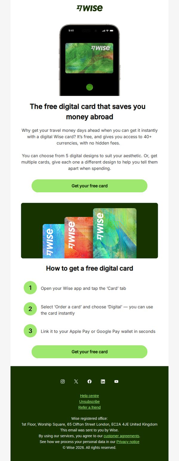


1. Wise - UK: Need a free travel card that’s ready to use instantly?
Objective
To drive immediate sign-ups for Wise’s free digital travel card by highlighting its instant availability, multi-currency support, and no hidden fees, positioning it as the smarter, faster alternative to traditional travel money solutions.
Why this works
The email brilliantly reframes the digital card not as a financial tool but as a travel convenience, emphasizing instant access and aesthetic customization to emotionally resonate with globetrotters who value both function and personal style.
How to implement
By breaking down the activation process into three simple, numbered steps with visual cues, the email reduces perceived friction and builds confidence that users can get started in seconds, a powerful conversion tactic for time-sensitive travelers.
Pro Tip
Add a subtle urgency element, like a countdown timer or limited-edition card design, near the CTA to nudge procrastinators into immediate action, especially since the offer is framed as instant and time-sensitive. • Include a micro-testimonial or trust badge (e.g., 'Used by 10M+ travelers') near the hero section to reinforce credibility and reduce skepticism around digital-only financial products.
2. MoneySavingExpert: 13mths' FREE travel + mobile + breakdown cover, free Lidl doughnut, £240k marriage saving, cheap drugs, 10% off Morrisons shop for NHS, £120 window vac for £55
Objective
This email aims to deliver high-impact, time-sensitive money-saving opportunities across banking, insurance, prescriptions, and retail to help readers immediately reduce household expenses and maximize value. It positions MoneySavingExpert as the essential weekly resource for savvy financial decisions.
Why this works
The email brilliantly front-loads its most compelling offers, like free insurance bundles and prescription savings, using bold headlines and urgent language to immediately capture attention and drive action before readers scroll away.
How to implement
By structuring complex financial products into simple, color-coded comparison tables with clear eligibility rules and step-by-step how-to instructions, the campaign transforms overwhelming choices into confident, actionable decisions for even novice savers.
Pro Tip
The primary CTA 'Act NOW to get Warm Home Discount' is buried mid-email and visually underwhelming; it should be moved above the fold with a contrasting button design to match the urgency of the offer and improve conversion. • The 'Revealed: The tricks medicine firms use...' section, while informative, disrupts the flow of actionable deals; consider relocating it to a dedicated 'Education Section' at the end to maintain momentum for immediate savings.
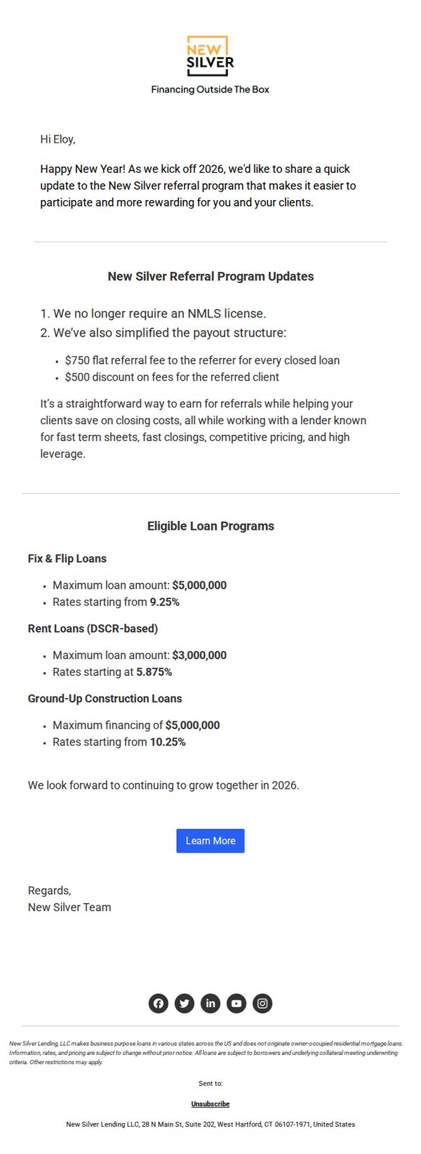
3. New Silver: Earn $750 Per Referral With Our Updated Program
Objective
This email aims to inform existing partners about updates to New Silver’s referral program, emphasizing increased earning potential and simplified participation to drive more referrals in 2026.
Why this works
The email opens with a warm, personalized greeting and timely New Year’s context, which builds rapport and positions the update as a fresh, forward-looking opportunity rather than just a policy change.
How to implement
By clearly listing the two major program updates, removing the NMLS license requirement and simplifying the payout structure, the email reduces friction and makes the value proposition instantly digestible for busy professionals.
Pro Tip
Add a visual element like a badge or icon next to the $750 referral fee to draw attention to the financial incentive, since the current text-only treatment may cause it to blend into the body copy. • Include a short testimonial or quote from a past referrer who successfully earned from the program to build social proof and reduce perceived risk for new participants.
4. MoneySavingExpert: 'Grab the last 4.5%+ savings fix this year', £55 off groceries, 20 mobile savers, Fix mortgage now?, Amazon £5 off
Objective
This email aims to drive immediate action on time-sensitive financial deals, especially high-interest savings accounts, while delivering a broad mix of money-saving tips across mobile, insurance, groceries, and mortgages to position MoneySavingExpert as the go-to authority for smart personal finance decisions.
Why this works
The email masterfully combines urgency with authority by leading with a time-bound savings fix while backing it with Martin Lewis’s analysis, making readers feel they’re acting on insider intelligence rather than just another promo.
How to implement
It leverages a ‘tip-of-the-iceberg’ structure, each numbered mobile tip is self-contained yet invites deeper exploration, creating a scroll-driven journey that keeps users engaged without overwhelming them with dense financial jargon.
Pro Tip
The primary CTA 'Grab the last 4.5%+ savings fix this year' is buried mid-email; move it above the fold with a sticky banner or bold hero section to capture attention before users scroll past the urgency trigger. • The mobile masterclass section, while rich in detail, lacks visual hierarchy, break up the 21 tips with icons, collapsible accordions, or a 'Top 3 Quick Wins' summary to reduce cognitive load and increase scannability for time-poor readers. • The savings rate graph is informative but static; add a micro-CTA beneath it like 'See which banks still offer 4.5%+' with a direct link to the comparison tool to turn passive data into an actionable next step.
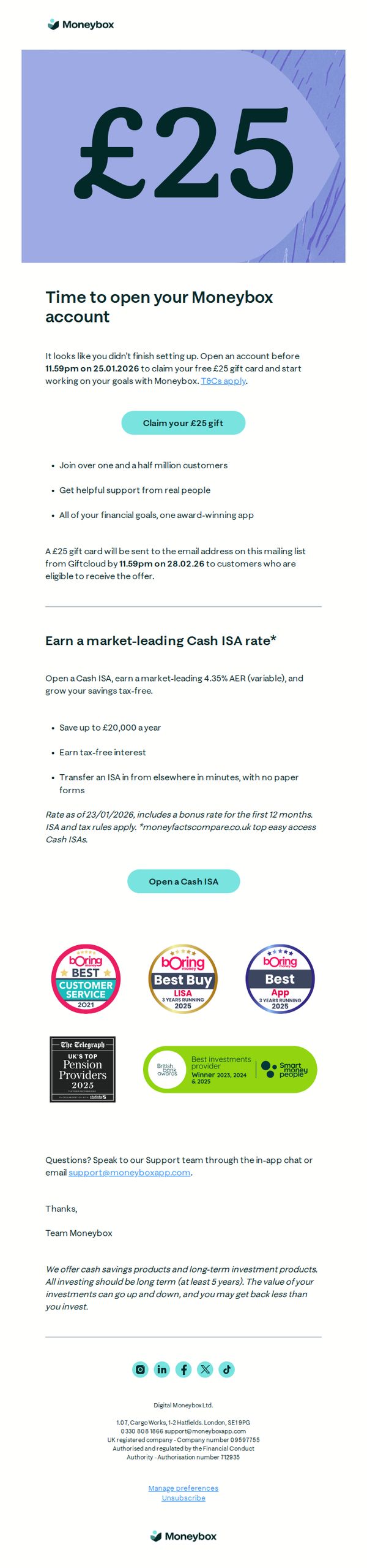
5. Moneybox: Claim your £25 gift card
Objective
This email aims to re-engage users who started but didn’t complete their Moneybox account setup by offering a £25 gift card incentive to finish onboarding before a hard deadline, while also promoting the benefits of opening a Cash ISA.
Why this works
The email brilliantly leverages FOMO by anchoring the £25 gift card to a specific, non-negotiable deadline, 11:59pm on 25.01.2026, creating urgency without feeling pushy, which is perfect for reactivating stalled signups.
How to implement
Instead of burying social proof, the campaign showcases five distinct, visually distinct award badges from trusted sources like Boring Money and The Telegraph, which builds instant credibility and reassures hesitant users about the platform’s legitimacy and performance.
Pro Tip
The email lacks a visual countdown timer near the CTA, which would reinforce urgency and increase conversion by making the deadline feel more immediate and tangible to the reader. • The 'Open a Cash ISA' CTA is visually underweighted compared to the gift card CTA, consider using a secondary button style or repositioning it closer to the ISA benefits to better balance dual conversion paths.
6. MoneySavingExpert: BILLBUSTER Special: Big Brit Gas Big Switch ends, £20/mth broadband, 20% off childcare bills, free £225 bank switch ends, cut Council Tax bills and far more

Objective
This email aims to empower UK consumers to slash everyday bills by highlighting 12 high-impact, actionable money-saving strategies across energy, broadband, childcare, and more, with urgency-driven deadlines to prompt immediate action.
Why this works
The email opens with a bold, benefit-driven headline that immediately communicates scale and simplicity, 'Stop the rip offs! 12 big & easy ways to slash bills', which hooks readers by promising tangible, life-changing savings without complexity.
How to implement
Each bill-busting tip is structured with a consistent, scannable format: typical saving, rough time to do, key action, and call to arms, making it effortless for time-poor readers to digest, prioritize, and act on the most relevant tips first.
Pro Tip
The primary CTA 'Stop the rip offs!' is visually buried under the hero image and subhead; reposition it as a sticky, contrasting button above the fold to ensure immediate visibility and reduce scroll friction for mobile users. • The energy switch offer section includes a dense comparison table that overwhelms readers; simplify it to highlight only the top 2 deals with clear 'Save £X/yr' callouts and a 'See All Deals' link to preserve clarity and conversion focus.
7. J.P. Morgan: Time to Shine

Objective
This email aims to position J.P. Morgan as a thought leader in financial markets by delivering timely, data-driven insights on silver, U.S. equities, AI venture trends, and healthcare innovation, encouraging subscribers to engage deeper with their research and stay informed on macroeconomic shifts.
Why this works
The email masterfully uses provocative, question-driven headlines like 'Is it silver’s time to shine?' to spark curiosity and position J.P. Morgan as the authoritative source for answering complex market questions that matter to sophisticated investors.
How to implement
By embedding direct quotes from internal experts like John Schlegel, the campaign builds credibility and humanizes institutional research, making high-level market analysis feel more accessible and trustworthy to readers who value insider perspectives.
Pro Tip
Add a subtle countdown or time-sensitive language near the 'SEE FORECAST' CTA to create urgency, for example, 'Forecast updated weekly, view before Friday’s market close', to nudge immediate engagement. • Include a brief 'Why This Matters' subheading under each section to explicitly connect the insight to the reader’s portfolio or decision-making, strengthening relevance and reducing cognitive load for busy professionals.
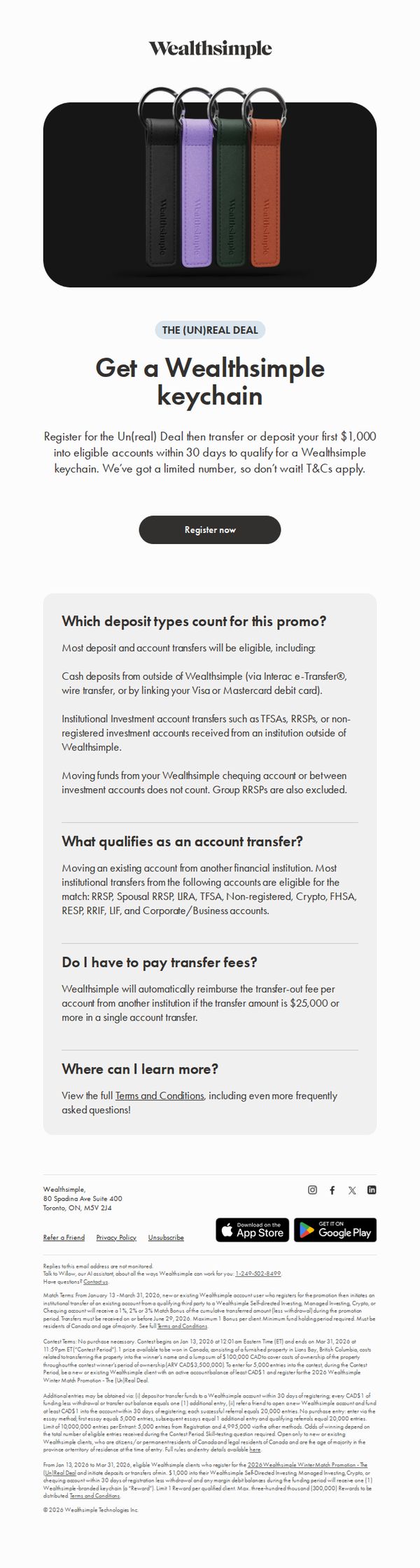
8. Wealthsimple: Want a Wealthsimple keychain?
Objective
This email aims to drive new account registrations and initial funding by offering a branded keychain as a tangible incentive, while also encouraging account transfers from other institutions to boost AUM quickly.
Why this works
The email brilliantly turns a low-cost swag item into a high-perceived-value reward by tying it to a meaningful financial action, funding an account, which makes the offer feel exclusive and achievement-based rather than gimmicky.
How to implement
By clearly defining eligible deposit types and transfer conditions upfront, the email reduces friction and preempts common objections, helping users self-qualify without needing to dig through fine print or contact support, which boosts conversion confidence.
Pro Tip
Add a visual progress bar or countdown timer near the CTA to create urgency, since the offer is time-bound and inventory-limited, showing ‘Only X keychains left’ or ‘Ends in 3 days’ would significantly increase FOMO-driven conversions. • Include a mini testimonial or social proof snippet near the CTA, such as ‘Over 5,000 users claimed their keychain last week’, this leverages social validation to reduce hesitation and reinforce that the offer is both popular and legitimate.
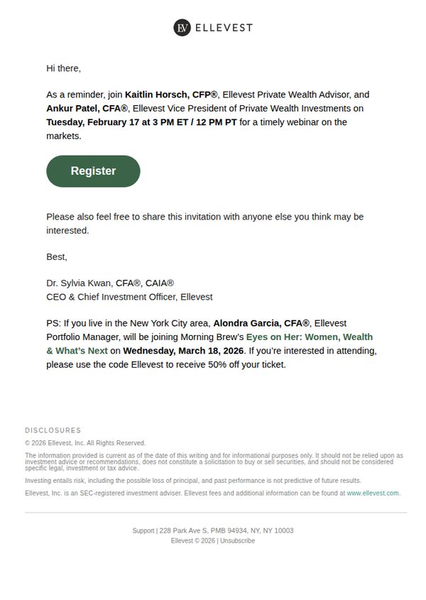
9. Ellevest: Reminder: February Market Insights Webinar
Objective
This email serves as a timely reminder to register for Ellevest’s February Market Insights Webinar, featuring senior financial advisors to help recipients stay informed on market trends. It also encourages sharing the invite and promotes an additional local event with a discount code.
Why this works
The email leverages authority by naming specific, credentialed speakers upfront, which builds instant credibility and reassures recipients that the content will be valuable and professionally delivered.
How to implement
Including a PS with a geo-targeted event and exclusive discount code creates a secondary conversion path without diluting the primary CTA, making the email feel personalized and strategically layered.
Pro Tip
Add a visual countdown timer or urgency indicator near the CTA to reinforce the time-sensitive nature of the webinar and nudge procrastinators to register immediately. • Include a short bullet-point preview of what attendees will learn during the webinar to increase perceived value and reduce hesitation before clicking 'Register'.
10. Investopedia: How Are Investors Dealing With AI Fears These Days? 'Sell First, Ask Questions Later'

Objective
This email aims to engage subscribers with timely, digestible financial news and analysis while reinforcing Investopedia’s authority as a trusted source for market insights and personal finance guidance. It encourages continued readership by highlighting diverse, high-interest topics that resonate with both novice and experienced investors.
Why this works
The email opens with a provocative, emotionally resonant headline about AI fears in investing, a smart hook that taps into current market anxiety and immediately positions Investopedia as a guide through uncertainty, not just a news source.
How to implement
Each article preview pairs a compelling, curiosity-driven title with a relevant, high-quality image and a consistent 'READ MORE' CTA, creating a clean, scannable rhythm that respects the reader’s time while encouraging deeper engagement with each story.
Pro Tip
Add a subtle visual hierarchy to the CTA buttons, such as varying button size or color intensity, to prioritize the top 2-3 most urgent or high-value articles, guiding readers toward content most aligned with current market volatility or subscriber interests. • Include a short, personalized teaser at the top, like 'Based on your recent reads, you might like this story on AI-driven market shifts', to increase relevance and click-through by leveraging behavioral data without compromising the newsletter’s editorial tone.