Dental Promotional Campaign email designs from top brands



1. quip: 🐣 Peep this! 25% off Brushes for Kids
Objective
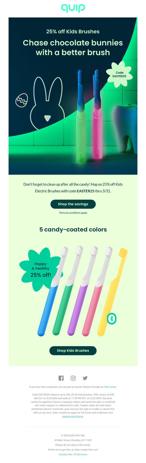
This email aims to drive immediate sales of Quip’s Kids Electric Brushes by leveraging the Easter holiday theme and offering a time-sensitive 25% discount. It encourages parents to act quickly to take advantage of the promotion before it expires on 3/31.
Why this works
The email brilliantly ties the Easter holiday to dental hygiene by using playful visuals like chocolate bunnies and candy-coated brush colors, making the product feel festive and relevant to seasonal parenting needs.
How to implement
By positioning the discount as a post-candy cleanup solution, the campaign reframes toothbrushing from a chore into a timely, responsible parenting win, creating emotional urgency without being pushy or guilt-driven.
Pro Tip
Add a countdown timer near the CTA to visually reinforce urgency and prevent the discount’s March 31 deadline from being overlooked in the fine print. • Include a short testimonial or parent quote near the product grid to build social proof and address potential skepticism about kids’ willingness to use electric brushes.
2. quip: 🪥 Fresh, focused, & 40% off
Objective
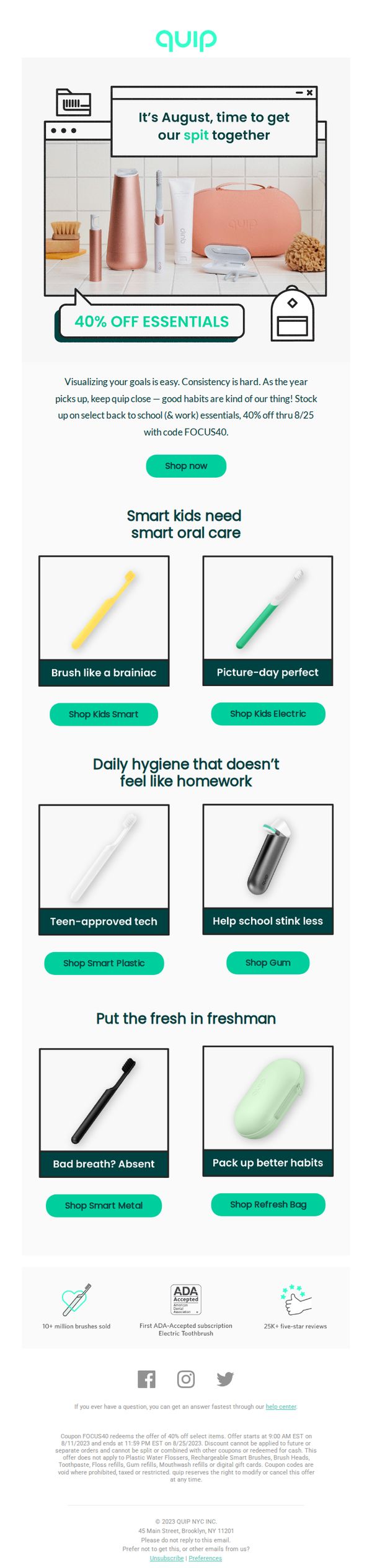
This email aims to drive urgency-driven purchases of Quip’s oral care essentials by offering a 40% discount tied to the back-to-school season, while positioning the brand as a partner in building consistent, smart hygiene habits for kids, teens, and adults.
Why this works
The email brilliantly ties a seasonal discount to behavioral psychology, framing oral care as a ‘back-to-school & work essential’ makes the purchase feel necessary rather than optional, increasing conversion potential through contextual relevance.
How to implement
By segmenting products into audience-specific categories, kids, teens, and freshmen, Quip transforms a generic sale into a personalized experience, subtly guiding users to the right product without overwhelming them with choice.
Pro Tip
Add a visible countdown timer near the CTA to reinforce urgency, the current offer end date (8/25) is buried in fine print, and a dynamic timer would create stronger FOMO without disrupting the clean layout. • Include a short, benefit-driven tagline under each product tile, for example, ‘Reduces plaque 2x faster’, to help users quickly grasp value beyond the visual, especially for products like ‘Smart Metal’ where function isn’t immediately obvious.
3. quip: Umm… real fairy sighting!? 👀🧚♀️
Objective
This email aims to engage subscribers with whimsical, fairy-themed storytelling while promoting limited-time product offers and app engagement. It blends education, entertainment, and conversion by tying oral care traditions to playful marketing around National Tooth Fairy Month.
Why this works
The email masterfully blends fantasy with function by personifying the tooth fairy as a relatable, modern character that ties childhood nostalgia to adult oral care habits, making the brand feel both playful and purposeful without sacrificing credibility.
How to implement
By anchoring the campaign to National Tooth Fairy Month, Quip transforms a cultural tradition into a timely, shareable marketing moment that educates while promoting products, turning a sentimental milestone into a strategic sales window with emotional resonance.
Pro Tip
The 'Press play' button in the 'Minty Melodies' section lacks context, adding a brief audio preview or visual cue (like a waveform or speaker icon) would better signal interactivity and increase click-through rates. • The product grid in the 'Word of Mouth' section shows two identical brushes with different CTAs, consolidating them into one unified CTA with a toggle or dropdown for 'Kids' vs. 'Adult' would reduce visual clutter and improve decision clarity.
4. quip: Just for you: 20% off sitewide 🦷
Objective
This email aims to drive immediate sales by offering a time-sensitive 20% discount sitewide to encourage recipients to upgrade their oral care routine with Quip’s modern, design-forward products. It also subtly promotes subscription habits for long-term customer retention.
Why this works
The email brilliantly frames the discount as a personal, exclusive gift, using phrases like 'Just for you' and 'Psst...your checkout code is VIP20', which builds emotional ownership and urgency without sounding pushy or generic.
How to implement
Each product highlight pairs a bold, benefit-driven headline with a clean visual and a direct link, making it effortless for readers to understand the value and take action without cognitive overload or decision paralysis.
Pro Tip
Add a visible countdown timer in the header or hero section to reinforce the 24-hour urgency, which could increase conversion by leveraging scarcity psychology more viscerally than text alone. • Include a customer testimonial or star rating near the hero section to build social proof early, especially since the offer is broad and not tied to a specific product, trust can offset hesitation.
5. quip: 🎉 Happy New Year! 15% off bundles + FREE tote
Objective
This email aims to drive immediate sales by celebrating the New Year with a limited-time discount on oral care bundles while incentivizing purchases with a free tote bag. It positions Quip as a partner in building healthier habits through curated, dentist-approved routines.
Why this works
The email brilliantly ties the New Year’s theme to behavior change by framing product bundles as ‘healthier habits,’ making the purchase feel like a self-improvement milestone rather than just a transaction.
How to implement
Including a free tote as a bonus, not just a discount, creates perceived value beyond price, turning a functional item into a lifestyle accessory that reinforces brand identity and encourages social sharing.
Pro Tip
Add a countdown timer near the hero section to emphasize urgency around the 1/20 deadline, which would increase conversion by leveraging scarcity without cluttering the clean layout. • Include a small testimonial or social proof snippet under each bundle (e.g., ‘Loved by 10K+ customers’) to build trust and reduce hesitation, especially for first-time buyers considering a new oral care system.
6. DentalPlans.com : Don't forget your $58.05 in savings!
Objective
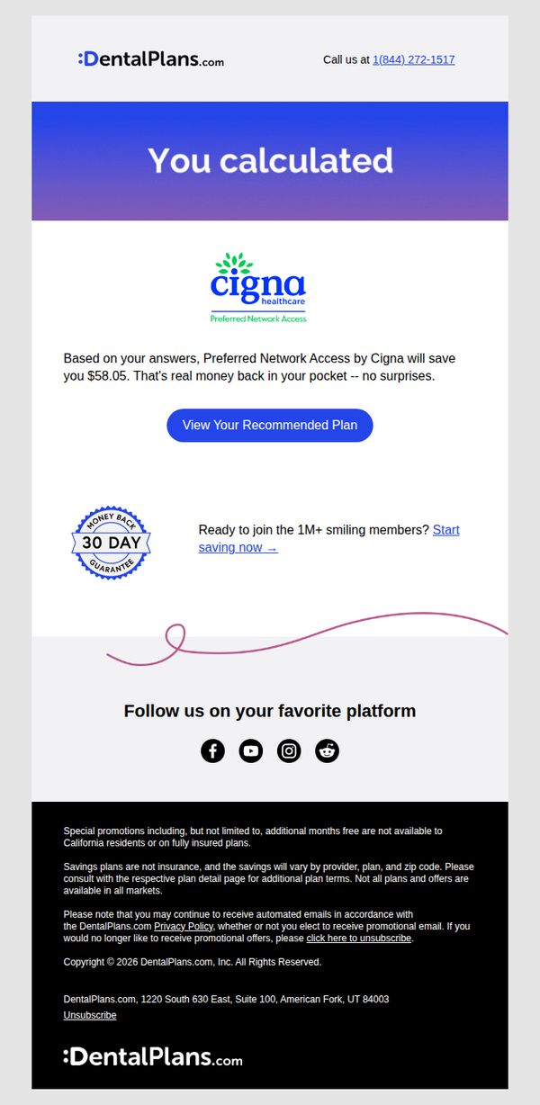
This email aims to re-engage users who previously calculated potential savings with DentalPlans.com by reminding them of their personalized $58.05 savings and encouraging immediate action to view and enroll in their recommended Cigna plan.
Why this works
The email leverages personalized savings data as a powerful psychological trigger, making the value proposition feel real and urgent rather than generic, which significantly increases conversion potential for cost-conscious consumers.
How to implement
By prominently featuring the Cigna logo and 'Preferred Network Access,' the campaign builds instant credibility and taps into brand recognition, reducing friction for users unfamiliar with DentalPlans.com’s third-party partnerships.
Pro Tip
Add a subtle countdown timer next to the CTA to create urgency around the personalized savings, since the current design lacks time-sensitive pressure that could boost immediate clicks. • Reposition the 'Start saving now' link closer to the CTA button or integrate it as a secondary button to reduce decision fatigue and provide a clearer alternative path for users hesitant to view the full plan details.
7. quip: 🚨35% OFF Every. Single. Brush.
Objective
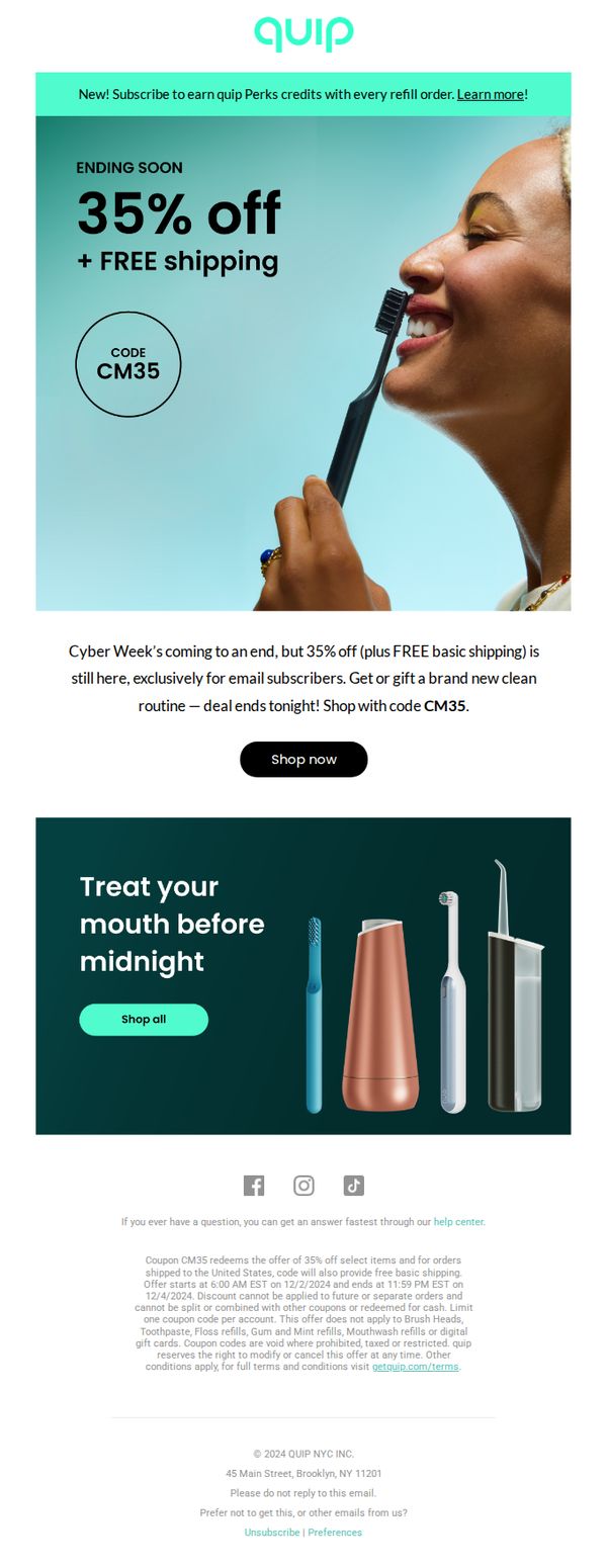
This email aims to drive immediate sales by leveraging urgency and exclusivity, offering email subscribers 35% off all brushes plus free shipping before the Cyber Week deal ends. It also encourages new subscriptions by highlighting perks tied to refill orders.
Why this works
The email brilliantly combines urgency with exclusivity by anchoring the 35% discount to email subscribers only and tying it to a Cyber Week deadline, making the offer feel both time-sensitive and personally valuable.
How to implement
By featuring a joyful, real-life image of someone using the product alongside bold, minimalist typography, the campaign visually reinforces the emotional payoff of clean teeth while keeping the message uncluttered and instantly digestible.
Pro Tip
Add a countdown timer beneath the 'ENDING SOON' headline to visually reinforce urgency and reduce the cognitive load of calculating the deadline, increasing conversion likelihood for time-sensitive shoppers. • Include a short testimonial or social proof snippet near the hero section, such as 'Over 500K customers switched to quip this month', to build trust and validate the offer’s popularity before the user scrolls further.
8. DentalPlans.com : Your dentist loves us! 💙
Objective
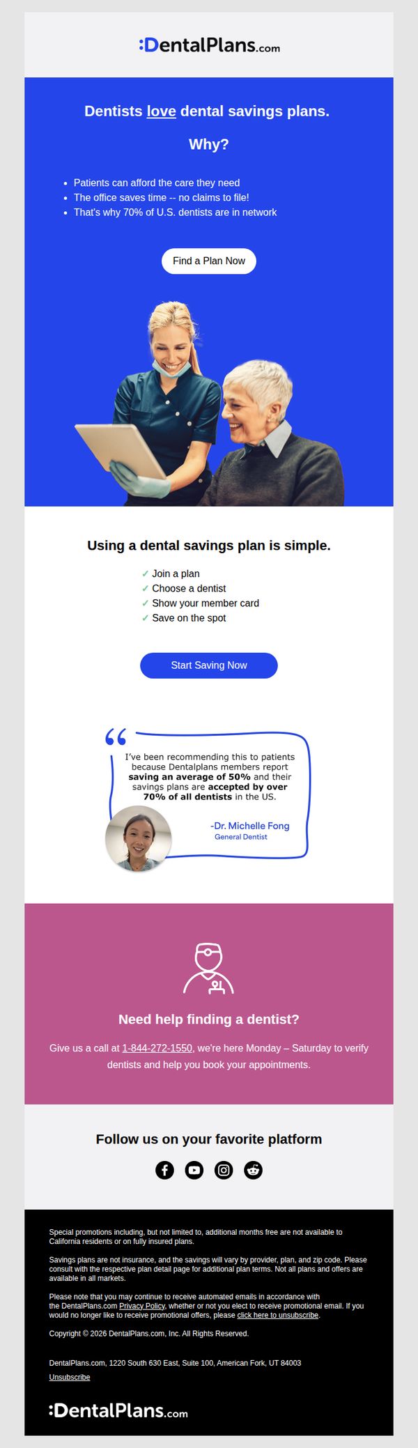
This email aims to build trust and drive sign-ups by highlighting that dentists endorse dental savings plans, emphasizing convenience and savings for patients while positioning the service as widely accepted and dentist-approved.
Why this works
The email smartly flips the script by leading with dentist approval instead of patient savings, which builds instant credibility and reassures skeptical consumers that this isn’t just another discount gimmick but a clinically endorsed solution.
How to implement
By breaking down the user journey into four simple, check-marked steps, the campaign removes friction and mental overload, making the process feel effortless and approachable even for those intimidated by dental costs or insurance complexity.
Pro Tip
The primary CTA 'Find a Plan Now' appears above the value explanation, consider moving it below the dentist testimonial or after the 4-step process to ensure users understand the benefit before being asked to act. • The purple help section feels visually disconnected; integrate the phone number and support offer into the main flow or add a secondary CTA like 'Call Us for Help Finding a Dentist' to maintain momentum and reduce drop-off for users needing guidance.
9. quip: Just for you: 20% off sitewide 🦷

Objective
This email aims to drive immediate sales by offering a time-sensitive 20% discount sitewide to encourage recipients to upgrade their oral care routine with Quip’s premium products. It also seeks to position Quip as a modern, lifestyle-aligned brand by highlighting innovative, design-forward tools.
Why this works
The email brilliantly frames the discount as an exclusive, whispered secret, 'Psst...your checkout code is VIP20 (but let’s keep it between us 😉)', which builds emotional ownership and urgency without sounding pushy.
How to implement
By spotlighting specific products with witty, benefit-driven headlines like 'Swish to keep cavities at bay' and 'Disposable floss picks are so last year,' the email turns functional items into desirable lifestyle upgrades with personality.
Pro Tip
Add a visible countdown timer in the header or hero section to reinforce the 24-hour urgency, since the current text-only mention of time limits may not register strongly enough to trigger immediate action. • Include a small testimonial or social proof snippet near the hero section, such as 'Join 500k+ users who upgraded their smile', to build trust and reduce hesitation for first-time buyers.
10. quip: 💵 $5 this weekend only!
Objective
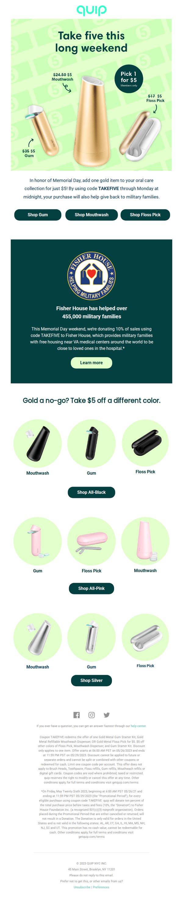
This email aims to drive immediate sales by offering a limited-time $5 discount on select gold-colored oral care products, while also promoting brand values through a charitable donation to Fisher House in honor of Memorial Day.
Why this works
The email brilliantly ties a time-sensitive discount to a patriotic holiday, creating emotional resonance while driving urgency, a smart fusion of commerce and cause that elevates the offer beyond a simple sale.
How to implement
By visually anchoring the $5 price point next to each product and using bold strikethroughs on original prices, the email makes the value proposition instantly clear and irresistible, reducing cognitive load for the shopper.
Pro Tip
Add a countdown timer near the hero section to visually reinforce the urgency of the 'this weekend only' offer, which would increase conversion by leveraging real-time scarcity. • Include a short customer testimonial or star rating next to the gold product trio in the hero section to build social proof and reduce perceived risk for first-time buyers.