The complete jewelry promotional campaign email collection



1. Ana Luisa: Back to school style starts here 📓
Objective
This email aims to drive back-to-school jewelry purchases by positioning personalized charms as essential style accessories for the new school year, while layering in a Labor Day sale to create urgency and increase average order value.
Why this works
The email brilliantly ties seasonal relevance to product utility by framing number, letter, and zodiac charms as back-to-school essentials, transforming jewelry from accessory to identity statement that resonates with students and gift-givers alike.
How to implement
By repeating the Labor Day sale offer both at the top and mid-funnel with clear tiered discounts, the campaign reinforces value without overwhelming the shopper, making the promotion feel like a natural part of the journey rather than a forced interruption.
Pro Tip
The hero CTA 'BUILD YOUR LOOK' is visually prominent but lacks urgency or benefit-driven language; rephrasing to 'Build Your Back-to-School Look & Save 25%' would better align the primary action with the sale incentive and seasonal theme. • The 'WE THINK YOU’LL LOVE THESE' section uses generic product names (Frida, Julie Cho) without explaining what makes them relevant to the campaign; adding micro-copy like 'Perfect for First Day Outfits' or 'Teacher-Approved Minimalist Style' would strengthen personalization and intent.
2. Ana Luisa: Ready for a plot twist? 💫
Objective
This email aims to drive immediate sales by introducing Ana Luisa’s limited-edition 'Twist & Fold' jewelry collection while leveraging urgency and volume-based discounts to encourage multiple purchases.
Why this works
The email brilliantly uses scarcity psychology by highlighting 'only 200 of each style available', this transforms a simple product launch into a must-act-now event that taps into FOMO without sounding desperate.
How to implement
By placing the volume discount offer both at the top and mid-funnel, the campaign reinforces the incentive to buy more without interrupting the browsing experience, making the deal feel both prominent and natural to the shopper’s journey.
Pro Tip
Add a countdown timer near the 'Limited Edition' banner to visually reinforce urgency and encourage faster decision-making, especially since the email already mentions limited stock. • Include a short testimonial or social proof snippet under the 'Twist & Fold' hero section to build trust and validate the collection’s appeal before users scroll to product details.
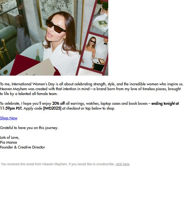
3. Heaven Mayhem: 20% Off Ends Tonight – International Women's Day Discount
Objective
This email aims to drive immediate sales by offering a time-sensitive 20% discount in honor of International Women’s Day, while reinforcing brand values of female empowerment and timeless style through a personal message from the founder.
Why this works
The email opens with a heartfelt, founder-signed message that ties the promotion to a meaningful cultural moment, making the discount feel like a celebration rather than just a sale, which builds emotional connection and brand loyalty.
How to implement
By explicitly naming the discount code and its expiration time in the body, the email removes friction for the customer, reducing decision fatigue and increasing the likelihood of immediate conversion without requiring them to hunt for details.
Pro Tip
Add a visual countdown timer near the CTA to reinforce urgency, since the current text-based deadline may not register as strongly with distracted readers who skim the email quickly. • Include a small product grid or hero image carousel showing the discounted items (earrings, watches, etc.) to give visual context and reduce the cognitive load of imagining what’s on sale, increasing click-through likelihood.
4. Nominal : 30-60% OFF. We're extending it.
Objective
The email aims to extend urgency and emotional connection by prolonging the Boxing Day sale for 48 more hours, encouraging immediate purchases while reinforcing community appreciation and personalization through founder-led messaging.
Why this works
The email leverages founder-led storytelling to humanize the brand, turning a sale extension into a gesture of gratitude that deepens customer loyalty and makes the discount feel personally earned rather than just transactional.
How to implement
By explicitly naming product categories like custom names, Arabic calligraphy, and the Levantine Collection, the email creates mental hooks for specific customer segments, guiding them directly to what they’re most likely to want without overwhelming with choice.
Pro Tip
Add a visual countdown timer in the hero section to reinforce the 48-hour extension, making urgency tangible and reducing the cognitive load of calculating the deadline from text alone. • Include a small product grid or carousel of top-selling or newly extended sale items directly after the CTA to reduce friction and guide users from interest to action without requiring navigation to another page.
5. Mejuri: Want more?
Objective
This email aims to convert non-members into Mejuri+ members by highlighting exclusive perks like early sale access, limited-edition products, and free shipping, all designed to create urgency and perceived value around joining for free.
Why this works
Mejuri brilliantly frames membership not as a cost but as an invitation to exclusivity, using aspirational visuals and emotionally resonant language like 'Let’s make things exclusive' to position joining as a lifestyle upgrade rather than a transaction.
How to implement
The campaign leverages FOMO effectively by emphasizing priority access to sales and limited-edition items, subtly implying that non-members risk missing out on coveted pieces, a powerful psychological trigger for impulse sign-ups.
Pro Tip
Add a countdown timer near the 'JOIN NOW FOR FREE' CTA to reinforce urgency around the free hoops offer, especially since it’s tied to a minimum spend and limited availability, this could nudge hesitant users to act faster. • Include a short video or animated GIF in the hero section showing members unboxing or wearing exclusive items, this would visually demonstrate the emotional payoff of membership beyond static images, enhancing relatability and desire.
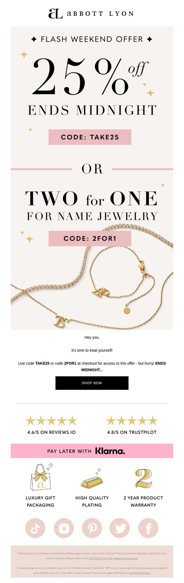
6. Abbott Lyon: 25% off OR 2 for 1 on Name Jewelry
Objective
This email aims to drive immediate sales by creating urgency around a limited-time weekend promotion on personalized name jewelry, offering customers a choice between a discount or a buy-one-get-one deal to increase perceived value and conversion likelihood.
Why this works
The email brilliantly leverages psychological urgency by anchoring the offer to a hard deadline, 'ENDS MIDNIGHT', which compels immediate action while making the promotion feel exclusive and time-sensitive.
How to implement
Offering two distinct promotional paths, 25% off or 2 for 1, gives customers a sense of control and personalization, increasing the likelihood they’ll choose the option that best aligns with their shopping intent and budget.
Pro Tip
Add a visual countdown timer near the CTA to reinforce urgency more dynamically than static text, increasing perceived scarcity and encouraging faster decision-making before the offer expires. • Include a small product grid or carousel of best-selling name jewelry pieces beneath the offer to inspire browsing and reduce friction for customers unsure what to buy, directly supporting the 'treat yourself' messaging.
7. Abbott Lyon: Get Resort Ready 🌴

Objective
This email aims to drive immediate summer jewelry purchases by evoking a resort-ready aesthetic and offering time-sensitive discounts on personalized and stackable pieces. It positions Abbott Lyon as the go-to brand for enhancing seasonal glow with luxury accessories.
Why this works
The email masterfully ties seasonal aspiration to product utility by using 'Resort Ready' as both a visual and emotional hook, making jewelry feel essential to summer confidence rather than optional adornment.
How to implement
By featuring real models in natural, sun-drenched settings with personalized initials and layered pieces, the campaign transforms generic product shots into aspirational lifestyle moments that invite self-identification and emotional connection.
Pro Tip
Add a subtle countdown timer next to the promo code to amplify urgency, especially since the offer lacks an explicit expiration date, this would convert passive interest into immediate action. • Include a micro-testimonial or customer quote beneath the product grid highlighting how a specific piece elevated someone’s vacation look, this would strengthen social proof where visual appeal alone may not seal the deal.
8. Bling Jewelry: Your Lucky Jewelry Awaits ✨

Objective
This email campaign aims to drive sales of St. Patrick’s Day-themed jewelry by promoting a 20% discount with the code LUCK20, encouraging recipients to celebrate the holiday in style while gifting or treating themselves to lucky charms and sparkling pieces.
Why this works
The campaign brilliantly ties emotional symbolism, luck, charm, and celebration, to product selection, making each piece feel personally meaningful rather than just decorative, which deepens customer connection and purchase intent.
How to implement
Using thematic visuals like clovers, green gemstones, and velvet textures creates an immersive seasonal experience that aligns perfectly with St. Patrick’s Day, helping customers visualize wearing and gifting these pieces during festive moments.
Pro Tip
Add a countdown timer near the hero section to create urgency around the LUCK20 offer, leveraging FOMO to boost immediate click-through rates before the promotion expires. • Include a short testimonial or social proof snippet under the 'Luck Looks Good on You' section to validate the emotional appeal with real customer experiences, enhancing trust and reducing perceived risk.
9. Pandora: Jessie, this year's must-have haunts 😱

Objective
This email aims to drive urgency and excitement around Pandora’s Halloween-themed charm collection by offering exclusive member rewards and limited-time discounts, encouraging immediate purchases before the seasonal items sell out.
Why this works
The email brilliantly ties seasonal emotion to product utility by framing Halloween charms not just as decorations but as personal style statements that let customers express their spooky side with elegance and flair.
How to implement
By layering two distinct offers, double points for members and a charm bundle discount, the campaign creates dual pathways to value, making it easier for different customer segments to justify an immediate purchase.
Pro Tip
Add a visible countdown timer near the 'Buy 2 Charms, Get 15% Off' offer to amplify urgency, since the current date range buried in fine print doesn’t create immediate FOMO for casual scrollers. • Include a small 'Customer Favorite' badge or star rating on top-performing Halloween charms in the product grid to leverage social proof and guide decision-fatigued shoppers toward bestsellers.
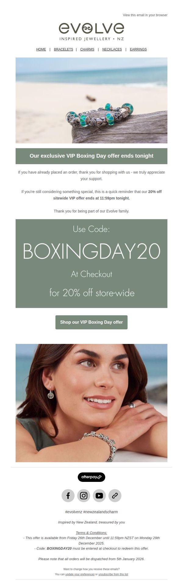
10. Evolve Jewellery : Final day | Enjoy 20% off sitewide!
Objective
This email aims to drive last-minute conversions by reminding subscribers that the VIP Boxing Day sale ends tonight, encouraging immediate action with a 20% sitewide discount code. It also expresses gratitude to past customers while creating urgency for those still considering a purchase.
Why this works
The email brilliantly leverages urgency by anchoring the offer to a specific, imminent deadline, 'ends tonight at 11:59pm', which taps into FOMO without sounding pushy, making it feel like a personal reminder rather than a sales pitch.
How to implement
By thanking past customers first and then addressing undecided shoppers, the message builds emotional rapport before delivering the sales hook, which softens the ask and makes the discount feel like a reward for loyalty rather than a desperate clearance tactic.
Pro Tip
Add a visible countdown timer near the CTA to visually reinforce urgency, seeing the clock tick down increases conversion pressure more effectively than static text alone, especially for time-sensitive offers like this one. • Include a small product grid or 'Best Sellers' carousel beneath the CTA to reduce decision fatigue, showing 2–3 popular items with the discount applied helps undecided shoppers quickly visualize what to buy, increasing click-through to checkout.