Magazine promotional campaign email examples & ideas



1. Travel + Leisure: Amazon's Fall Prime Day Secretly Kicked Off With Up to 70% Off Hundreds of Items
Objective
This email aims to drive immediate clicks and purchases by surfacing time-sensitive Amazon Prime Day deals curated by Travel + Leisure editors, while reinforcing brand authority through product testing and exclusive discount codes.
Why this works
By anchoring deals to editorial credibility, 'We test thousands of travel products each year', the email transforms generic discounts into trusted, curator-backed recommendations that feel personalized and authoritative rather than promotional.
How to implement
The strategic use of urgency cues like 'secretly kicked off' and 'nearly 50% off right now' paired with clear discount percentages creates a compelling FOMO trigger that motivates immediate action without overwhelming the reader with hype.
Pro Tip
Add a visual countdown timer near the top of the email to reinforce the urgency of Prime Day deals, especially since the subject line implies a secret early launch, this would heighten perceived scarcity and drive faster conversions. • Reposition the 'SHOP NOW' CTA buttons to appear directly beneath product images rather than after descriptive text, reducing friction by aligning the action with the visual cue and minimizing scroll-to-click distance.
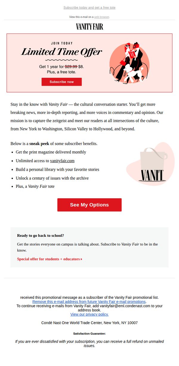
2. Vanity Fair: Subscribe to Vanity Fair for just $8 and get a free tote!
Objective
This email aims to convert casual readers into paid subscribers by highlighting a limited-time discount and a free tote bag incentive, while reinforcing Vanity Fair’s cultural authority and value proposition through mission-driven messaging and subscriber benefits.
Why this works
The email brilliantly pairs a steep price reduction with a tangible, branded gift, the tote, turning a transactional offer into an emotionally resonant keepsake that reinforces brand identity and encourages impulse conversion.
How to implement
By framing the subscription as access to 'the cultural conversation starter,' Vanity Fair elevates its value beyond content delivery, positioning itself as a cultural passport that connects readers to elite discourse across cities and industries.
Pro Tip
Add a countdown timer beneath the 'Limited Time Offer' to create urgency and reduce decision latency, especially since the offer’s time-bound nature is mentioned but not visually reinforced. • Reposition the 'See My Options' button closer to the hero section or duplicate it above the education section to reduce friction, users may scroll past it without realizing it’s the gateway to subscription tiers.
3. New York Magazine: The Nondescript Condo Building Where Jeffrey Epstein Kept His Victims
Objective
This email aims to drive engagement with New York Magazine’s City Desk newsletter by highlighting investigative journalism and cultural commentary that captures the contradictions and hidden stories of New York City life, encouraging readers to read deeper and subscribe for weekly updates.
Why this works
The email masterfully juxtaposes shocking investigative reporting with cultural ephemera to reflect the city’s chaotic, layered identity, a strategy that keeps readers emotionally invested while subtly reinforcing the publication’s editorial authority across genres.
How to implement
By leading with a visually arresting, morally charged headline about Epstein’s lesser-known property, the campaign leverages curiosity and outrage to hook readers immediately, then rewards them with nuanced, locally grounded storytelling that feels both urgent and deeply human.
Pro Tip
The CTA ‘READ THE STORY’ is repeated identically under every article, diluting urgency, vary the language (e.g., ‘Uncover the Hidden Address’, ‘See the Photos That Prove It’) to match each story’s emotional tone and increase click-through diversity. • The layout buries the ‘Sign Up for The Listings Edit’ CTA at the bottom with minimal visual hierarchy, elevate it with a colored button and brief value prop (e.g., ‘Get the best NYC apartments before they’re gone’) to convert casual readers into subscribers.
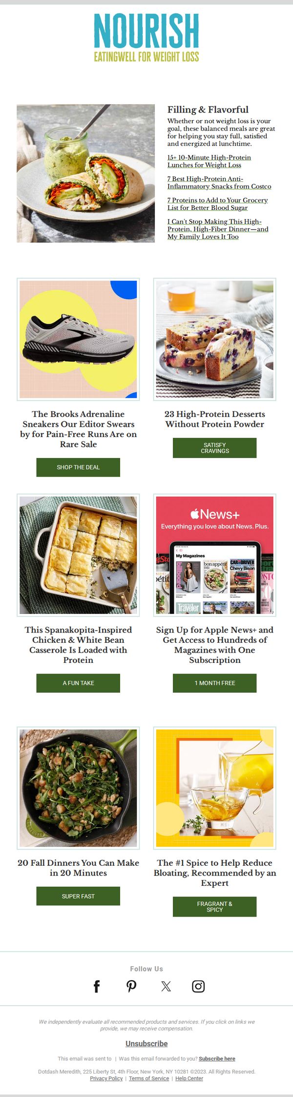
4. EatingWell : 15+ 10-Minute High-Protein Lunches for Weight Loss
Objective
This email aims to drive engagement and clicks by offering quick, high-protein lunch ideas tailored for weight loss, while also promoting related content and affiliate products that align with a health-conscious lifestyle. It seeks to position EatingWell as a trusted source for time-efficient, nutritious meal solutions.
Why this works
The email immediately hooks readers by promising 15+ high-protein lunches ready in 10 minutes, a powerful combo of speed and nutrition that speaks directly to busy dieters seeking sustainable weight loss without sacrificing flavor or satisfaction.
How to implement
By blending editorial content with smart affiliate placements, like sneakers for active lifestyles and protein-rich desserts, the campaign subtly expands the customer journey beyond recipes, turning meal inspiration into a holistic wellness experience that drives multiple conversions.
Pro Tip
The primary CTA 'SHOP THE DEAL' is generic and misaligned with the email’s core content, replacing it with a more relevant action like 'GET THE RECIPES' or 'START YOUR 10-MINUTE LUNCH PLAN' would better match user intent and improve conversion clarity. • The hero section’s headline and subhead are text-heavy and lack visual hierarchy, breaking up the copy with bullet points or icons (e.g., clock for time, scale for weight loss) would improve scannability and reinforce key benefits at a glance.
5. Newsweek: Why is democracy dying?
Objective
This email aims to provoke critical thinking about the global decline of democracy by linking it to the rise of the internet and digital polarization, while subtly encouraging readers to subscribe to Newsweek for deeper, ongoing analysis on complex societal issues.
Why this works
The email masterfully frames a complex geopolitical issue, the erosion of democracy, as a direct consequence of digital culture, making abstract global trends feel urgent and personally relevant to every reader scrolling through their inbox.
How to implement
By weaving together data from Freedom House, Pew Research, and academic experts, the email builds undeniable credibility without overwhelming the reader, turning a dense topic into a compelling narrative that invites further exploration rather than passive consumption.
Pro Tip
Add a visual hierarchy to the 'One More Thing' section, perhaps a small icon or colored divider, to better distinguish the football/AI tangent from the main democracy narrative, preventing reader whiplash and maintaining thematic focus. • Include a micro-CTA or teaser link within the body (e.g., 'Read the full study on global democracy trends →') to capture engaged readers earlier in the scroll, rather than relying solely on the final subscription button.
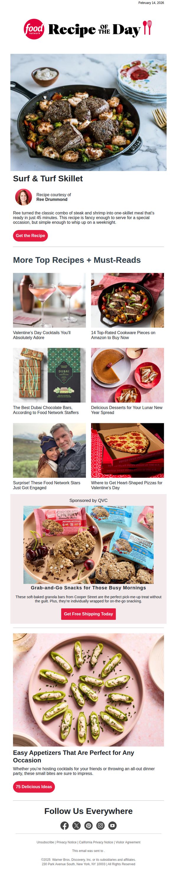
6. Food Network: Ree's Surf & Turf Skillet
Objective
This email aims to drive engagement by showcasing Ree Drummond’s Surf & Turf Skillet recipe as a quick, elegant weeknight meal while cross-promoting related content and sponsored products to keep readers exploring the Food Network ecosystem.
Why this works
The email brilliantly frames a complex-sounding dish as approachable by emphasizing its 45-minute prep time and versatility for both weeknights and special occasions, lowering the psychological barrier to trying it.
How to implement
By embedding a sponsored snack section between recipe highlights, the campaign seamlessly monetizes reader interest without disrupting the culinary narrative, making the ad feel like a natural extension of the content.
Pro Tip
Add a subtle countdown timer or urgency cue near the 'Get the Recipe' CTA to nudge immediate action, especially since the recipe is tied to a timely occasion (Valentine’s Day). • Include a short testimonial or user rating under the main recipe to build social proof, reinforcing that this dish is not just visually appealing but also loved by home cooks.
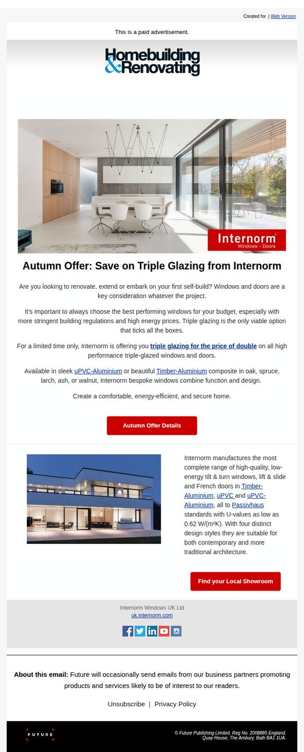
7. Homebuilding & Renovating: Autumn Offer: Save on Triple Glazing from Internorm
Objective
This email aims to drive immediate interest and action from homeowners and self-builders by promoting a limited-time autumn offer that lets them upgrade to high-performance triple-glazed windows at the price of double glazing, positioning Internorm as the premium yet accessible choice for energy-efficient home improvements.
Why this works
The email brilliantly frames the offer as a rare, time-sensitive opportunity, triple glazing at double glazing prices, which creates urgency while simultaneously addressing budget concerns that often stall high-end home improvement decisions.
How to implement
By explicitly tying the product to both modern and traditional architecture, the campaign avoids alienating any segment of its audience and instead positions Internorm as a versatile, design-conscious solution that adapts to the homeowner’s vision, not the other way around.
Pro Tip
Add a countdown timer near the CTA to visually reinforce the limited-time nature of the offer, which could increase conversion by creating real-time urgency that static text alone doesn’t convey. • Include a short testimonial or case study snippet from a recent customer who upgraded with Internorm triple glazing, this would humanize the offer and provide social proof that builds trust beyond technical specs.
8. MoneyWeek: Affordable airport lounge access | Houses with beautiful kitchens

Objective
This email aims to engage readers with curated lifestyle content that blends travel, property, and luxury experiences while subtly promoting MoneyWeek’s value proposition, helping readers spend smarter and stretch their money further. It also encourages subscription and deeper engagement with the brand’s digital and print offerings.
Why this works
The email opens with a culturally relevant hook, the lunar new year, to immediately connect with readers on a personal, seasonal level, making the content feel timely and emotionally resonant rather than purely transactional.
How to implement
By blending high-end lifestyle content like luxury hotels and wine reviews with practical money-saving tips, the email positions MoneyWeek as both aspirational and actionable, appealing to readers who want to live well without overspending.
Pro Tip
The primary CTA 'Read review' is buried under multiple sections; consider elevating a more conversion-focused CTA like 'Start Your Free Trial' or 'Save 58% Today' near the top or mid-funnel to align with the subscription goal. • The email lacks a clear visual hierarchy between editorial content and promotional offers, adding subtle dividers, badges, or color-coded labels (e.g., 'Editor’s Pick' vs. 'Money-Saving Tip') would help readers distinguish value types and prioritize engagement.
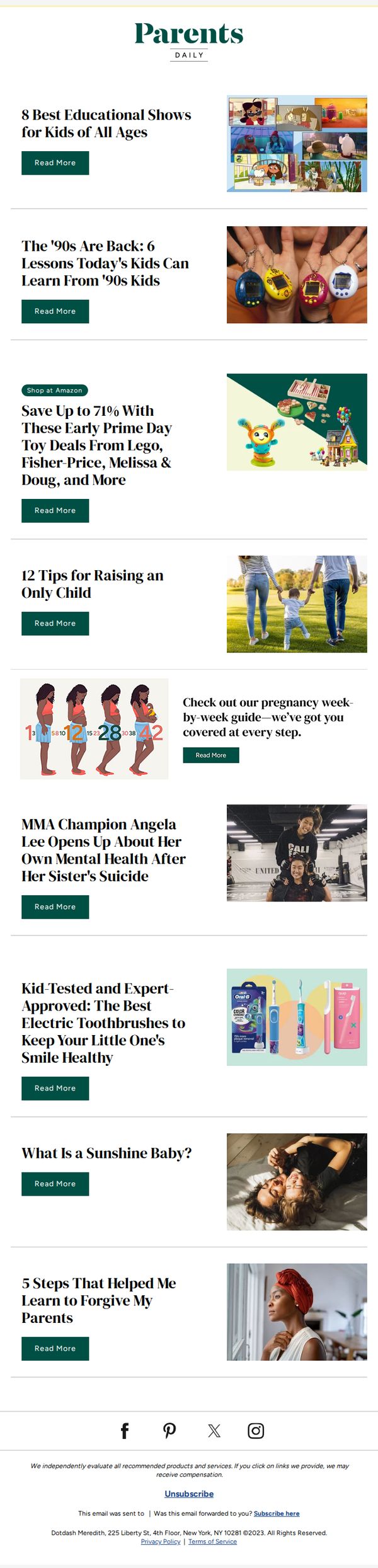
9. Parents: 8 Best Educational Shows for Kids of All Ages
Objective
This email aims to engage parents by delivering curated, age-appropriate educational content and product recommendations that support child development, while subtly driving traffic to affiliate-linked shopping deals and deeper editorial content.
Why this works
The email smartly blends evergreen parenting topics with timely nostalgia-driven content, creating emotional resonance while positioning the brand as a trusted guide for modern family life across generations.
How to implement
By embedding affiliate-driven product deals within editorially framed sections, like toy sales tied to '90s lessons, it seamlessly monetizes reader trust without disrupting the content-first experience parents expect.
Pro Tip
Add a personalized subject line or preheader text referencing the recipient’s child’s age group to increase relevance and open rates, since the content spans multiple developmental stages. • Include a small visual indicator (like a star or badge) next to the top-performing or most popular article to guide attention and reduce choice overload for time-pressed readers.
10. PC Gamer : Do I really spy a reasonable price for RAM? Here are this week's best PC gaming deals

Objective
This email aims to drive immediate clicks and purchases by highlighting time-sensitive, high-value PC gaming hardware deals while reinforcing PC Gamer’s authority as a trusted curator of gaming tech. It also seeks to grow newsletter subscriptions by offering ongoing value through expert picks and price tracking.
Why this works
The email opens with a relatable, personality-driven editor’s letter that humanizes the brand and frames the deals as insider intel rather than generic promotions, making readers feel like they’re getting privileged access to market-moving discounts.
How to implement
Each product listing pairs a bold price drop with a concise, specs-forward description that speaks directly to PC gamers’ decision-making criteria, like VRAM, refresh rate, or CPU pairing, turning technical specs into persuasive selling points without overwhelming the reader.
Pro Tip
Add a countdown timer or 'deal expires in X hours' tag next to each product to create urgency, since the current layout relies solely on static pricing without signaling time sensitivity, which could reduce conversion momentum. • Reposition the 'Sign Up' CTA above the footer and below the 'In Case You Missed It' section to capture attention while users are still engaged with content, rather than burying it at the very bottom where scroll fatigue may kill conversion intent.