Proven Media promotional campaign email designs you can use




1. Bloomberg: Bw Reads: Child care is still in crisis
Objective
This email aims to inform subscribers about the ongoing child care crisis in the U.S., using a compelling human story and data-driven analysis to highlight systemic failures and policy gaps, while encouraging deeper engagement with Bloomberg’s long-form journalism.
Why this works
The email masterfully opens with a relatable, emotionally resonant personal story of a working mother turned child care provider, grounding complex policy issues in human experience to immediately capture reader empathy and attention.
How to implement
It strategically layers data and historical context around the personal narrative, transforming a single case study into a national indictment of systemic underfunding and regulatory failure, a powerful model for turning human interest into policy advocacy.
Pro Tip
Add a visual progress bar or timeline graphic near the policy discussion section to illustrate the decades-long stagnation in child care funding, helping readers grasp the scale of inaction more intuitively than text alone. • Reposition the 'sign up here' CTA to appear immediately after the emotional climax of Deanna Cohen’s story, before diving into policy details, to capitalize on peak reader engagement and emotional resonance.
2. The Week - UK: Is Ukraine's counteroffensive working?
Objective
To inform subscribers of the day’s most critical global developments with concise, context-rich summaries while reinforcing The Week’s value as a trusted, digestible news source. It also aims to drive engagement through deeper reads and subscription conversions.
Why this works
The email opens with a high-stakes, timely question that immediately hooks readers by framing Ukraine’s military progress as both a tactical milestone and a symbolic turning point, making complex geopolitics feel urgent and personal.
How to implement
By embedding a sponsored event within the editorial flow, using clean visual separation and a clear discount code, the campaign monetizes attention without disrupting the reader’s trust, turning passive consumption into potential revenue with minimal friction.
Pro Tip
The primary CTA ‘Start your free trial’ is buried mid-email and visually underwhelming; relocating it to the top or bottom with stronger contrast and a benefit-driven headline (e.g., ‘Get clarity without the noise, start your free trial’) would increase conversion potential. • The ‘Picture of the Day’ and ‘Instant Opinion’ sections lack clear visual hierarchy or emotional pull; adding a short caption or quote overlay on the image and using bold typography for opinion headlines would better signal their value and encourage clicks.
3. theSkimm: Today’s the only day to shop Quince’s flash sale
Objective
This email aims to drive immediate purchases by highlighting time-sensitive flash sales and curated product picks, while reinforcing theSkimm’s role as a trusted shopping guide that surfaces affordable, high-quality finds across categories.
Why this works
The email leverages urgency with a clear, time-bound flash sale headline while grounding it in editorial credibility through the editor’s personal voice, making the promotion feel like a curated insider tip rather than a generic discount push.
How to implement
By blending product highlights with lifestyle context, like pairing Quince’s activewear with spring readiness or Wishi’s styling service with seasonal transition struggles, the email transforms transactional offers into relatable, emotionally resonant solutions for the reader’s daily life.
Pro Tip
The primary CTA ‘shop the retailer’s flash sale’ is buried mid-email and lacks visual prominence; elevating it with a bold button or sticky banner near the top would better capture attention and align with the urgency of ‘today only’ messaging. • The ‘Just Wear This’ section featuring Wishi styling services feels disconnected from the flash sale theme; integrating a direct CTA to book a session with a discount code tied to Quince or Ulta purchases would create a stronger cross-promotional flow.
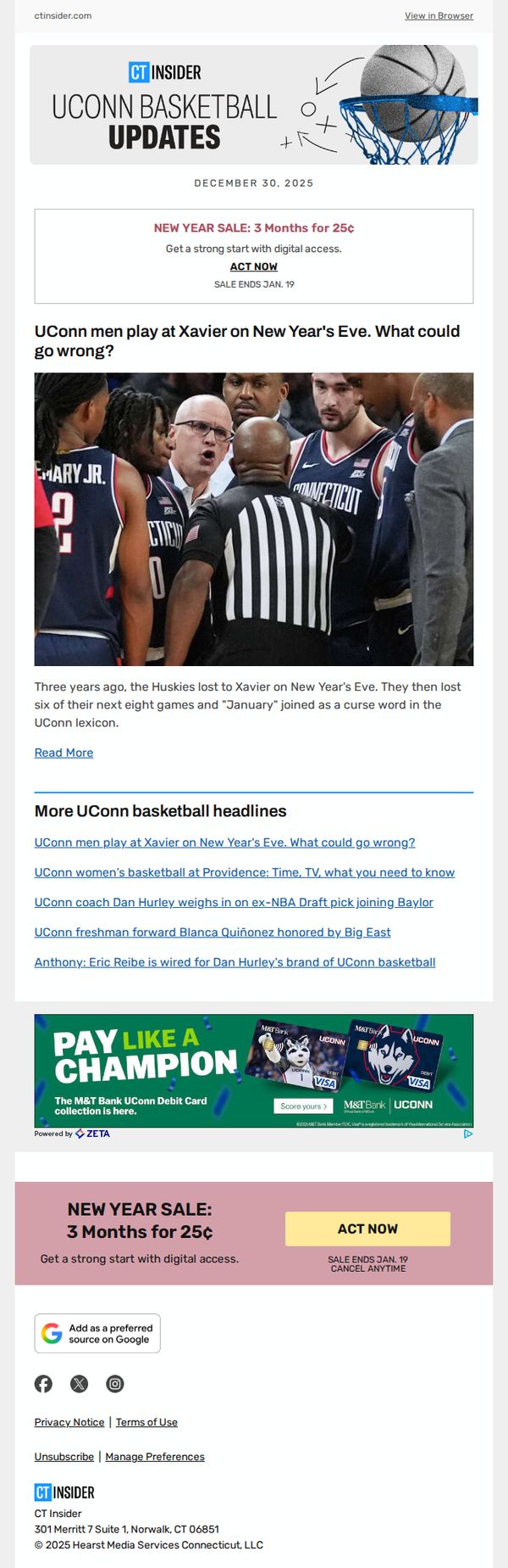
4. Connecticut Magazine: UConn men play at Xavier on New Year's Eve. What could go wrong?
Objective
This email aims to drive digital subscription sign-ups by leveraging timely, emotionally resonant UConn basketball content while creating urgency with a limited-time New Year’s sale offer.
Why this works
The email brilliantly ties a high-emotion sports moment, UConn’s New Year’s Eve game against Xavier, to a subscription offer, making the purchase feel like joining a community that understands the stakes, not just buying access.
How to implement
By referencing a three-year-old loss that turned January into a ‘curse word’ for fans, the campaign taps into shared tribal memory, transforming a simple update into a narrative that compels loyalists to engage and subscribe to stay in the loop.
Pro Tip
Add a countdown timer next to the 'ACT NOW' CTA to visually reinforce the Jan. 19 deadline, which would increase perceived scarcity and reduce decision latency for hesitant subscribers. • Include a short testimonial or subscriber quote near the offer section, e.g., 'As a UConn fan, CT Insider’s game breakdowns are my post-game ritual', to build social proof and validate the value of the subscription.
5. Cleveland Magazine: 📅 New Year's Eve: CLE Weekender
Objective
This email aims to guide Cleveland residents and visitors through curated weekend entertainment options for New Year’s Eve and the following days, while reinforcing brand loyalty by positioning Cleveland Magazine as the go-to source for local cultural happenings.
Why this works
The email opens with a visually arresting hero image of a live performance that immediately signals excitement and cultural relevance, drawing readers into the weekend’s offerings without overwhelming them with text.
How to implement
Each event is presented with consistent formatting, numbered, bolded title, category tag, date, and essential logistics, which makes scanning effortless and builds trust through structured clarity across diverse event types.
Pro Tip
Add a countdown timer or urgency cue next to the 'Reserve Your Seat!' CTA for time-sensitive events like The SpongeBob Musical to nudge immediate action instead of passive browsing. • Include short, punchy quotes or social proof snippets under each event (e.g., 'Sold out last year!' or 'Rated 4.8/5 by locals') to boost perceived value and reduce decision fatigue.
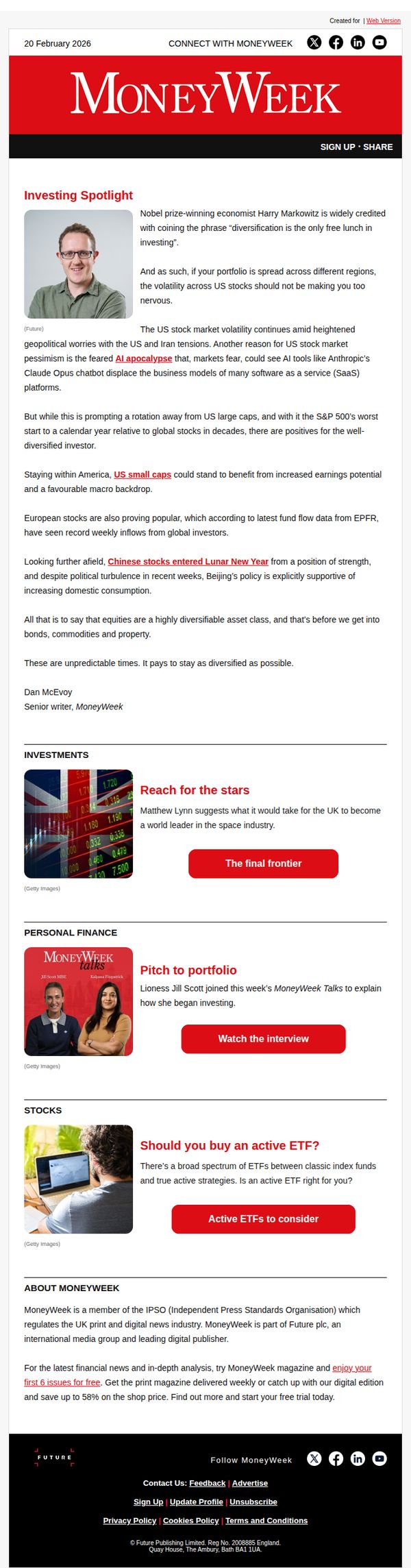
6. MoneyWeek: Are your investments diversified? | Can US small caps beat the selloff?
Objective
This email aims to engage readers with timely investment insights while subtly promoting MoneyWeek’s subscription by highlighting the value of diversified portfolios and expert analysis during market uncertainty. It positions the brand as a trusted authority to encourage trial sign-ups.
Why this works
The email opens with a provocative, audience-specific question that immediately taps into investor anxiety, creating instant relevance and encouraging readers to keep scrolling for reassurance and expert guidance.
How to implement
By anchoring the lead article in a Nobel laureate’s famous quote, the email leverages intellectual authority to validate its core message, diversification, making the advice feel both timeless and trustworthy to skeptical readers.
Pro Tip
Add a visual countdown timer near the free trial CTA in the footer to create urgency and increase conversion, since the offer lacks time-sensitive framing despite being a limited-time incentive. • Reposition the ‘Enjoy your first 6 issues for free’ CTA higher in the email, perhaps after the Investing Spotlight, to capture attention while readers are most engaged, rather than burying it in the footer.
7. Good Housekeeping: The Coveted Disney Storybook Advent Calendar Is HERE!

Objective
To drive pre-orders for the Disney Storybook Collection 2023 Advent Calendar by leveraging its best-seller status and holiday appeal, while also engaging readers with curated lifestyle content to maintain brand relevance and encourage site exploration.
Why this works
Positioning the product as a best-seller right out of the gate builds instant credibility and taps into social proof, making hesitant buyers feel confident they’re choosing a popular, vetted holiday favorite.
How to implement
Pairing the main product announcement with lifestyle-driven content like dating tips and celebrity news keeps the email from feeling overly promotional, subtly reinforcing the brand’s role as a trusted curator of everyday culture and holiday joy.
Pro Tip
Replace the generic 'Read More' CTA under the advent calendar with a time-sensitive, action-oriented phrase like 'Pre-Order Now, Limited Stock!' to create urgency and directly align with the campaign’s sales objective. • Add a visual countdown timer or 'Only X Left!' badge near the advent calendar hero section to amplify scarcity and encourage immediate action, especially since pre-orders imply limited availability.
8. Us Weekly: ‘Love Island U.K.’ Couples Still Together: Where Are They Now?

Objective
This email aims to re-engage subscribers by delivering timely, celebrity-driven content that taps into ongoing public interest in reality TV relationships and pop culture drama, encouraging clicks through curiosity-driven headlines and familiar star power.
Why this works
The email leverages nostalgia and emotional investment by spotlighting past 'Love Island U.K.' couples, creating instant relevance for fans who still care about where their favorite pairings ended up, a smart hook to drive opens and clicks.
How to implement
Each story tile pairs a high-emotion celebrity image with a punchy, question-based headline that implies unresolved drama or insider knowledge, effectively triggering FOMO and prompting immediate engagement without requiring prior context.
Pro Tip
Add a subtle visual hierarchy to the CTA buttons, such as slightly larger sizing or micro-animation on hover, to guide attention more deliberately toward the primary action, especially since all CTAs are identical and visually compete equally. • Introduce a personalized subject line or dynamic header (e.g., 'You loved these couples, here’s where they are now') to increase perceived relevance and open rates by tapping into subscriber behavior or past engagement history.
9. Connecticut Magazine: A Connecticut professor is adapting toys so children with disabilities can play

Objective
This email aims to engage Connecticut residents by delivering locally relevant news and human-interest stories while promoting a limited-time digital subscription offer to convert readers into paying subscribers.
Why this works
The email leads with an emotionally resonant human-interest story about a professor adapting toys for children with disabilities, immediately creating empathy and local pride that draws readers deeper into the content.
How to implement
Strategically placing the end-of-year subscription offer both above and below the main content creates multiple conversion opportunities without disrupting the reader’s journey through the news stories.
Pro Tip
The primary CTA 'ACT NOW' lacks urgency or benefit-driven language; rephrasing it to 'Get 6 Months for 99¢, Ends Dec 28' would better communicate value and deadline directly in the button text. • The ad placements (iPhone 15, Lovemoments) interrupt the editorial flow and feel disconnected from the CT Insider brand; replacing them with native CT-focused sponsorships or community spotlights would maintain trust and relevance.
10. WIRED: Chinese hackers are hiding in routers in the US and Japan

Objective
This email aims to engage WIRED readers with a curated selection of timely, tech-forward stories while driving subscriptions through a limited-time offer and promoting an AI-focused educational newsletter. It balances editorial depth with commercial conversion.
Why this works
The email masterfully blends high-stakes tech news with quirky, human-centered storytelling, like robots playing Tetris or sweat saving lives, to keep readers emotionally invested while reinforcing WIRED’s brand as both authoritative and delightfully unexpected.
How to implement
By placing the subscription CTA immediately after a hard-hitting security story, the campaign leverages urgency and relevance to convert curious readers into paying subscribers, turning fear of digital vulnerability into a tangible, value-driven action.
Pro Tip
The subscription CTA appears twice, once in a banner and again in text, but lacks visual hierarchy; the second CTA should be styled as a button to match the first, ensuring consistent conversion cues and reducing decision fatigue. • The AI Unlocked promo at the bottom feels disconnected from the rest of the content; adding a brief transitional line like 'Want to turn today’s tech headlines into real skills? Start here.' would better bridge editorial and promotional intent.