Onnit promotional campaign email examples & ideas


1. ICYMI: This Week's Drops, Sales, & More
Objective
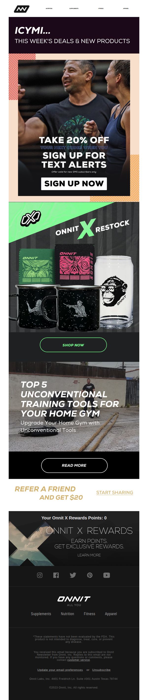
This email aims to re-engage subscribers by highlighting this week’s new product drops and exclusive sales while incentivizing sign-ups for SMS alerts with a 20% discount. It also promotes brand loyalty through referral rewards and Onnit X product restocks.
Why this works
The email smartly combines urgency and exclusivity by offering a 20% discount only for new SMS subscribers, turning passive readers into active, opt-in customers who are more likely to convert and stay engaged.
How to implement
By featuring the Onnit X restock with bold visuals and a clear 'Shop Now' CTA, the campaign leverages scarcity and brand loyalty to drive immediate action without overwhelming the reader with too many options.
Pro Tip
The hero section’s CTA 'SIGN UP NOW' is visually strong but lacks context, adding a micro-copy line like 'Get 20% off your first order + early access to drops' would clarify the value and increase conversion. • The referral section feels disconnected from the main flow; integrating it as a sticky banner or placing it after the product grid would better leverage social proof and reward-driven behavior without breaking the email’s momentum.
2. Mark Your Calendars! Prime Day is October 10th-11th
Objective
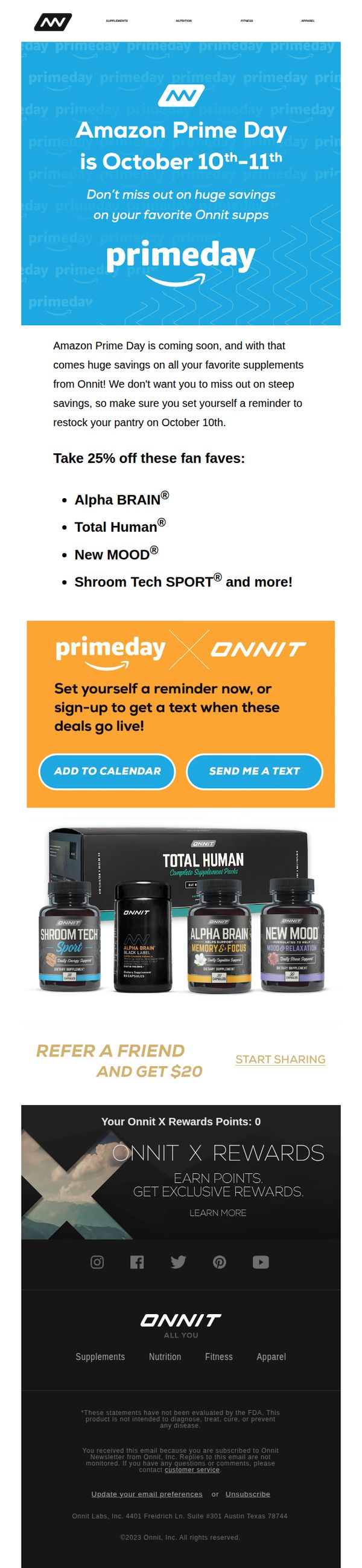
This email aims to drive anticipation and action for Onnit’s Amazon Prime Day sale by highlighting exclusive discounts on popular supplements and encouraging subscribers to set reminders or receive text alerts for when deals go live.
Why this works
The email brilliantly leverages urgency by anchoring the sale to a specific, well-known event, Amazon Prime Day, making the discount feel exclusive and time-sensitive without relying on artificial countdowns or fake scarcity.
How to implement
By spotlighting fan-favorite products with clear discount language and visual grouping, the email reduces decision fatigue and guides users toward high-conversion items, turning a broad sale into a curated, confidence-inspiring shopping experience.
Pro Tip
The CTA buttons 'ADD TO CALENDAR' and 'SEND ME A TEXT' are visually equal in weight, which dilutes urgency; prioritize one action (e.g., 'SEND ME A TEXT') as primary with stronger visual hierarchy to guide users toward the more trackable, behavior-driven option. • The product grid lacks pricing context, showing original vs. discounted prices or savings percentage next to each product would increase perceived value and reduce friction for users comparing deals across brands during Prime Day.
3. Pumpkin day = protein day 🎃 Save 30% now
Objective
This email aims to drive immediate sales by positioning National Pumpkin Day as a fitness-friendly occasion to stock up on protein powders with a 30% discount, while also promoting complementary supplements and a free gift to increase cart value and urgency.
Why this works
By tying a seasonal holiday to a functional product benefit, pumpkin as fuel paired with protein, the email creates emotional resonance while reinforcing performance goals, making the discount feel purposeful rather than purely promotional.
How to implement
Including a ready-to-use recipe with specific product pairings transforms the offer from a transaction into an experience, guiding the customer toward immediate usage and reducing decision fatigue while subtly upselling complementary items.
Pro Tip
Add a countdown timer near the top of the email to visually reinforce the urgency of the Black Friday Preview offer, especially since the deadline (10/27/2025) is mentioned only in fine print at the bottom. • Reposition the 'FREE GIFT. BIGGER FOCUS.' section higher in the email flow, perhaps after the hero section, to immediately anchor the perceived value before diving into product details, increasing conversion likelihood.
4. Celebrate OctoBROfest With 15% Off Alpha BRAIN® Pre-Workout!
Objective
This email aims to drive immediate sales of Alpha BRAIN® Pre-Workout by leveraging a themed promotional event, OctoBROfest, while encouraging social sharing through a referral incentive. It also promotes brand loyalty via the Onnit X Rewards program.
Why this works
The campaign brilliantly ties a product promotion to a playful, culturally resonant theme, OctoBROfest, that creates emotional engagement while subtly reinforcing the target audience’s identity as fitness-focused, community-minded men.
How to implement
By emphasizing natural ingredients and taste alongside performance benefits, the copy bridges functional and sensory appeal, making the supplement feel both scientifically credible and personally enjoyable, a winning combo for skeptical buyers.
Pro Tip
Add a countdown timer near the CTA to create urgency around the 15% discount, since the current design lacks temporal pressure that could boost conversion rates during the limited-time event. • Reposition the 'REFER A FRIEND AND GET $20' section higher, ideally below the hero or alongside the CTA, to capitalize on momentum before users scroll past, increasing referral participation without disrupting purchase intent.
5. Last chance: 30% off ends at midnight
Objective
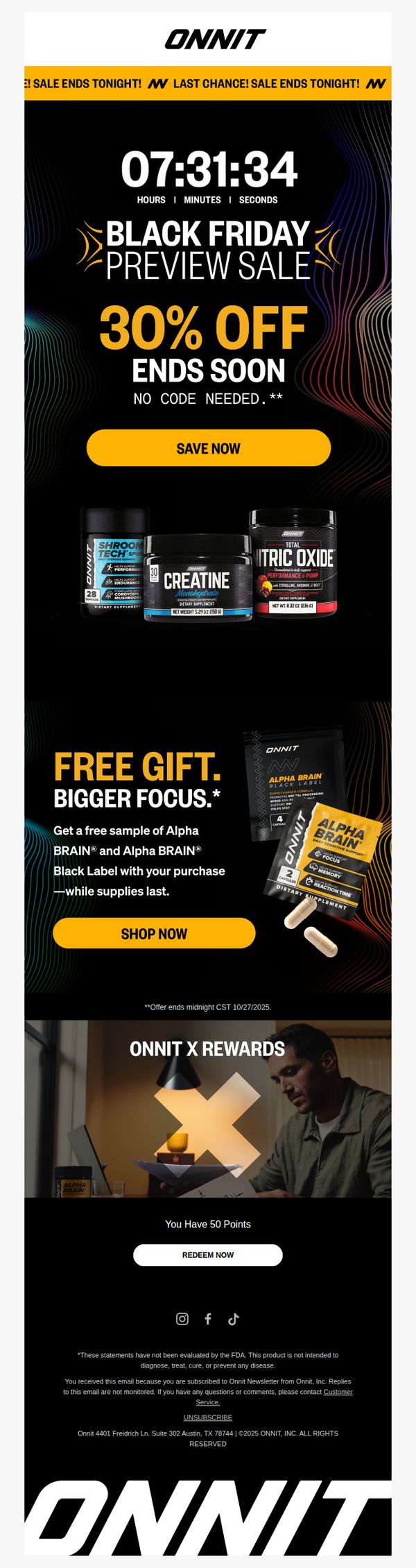
This email aims to drive immediate purchases by creating urgency around a Black Friday preview sale ending at midnight, while also incentivizing action with a free gift offer and highlighting loyalty rewards to increase conversion from existing subscribers.
Why this works
The email masterfully combines a real-time countdown timer with bold, high-contrast typography to create visceral urgency, making the limited-time offer feel unmissable and prompting instant action from subscribers who might otherwise delay.
How to implement
By bundling a free sample gift with purchase, specifically naming Alpha BRAIN and Alpha BRAIN Black Label, the campaign adds perceived value without discounting further, turning a price-driven sale into a benefit-rich experience that appeals to both new and loyal customers.
Pro Tip
The hero section’s countdown timer reads 07:31:34, which may confuse recipients if the email is opened later in the day, consider dynamically updating the timer or adding a clear time zone label (e.g., 'CST') to maintain credibility and urgency. • The CTA 'SAVE NOW' is strong but generic; testing a more benefit-driven variant like 'Claim 30% Off + Free Alpha BRAIN Sample' could increase click-through by aligning the button text directly with the dual incentives presented above it.
6. Take Up To 50% OFF During The Back To School Sale

Objective
This email aims to drive immediate sales by promoting a limited-time Back to School Sale with discounts up to 50% on popular supplements and fitness products, while also encouraging engagement through a raffle and referral program to boost customer acquisition and loyalty.
Why this works
The email masterfully ties the Back to School theme to wellness and performance, positioning supplements not as generic products but as essential tools for academic and physical success during a transitional season.
How to implement
By visually overlaying discount tags directly onto product images with hand-drawn arrows and doodles, the email creates an energetic, urgent, and personalized feel that mimics a student’s notebook, making savings feel immediate and authentic.
Pro Tip
The CTA 'SHOP NOW' appears only once and is buried below a product grid; adding a sticky or secondary CTA above the fold and repeating it after the raffle section would capture users at multiple decision points. • The raffle section lacks urgency, adding a countdown timer or limited-entry notice (e.g., 'Only 500 spots left') would heighten FOMO and convert passive scrollers into active participants.
7. Celebrate OctoBROfest With Up To 40% Off!

Objective
This email aims to drive immediate sales by leveraging the cultural momentum of Oktoberfest with a themed promotion called 'OktoBROfest,' offering up to 40% off select drinkable supplements to encourage impulse purchases during a limited-time window.
Why this works
The email brilliantly ties a global cultural event to a product promotion by rebranding it as 'OktoBROfest,' creating instant relevance and emotional resonance with fitness-minded consumers who enjoy playful, masculine-themed marketing.
How to implement
Each product tile in the grid clearly displays the discount percentage alongside the product image and name, reducing cognitive load and making it effortless for shoppers to compare value and make quick purchasing decisions.
Pro Tip
Add a countdown timer beneath the 'SHOP NOW' CTA to create urgency and reinforce the limited-time nature of the sale, which is currently only mentioned in small text at the top. • Reposition the 'REFER A FRIEND AND GET $20' section higher in the email, ideally after the product grid, to capitalize on purchase intent and increase referral conversions before the user scrolls to the footer.
8. ICYMI: This Week's Drops, Sales, & More

Objective
This email aims to re-engage subscribers by highlighting time-sensitive back-to-school promotions and new product drops, while also driving traffic to educational content and loyalty program sign-ups to increase customer lifetime value.
Why this works
The email smartly ties seasonal relevance to product utility by framing supplements as 'back-to-school essentials,' making health products feel urgent and contextually necessary for students and parents alike.
How to implement
Using a handwritten-style graphic with a pencil and sticky note creates an approachable, nostalgic vibe that aligns with the back-to-school theme while subtly reinforcing the brand’s casual, community-driven tone.
Pro Tip
The 'Refer a Friend' CTA is visually underwhelming and buried between two stronger sections; it should be redesigned with a contrasting color or icon to match the visual weight of the primary 'Shop Now' button. • The hero section’s discount claim 'Save Up to 50%' lacks specificity, adding a few example products or categories that qualify would reduce ambiguity and increase perceived value for hesitant shoppers.
9. 🚨 Last Chance To Take 40% Off Supp Essentials!
Objective
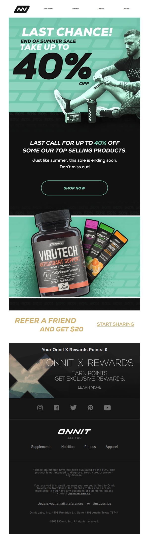
This email aims to drive immediate sales by creating urgency around a limited-time summer sale offering up to 40% off top-selling supplements, while also encouraging customer referrals and loyalty program engagement.
Why this works
The email leverages time-sensitive urgency with 'Last Chance' messaging paired with bold discount visuals, effectively triggering FOMO without overwhelming the reader with clutter or competing offers.
How to implement
By spotlighting high-impact products like Virutech alongside vibrant packaging shots, the campaign visually reinforces product value and trustworthiness, making it easier for customers to justify impulse purchases during a sale.
Pro Tip
Add a countdown timer beneath the hero CTA to reinforce urgency visually, currently, the 'ending soon' message is text-only and lacks dynamic pressure that could boost click-through rates. • Reposition the referral section above the rewards module; placing the $20 cash incentive higher in the flow taps into immediate gratification psychology before introducing long-term loyalty mechanics.
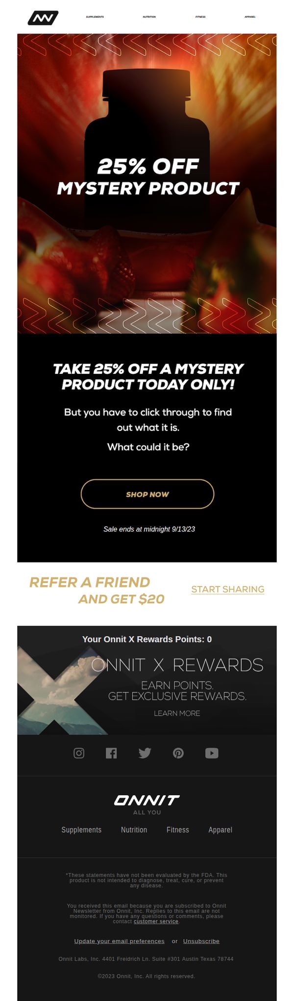
10. Today Only! 25% Off Mystery Product
Objective
This email aims to drive immediate clicks and conversions by teasing a limited-time 25% discount on a mystery product, leveraging curiosity and urgency to get subscribers to engage before the sale ends at midnight.
Why this works
The mystery product hook brilliantly turns a simple discount into an interactive experience, making subscribers feel like they’re uncovering a secret rather than just clicking a sale banner, which boosts emotional engagement and click-through rates.
How to implement
By anchoring the offer to a hard deadline, 'Sale ends at midnight 9/13/23', the email creates authentic urgency without resorting to fake timers, making the scarcity feel real and compelling enough to override hesitation.
Pro Tip
Add a subtle visual cue or micro-animation near the 'SHOP NOW' button to draw the eye downward after reading the headline, since the black background and centered layout may cause the CTA to visually blend in for some users. • Include a teaser line beneath 'What could it be?', such as 'Think supplements, gear, or nutrition, you’ll be surprised', to reduce friction for hesitant shoppers by hinting at product categories without spoiling the mystery.