Proven Relational Campaign email designs you can use in Beauty & Care


1. Kopari: Celebrating Our Bday with Kosas!
Objective
This email aims to celebrate Kopari’s 8th birthday by partnering with Kosas to offer a limited-time free gift with purchase, encouraging customers to shop while reinforcing brand values through curated product highlights and ethical badges.
Why this works
The email brilliantly leverages a milestone anniversary not just as a celebration but as a strategic partnership opportunity, creating urgency and exclusivity through a co-branded free gift that aligns with both brands’ aesthetics and customer expectations.
How to implement
By featuring two highly visual, color-coded product bundles under 'Our Bday Faves,' the campaign simplifies decision-making for shoppers while subtly guiding them toward higher-value purchases through curated, lifestyle-driven pairings that feel personal and intentional.
Pro Tip
Add a subtle countdown timer or 'supplies running low' indicator near the CTA to amplify urgency beyond 'while supplies last,' especially since the free Kosas serum is likely a high-demand item that could drive faster conversions. • Include a short testimonial or social proof snippet from a real customer who loved the Kosas serum or one of the featured body care sets, this would bridge the gap between promotional offer and authentic experience, increasing perceived value and trust.
2. Treslúce: Hello, Brows! + Happy National Brow Day
Objective
This email aims to celebrate National Brow Day by introducing and promoting Treslúce’s new 'Hello, Brows!' bundle, encouraging immediate purchase through a limited-time discount and clear product value proposition.
Why this works
The email brilliantly ties a cultural moment, National Brow Day, to a product launch, creating urgency and relevance that makes the offer feel timely and celebratory rather than purely promotional.
How to implement
By highlighting a 38% discount and contrasting the bundle’s $20 price against its $32 value, the email leverages perceived savings to make the deal irresistible while keeping the math simple and instantly digestible.
Pro Tip
Add a countdown timer or 'limited-time offer' badge near the CTA to reinforce urgency, since the email mentions the deal lasts 'all month long', which dilutes scarcity and reduces immediate conversion pressure. • Include a customer testimonial or before/after brow image in the hero or offer section to build social proof and visually demonstrate the bundle’s effectiveness, which would strengthen trust and perceived value.
3. Etre Vous: Etre Vous – Verify your email address
Objective
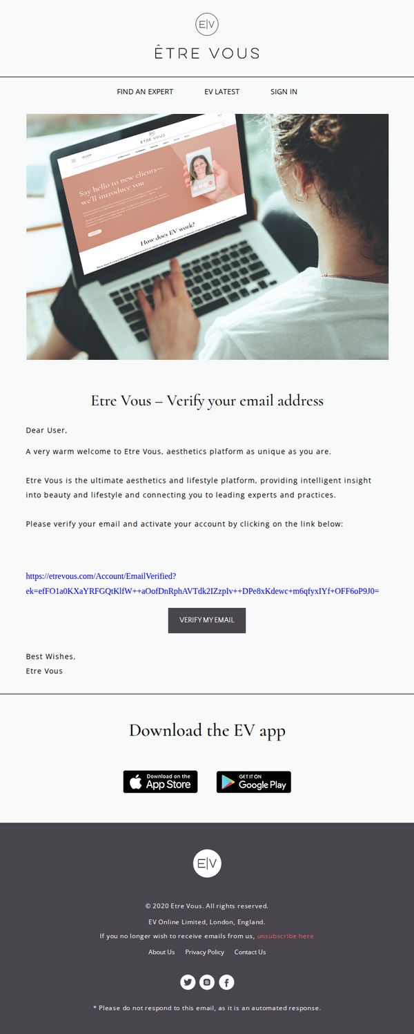
This email aims to guide new users to verify their email address to activate their Etre Vous account, while introducing them to the brand’s positioning as a personalized aesthetics and lifestyle platform connecting users with expert insights.
Why this works
The email opens with a warm, personalized welcome that immediately frames Etre Vous as a unique, client-first platform, subtly building emotional connection before asking for action.
How to implement
By positioning the brand as an 'ultimate aesthetics and lifestyle platform' with 'intelligent insight,' the copy elevates perceived value and justifies the verification step as access to exclusive expertise.
Pro Tip
Add a brief visual indicator or progress bar near the CTA to show users they’re one step away from unlocking full platform access, reinforcing urgency and reducing friction. • Include a short testimonial or social proof snippet from a verified user to build trust and reduce skepticism around clicking the verification link, especially for new signups.
4. Coco & Eve: Because You Deserve It - $11 OFF For You!
Objective
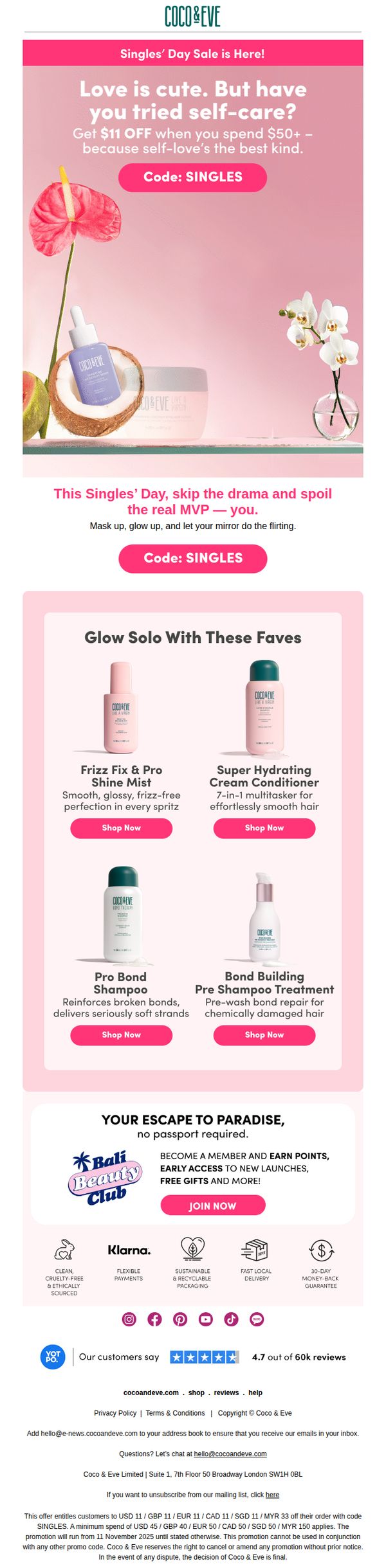
This email aims to drive sales during Singles’ Day by positioning self-care as a form of self-love, encouraging recipients to treat themselves with a $11 discount on orders over $50 while showcasing hero products and promoting membership benefits.
Why this works
The email brilliantly reframes Singles’ Day from a romantic holiday into a celebration of self-love, making the discount feel emotionally rewarding rather than transactional, which deepens customer connection and justifies the spend.
How to implement
By featuring four hero products with benefit-driven headlines and clear ‘Shop Now’ CTAs, the email guides users effortlessly from curiosity to conversion while subtly reinforcing product versatility and results for different hair concerns.
Pro Tip
Add a countdown timer near the promo code to create urgency, since the offer’s end date isn’t visually emphasized, this would reinforce scarcity and encourage faster redemption without cluttering the layout. • Reposition the ‘Join Now’ CTA for the Bali Beauty Club to appear immediately after the product grid, before the footer, so it doesn’t compete with trust signals and feels like a natural progression for engaged shoppers.
5. TK Maxx - UK: Pssst! We're emailing you first...
Objective
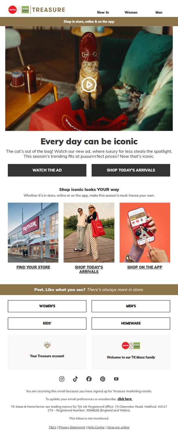
To excite subscribers with exclusive early access to TK Maxx’s new advertising campaign and drive immediate traffic to both physical stores and digital platforms by highlighting luxury items at discounted prices. The email aims to convert curiosity into action through urgency and visual storytelling.
Why this works
The email opens with a playful, exclusive tone, 'Pssst! We're emailing you first', which instantly creates a sense of insider access and emotional connection, making subscribers feel valued and more likely to engage with the content.
How to implement
Using a whimsical visual of a cat in a luxury shoe immediately captures attention while reinforcing the brand’s quirky personality and value proposition: high-end fashion at unexpectedly low prices, which is both memorable and on-brand.
Pro Tip
Add a countdown timer or urgency indicator near the 'WATCH THE AD' CTA to heighten FOMO and encourage immediate action, since the current layout lacks time-sensitive motivation despite the 'first access' framing. • Include a brief testimonial or social proof snippet near the hero section, such as '90% of customers say our finds are worth the hunt', to validate the 'luxury for less' promise and reduce perceived risk for new shoppers.
6. TK Maxx - UK: Today's Arrivals have landed ✈️

Objective
This email aims to drive immediate traffic and sales by highlighting newly arrived products with limited availability, leveraging urgency and visual appeal to encourage quick browsing and purchasing across both women’s and men’s categories.
Why this works
The email masterfully combines urgency with visual clarity by using bold red headers and time-sensitive language like 'they won’t stick around long' to trigger FOMO while keeping product grids clean and scannable for effortless browsing.
How to implement
Strategically placing dual 'SHOP WOMEN’S' and 'SHOP MEN’S' CTAs above and below the product grid ensures gender-specific navigation without forcing users to scroll, increasing the likelihood of category-specific engagement and conversion.
Pro Tip
Add a countdown timer or 'X items left' indicator beneath high-discount items (like the 71% off sweatshirt) to amplify urgency and reduce hesitation, directly supporting the 'they won’t stick around long' messaging. • Reposition the 'Happy Lunar New Year' graphic to sit beside or below the product grid rather than interrupting the flow, this preserves visual momentum while still honoring cultural relevance without breaking the shopping rhythm.
7. Kopari: Summer's almost over, but you still need SPF

Objective
To remind subscribers that daily SPF use is essential beyond summer and to drive immediate purchases of Kopari’s sun protection products by highlighting their dual skincare and cosmetic benefits.
Why this works
The email smartly reframes SPF as a year-round essential rather than a seasonal product, leveraging the emotional hook of post-summer skincare anxiety to drive relevance and urgency without relying on discounts.
How to implement
By showcasing two distinct SPF products with clear, benefit-driven headlines, one for glow and primer functionality, the other for antioxidant protection and dewy finish, the email caters to different customer motivations while reinforcing product versatility.
Pro Tip
Add a subtle urgency element like a countdown timer or limited-quantity indicator near the hero CTA to increase conversion, since the message already implies seasonal relevance but lacks time-sensitive pressure. • Include a short customer testimonial or rating badge under each product to build social proof, especially since the products are positioned as multi-functional and may require reassurance for first-time buyers.
8. Vivacy: 🎇 Happy New Year!
Objective
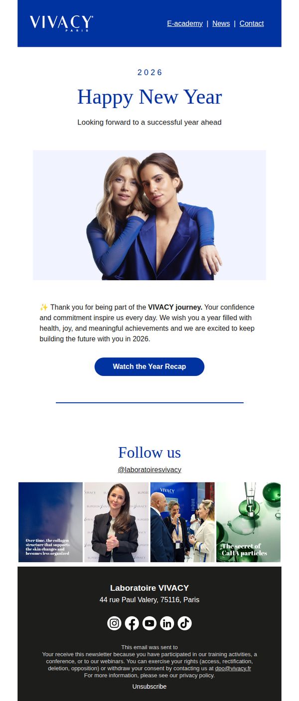
This email aims to strengthen brand loyalty and emotional connection by celebrating the new year with customers, while subtly reinforcing Vivacy’s professional identity and inviting engagement through a year-in-review video. It positions the brand as a partner in the recipient’s journey rather than just a vendor.
Why this works
The email opens with a warm, personalized tone that frames the recipient as a valued partner in the brand’s journey, a powerful emotional hook that transforms a generic holiday greeting into a relationship-building moment.
How to implement
By embedding a video CTA titled 'Watch the Year Recap,' the campaign leverages curiosity and nostalgia to drive engagement without pushing a hard sell, making the interaction feel rewarding rather than transactional.
Pro Tip
Add a secondary CTA below the video button, such as 'Explore Our 2026 Innovations', to guide engaged readers toward product or educational content, turning passive viewers into active explorers. • Include a brief testimonial or client quote near the thank-you message to strengthen social proof and make the emotional appeal more tangible and credible to the reader.
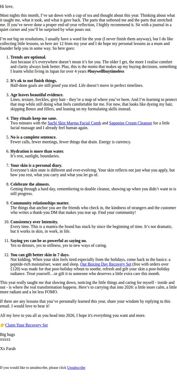
9. Sachi Skin - UK: 12 Lessons I learned in 2025 (and you might too)
Objective
To foster emotional connection and brand loyalty by sharing personal, reflective lessons from the year, while subtly promoting Sachi Skin products as solutions to real-life skin concerns and encouraging recipients to claim a free recovery set with purchase.
Why this works
The email brilliantly blends personal storytelling with product integration by framing skincare routines as self-care rituals tied to life lessons, making the brand feel authentic and emotionally resonant rather than sales-driven.
How to implement
By positioning the free Boxing Day Recovery Set as a gift to oneself or others during post-holiday skin fatigue, the campaign taps into seasonal emotional needs while creating urgency through a threshold-based offer that feels generous, not transactional.
Pro Tip
Add a visual product tile or small hero image next to the Recovery Set CTA to increase click-through by giving the offer tangible form and reinforcing the product’s role in the narrative of post-holiday skin renewal. • Include a brief testimonial or customer quote near lesson #12 to validate the claim that skin can visibly improve in 7 days, bridging the emotional story with social proof that supports conversion confidence.
10. Kopari: Did someone say birthday?

Objective
This email aims to celebrate Kopari’s 8th anniversary by fostering emotional connection with customers through a personal note from the co-founder, while driving engagement via a text-based opt-in for exclusive birthday surprises and limited-edition product drops.
Why this works
The email brilliantly humanizes the brand by opening with a heartfelt, first-person note from the co-founder, turning a milestone into a shared celebration that deepens customer loyalty and emotional investment in the brand’s journey.
How to implement
By framing the anniversary as a month-long event with free gifts and limited-edition drops, the campaign creates sustained excitement and urgency without relying on discounts, positioning exclusivity and community as the real rewards.
Pro Tip
Add a visual countdown timer or 'limited-time' badge near the CTA to reinforce urgency around the birthday gifts, since the current design implies ongoing celebration without clear time boundaries to drive immediate action. • Include a small product preview or teaser image of one of the 'limited-edition drops' in the offer section to visually entice recipients and give tangible reason to join texts, rather than relying solely on text-based promises.