Proven relational brand engagement email designs you can use





1. Classics AutoTrader : Classics on Autotrader - Daily Auctions
Objective
This email aims to drive immediate engagement by alerting subscribers to classic cars ending their auctions today, encouraging them to view and bid before time runs out. It also promotes an upcoming live auction event to expand reach beyond digital bidding.
Why this works
The email creates urgency by highlighting auction end times with bold, time-sensitive language and clear visuals of desirable classic cars, making it hard for enthusiasts to ignore the ticking clock on rare finds.
How to implement
Including a live auction event promotion within the same email bridges digital and physical engagement, offering collectors multiple pathways to participate and increasing the perceived value of the brand’s ecosystem.
Pro Tip
Add a countdown timer next to each auction end time to visually reinforce urgency and reduce cognitive load for users deciding whether to act now. • Include a short testimonial or user review near the CTA to build social proof, for example, 'Over 85% of bidders last week won their dream car within 24 hours.'
2. Waitrose: Spring incoming
Objective
This email aims to excite customers about the arrival of spring by showcasing new seasonal products across fashion, home, and tech categories, encouraging immediate browsing and purchase through curated category links and time-sensitive offers.
Why this works
The email masterfully ties seasonal emotion to product discovery by opening with 'The First Taste of Spring', a phrase that evokes sensory anticipation and frames every category as part of a fresh, uplifting lifestyle shift rather than just a sale.
How to implement
By using clean, high-contrast category tiles with minimal text and strong imagery, the email reduces decision fatigue and guides the eye naturally from fashion to home to tech, making browsing feel intuitive and effortless for time-pressed shoppers.
Pro Tip
The hero section’s CTA 'Shop new in' is too generic, replacing it with a benefit-driven phrase like 'Discover Spring’s Fresh Picks' would better align with the emotional hook and increase click-through intent. • The Topshop announcement feels disconnected from the spring theme; integrating it with a visual cue like 'Spring Style Just Landed' or placing it near the Women’s section would strengthen thematic cohesion and brand synergy.
3. Bombas: Wow, People Love Our Compression Socks
Objective
This email aims to drive sales of Bombas compression socks by showcasing real customer enthusiasm and highlighting product benefits for specific use cases like working out and standing for long hours. It leverages social proof and clear segmentation to guide users toward the right product for their needs.
Why this works
Bombas brilliantly uses real customer quotes to validate product performance, turning testimonials into persuasive proof points that resonate emotionally and functionally with potential buyers.
How to implement
By segmenting compression socks into use-case categories, like working out or standing all day, the email speaks directly to the customer’s lifestyle, making product selection feel intuitive and personalized.
Pro Tip
Add a subtle countdown timer or limited-availability indicator near the hero section to create urgency, especially since the subject line implies high demand and social proof. • Include a small visual icon or badge next to each product highlighting key differentiators (e.g., 'Graduated Compression' or 'Targeted Ankle Support') to reinforce benefits at a glance without requiring extra reading.
4. DFWChild: This issue is full of fun and so much more 🎡😺🎈🎃🍁🦋
Objective
To drive engagement with DFWChild’s October/November digital magazine issue by highlighting its family-friendly content and encouraging readers to explore the full issue, while also promoting a virtual model search to increase community participation and brand visibility.
Why this works
The email opens with a vibrant, magazine-style hero image that instantly communicates the publication’s tone and seasonal relevance, making it feel like a curated experience rather than a promotional blast.
How to implement
By listing specific, benefit-driven article teasers, like 'The best family fun events this fall' and 'Expert advice for weaning your toddler', the email creates immediate perceived value and gives readers clear reasons to click through.
Pro Tip
Add a subtle countdown timer or urgency cue near the 'See the issue' CTA to encourage immediate action, since the digital issue may feel less time-sensitive than a physical one. • Reposition the 'Get the details' button for the model search higher in the email or duplicate it near the top, as it’s currently buried below the hero and may be missed by users who don’t scroll.
5. Bombas: Which Sock Height Is Right?
Objective
This email aims to educate subscribers on the different sock heights Bombas offers while guiding them toward a purchase by highlighting comfort, fit, and style benefits tailored to each height. It also reinforces brand values through the one-for-one donation model.
Why this works
Bombas brilliantly turns a simple product category, sock height, into an educational journey, helping customers self-select the perfect fit by clearly explaining the functional and stylistic benefits of each option with clean visuals and concise copy.
How to implement
Each sock height is presented with a dedicated visual, descriptive tagline, and gender-specific CTAs, making it easy for users to navigate by need rather than by gender alone, which enhances personalization and reduces decision fatigue.
Pro Tip
Add a visual comparison chart or side-by-side slider near the top to help users quickly contrast sock heights, reducing scroll fatigue and improving decision-making speed for first-time buyers. • Include a short testimonial or customer quote under each sock height section to add social proof and reinforce the comfort or performance claims made in the descriptive copy.
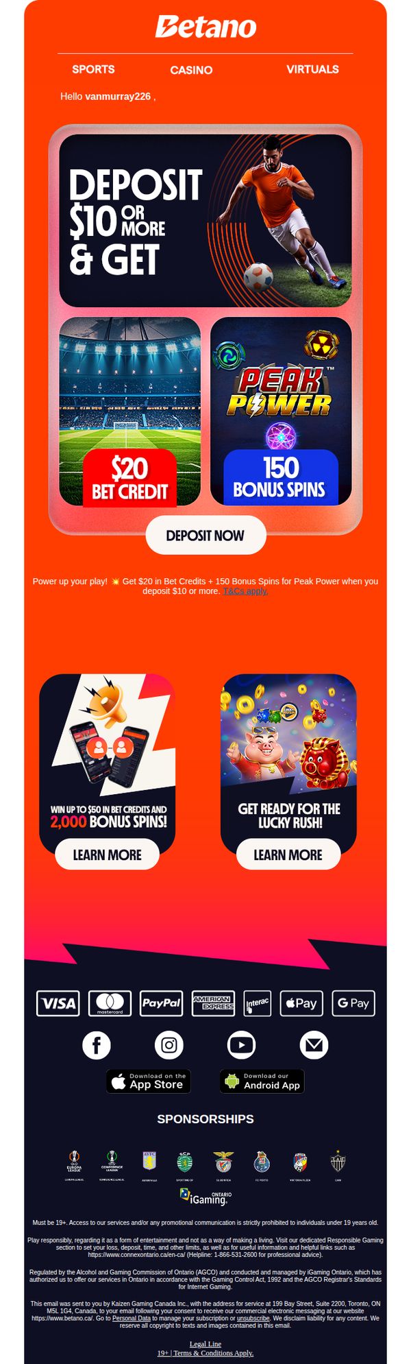
6. Betano - CA: 🎁 Get $20 in Bet Credits + 150 Bonus Spins
Objective
The email aims to drive immediate deposits by offering new users a compelling incentive: $20 in Bet Credits and 150 Bonus Spins for depositing $10 or more, while also promoting additional high-value promotions to increase engagement and app downloads.
Why this works
The email brilliantly anchors the offer around a low deposit threshold ($10) to reduce friction, making the $20 credit and 150 spins feel like an instant win, which dramatically increases conversion likelihood for new users.
How to implement
By visually separating the core offer from secondary promotions using bold color blocks and distinct CTAs, the design guides the user’s eye without overwhelming them, ensuring the primary action remains the focal point while still teasing additional value.
Pro Tip
Add a small countdown timer or urgency indicator near the 'DEPOSIT NOW' button to create FOMO, since the offer lacks time sensitivity cues that could boost immediate action. • Include a short testimonial or social proof snippet near the hero section, such as 'Join 50,000+ players who claimed their bonus this week', to reinforce trust and reduce hesitation for first-time depositors.
7. Hiut Denim : Scrapbook Chronicles No.385

Objective
This email aims to engage subscribers with a curated, magazine-style storytelling experience that blends culture, creativity, and product relevance, subtly reinforcing Hiut Denim’s brand ethos while driving traffic to seasonal denim slots and complementary lifestyle products.
Why this works
The email brilliantly mimics a cultural scrapbook, using eclectic content like tech reviews, art features, and film tributes to build emotional resonance, making the brand feel like a trusted curator rather than a seller, which deepens subscriber loyalty.
How to implement
By embedding product CTAs within editorial-style sections, like linking denim care to Attirecare spray, the campaign avoids hard selling and instead positions products as natural extensions of the reader’s lifestyle, increasing perceived value without overt promotion.
Pro Tip
The primary CTA 'SHOP MARCH SLOTS' appears only once and is visually isolated; adding a secondary sticky CTA near the bottom or after key content blocks would improve conversion by recapturing attention after the reader scrolls through editorial content. • While the scrapbook format is engaging, the lack of visual hierarchy between editorial content and product links (e.g., 'DENIM CARE' section) risks diluting the campaign’s commercial intent, consider using subtle visual cues like icons or color accents to distinguish shoppable elements.
8. VanEd: 🏢📜 Get Your Real Estate License: Unlock Opportunities Nationwide

Objective
This email aims to drive enrollment in VanEd’s real estate licensing courses by highlighting nationwide reciprocity and offering time-sensitive discounts to motivate immediate action. It positions VanEd as a trusted, scalable solution for agents looking to expand their practice across state lines.
Why this works
The email smartly ties geographic flexibility to career growth by framing multi-state licensing as a strategic advantage, not just a regulatory requirement, which resonates with ambitious agents seeking scalability.
How to implement
By layering two distinct discounts, 40% off in the body and 30% off in a bold banner, the campaign creates urgency while giving readers multiple entry points to act, reducing decision paralysis.
Pro Tip
Add a countdown timer next to the 30% OFF banner to amplify urgency, since the discount is time-sensitive, visual scarcity cues would increase conversion by triggering FOMO. • Include a short testimonial or stat (e.g., '92% of students pass on first try') near the CTA to build social proof and reduce perceived risk for new learners.
9. Bombas: Almost Gone: Limited-Edition Styles

Objective
This email aims to drive urgency and conversions by promoting limited-edition sock styles before they sell out, while reinforcing Bombas’s brand values of comfort, fun, and social impact through curated product groupings and mission-driven messaging.
Why this works
Bombas masterfully blends emotional storytelling with product merchandising by grouping socks into themed collections like 'Wild Wear' and 'Forest Friends,' making each purchase feel like a curated, personality-driven choice rather than a commodity transaction.
How to implement
The email leverages scarcity psychology not through aggressive countdowns but through subtle yet compelling copy like 'Almost Gone' and 'total attention grabbers,' which positions limited-edition styles as desirable collectibles rather than just dwindling inventory.
Pro Tip
Add a subtle countdown timer or stock indicator near the 'Almost Gone' headline to heighten urgency without disrupting the clean layout, this would visually reinforce scarcity and nudge hesitant shoppers toward immediate action. • Integrate a mini testimonial or social proof snippet under one or two high-performing product tiles (e.g., 'Rated 4.9/5 by 2K+ customers') to build trust and reduce friction for first-time buyers unfamiliar with Bombas’s comfort claims.
10. Bombas: Two Pairs, Limitless Potential 🏋️

Objective
This email aims to drive sales of Bombas’ workout sock collections by positioning them as essential gear for both running and everyday active lifestyles, while reinforcing brand values through social proof and their one-for-one donation model.
Why this works
Bombas brilliantly segments their product offering by activity, running versus all-purpose, making it easy for customers to self-identify their need and reducing decision fatigue with clear, context-driven categories.
How to implement
The inclusion of real, concise customer quotes directly overlaid on lifestyle imagery builds instant credibility and emotional resonance, turning product shots into social proof moments that feel authentic and relatable.
Pro Tip
Add a subtle countdown timer or urgency indicator near the '5% Pack Savings' offer to nudge immediate action, since the current layout lacks any time-sensitive incentive despite promoting a discount. • Reposition the 'One BOMBAS purchased. One BOMBAS donated.' message higher in the email, perhaps beneath the hero headline, to strengthen emotional connection before users reach the product grid.