Proven relational brand history email designs you can use


1. Missouri Life: Learn About Mining in Missouri, Set Your Sights on Big Lake State Park, and the Story of Pumpkins
Objective
This email aims to engage readers with Missouri’s cultural and natural heritage by highlighting local attractions, seasonal events, and historical stories, encouraging exploration, education, and subscription to Missouri Life magazine for ongoing discovery.
Why this works
The email masterfully ties regional history to modern-day experiences, like mining tours and pumpkin festivals, making heritage feel relevant and inviting rather than academic or distant, which boosts reader curiosity and local pride.
How to implement
Each content block uses vivid imagery paired with concise, benefit-driven copy that answers ‘why should I care?’, turning passive readers into potential visitors or subscribers by connecting emotion, utility, and place.
Pro Tip
Add a secondary CTA above the footer, such as ‘Subscribe for Weekly Missouri Stories’, to capture interest earlier, especially after the emotionally resonant pumpkin or lake sections, rather than waiting until the end. • Include a small map or clickable location pin next to each attraction (e.g., Big Lake State Park, Missouri Mines) to reduce friction for readers planning visits and enhance the practical value of the content.
2. Lewis Howes: 😬 This ONE Law Is Why Most People Stay Broke
Objective
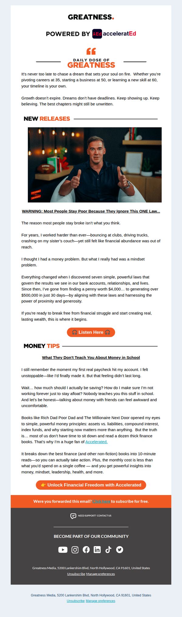
This email aims to capture attention with a provocative financial truth and convert readers into subscribers for 'Accelerated' by positioning it as the solution to breaking free from poverty through mindset and practical money laws. It leverages Lewis Howes’ personal story to build credibility and urgency.
Why this works
The email opens with a bold, emotionally charged hook that challenges conventional thinking about poverty, immediately drawing in readers who feel stuck financially and creating curiosity about the 'one law' they’re missing.
How to implement
Lewis Howes uses his own rags-to-riches journey not just as a testimonial but as a narrative bridge, showing vulnerability, transformation, and results, to make the offer feel attainable and trustworthy rather than salesy or abstract.
Pro Tip
Add a countdown timer or limited-time bonus near the CTA to increase urgency, since the current email relies solely on emotional appeal without temporal scarcity to nudge immediate action. • Include a short testimonial or user result quote under the 'Unlock Financial Freedom' CTA to reinforce social proof and reduce perceived risk before the reader commits to subscribing.
3. Wyze: A Letter From the Founders
Objective
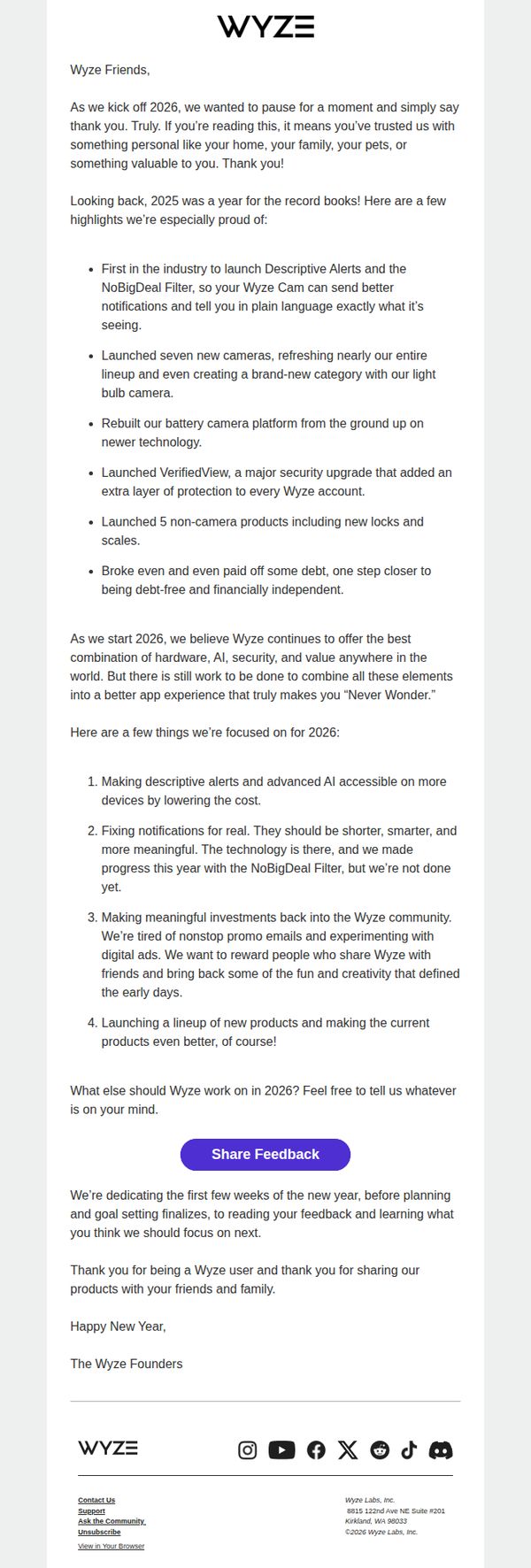
This email aims to build emotional connection and brand loyalty by thanking customers for their trust, highlighting 2025’s key achievements, and inviting feedback to co-create Wyze’s 2026 roadmap, turning users into active partners in the brand’s evolution.
Why this works
Wyze masterfully turns a year-in-review into a heartfelt conversation by framing achievements as shared victories with customers, making recipients feel personally invested in the brand’s progress rather than just passive consumers.
How to implement
By openly admitting imperfections, like notifications still needing refinement, Wyze builds trust through vulnerability, showing they’re not just selling products but genuinely listening and evolving based on real user experiences.
Pro Tip
Add a visual timeline or icon-based summary of 2025 wins to break up text-heavy sections, this would improve scannability and help users quickly grasp key milestones without reading every bullet point. • Reposition the 'Share Feedback' CTA higher in the email, perhaps after the 2025 highlights, to capture momentum while users are most engaged, currently, it’s buried after the 2026 goals, reducing conversion potential.
4. Kalahari Resorts: wilderman, Get Ready for the Ultimate Food and (Not Just) Wine Experience at Kalahari!
Objective
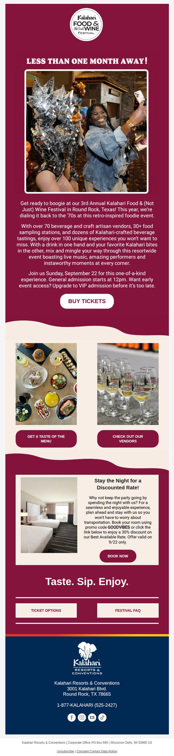
This email aims to drive ticket sales and hotel bookings for Kalahari’s 3rd Annual Food & Wine Festival by highlighting its retro 70s theme, diverse vendors, and exclusive experiences while encouraging early VIP upgrades and overnight stays.
Why this works
The email brilliantly leverages nostalgia by anchoring the festival in a 70s retro theme, which instantly creates emotional resonance and positions the event as more than just food and wine, it’s a full sensory throwback experience.
How to implement
By offering a VIP upgrade and discounted hotel stay with a promo code, the campaign smartly bundles experiences to increase perceived value and drive higher conversion through urgency and convenience.
Pro Tip
Add a countdown timer near the 'BUY TICKETS' CTA to amplify urgency, especially since the event is 'less than one month away', this would visually reinforce time sensitivity and boost conversion. • Include a short video or animated GIF in the hero section showing live music or guests mingling to better convey the festival’s energy, as static images can’t fully capture the 'boogie' and 'instaworthy moments' described.
5. Jay Shetty: Wishing You Well
Objective
This email aims to nurture emotional connection and brand loyalty by offering heartfelt holiday well-wishes while reinforcing Jay Shetty’s mission of daily wisdom and inner peace. It subtly invites readers to engage further with his content by highlighting his podcast and practical mindfulness exercises.
Why this works
The email opens with a deeply personal, emotionally resonant message that frames joy as a practice rooted in gratitude and service, a powerful way to connect with readers during the holidays without relying on sales or promotions.
How to implement
By defining joy through the Sanskrit word 'Mudita' and tying it to real reader stories, the email elevates a common holiday sentiment into a meaningful, culturally grounded philosophy that aligns with Jay Shetty’s brand of mindful living.
Pro Tip
Add a secondary CTA button or link beneath the 'On Purpose' section that says 'Listen to Today’s Episode', this would directly convert emotional resonance into content consumption, aligning with the email’s goal to drive podcast engagement. • Include a small, visually distinct quote box or pull-out in the 'Today’s Wiser Choice' section to highlight the 'Try This' exercise, this would increase scannability and make the actionable advice stand out for readers who skim.
6. The Atlantic: What to read, watch, and listen to today

Objective
This email aims to engage readers by curating timely, culturally relevant content around Martin Luther King Jr. Day, while subtly encouraging subscription through value-driven storytelling and a clear call to action at the bottom.
Why this works
The email opens with a culturally resonant hook, tying current events to MLK Day, to immediately establish relevance and emotional weight, making readers feel the content is not just timely but necessary for understanding today’s social landscape.
How to implement
By blending historical context, personal reflection, and curated media recommendations, the email transforms a newsletter into a guided cultural experience, positioning The Atlantic as both educator and curator rather than just a publisher of articles.
Pro Tip
Add a visual hierarchy or iconography to distinguish between 'Read,' 'Watch,' and 'Play' sections in the Culture Break to improve scannability and help readers quickly identify their preferred media format. • Include a brief, bolded pull quote or teaser from 'Letter From Birmingham Jail' in the Today’s Read section to create immediate emotional gravity and entice clicks without requiring readers to scroll through the full excerpt.
7. Siba Consulting : Why a lot of brands will struggle in 6-12 months

Objective
This email aims to warn brand owners, especially in the supplement and health space, about the impending risks of over-relying on AI-generated creatives, while positioning Siba Consulting as a forward-thinking strategic partner that can help them adapt before regulations and audience fatigue hit. It also quietly recruits top-tier creative talent by signaling growth and credibility.
Why this works
The email opens with a bold, provocative claim that immediately hooks the reader by naming a specific, time-bound consequence, brands will struggle in 6–12 months, creating urgency without being salesy, which is perfect for cutting through inbox noise in a saturated market.
How to implement
Instead of just warning about AI, it offers a concrete, actionable alternative: diversify into UGC, founder ads, and high-prod videos, giving readers a clear path forward that positions the sender as a strategic guide, not just a critic, which builds trust and authority.
Pro Tip
Add a visual example or mockup of what an 'AI-labeled ad' might look like on Meta to make the regulatory prediction more tangible and emotionally resonant, right now, the concept is abstract and may not land as strongly with time-poor readers. • Include a micro-CTA after the diversification list, like 'Want a free audit of your current creative mix?', to capture interest from readers who agree with the message but aren’t ready to apply for a job, turning passive readers into leads.
8. Voluspa: Today Only! Enjoy 2-Day Shipping on Us ❤️

Objective
This email aims to drive urgent Valentine’s Day gift purchases by highlighting time-sensitive shipping offers and curated gift collections, while reinforcing brand trust through product quality assurances and complimentary perks.
Why this works
The email masterfully ties urgency to romance by anchoring the 2-day shipping offer to Valentine’s Day timing, making the promotion feel personal and emotionally relevant rather than just transactional.
How to implement
By segmenting gift options into ‘For Her,’ ‘For Him,’ ‘Gift Sets,’ and ‘Eau de Parfum,’ the email reduces decision fatigue and guides shoppers toward confident, curated purchases aligned with gifting intent.
Pro Tip
The hero section’s CTA ‘SHOP THE EDIT’ is generic, replacing it with ‘SHOP VALENTINE’S GIFTS’ or ‘GET GIFT-READY IN 2 DAYS’ would better align with the urgency and intent of the offer. • The ‘Candle Highlights’ section uses icons but lacks persuasive microcopy, adding brief benefit-driven phrases like ‘Clean burn for cozy nights’ or ‘Vegan-friendly for conscious givers’ would strengthen emotional appeal.
9. Common Thread Collective: Wait... consumer confidence is at its lowest since when? 🤔

Objective
This email aims to inform DTC marketers about the disconnect between consumer confidence surveys and actual purchasing behavior, while highlighting how major platforms like Meta, Google, and OpenAI are reshaping digital advertising through AI-driven content and intent-based targeting. It positions Common Thread Collective as a strategic thought leader helping brands adapt.
Why this works
The email brilliantly reframes consumer confidence by contrasting official survey data with real-world spending behavior, creating immediate intrigue and positioning the brand as a counterintuitive truth-teller in a noisy industry.
How to implement
By spotlighting Meta’s AI-generated Vibe app and OpenAI’s Facebook-style ChatGPT redesign, the email ties platform shifts directly to tactical implications for marketers, making abstract AI trends feel urgent and actionable for daily strategy.
Pro Tip
Add a visual timeline or annotated graphic in the 'Market Performance' section to show the divergence between survey sentiment and actual spending, making the paradox more digestible and memorable for skimmers. • Reposition the sponsor CTA 'Get started.' to appear after the sponsor’s value proposition and performance stats, rather than buried mid-paragraph, to improve conversion flow and reduce cognitive friction.
10. RB Leipzig: A tradition that never gets old! 🥨

Objective
This email aims to drive immediate sales of the limited-edition 2023 EHC Red Bull München Wiesn Jersey by tying it to the cultural excitement of Oktoberfest, while reinforcing fan identity and team pride through heritage-inspired design elements.
Why this works
The email brilliantly leverages cultural timing by anchoring the jersey launch to Oktoberfest, transforming a product drop into a shared celebration that fans don’t just buy, they participate in, deepening emotional connection and urgency.
How to implement
By highlighting symbolic design elements like the Wiesn skyline and star buttons representing title wins, the campaign turns apparel into storytelling, allowing fans to wear their team’s legacy rather than just a logo, which elevates perceived value.
Pro Tip
Add a countdown timer or limited-quantity indicator near the 'SHOP NOW' button to amplify urgency, since the Oktoberfest tie-in naturally implies temporal scarcity that’s currently underutilized in the visual hierarchy. • Include a small visual of the jersey being worn, either on a player or fan, to help customers visualize fit and style, reducing hesitation and increasing conversion by bridging the gap between concept and real-world appeal.