Dental relational campaign email gallery from real brands

1. quip: Don’t miss your mintiest (& healthiest) mouth yet 🌿
Objective
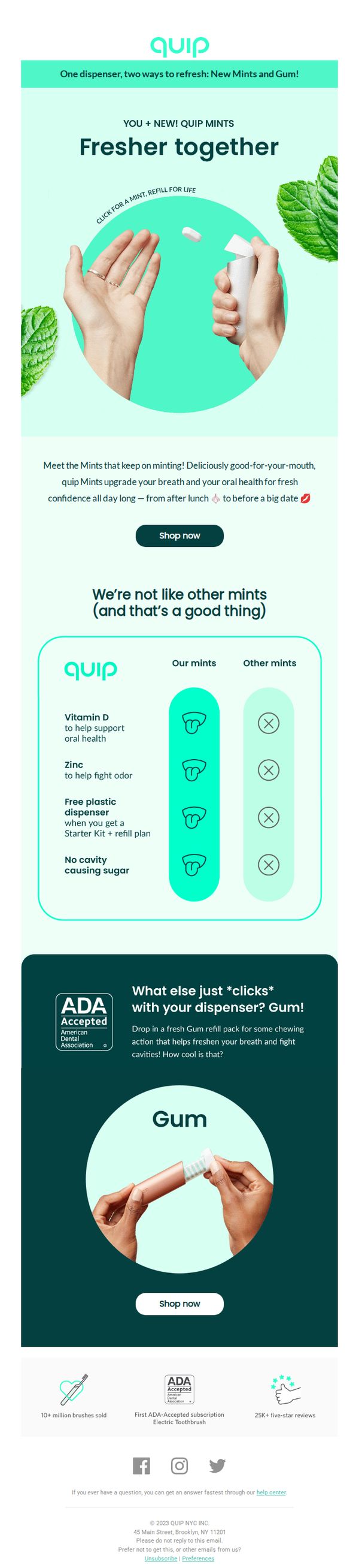
To introduce and drive sales of Quip’s new Mints and Gum by positioning them as superior, health-focused oral care companions that enhance daily freshness and confidence. The email aims to convert readers into customers by highlighting unique benefits and encouraging immediate purchase.
Why this works
The email brilliantly frames mints not as a snack but as a daily oral health ritual, using phrases like 'fresher together' and 'upgrade your breath' to emotionally connect with users seeking confidence and wellness in everyday moments.
How to implement
By visually contrasting Quip’s mints against 'other mints' with clear icons and benefits like Vitamin D and zinc, the email creates instant perceived value and educates consumers without overwhelming them, a masterclass in comparative product positioning.
Pro Tip
Add a limited-time incentive like 'First 100 orders get free shipping' or a countdown timer near the CTA to create urgency and reduce decision fatigue, especially since the email already positions the product as a daily ritual that benefits from immediate adoption. • Include a small visual cue or icon next to the 'Shop now' button indicating what happens next, e.g., 'Choose your flavor' or 'Start your subscription', to reduce friction by setting clear expectations for the user’s next step.
2. quip: 🪥 Happy National Brush Day! Win $1000
Objective
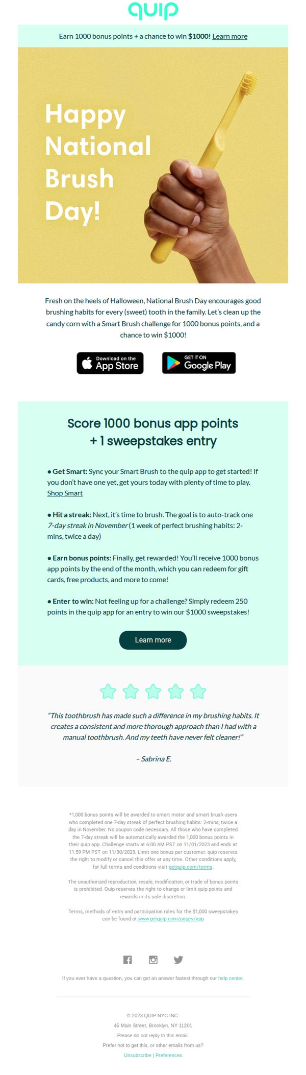
This email aims to celebrate National Brush Day by encouraging users to adopt consistent brushing habits through a gamified challenge, while incentivizing app engagement and product adoption with bonus points and a $1000 sweepstakes entry.
Why this works
By tying a national observance to a behavioral challenge, the email transforms routine hygiene into a fun, time-bound event that drives immediate user action while reinforcing brand values around consistent oral care.
How to implement
The campaign cleverly layers incentives, bonus points for habit-building and a sweepstakes for low-effort participation, creating multiple entry points for users regardless of their motivation or current engagement level with the product.
Pro Tip
Add a visual countdown timer in the Offer Section to create urgency around the November 30 deadline, making the time-sensitive nature of the challenge more prominent and increasing immediate participation. • Reposition the primary CTA 'Learn more' closer to the top of the email, ideally beneath the hero image, to reduce friction for users who want to act immediately after seeing the headline and visual hook.
3. quip: Tooth tip: Chase your PSL with a swig of H2O
Objective
This email aims to educate subscribers on gum health during National Gum Care Month while promoting quip’s Mint Starter Kit and HidrateSpark water bottles through engaging content, a contest, and a limited-time discount. It blends lifestyle tips with product promotion to drive engagement and conversions.
Why this works
The email brilliantly ties seasonal indulgences like pumpkin spice lattes to oral care by recommending hydration and sugar-free mints, making dental hygiene feel relevant, timely, and woven into daily rituals rather than a chore.
How to implement
By featuring a fun contest for smart water bottles alongside educational content about gum health, the campaign transforms passive reading into active participation, subtly reinforcing hydration’s role in oral wellness while driving app downloads and brand loyalty.
Pro Tip
The primary CTA 'Shop Mints' is buried at the bottom; moving it higher or duplicating it near the offer section would improve conversion by reducing scroll friction and aligning with the email’s promotional intent. • While the contest is compelling, the entry mechanism (download the app) creates a barrier; adding a direct web-based entry option would capture users who aren’t ready to commit to an app install, increasing participation rates.
4. quip: 🪥 Happy National Brush Day! Win $1000
Objective
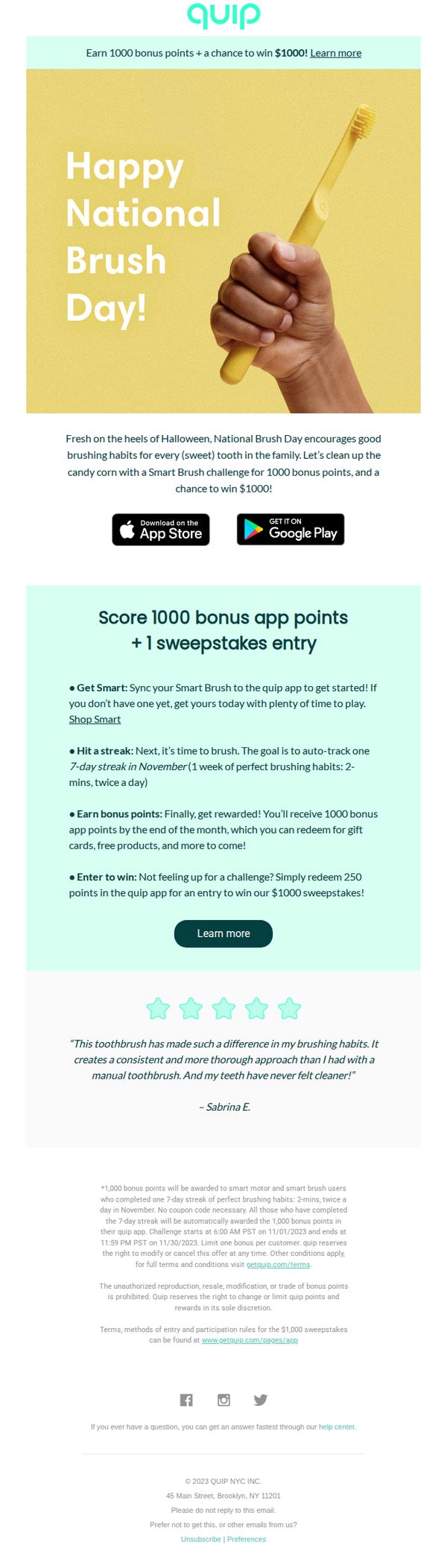
This email aims to celebrate National Brush Day by encouraging users to adopt consistent brushing habits through a gamified challenge, while incentivizing app engagement and product adoption with bonus points and a $1000 sweepstakes entry.
Why this works
By tying a fun, time-limited challenge to a national observance, the campaign taps into cultural momentum to make oral hygiene feel celebratory rather than obligatory, increasing emotional resonance and participation likelihood.
How to implement
The layered incentive structure, bonus points for habit tracking plus a sweepstakes entry for redemption, creates dual motivational pathways that appeal to both intrinsic goal-setters and extrinsic reward-seekers without diluting either message.
Pro Tip
Add a visual progress bar or calendar graphic within the Offer Section to help users track their 7-day streak visually, reducing cognitive load and increasing perceived achievability of the challenge. • Reposition the primary CTA 'Learn more' closer to the top of the Offer Section or duplicate it after the bullet-point breakdown to reduce friction for users ready to act immediately after reading the rules.
5. DentalPlans.com : Hi, Efrain. Your dental plan questions, answered.
Objective
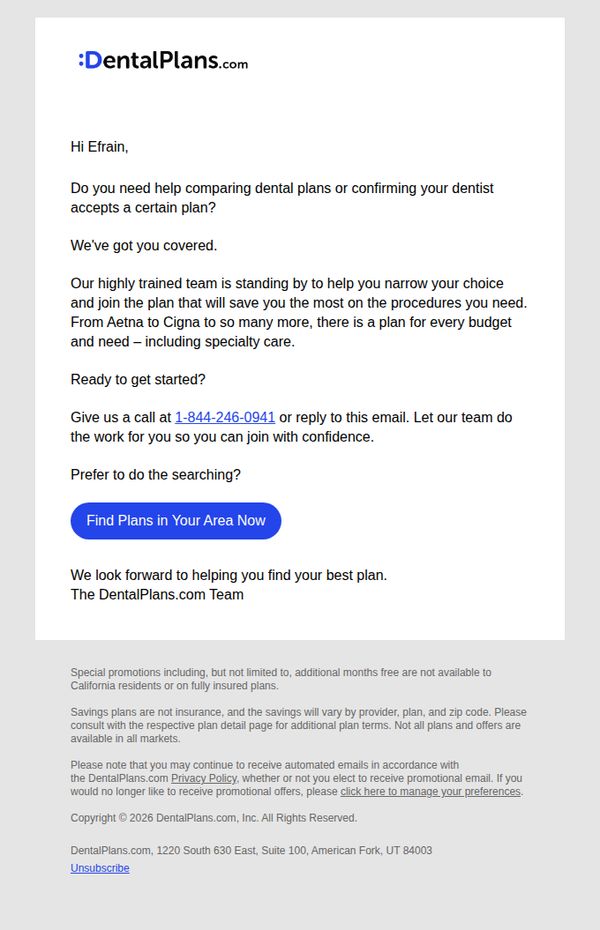
This email aims to reassure the recipient, Efrain, that expert help is available to simplify dental plan selection and confirm dentist network compatibility, ultimately guiding him toward confident enrollment through personalized support.
Why this works
The email opens with a personal greeting and immediately addresses a common pain point, comparing plans and verifying dentist acceptance, which builds instant relevance and trust by speaking directly to the reader’s uncertainty.
How to implement
By positioning their team as ‘highly trained’ and ready to do the work for the customer, the message shifts the burden from the overwhelmed consumer to a supportive, knowledgeable guide, making the decision feel safer and more manageable.
Pro Tip
Add a brief testimonial or stat (e.g., '92% of customers find their ideal plan within 15 minutes') near the CTA to boost social proof and reduce perceived effort in taking the next step. • Include a subtle visual cue like a small icon or badge next to the phone number to highlight it as a preferred contact method, helping users quickly identify the fastest path to assistance.
6. quip: 🔥 October app rewards coming in hot
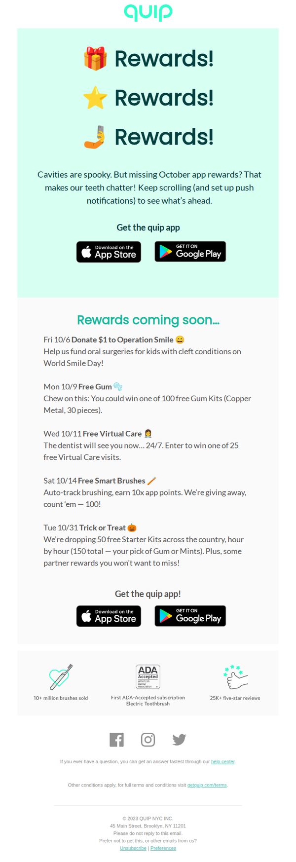
Objective
This email aims to re-engage users by teasing upcoming October app rewards while encouraging app downloads and push notification opt-ins. It leverages urgency and social impact to drive immediate action and sustained app usage.
Why this works
The email brilliantly uses playful, emoji-driven repetition of 'Rewards!' to create instant visual rhythm and emotional anticipation, making the offer feel celebratory rather than transactional, a smart hook for casual scrollers.
How to implement
By tying each reward to a specific date and cause, like donating to Operation Smile or giving away free gum kits, the campaign transforms generic promotions into a narrative-driven calendar event, boosting perceived value and FOMO.
Pro Tip
Add a countdown timer or 'X days until next reward' indicator next to each date to amplify urgency and encourage users to return daily, rather than treating the calendar as a static list. • Include a short testimonial or user quote near the '25K+ five-star reviews' badge to humanize social proof, right now it’s a statistic, but a real voice would strengthen trust and emotional connection.
7. quip: Don’t miss your mintiest (& healthiest) mouth yet 🌿
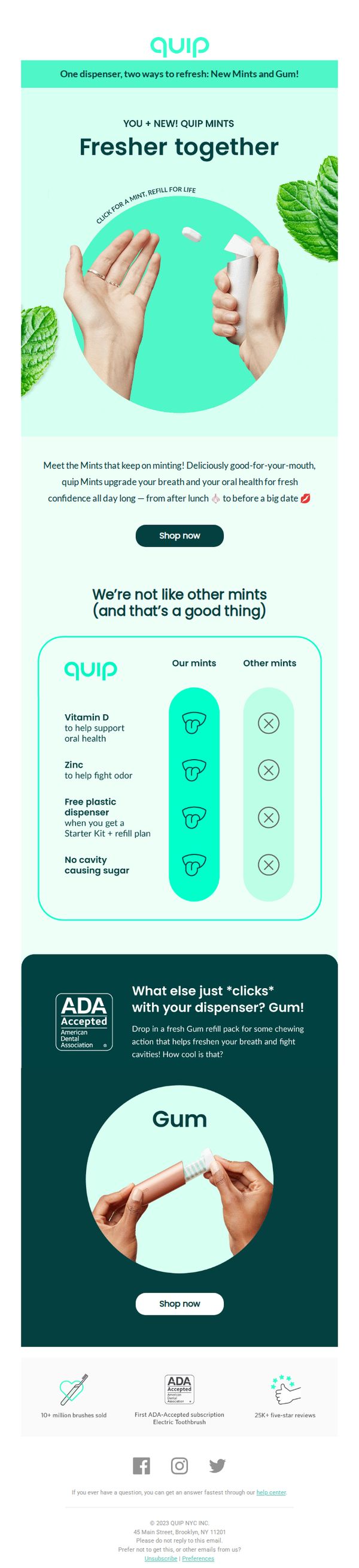
Objective
This email aims to introduce and drive sales of Quip’s new Mints and Gum by positioning them as fresh, healthy, and uniquely beneficial oral care companions that integrate seamlessly with their existing dispenser system. It seeks to convert interest into immediate purchases through clear product differentiation and social proof.
Why this works
The email brilliantly frames mints and gum not as snacks but as oral health tools, tying Vitamin D, zinc, and ADA acceptance to everyday confidence, which elevates the product beyond typical breath fresheners and aligns with modern wellness-driven consumer values.
How to implement
By visually contrasting Quip’s mints against ‘other mints’ using clean icons and checkmarks, the email instantly communicates superiority without overwhelming the reader, a smart, scannable way to build trust and justify premium positioning in a crowded category.
Pro Tip
Add a subtle countdown timer or limited-time offer badge near the CTA to create urgency, since the email currently lacks any time-sensitive incentive that could nudge hesitant buyers toward immediate action. • Include a short customer quote or micro-testimonial near the product comparison section to humanize the claims, for example, ‘I never knew mints could actually help my teeth until I tried Quip’, to strengthen emotional resonance and credibility.
8. quip: 3 steps to get 💲back on quip
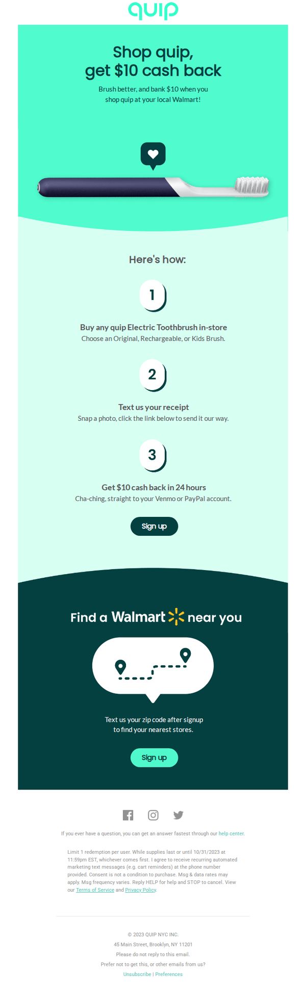
Objective
The email aims to drive in-store purchases of Quip electric toothbrushes at Walmart by offering a $10 cash-back incentive, encouraging immediate action through a simple three-step redemption process while reinforcing brand trust and convenience.
Why this works
Quip brilliantly simplifies the cash-back redemption into three numbered steps that feel effortless and trustworthy, reducing friction for first-time buyers who might otherwise hesitate due to perceived complexity or skepticism about rewards.
How to implement
By anchoring the promotion to Walmart, a familiar, high-traffic retail partner, Quip leverages existing consumer habits and store loyalty to increase conversion likelihood without needing to build new shopping behavior from scratch.
Pro Tip
Add a small countdown timer near the CTA to create urgency around the October 31, 2023 deadline, which is currently buried in fine print and may not register as time-sensitive to casual readers. • Include a testimonial or social proof element near the 'Here's how' section, such as 'Over 50,000 customers have claimed their $10 back', to reinforce credibility and reduce perceived risk for hesitant first-time buyers.
9. DentalPlans.com : Let's bring down the size of that dental bill 💵
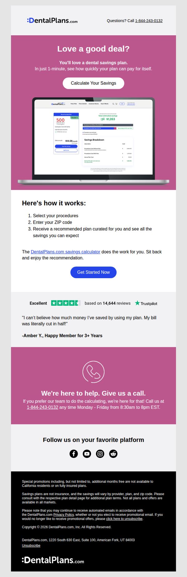
Objective
The email aims to drive immediate engagement by encouraging recipients to calculate their potential dental savings using DentalPlans.com’s tool, positioning the service as a fast, personalized solution to reduce dental costs. It leverages social proof and urgency to convert interest into action.
Why this works
The email opens with a bold, benefit-driven headline that speaks directly to financial pain points, immediately anchoring the reader’s attention on the value proposition of reducing dental bills, a smart emotional hook for cost-conscious consumers.
How to implement
Including a visual mockup of the savings calculator on a laptop creates instant credibility and reduces friction by showing users exactly what to expect, making the abstract idea of ‘savings’ feel tangible and achievable within minutes.
Pro Tip
Add a secondary CTA button below the testimonial that says 'Talk to a Savings Specialist' to capture users who prefer human assistance, reducing drop-off for those hesitant to self-navigate the calculator. • Include a small countdown timer or urgency indicator near the 'Calculate Your Savings' button (e.g., 'Savings calculator updated 2 hours ago, 87 people saved today') to create subtle FOMO and encourage immediate action.
10. quip: Don’t want Mother’s & Father’s Day emails?
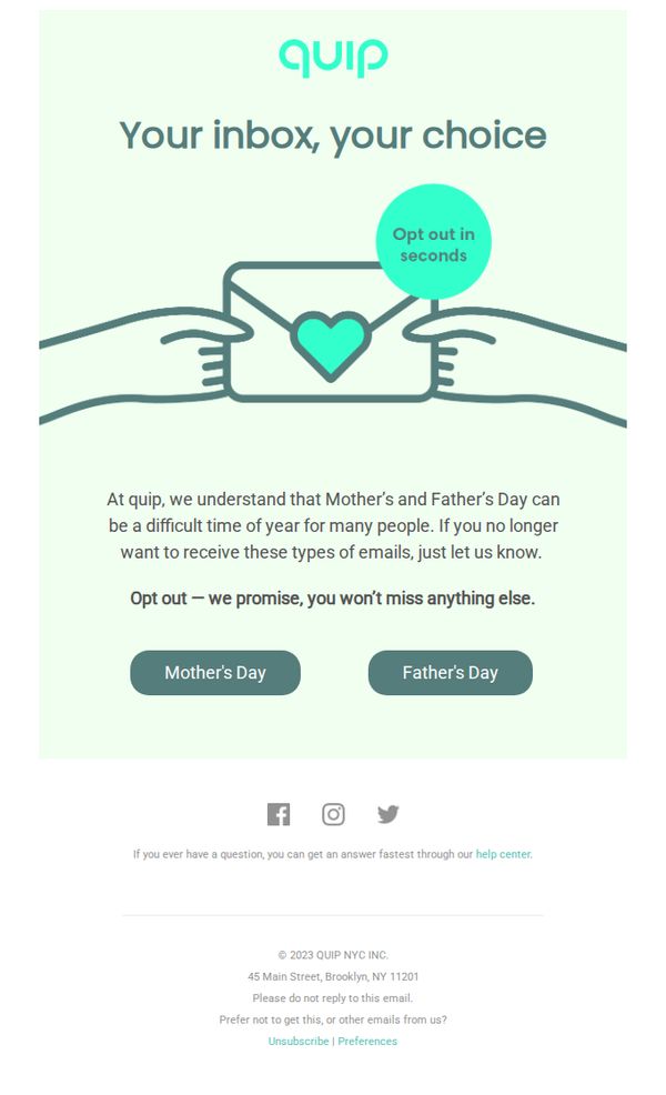
Objective
This email aims to respectfully allow subscribers to opt out of Mother’s and Father’s Day-themed marketing messages, acknowledging the emotional sensitivity of these holidays while preserving the relationship by assuring them they won’t miss other important communications.
Why this works
Quip demonstrates emotional intelligence by proactively acknowledging that Mother’s and Father’s Day can be painful for some subscribers, turning a potential point of friction into a moment of brand empathy and trust-building.
How to implement
The email’s minimalist design and clear opt-out buttons reduce cognitive load, making it easy for recipients to take action without feeling pressured or overwhelmed, which enhances user experience and brand perception.
Pro Tip
Add a brief explanation of what types of emails subscribers will still receive after opting out (e.g., product updates, restock alerts) to reinforce the promise and reduce uncertainty. • Include a subtle visual cue or micro-animation near the 'Opt out in seconds' button to draw attention without disrupting the calm tone, increasing click-through for those who may overlook the CTA.