The complete relational campaign email collection for deodorant brands
1. woohoobody: New year, fresh you 🙂
Objective
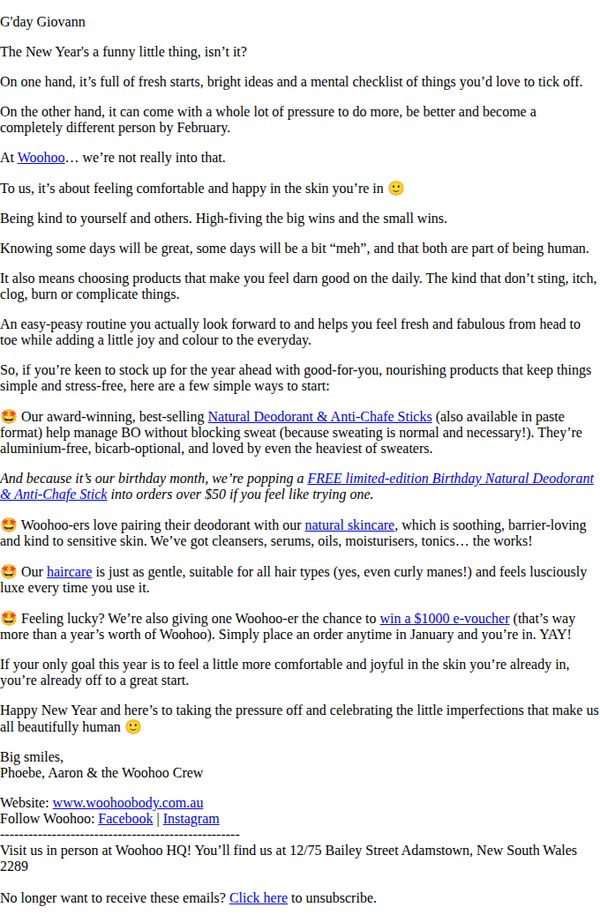
The email aims to welcome the new year with a warm, pressure-free message that encourages self-acceptance while promoting Woohoo Body’s natural skincare and deodorant products as joyful, everyday essentials. It also drives sales through a limited-time birthday offer and a $100 e-voucher giveaway to incentivize January orders.
Why this works
The email brilliantly reframes New Year’s resolutions as gentle self-care rituals, using empathetic language to reduce pressure and position products as joyful daily companions rather than performance tools, which builds emotional trust with the audience.
How to implement
By tying the birthday promotion to January orders and adding a high-value e-voucher giveaway, the campaign creates urgency and perceived generosity, turning a seasonal message into a compelling conversion driver without sounding salesy or pushy.
Pro Tip
The primary CTA 'Click here to unsubscribe' is buried at the bottom and lacks a visible, action-oriented button for purchasing or claiming the voucher, adding a bold, color-contrasting CTA button above the fold would significantly improve conversion rates. • The email mentions award-winning products and a free birthday deodorant but doesn’t include product images or direct links to the items, adding visual thumbnails with clickable links would reduce friction and help customers immediately explore or buy the highlighted offers.
2. Carpe: Feeling Lucky? 🍀
Objective
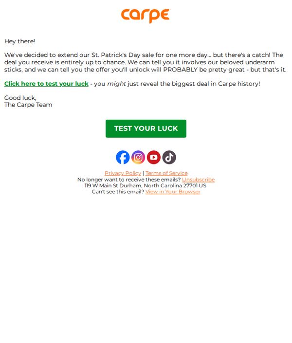
The email aims to create urgency and excitement by extending a St. Patrick’s Day sale for one more day, encouraging recipients to click and discover a randomized, potentially historic discount on underarm products. It leverages curiosity and luck to drive immediate engagement.
Why this works
The email brilliantly uses playful mystery by teasing a randomized deal tied to luck, making the recipient feel like they’re participating in a game rather than just receiving a discount, which boosts emotional engagement and click-through rates.
How to implement
By hinting that the unlocked offer might be the biggest in brand history, the campaign taps into FOMO and perceived exclusivity, turning a simple sale extension into a high-stakes, must-try moment that feels personal and urgent.
Pro Tip
Add a subtle visual cue or icon near the CTA button, like a spinning wheel or clover, to reinforce the ‘luck’ theme and make the interactive element feel more immersive and playful, increasing perceived value of the action. • Include a micro-copy line beneath the CTA such as ‘Only 24 hours left, your lucky deal disappears at midnight!’ to heighten urgency and clarify the time-sensitive nature of the offer, which is currently implied but not explicitly stated.
3. Blume: last call 💥 back to basics 3 for $65
Objective
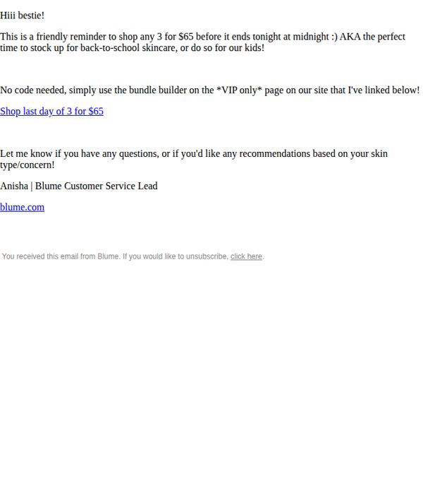
This email aims to create urgency for Blume’s limited-time '3 for $65' skincare bundle by positioning it as the final opportunity to stock up before the offer expires at midnight, while also personalizing the message as a friendly reminder from a customer service lead.
Why this works
The email leverages emotional urgency with a conversational tone, 'last call 💥' and 'Hi bestie!', to transform a promotional deadline into a personal, time-sensitive invitation rather than a generic sales push.
How to implement
By framing the offer as 'back to basics' and tying it to back-to-school routines, the campaign smartly aligns product value with real-life customer moments, making the discount feel relevant and timely rather than arbitrary.
Pro Tip
Add a visual hero section with product imagery or a mini bundle preview to reinforce what ‘3 for $65’ includes, currently, the offer lacks visual context, which may reduce perceived value and urgency. • Include a countdown timer or ‘ending tonight at midnight’ badge near the CTA to amplify urgency visually, since the current text-only reminder may not grab attention quickly enough in a crowded inbox.
4. Wild: LOW IN STOCK: Get your Ghost case and Vanilla Bean & Buttercream
Objective
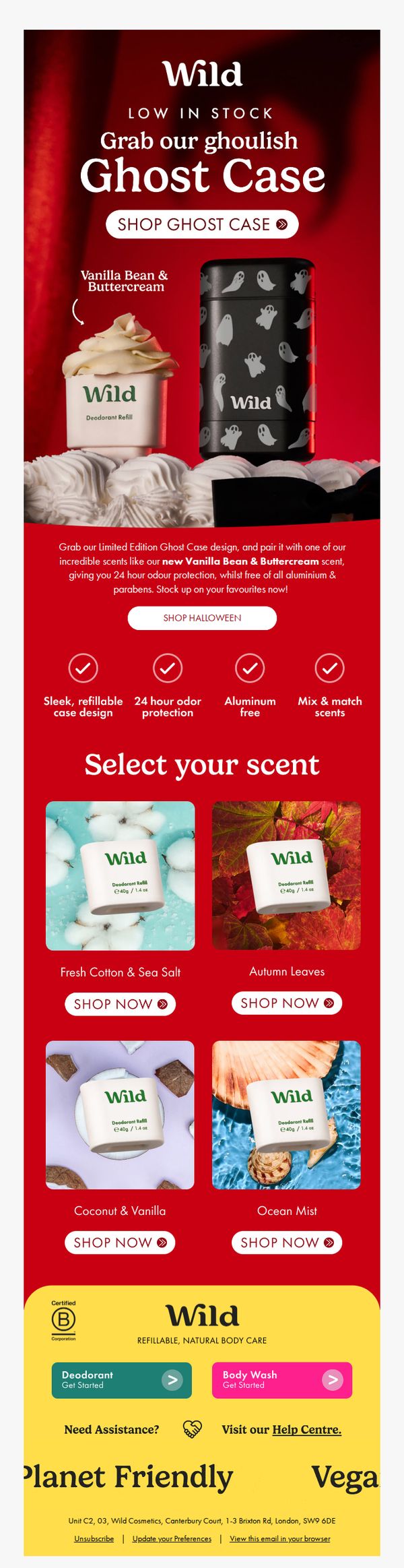
This email aims to drive urgency-driven purchases of the limited-edition Ghost Case and new Vanilla Bean & Buttercream scent by highlighting low stock levels and pairing them with seasonal Halloween appeal. It encourages immediate action through clear CTAs and scent variety options.
Why this works
The email brilliantly leverages scarcity and seasonality by pairing a limited-edition Halloween-themed case with a new dessert-inspired scent, creating an irresistible combo that feels both timely and indulgent for the target audience.
How to implement
Instead of overwhelming with options, the email simplifies decision-making by showcasing only four complementary scents with clean visuals and direct 'Shop Now' buttons, reducing friction and guiding users toward quick, confident purchases.
Pro Tip
Add a visible countdown timer or 'Only X left!' stock indicator near the Ghost Case CTA to amplify urgency beyond the static 'LOW IN STOCK' headline and increase conversion pressure. • Include a short customer testimonial or social proof near the scent grid to validate the new Vanilla Bean & Buttercream scent’s appeal, since first-time buyers may hesitate without peer validation for a new fragrance.
5. By HumanKind: Happy Valentines Day <3
Objective
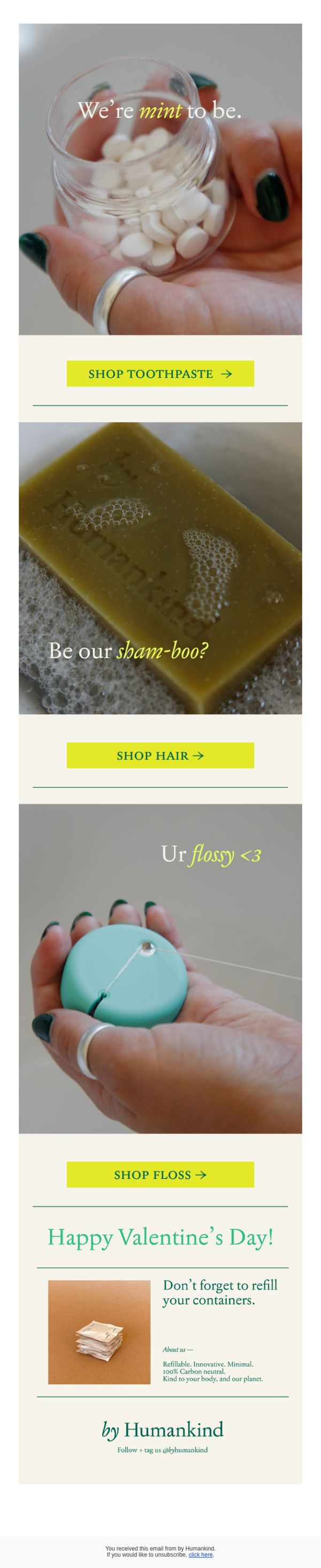
This Valentine’s Day email aims to drive product engagement by playfully connecting By HumanKind’s eco-friendly personal care items to romantic gestures, encouraging recipients to shop for themselves or loved ones while reinforcing the brand’s sustainable values.
Why this works
The email brilliantly ties product features to Valentine’s Day emotions, like calling toothpaste ‘mint to be’, making functional items feel romantic and emotionally resonant without forcing the theme.
How to implement
Each product section uses cheeky, conversational copy like ‘Be our sham-boo?’ to lower the barrier to engagement, turning routine purchases into playful, shareable moments that align with the brand’s lighthearted tone.
Pro Tip
Add a visual countdown or limited-time Valentine’s offer badge near the CTAs to create urgency, since the current design lacks time-sensitive motivation despite the holiday context. • Include a small testimonial or user-generated photo near the ‘Happy Valentine’s Day!’ section to build social proof and humanize the brand’s ‘kind to your body and planet’ claim.
6. By HumanKind: The freshest rinse –
Objective
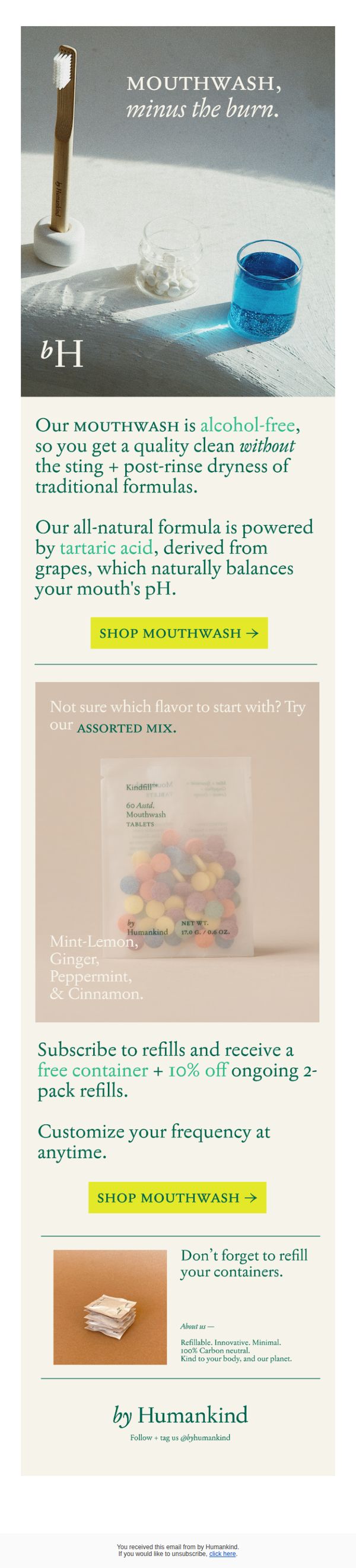
This email aims to convert subscribers into first-time buyers of By HumanKind’s alcohol-free mouthwash tablets by highlighting their gentle, natural formula and offering a risk-free way to try multiple flavors. It also encourages subscription for long-term retention through a free container and discount.
Why this works
The email brilliantly reframes mouthwash as a soothing, non-irritating experience by leading with 'minus the burn', a clever emotional hook that immediately addresses a universal pain point of traditional formulas and positions the product as a gentle upgrade.
How to implement
By showcasing the assorted flavor mix with a clear visual and naming each flavor, the email reduces decision fatigue and invites experimentation, making the first purchase feel less like a commitment and more like a fun, low-risk sampling experience.
Pro Tip
Add a small visual icon or badge next to the 'SHOP MOUTHWASH →' CTA in the second section to indicate it’s a subscription offer, this would reduce friction by signaling the benefit upfront without requiring the reader to scroll back up. • Include a micro-testimonial or social proof near the flavor mix section, such as '92% of first-time buyers choose the Assorted Mix', to leverage social validation and nudge hesitant customers toward the recommended starter option.
7. Nuud: You’re welcome - your first 50 Happy Points!
Objective
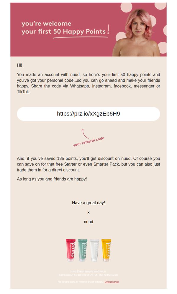
This email aims to welcome new Nuud customers by rewarding them with 50 Happy Points and encouraging social sharing through a personal referral code, while subtly promoting future savings and product engagement.
Why this works
The email brilliantly turns a simple welcome into a social growth engine by giving users a personal referral code right away, making sharing feel rewarding rather than transactional.
How to implement
By framing points as 'Happy Points' and tying them to emotional outcomes like 'making your friends happy,' the brand humanizes its loyalty program and deepens emotional connection with the customer.
Pro Tip
Add a visual highlight or icon next to the referral link to draw attention to it, currently, it blends into the body text and may be overlooked despite being the primary action. • Include a small visual cue or micro-copy near the point-saving threshold (135 points) to clarify how close the user is to unlocking the discount, increasing motivation to engage further.
8. Nuud: Customer account confirmation
Objective
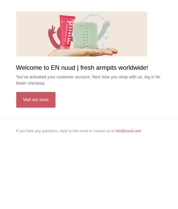
To welcome new customers after account activation and encourage immediate engagement by directing them to the store for their first purchase, while reinforcing brand identity with playful visuals and a clear next step.
Why this works
The email uses whimsical product illustrations with animated arms to create emotional connection and brand personality, making a functional confirmation message feel warm and memorable rather than transactional.
How to implement
By immediately highlighting the benefit of faster checkout upon login, the message transforms account activation from a technical step into a value-driven incentive that encourages future purchases.
Pro Tip
Add a subtle countdown or limited-time offer beneath the CTA to create urgency, since this is a welcome email, incentivizing first-purchase behavior within 24–48 hours can significantly boost conversion rates. • Reposition the CTA button higher in the visual hierarchy or add a secondary micro-CTA (e.g., 'Explore Best Sellers') to reduce friction for users who may not scroll past the hero image on mobile devices.
9. Blume: 2025 so far + a little tease 👀
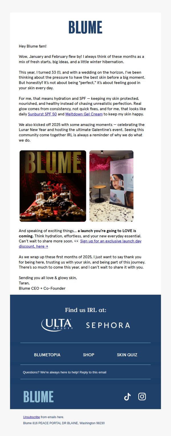
Objective
This email aims to build emotional connection and anticipation by sharing a personal update from the CEO, while teasing an upcoming product launch to drive sign-ups for an exclusive discount. It reinforces brand values around consistent, healthy skincare over perfection.
Why this works
The CEO’s personal story about turning 33 and preparing for her wedding humanizes the brand, making skincare feel like a shared journey rather than a transactional need, which builds deeper trust and loyalty.
How to implement
Teasing a new launch with the phrase 'a launch you’re going to LOVE' creates emotional anticipation without revealing details, leveraging curiosity and exclusivity to drive immediate sign-ups for the discount.
Pro Tip
Add a visual countdown timer or 'limited spots' indicator near the CTA to create urgency around the exclusive launch discount, encouraging faster sign-ups before the offer feels less exclusive. • Include a short testimonial or user-generated photo from the Valentine’s event mentioned to validate community engagement and social proof, strengthening the emotional pull of 'seeing this community come together IRL.'
10. Nuud: RE: OUT OF OFFICE
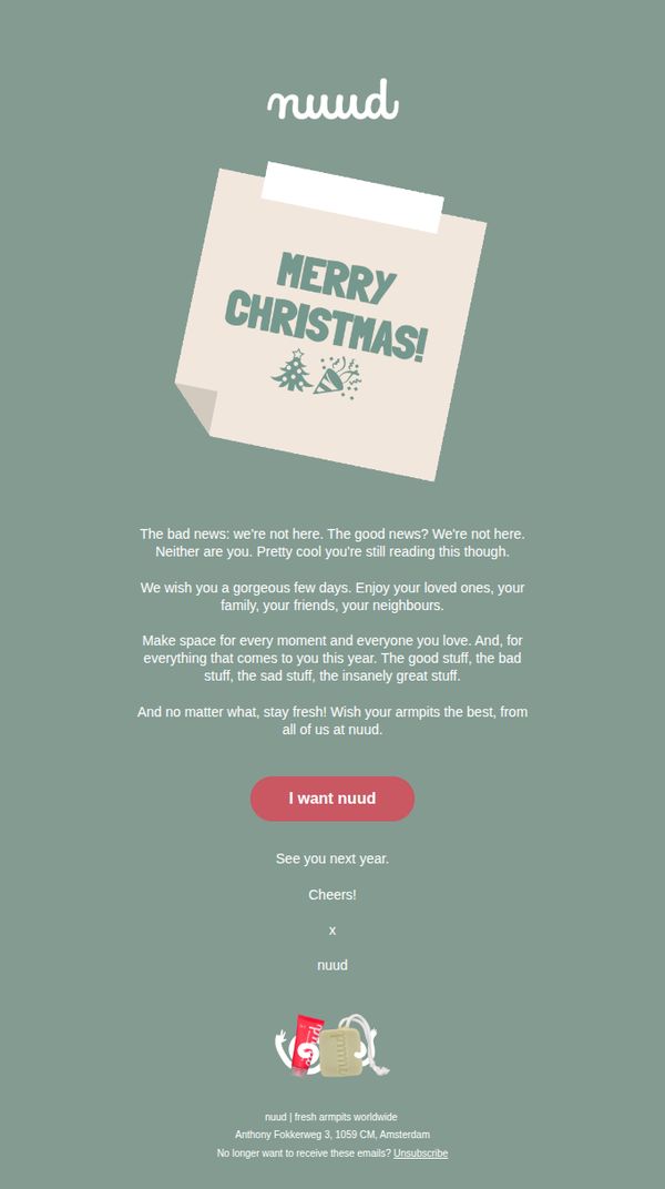
Objective
This email aims to maintain brand connection during a holiday closure by delivering a warm, personality-driven message that reassures customers while subtly reinforcing product relevance, all while encouraging future engagement through a playful CTA.
Why this works
The brand cleverly turns an out-of-office notice into a heartfelt holiday message that humanizes the company, making customers feel seen and valued rather than ignored during downtime.
How to implement
By tying the product’s core benefit, staying fresh, into a seasonal well-wish, the email reinforces brand purpose without hard-selling, creating emotional resonance that lingers beyond the holiday.
Pro Tip
Add a subtle visual cue or micro-animation near the CTA button to draw attention without disrupting the calm aesthetic, increasing click-through likelihood for users scrolling quickly. • Include a brief line about when customer service will resume, reducing uncertainty and preventing support inquiries during the closure period.