Expert Recommends relational campaign emails worth copying

1. Ankorstore UK: Welcome to Ankorstore
Objective
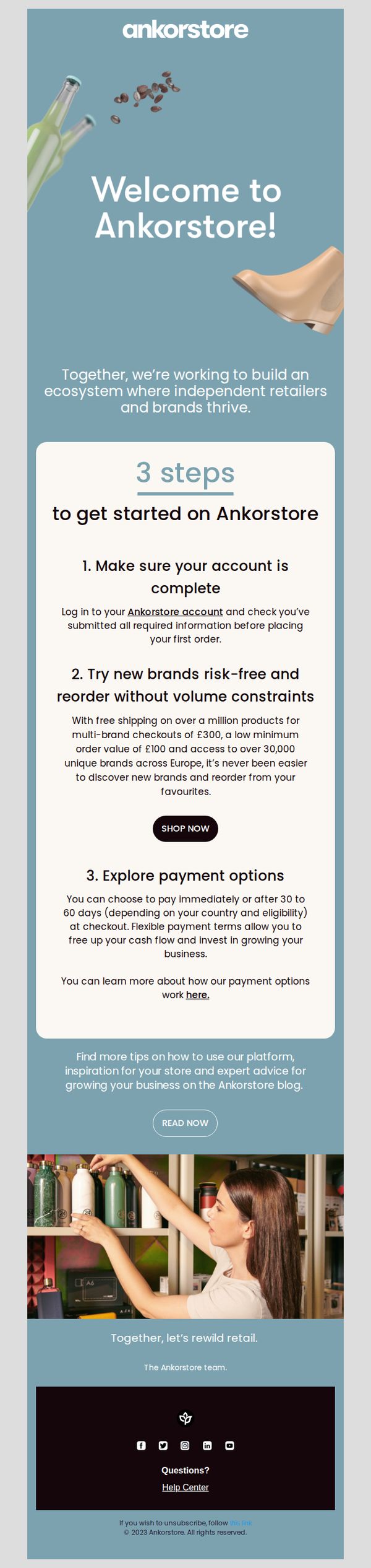
This email aims to onboard new independent retailers by clearly guiding them through their first steps on Ankorstore, while reinforcing the platform’s value in helping them discover brands and manage cash flow with flexible payment terms.
Why this works
The email brilliantly frames onboarding as a three-step journey, reducing overwhelm for new users by breaking down complex platform adoption into simple, actionable milestones that feel achievable and purposeful.
How to implement
By highlighting risk-free brand discovery with concrete numbers, like free shipping on £300+ multi-brand orders and access to 30,000+ European brands, it turns abstract platform benefits into tangible, trust-building incentives for retailers.
Pro Tip
The 'SHOP NOW' CTA appears after step 2 but doesn’t visually stand out enough against the white card; consider increasing contrast or adding a subtle hover effect to draw attention and reduce friction for users ready to act. • The hero section’s background image includes product visuals (bottles, boots) that don’t clearly relate to the platform’s B2B retail focus; replacing them with imagery of curated retail shelves or brand catalogs would better align with the target audience’s identity.
2. RAYGUN: Welcome to Raygun 👋
Objective
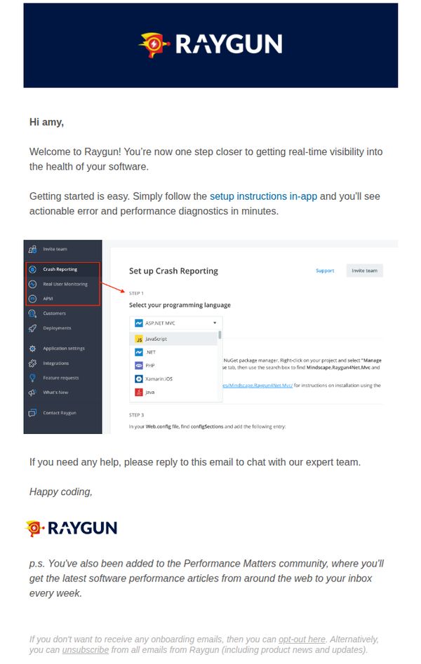
This email aims to warmly welcome new users to Raygun and guide them toward immediate onboarding by directing them to in-app setup instructions for real-time software diagnostics. It also reinforces brand community by subscribing them to performance-focused content.
Why this works
The email opens with a personalized greeting and immediately frames the user’s next step as a natural progression toward value, ‘one step closer to getting real-time visibility’, which reduces friction and builds momentum for onboarding.
How to implement
By embedding a visual screenshot of the actual setup interface with highlighted navigation and step-by-step instructions, the email bridges the gap between abstract guidance and concrete action, making technical onboarding feel approachable and intuitive.
Pro Tip
Add a secondary CTA button labeled 'Start Setup Now' next to the 'setup instructions in-app' link to increase conversion by reducing cognitive load and giving users a clear, clickable path to action. • Include a short testimonial or success metric (e.g., '92% of users complete setup in under 5 minutes') near the setup instructions to build confidence and reduce perceived complexity for new users.
3. Lancôme - US: Explore Our Experts Top Beauty Picks
Objective
To drive sales and engagement by showcasing Lancôme’s expert-curated beauty products while encouraging recipients to book virtual consultations and take advantage of a sitewide 25% discount. The email also promotes loyalty sign-ups and highlights customer benefits to strengthen brand affinity.
Why this works
Leveraging real beauty experts with named endorsements adds authenticity and trust, transforming product recommendations into personal, relatable advice that resonates more deeply than generic marketing copy.
How to implement
Pairing each featured product with a short, emotional testimonial from the expert creates narrative momentum, making the reader feel they’re discovering insider secrets rather than just browsing a catalog.
Pro Tip
The primary CTA 'BOOK NOW' is visually strong but lacks urgency or incentive; adding a time-sensitive phrase like 'Book Your Free Appointment Before [Date]' would better align with the promotional discount and drive faster action. • The product grid lacks visual hierarchy, each product is given equal weight, which dilutes focus. Highlighting one hero product with larger imagery and a bolder testimonial would guide the eye and increase conversion potential for top-performing items.
4. Palm Springs Life Magazine: Sneak Peek: The October Issue of The Guide!
Objective
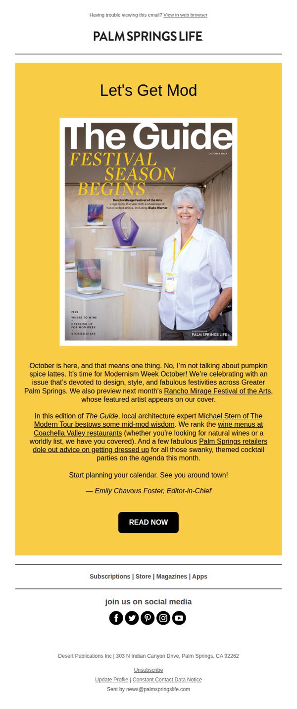
This email aims to generate excitement and anticipation for the upcoming October issue of The Guide by highlighting its Modernism Week focus and exclusive local content, encouraging readers to engage with the magazine’s digital edition. It also reinforces brand identity by showcasing editorial authority and community relevance.
Why this works
The email opens with a bold, culturally relevant hook, 'Let’s Get Mod', that instantly aligns with the local aesthetic and taps into seasonal enthusiasm, making the content feel timely and insider-driven rather than promotional.
How to implement
By featuring the Editor-in-Chief’s personal sign-off and teasing specific local experts and events, the email builds trust and authority while transforming a simple preview into a curated, must-read experience for the community.
Pro Tip
Add a subtle countdown or 'Issue Launching Soon' indicator near the CTA to create urgency and reinforce the timeliness of the preview, encouraging immediate clicks rather than passive reading. • Include a small visual teaser or icon next to the mention of 'wine menus' and 'Palm Springs retailers' to visually anchor those highlights and make the content skimmable for time-pressed readers.
5. Huel: The daily habits of the super fit
Objective
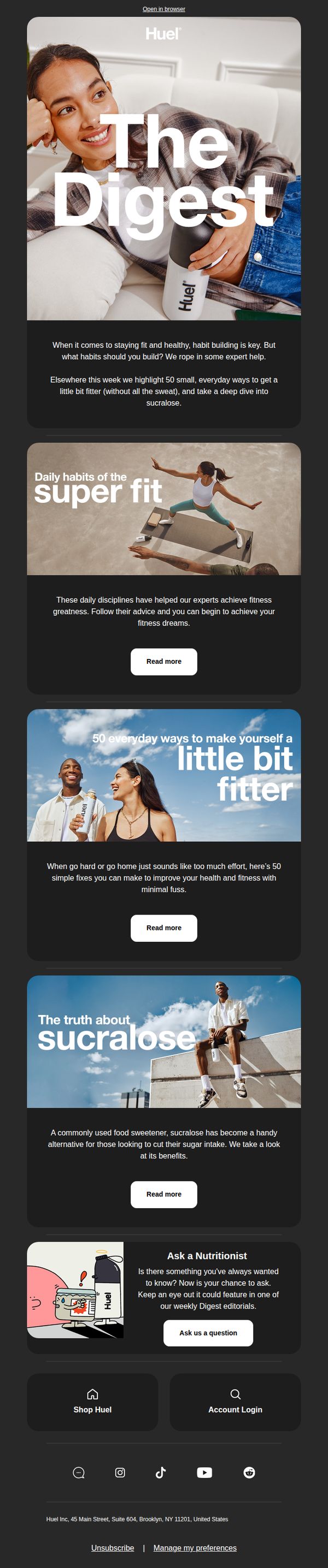
This email aims to position Huel as a trusted guide in everyday wellness by sharing expert-backed, low-effort fitness and nutrition tips, subtly reinforcing brand relevance without overt product promotion. It encourages engagement through curiosity-driven content while nurturing long-term subscriber loyalty.
Why this works
By framing fitness as accessible daily habits rather than extreme routines, the email lowers psychological barriers and invites readers to see small, sustainable changes as the real path to lasting health, a message that resonates with overwhelmed modern audiences.
How to implement
The strategic use of curiosity-driven headlines like 'The truth about sucralose' transforms potentially dry nutritional topics into compelling stories, making readers feel informed rather than sold to, a subtle but powerful trust-building technique for health brands.
Pro Tip
Add a subtle product tie-in after each 'Read more' section, for example, 'Huel’s balanced macros make it easy to stick to these habits', to gently connect educational content with brand value without disrupting the editorial tone. • Include a visual progress indicator or checklist (e.g., 'You’ve read 1 of 3 tips, keep going!') to gamify engagement and encourage readers to scroll through all sections, increasing time-on-email and content absorption.
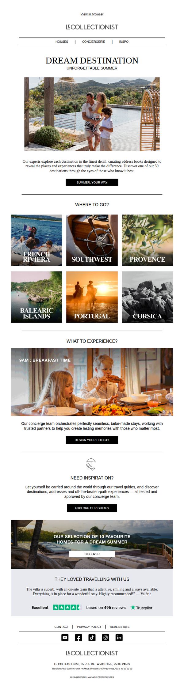
6. Le Collectionist: // Summer inspirations
Objective
To inspire luxury travelers to plan their summer vacations by showcasing curated destinations and personalized concierge experiences, encouraging them to engage with Le Collectionist’s tailored holiday design service.
Why this works
The email opens with an emotionally resonant hero image of a family enjoying a sun-drenched villa, immediately anchoring the campaign in aspirational, experiential luxury rather than just accommodation listings.
How to implement
By organizing destinations into a clean, visually driven grid with evocative labels like 'French Riviera' and 'Corsica,' the email transforms geographic options into sensory invitations, making browsing feel like daydreaming.
Pro Tip
Add a subtle countdown timer or seasonal urgency indicator near the 'SUMMER, YOUR WAY' CTA to encourage immediate action, since summer travel planning is time-sensitive and benefits from scarcity cues. • Reposition the 'DESIGN YOUR HOLIDAY' CTA to appear immediately after the 'WHAT TO EXPERIENCE?' section, where emotional engagement peaks, rather than buried below the 'NEED INSPIRATION?' section which dilutes conversion momentum.
7. Charlotte Tilbury - UK: Happy Mother's Day, Darling🤍💐

Objective
This Mother’s Day email from Charlotte Tilbury aims to drive last-minute gifting by promoting virtual experiences, new product launches, and exclusive offers, while reinforcing brand magic and emotional connection to encourage immediate purchase and loyalty sign-ups.
Why this works
The email brilliantly blends emotional storytelling with urgency by opening with a personal note from Charlotte herself, making the recipient feel seen and celebrated while subtly nudging them toward last-minute gifting solutions.
How to implement
By showcasing multiple gift pathways, e-gift cards, virtual consultations, and live masterclasses, the campaign caters to diverse customer preferences, reducing friction and increasing conversion potential through personalized, experience-driven options.
Pro Tip
The CTA 'GET YOUR FREE GIFT NOW' appears only once and is buried below multiple product sections; repositioning it as a sticky banner or repeating it after each major offer would reinforce urgency and improve conversion flow. • The loyalty program section uses whimsical fairy imagery that clashes with the luxurious, mature tone of the rest of the email; replacing it with a more elegant, aspirational visual would better align with the brand’s premium positioning and target audience.
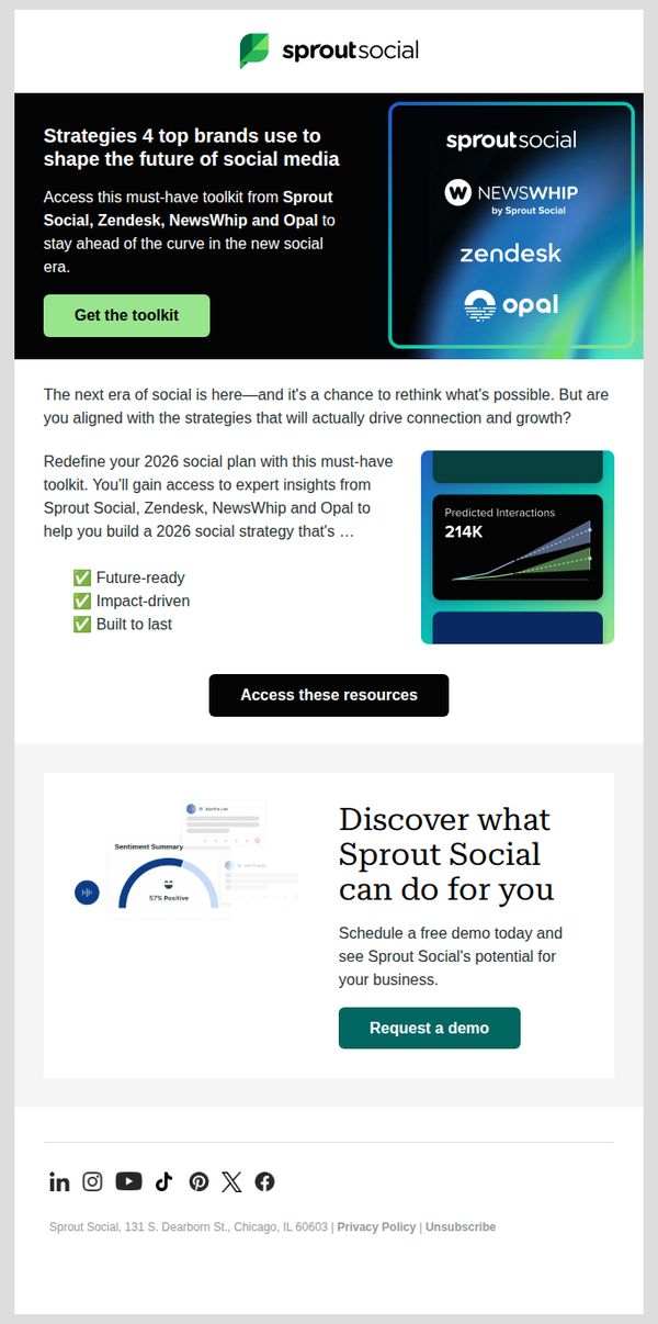
8. Sprout Social: Don't finalize your 2026 social plan w/o this toolkit
Objective
This email aims to drive downloads of a 2026 social media strategy toolkit by positioning it as essential for staying ahead in the evolving social landscape, while also encouraging demo requests to convert leads into qualified prospects.
Why this works
The email smartly frames the toolkit as a non-negotiable resource for 2026 planning, leveraging urgency and authority by citing top brands and positioning Sprout Social as a thought leader in the new social era.
How to implement
By listing tangible benefits like 'future-ready,' 'impact-driven,' and 'built to last,' the email transforms abstract value into concrete outcomes, helping prospects visualize ROI and reducing perceived risk in downloading the asset.
Pro Tip
Add a subtle countdown timer or limited-time badge near the 'Get the toolkit' CTA to amplify urgency, since the subject line implies time sensitivity but the body lacks visual reinforcement of scarcity. • Include a short testimonial or client logo near the 'Access these resources' section to build social proof and credibility, especially since the toolkit is co-branded with Zendesk, NewsWhip, and Opal, leveraging their authority could boost trust.
9. Superior School of Real Estate: Learn from experts in the NC real estate market

Objective
This email aims to attract prospective real estate students in North Carolina by positioning Superior School of Real Estate as a trusted, expert-led training provider that offers flexible learning paths and proven exam preparation support to launch successful careers.
Why this works
The email immediately establishes credibility by anchoring its value proposition in local market expertise, specifically naming North Carolina, which helps build trust with geographically targeted prospects who want training that reflects their actual licensing environment.
How to implement
By showcasing a real student testimonial with a named individual and specific outcome, passing both national and state exams, the campaign transforms abstract promises into tangible proof, making the emotional and practical payoff of enrollment feel real and achievable.
Pro Tip
Add a brief 'How It Works' or 'What’s Included' section beneath the testimonial to reduce friction, prospects may hesitate if they don’t immediately understand the time commitment, curriculum structure, or support resources included in the course. • Include a subtle urgency or social proof element near the CTA, such as 'Join 1,200+ NC agents who started their journey this month' or a countdown to the next class start date, to nudge decision-making without overwhelming the clean layout.
10. Otter: Demo Confirmed

Objective
This email confirms a demo request and sets clear expectations for the next steps, aiming to build trust and excitement by outlining what the recipient will experience during their personalized tour with an Otter expert.
Why this works
The email opens with a warm, personalized greeting that immediately validates the recipient’s interest, making them feel seen and valued before diving into logistics or next steps.
How to implement
By listing exactly three clear outcomes the recipient can expect from the demo, the email reduces uncertainty and builds anticipation, turning a simple confirmation into a compelling preview of value.
Pro Tip
Add a secondary CTA button labeled 'Explore Features Now' above the footer to give users an immediate, low-friction action while they wait for the expert to reach out. • Include a small visual element, like a calendar icon or countdown, next to 'within a business day' to reinforce urgency and manage expectations more effectively.