How Fjällräven does relational campaign emails





1. Summer of cycling
Objective
This email campaign aims to inspire outdoor enthusiasts to embrace bikepacking adventures during summer by showcasing Jennie Assur’s essential gear and storytelling, while driving product exploration and purchase through curated collections and educational content.
Why this works
The campaign brilliantly ties product promotion to an authentic adventurer’s narrative, making gear feel like an essential companion rather than just merchandise, which builds emotional resonance and trust with the audience.
How to implement
By spotlighting Jennie Assur’s personal journey and gear choices, the email transforms product recommendations into curated lifestyle advice, positioning Fjällräven as a guide rather than just a retailer in the outdoor space.
Pro Tip
Add a subtle countdown timer or seasonal urgency cue near the CTA to encourage immediate exploration, especially since the campaign is tied to a limited summer window and could benefit from time-sensitive motivation. • Include a short testimonial or quote from Jennie or Jens Assur directly under the 'Top tips' button to reinforce credibility and entice users to click by previewing the value of the educational content.
2. Show your legs some love
Objective
This email aims to drive interest and sales in Fjällräven’s cold-weather trouser collection by educating customers on key features and fit considerations, while also teasing upcoming products and reinforcing brand authority in outdoor gear.
Why this works
The email smartly blends educational content with product promotion, teaching customers what to look for in cold-weather trousers while subtly guiding them toward specific items that meet those criteria, making the pitch feel helpful rather than salesy.
How to implement
By teasing the upcoming Expedition Down Jacket Black Edition with a moody, atmospheric visual and a story-driven caption, the brand builds anticipation and emotional connection, turning a simple product drop into a narrative moment that aligns with its Scandinavian heritage.
Pro Tip
The primary CTA 'Learn more' is too generic and doesn’t reflect urgency or value, replacing it with action-oriented text like 'Shop Cold-Weather Trousers Now' or 'Grab Yours Before Winter Hits' would better align with the campaign’s conversion goal. • The product grid lacks pricing or discount indicators, which could reduce perceived value, adding subtle price tags or 'New Colour' badges with a 'Limited Stock' note would create scarcity and encourage faster decision-making.
3. Summer of opportunities
Objective
This email aims to inspire casual outdoor enthusiasts to embrace day hiking as an accessible, joyful way to connect with nature, while subtly guiding them toward purchasing Fjällräven’s curated summer gear through storytelling and product curation.
Why this works
By featuring a real ambassador with a relatable quote and lifestyle imagery, the email builds trust and emotional resonance, making the brand feel like a companion rather than a seller, which is far more persuasive than generic product shots.
How to implement
The product grid is intelligently curated around a single activity, day hiking, which reduces decision fatigue and positions each item as part of a cohesive experience, not just a standalone purchase, thereby increasing perceived value and conversion likelihood.
Pro Tip
The primary CTA 'Choose yours' is too vague and lacks urgency or benefit; it should be rewritten to reflect the emotional payoff, such as 'Find Your Perfect Day Hike Pack →' to better align with the campaign’s inspirational tone and drive action. • The product grid lacks pricing or key differentiators (e.g., 'lightweight', 'water-resistant'), which could help shoppers quickly evaluate relevance; adding micro-copy or badges would reduce friction and support faster decision-making.
4. Jackets by the winter experts
Objective
This email aims to drive winter jacket sales by positioning Fjällräven as cold-weather experts and showcasing their functional, stylish outerwear for both men and women. It also promotes brand engagement through the Fjällräven Polar 2026 expedition and encourages long-term product care to build loyalty.
Why this works
The email opens with a warm, seasonal hook, 'Smile! It’s almost winter', that instantly connects emotionally while positioning the brand as a trusted authority on cold-weather gear, making the audience feel prepared rather than pressured to buy.
How to implement
By featuring both men’s and women’s jackets side-by-side with clear labels and lifestyle imagery, the campaign avoids gender silos and invites inclusive browsing, subtly encouraging couples or gift-givers to explore options across categories without friction.
Pro Tip
The primary CTA 'Learn more' is vague and underwhelming for a product-focused campaign; replacing it with action-driven text like 'Shop Winter Jackets' or 'See New Colors' would better align with the goal of driving immediate conversions. • The Fjällräven Polar 2026 section, while compelling, interrupts the product flow and lacks a direct link to purchase; adding a secondary CTA like 'Explore Expedition Gear' would bridge the inspirational content with commercial intent.
5. Light tops that last
Objective
This email aims to drive summer apparel sales by showcasing durable, breathable tops while subtly reinforcing brand values through sustainability storytelling and cross-category exploration. It encourages immediate browsing with clear category CTAs and leverages aspirational outdoor imagery to connect emotionally with active lifestyles.
Why this works
The email brilliantly ties product functionality to seasonal lifestyle needs by positioning breathable, durable tops as essential summer companions, not just clothing, but gear for lasting adventures that match the customer’s active rhythm.
How to implement
By embedding a sustainability report as a ‘summer read,’ the brand elevates its CSR message into a compelling narrative rather than a footnote, making ethical values feel relevant and digestible while reinforcing long-term brand trust without overt sales pressure.
Pro Tip
Add a subtle countdown timer or urgency cue near the ‘Limited Edition’ product tiles to nudge immediate action without disrupting the calm, exploratory tone, especially effective for time-sensitive items like the cream-colored limited edition tee. • Reposition the ‘All shorts’ CTA to appear immediately after the top product grid, creating a tighter visual and behavioral flow that capitalizes on the momentum of browsing tops before prompting the next logical category, shorts, for complete summer outfit planning.
6. Start Fjällräven Polar early
Objective
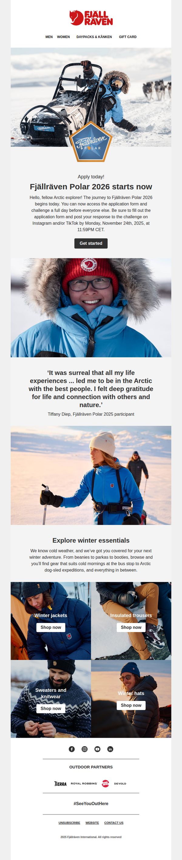
This email aims to drive early applications for the Fjällräven Polar 2026 expedition by creating urgency and emotional connection through participant testimonials and visual storytelling, while also cross-promoting winter gear to support the adventure theme.
Why this works
The email masterfully blends adventure storytelling with product relevance by anchoring the campaign in a real, emotionally resonant participant quote that validates the experience and subtly positions the brand as a gateway to meaningful human-nature connection.
How to implement
By featuring a visually immersive hero image of a dog-sledding expedition paired with a time-sensitive application deadline, the campaign creates both aspirational pull and behavioral urgency without relying on discounts or artificial scarcity tactics.
Pro Tip
Add a countdown timer beneath the 'Get started' CTA to visually reinforce the November 24 deadline, increasing urgency without requiring users to mentally calculate time remaining. • Include a brief FAQ or 'What to Expect' section after the testimonial to preemptively address common applicant concerns (e.g., fitness level, gear provided, travel logistics), reducing drop-off before the application form.
7. Trousers built for adventure

Objective
This email aims to drive interest and sales in Fjällräven’s autumn-ready trousers by connecting them to seasonal outdoor adventures, while also educating customers on fabric technology and cross-selling complementary apparel and tech-enhanced gear.
Why this works
The email brilliantly ties product utility to seasonal storytelling, inviting readers to imagine their own autumn adventures, which transforms trousers from mere apparel into essential gear for personal exploration and resilience against the elements.
How to implement
By embedding a short educational video about waxed fabric benefits, the brand elevates perceived value without hard selling, turning technical specs into compelling reasons to trust and invest in the product’s long-term performance and adaptability.
Pro Tip
The primary CTA 'Learn more' is too vague for a product-focused email; it should be action-oriented like 'Shop Autumn Trousers' or 'See Men’s/Women’s Options' to better align with the campaign’s conversion goal and reduce decision friction. • The product grid lacks pricing, availability indicators, or 'New' badges on all new items, adding these would increase urgency and clarity, especially since some products are marked 'NEW COLOUR' but others aren’t, creating inconsistent visual cues for shoppers.
8. It’s time for Kånken

Objective
This email aims to re-engage customers by positioning the Kånken backpack as a versatile, timeless solution for any new beginning, whether for work, school, or personal adventures, while driving traffic to explore the full product family and customization options.
Why this works
The email brilliantly frames the Kånken not just as a bag, but as a companion for life’s fresh starts, tapping into emotional motivation while subtly reinforcing its durability and adaptability across life stages.
How to implement
By showcasing each Kånken variant with a distinct lifestyle context and benefit-driven micro-copy, the campaign transforms a product grid into a personalized storytelling engine that helps recipients self-identify with the right model.
Pro Tip
Add a subtle countdown or urgency cue near the 'Find yours' CTA, such as 'Limited-edition colors selling fast', to nudge decision-making without compromising the brand’s calm, timeless tone. • Reorder the product grid to lead with the most popular or best-selling model (e.g., original Kånken) before niche variants, helping new customers anchor on the classic before exploring customization or specialty styles.
9. Top summer trekking jackets

Objective
This email aims to drive sales of Fjällräven’s summer trekking jackets by highlighting their technical features and situating them within a broader outdoor adventure context, while also cross-promoting complementary gear and responsible trekking values.
Why this works
The email smartly frames jackets not just as apparel but as essential trekking tools, using practical features like ventilation and packability to justify purchase while aligning with the audience’s functional outdoor needs.
How to implement
By embedding a responsible trekking message with Leave No Trace principles, the brand deepens emotional resonance, turning a product pitch into a values-driven conversation that builds trust and community with eco-conscious adventurers.
Pro Tip
Add a subtle countdown or limited-availability indicator near the jacket grid to create urgency, since the current layout lacks any time-sensitive incentive to act immediately. • Reposition the 'Trekking backpacks' CTA to appear directly beneath the jacket product grid, creating a natural visual and behavioral flow from jacket selection to complementary gear purchase.
10. Buy trousers that last

Objective
This email aims to drive sales of durable, high-performance trousers by positioning them as long-term investments for outdoor enthusiasts, while reinforcing Fjällräven’s brand values of quality, functionality, and thoughtful design tailored to both men and women.
Why this works
Fjällräven brilliantly reframes the purchase of trousers not as a seasonal fashion decision but as a long-term investment in durability and performance, appealing directly to outdoor lovers who value gear that endures real-world conditions.
How to implement
By featuring both men’s and women’s models in authentic outdoor settings and then explicitly calling out gender-specific design philosophy, the brand builds trust with audiences who care about thoughtful, body-conscious engineering rather than just scaled-down versions of men’s styles.
Pro Tip
Add a subtle countdown timer or limited-edition badge near the 'New Colour' product (Vidda Pro Lite Trousers M) to create urgency and highlight novelty, encouraging faster decision-making without disrupting the email’s calm, premium tone. • Reposition the 'Explore' CTA button under the 'Trekking trousers for life' section to be more visually prominent, perhaps with a contrasting color or larger size, to better guide users from emotional storytelling to immediate action, reducing friction in the conversion path.