Food relational campaign email gallery from real brands
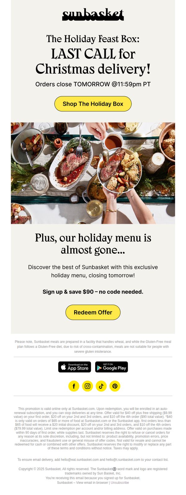



1. Sunbasket: 🎄 Holiday Feast: Last chance for Christmas delivery!
Objective
This email aims to drive last-minute holiday meal orders by creating urgency around Christmas delivery cutoffs while promoting a limited-time discount for new subscribers. It seeks to convert recipients into customers by combining scarcity messaging with a compelling financial incentive.
Why this works
The email brilliantly leverages time-sensitive urgency by announcing orders close tomorrow, which taps into psychological scarcity and motivates immediate action without feeling overly aggressive or manipulative.
How to implement
By pairing the holiday feast promotion with a no-code $90 savings offer, the campaign removes friction for new customers and positions the brand as generous and accessible during a high-spending season.
Pro Tip
Add a countdown timer beneath the 'Orders close TOMORROW' line to visually reinforce urgency and reduce cognitive load for time-pressed shoppers. • Include a brief testimonial or customer quote near the offer section to build social proof and alleviate hesitation for first-time buyers considering a high-value holiday purchase.
2. Huel: The best email you'll get today 🤑
Objective
This email aims to re-engage subscribers by offering a time-sensitive $15 discount to encourage immediate purchase, while framing Huel as a seamless solution for seasonal lifestyle transitions.
Why this works
The email brilliantly ties the discount to seasonal change, positioning Huel not just as food but as a lifestyle reset tool, making the offer feel timely and emotionally resonant rather than purely transactional.
How to implement
By clearly outlining the three-step redemption process with a bold 'Unlock offer' button, the email removes friction and guides users confidently toward conversion without overwhelming them with fine print upfront.
Pro Tip
Add a countdown timer near the discount code section to create urgency, the current expiration date is buried in small text, reducing its psychological impact on decision-making. • Include a mini product grid or 'Most Popular Picks' beneath the CTA to reduce decision fatigue, users may abandon if they don’t know what to add to cart first, even with a discount.
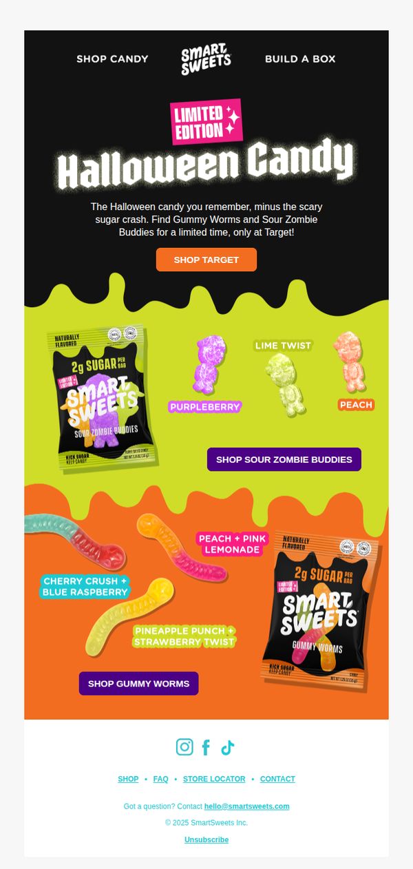
3. Smart Sweets: Now haunting the aisles at Target 👻
Objective
This email aims to drive immediate in-store purchases of Smart Sweets’ limited-edition Halloween candy at Target by highlighting the nostalgic appeal and low-sugar benefit, while creating urgency through time-limited availability.
Why this works
The email brilliantly taps into nostalgic Halloween candy cravings while immediately reassuring health-conscious parents with the 'minus the scary sugar crash' hook, making indulgence feel guilt-free and smart.
How to implement
Using bold, dripping color blocks to visually separate product categories creates an energetic, festive rhythm that guides the eye naturally from one candy type to the next without overwhelming the reader.
Pro Tip
Add a small countdown timer or 'while supplies last' badge near the CTA to amplify urgency, since the 'limited time' message is currently buried in the hero copy and lacks visual reinforcement. • Include a mini testimonial or social proof snippet like 'Loved by 10K+ parents this season' near the product grid to build trust and reduce hesitation for first-time buyers unfamiliar with the low-sugar claim.
4. Sacred Taste : 🌑 Happy Lunar New Year!
Objective
This email aims to align the brand’s spiritual and wellness messaging with the Lunar New Year and Solar Eclipse, inviting subscribers to embrace renewal and inner liberation through their cacao products. It seeks to drive product engagement by framing consumption as a ritual for personal transformation during a powerful astrological window.
Why this works
By anchoring the campaign to a rare celestial event, the Lunar New Year paired with a Solar Eclipse, the brand elevates its product from commodity to ritual tool, inviting customers to participate in a meaningful, time-bound spiritual journey rather than just making a purchase.
How to implement
The email masterfully blends poetic, introspective language with a clear product recommendation, making the cacao blend feel like a necessary companion for inner transformation, a subtle but powerful emotional hook that resonates with spiritually minded consumers seeking purpose in consumption.
Pro Tip
Add a subtle countdown timer or date reference (e.g., 'Only 3 days left to align with this eclipse energy') near the CTA to create gentle urgency without undermining the spiritual tone, encouraging immediate action while honoring the campaign’s theme. • Include a short testimonial or customer quote beneath the product image to reinforce social proof, for example, 'This blend helped me release old patterns and step into my power during the eclipse', to bridge emotional messaging with real-world validation.
5. Petrossian - US: Last Chance for New Year’s Eve Caviar!
Objective
This email aims to drive last-minute New Year’s Eve caviar orders by emphasizing time-sensitive overnight delivery availability and positioning Petrossian as the essential luxury brand for a memorable holiday celebration. It seeks to convert urgency into immediate purchases before delivery slots expire.
Why this works
The email brilliantly leverages time-sensitive urgency by anchoring the offer to a specific, culturally significant moment, New Year’s Eve, making the purchase feel not just desirable but essential for a complete celebration.
How to implement
By showcasing four distinct caviar varieties with clean, uniform product tiles, the email reduces decision fatigue while still conveying premium variety, allowing customers to quickly identify their preferred luxury without overwhelming them.
Pro Tip
Add a visible countdown timer near the CTA to reinforce urgency visually, since the text-based deadline may be overlooked, this would strengthen the psychological trigger for immediate action without altering the message. • Reposition the 'SHOP NOW' button under the sweet treats section to appear immediately after the product grid, creating a clearer visual flow from savory to sweet and reducing friction for customers considering complementary items.
6. 1-800-Baskets: What we learn from losing a friend

Objective
This email aims to emotionally engage readers by reflecting on the meaning of friendship through the lens of loss, while subtly positioning 1-800-Baskets as a thoughtful companion for honoring meaningful relationships. It also promotes brand loyalty by tying personal storytelling to upcoming events and community participation.
Why this works
The email masterfully uses personal grief as a narrative anchor to deepen emotional resonance, making the brand feel less like a seller and more like a compassionate confidant who understands life’s most tender moments.
How to implement
By weaving in expert voices, real stories, and multimedia content like podcasts and videos, the campaign builds credibility and keeps readers engaged longer, turning a simple newsletter into a rich, multi-sensory experience that invites reflection and action.
Pro Tip
The primary CTA is buried mid-email and lacks visual prominence; relocating it to the hero section or adding a sticky button would better align with the goal of driving engagement with the podcast conversation. • While the emotional storytelling is powerful, the connection to 1-800-Baskets’ products is too subtle, adding a small, tasteful product suggestion (e.g., 'A basket to honor their memory') near the conclusion would gently guide sentiment toward action.
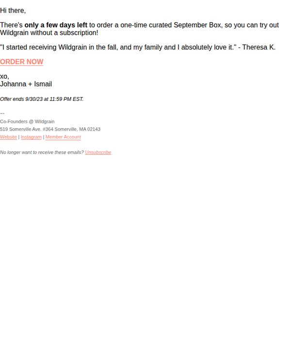
7. Wildgrain: Ends 9/30: one-time September Box!
Objective
This email aims to drive last-minute conversions by creating urgency around a limited-time, one-time September Box offer that lets new customers try Wildgrain without committing to a subscription. It leverages social proof and founder personalization to build trust and reduce friction.
Why this works
The email brilliantly reduces perceived risk by positioning the offer as a one-time box without subscription commitment, making it psychologically easier for hesitant first-time buyers to say yes without long-term guilt.
How to implement
Including a real customer testimonial right after the offer creates instant social proof that validates the product’s quality and emotional payoff, helping new readers visualize themselves enjoying the same experience with their family.
Pro Tip
Add a visual element, even a simple product photo or box mockup, to the hero area to give the offer tangible form; currently, the text-only layout lacks sensory appeal and fails to trigger appetite or desire. • Reposition the CTA button to appear immediately after the testimonial, not buried below it, to capitalize on the emotional peak of social proof and reduce friction between persuasion and action.
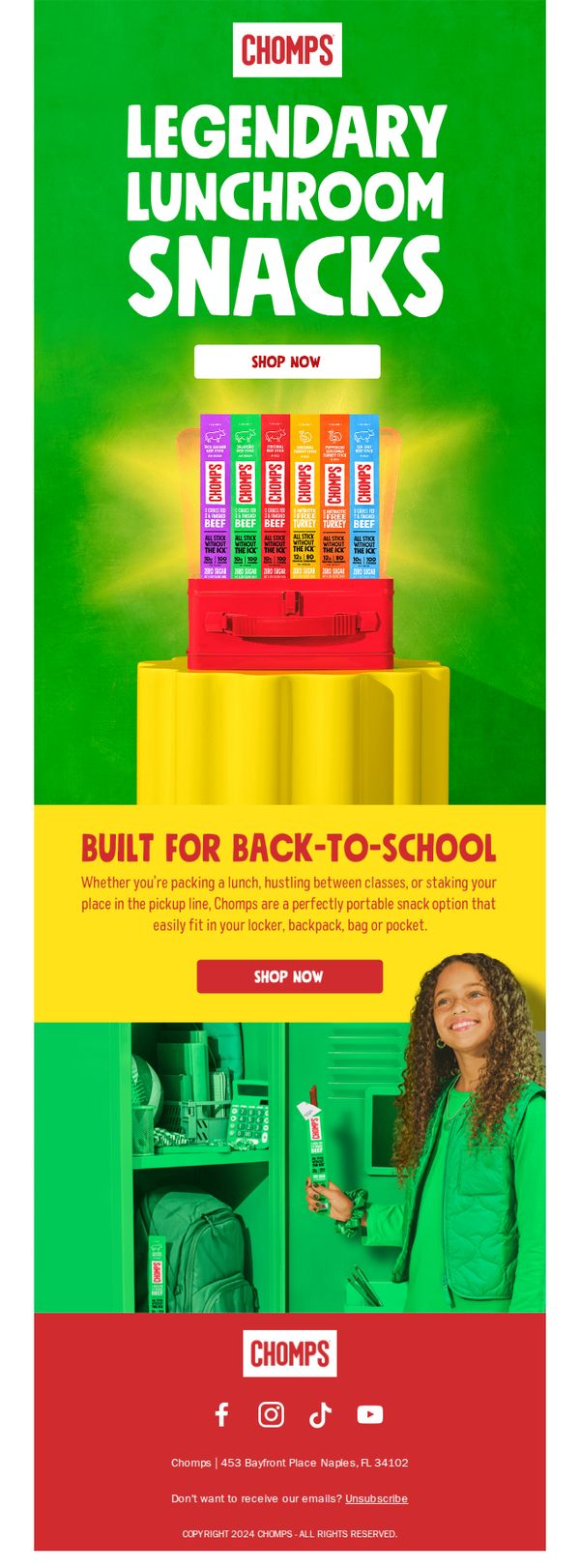
8. Chomps: Snacks you can count on 💪
Objective
This email aims to position Chomps as the go-to portable snack for students returning to school, emphasizing convenience, nutrition, and reliability while driving immediate purchases through a clear call-to-action.
Why this works
The email brilliantly ties the product’s portability to real student routines, lunch packing, class transitions, and pickup lines, making the snack feel indispensable rather than optional.
How to implement
Using a bold, high-contrast color palette with green as the hero hue creates instant visual energy that mirrors the brand’s ‘legendary’ claim while keeping the design youthful and school-appropriate.
Pro Tip
Add a brief testimonial or social proof near the product grid, like a quote from a parent or student, to reinforce trust and address potential skepticism about snack quality or nutrition. • Include a small visual indicator (e.g., a checkmark or badge) next to each flavor highlighting key benefits like ‘High Protein’ or ‘No Sugar Added’ to help shoppers compare quickly and make informed choices.
9. Graza: Early birds get the DELICIOUS OLIVE OIL

Objective
This email aims to simplify holiday gift shopping for busy recipients by highlighting Graza’s curated, giftable olive oil products, specifically the Duo Gift Set and limited-edition 'Drizz & Dip' Serving Set, while creating urgency to order before Thanksgiving.
Why this works
Graza brilliantly frames holiday gifting as a stress-relief solution, not just a product push, by acknowledging the recipient’s busy life and positioning their olive oil sets as the perfect, effortless gift that doubles as self-care.
How to implement
The playful tone and conversational phrasing, like 'look at that box??' and 'You’re welcome :-)', builds warmth and familiarity, making the brand feel like a helpful friend rather than a salesperson, which boosts emotional connection and trust.
Pro Tip
Add a visual of the actual gift sets, especially the 'Drizz & Dip' box, to the email body, since the current text-only description under-sells the product’s aesthetic appeal and gifting potential. • Include a secondary CTA or reminder near the bottom (e.g., 'Still deciding? Here’s why 10,000+ customers chose the Duo Set') to re-engage readers who scrolled past the initial offer without clicking.
10. Bean Box: Last Batch Alert: Honey Whiskey Barrel-Aged 🥃☕

Objective
To create urgency and drive immediate purchases of a limited-edition Honey Whiskey Barrel-Aged Colombian coffee by highlighting its unique flavor profile, seasonal relevance, and exclusive availability. The email also aims to convert non-members by showcasing membership savings.
Why this works
The email brilliantly frames the limited-edition coffee as a seasonal ritual, tying St. Patrick’s Day to a boozy, luxurious coffee experience that feels both indulgent and timely, making the purchase feel like a celebration rather than a transaction.
How to implement
By using vivid, sensory-rich language, like 'melted ice cream with a shot of alcohol poured over the top', the copy transforms flavor notes into an immersive experience, helping customers visualize and emotionally connect with the product before they even taste it.
Pro Tip
Add a subtle countdown timer near the CTA to visually reinforce scarcity, since the 'Last Batch Alert' subject implies urgency but the body lacks a time-sensitive visual cue to prompt immediate action. • Reposition the membership savings offer directly beneath the primary CTA button, not as a secondary line, to make the value proposition more prominent and reduce friction for non-members considering conversion.