Relational Campaign email designs from top gifts brands


1. Etsy: No tricks, just treats! 🎃
Objective
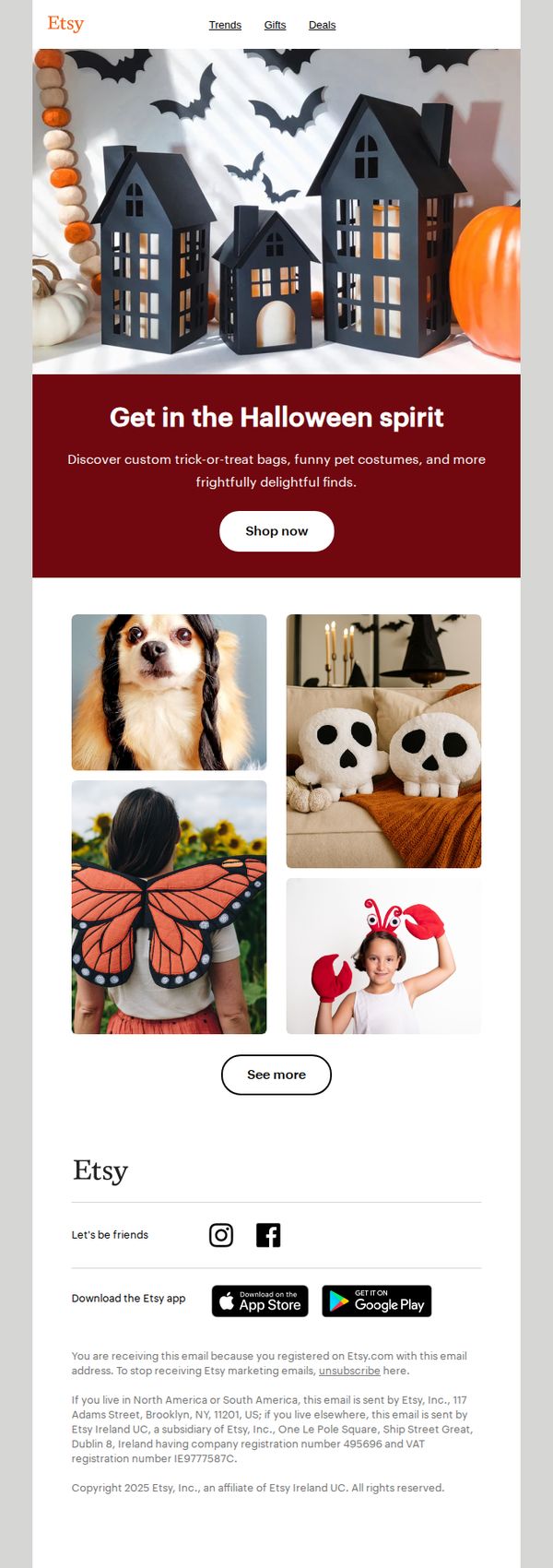
This email aims to inspire Halloween shopping by showcasing whimsical, handmade items like pet costumes and decorative lanterns, encouraging immediate browsing with a festive, low-pressure tone that aligns with Etsy’s artisanal brand identity.
Why this works
Etsy masterfully blends seasonal charm with product discovery by using a warm, inviting hero image of Halloween lanterns and pumpkins that immediately sets a festive mood without overwhelming the viewer with sales pressure.
How to implement
The email strategically features diverse, emotionally resonant product visuals, from a dog in braids to a child in butterfly wings, that tap into personal, relatable moments, making shoppers feel the joy of gifting or dressing up rather than just buying.
Pro Tip
Add a subtle countdown timer or limited-time badge near the 'Shop now' CTA to create urgency without disrupting the festive tone, encouraging faster decision-making during the peak Halloween shopping window. • Include a short testimonial or customer review snippet under one of the product images, such as 'Loved this costume for my pup!', to build social proof and reinforce trust in handmade, one-of-a-kind items.
2. Etsy: Two words: JUST. DROPPED.
Objective
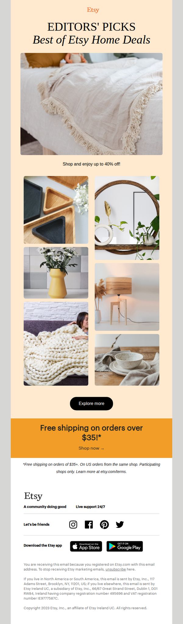
To drive immediate engagement and sales by highlighting newly released, curated home decor items with a limited-time discount of up to 40%, while reinforcing Etsy’s brand as a destination for unique, handcrafted goods.
Why this works
The email leverages urgency and exclusivity through the punchy subject line 'JUST. DROPPED.' paired with 'Editors’ Picks,' which positions the sale as curated and timely, encouraging immediate clicks from users who value insider access.
How to implement
By featuring a warm, cohesive product grid that visually tells a story of cozy, aspirational home living, rather than just listing products, the email emotionally connects with shoppers and subtly guides them toward lifestyle-based purchasing decisions.
Pro Tip
Add a subtle countdown timer near the CTA to reinforce urgency around the 40% off deal, since the current design lacks time-sensitive cues that could nudge hesitant shoppers to act immediately. • Reposition the 'Free shipping on orders over $35!' banner above the product grid instead of below it, this moves a key incentive closer to the decision-making moment and increases its psychological impact on purchase intent.
3. Etsy: Yes, we did say $5 OFF EVERYTHING! 📣
Objective
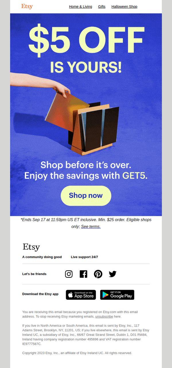
This email aims to drive immediate sales by promoting a limited-time $5 discount across all eligible Etsy products, encouraging users to shop before the offer expires while reinforcing Etsy’s community-driven brand identity.
Why this works
The email opens with a bold, benefit-driven headline that immediately communicates value, '$5 OFF EVERYTHING', creating urgency and excitement while speaking directly to the customer’s desire for savings.
How to implement
By pairing the offer with a visually striking hero image of hands opening a gift box, Etsy emotionally connects the discount to the joy of giving and receiving, making the promotion feel personal and experiential rather than transactional.
Pro Tip
Add a countdown timer beneath the CTA to visually reinforce urgency and encourage immediate action, especially since the offer ends at a specific time and could benefit from real-time pressure. • Include a small 'Top Picks for You' product grid or category links just below the hero section to personalize the browsing experience and guide users toward relevant items, reducing decision fatigue.
4. WonderDays: Celebrate Your Mate With An Experience Day To Remember
Objective
This email aims to inspire recipients to celebrate their friends with unforgettable experience gifts, especially timed around August birthdays and International Friendship Day, by showcasing curated, emotionally resonant activities that create lasting memories together.
Why this works
The email brilliantly ties emotional gifting to timely cultural moments, like International Friendship Day, making the offer feel urgent, relevant, and deeply personal rather than just transactional.
How to implement
By featuring diverse, high-energy experiences, from zombie survival to spaceship simulators, the campaign appeals to a wide range of personalities, ensuring there’s a ‘wow’ moment for every type of friend dynamic.
Pro Tip
Add a countdown timer near the hero section to emphasize the urgency of International Friendship Day, encouraging faster decision-making and reducing procrastination around gifting. • Include a short FAQ or 'How It Works' section after the product grid to clarify gifting logistics (e.g., digital delivery, booking flexibility), which could reduce cart abandonment for first-time buyers.
5. uncommon goods: Valentine's Day gifts you can't find on Amazon
Objective
This email aims to drive Valentine’s Day gift purchases by positioning Uncommon Goods as the go-to source for unique, Amazon-exclusive gifts that feel personal and meaningful. It leverages emotional storytelling and curated product selection to convert gift shoppers seeking standout options.
Why this works
The email brilliantly frames its entire value proposition around exclusivity, not just ‘unique gifts,’ but ‘gifts you can’t find on Amazon’, instantly differentiating the brand in a crowded gifting market and appealing to shoppers tired of generic options.
How to implement
Each product is presented with a mini-narrative or emotional hook, like ‘Where It All Began Couple Art’ or ‘Made-To-Order Personalized Song’, transforming items from commodities into sentimental experiences, which increases perceived value and emotional resonance with gift-givers.
Pro Tip
Add a countdown timer or deadline badge near the hero CTA to reinforce urgency around Valentine’s Day gifting, since the current design lacks time-sensitive pressure that could boost conversion for last-minute buyers. • Include a short testimonial or customer review snippet under 1–2 hero products to build social proof, especially for high-ticket or emotionally charged items like personalized art or journals, which would strengthen trust and reduce perceived risk.
6. Poo-Pourri: You've unlocked early access to 2 NEW scents 🎉
Objective
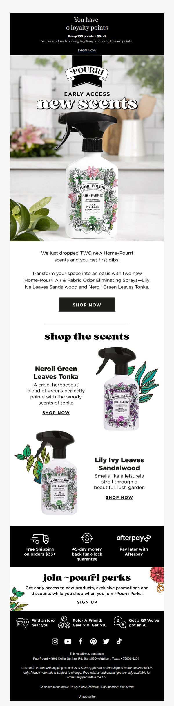
This email aims to reward loyal customers with exclusive early access to two new Home-Pourri scents, driving immediate purchases by creating urgency and leveraging their existing brand affinity. It also encourages program sign-ups through perks like discounts and early product access.
Why this works
The email brilliantly leverages exclusivity by framing new product access as a reward for loyalty, making subscribers feel valued while subtly nudging them toward immediate action with a clear, benefit-driven CTA.
How to implement
Each scent is described with vivid, sensory-rich language, like 'crisp, herbaceous blend' and 'leisurely stroll through a lush garden', which transforms functional products into emotional experiences, helping customers visualize the lifestyle benefit.
Pro Tip
Add a countdown timer or 'limited stock' indicator near the CTA to amplify urgency, since early access implies scarcity, this would strengthen the psychological trigger already hinted at in the subject line. • Include a short customer testimonial or review snippet under each scent description to build social proof, especially since new scents may require more reassurance than established products.
7. uncommon goods: In case you missed it: every item you'll want to see

Objective
This email aims to re-engage subscribers by highlighting recently sold-out items, new arrivals, and customer favorites, while driving traffic to the site through a seasonal sale and personalized product recommendations. It also encourages long-term loyalty via perks sign-up and gift center engagement.
Why this works
The email masterfully turns FOMO into a sales driver by spotlighting sold-out items first, subtly implying scarcity and urgency without being pushy, which encourages immediate browsing and rediscovery of desirable products.
How to implement
By blending new arrivals with customer-loved items and a seasonal sale, the campaign creates a dynamic narrative that feels curated rather than promotional, making the shopper feel like they’re discovering hidden gems rather than being sold to.
Pro Tip
The 'we’re-so-over-summer SALE' section could benefit from a countdown timer or limited-time badge to reinforce urgency, since the current copy relies solely on humor without a tangible deadline to drive immediate action. • The 'WE FOUND THESE FOR YOU' product grid lacks visual hierarchy, adding subtle badges like 'Trending' or 'Just Added' next to items would help guide attention and reinforce why these specific products were chosen for the recipient.
8. uncommon goods: Our 2025 holiday gift guides have landed!

Objective
This email aims to drive early holiday shopping by showcasing curated gift guides and bestsellers, encouraging recipients to explore personalized gift options while highlighting perks like free shipping to reduce purchase friction.
Why this works
The email brilliantly segments gift options by recipient type and budget, making it effortless for shoppers to navigate and find relevant presents without feeling overwhelmed by choice.
How to implement
By featuring both trending holiday items and evergreen bestsellers, the campaign balances seasonal urgency with timeless appeal, increasing the likelihood of conversion across diverse buyer mindsets.
Pro Tip
Add a countdown timer or 'limited stock' indicator next to top-selling items like the Advent Calendar or Weighted Emotional Support Animal to create urgency and prevent cart abandonment. • Reposition the 'shop holiday gifts' CTA button in the orange banner to be more visually dominant, perhaps larger or with a contrasting color, to ensure it captures attention immediately after the product grid.
9. uncommon goods: Eggs= hard to find, Extraordinary gifts = easy!

Objective
This email aims to drive Easter gift purchases by positioning Uncommon Goods as the effortless solution for finding unique, memorable presents during a busy holiday season. It also promotes a spring sale and encourages long-term loyalty through free shipping perks.
Why this works
The email brilliantly reframes Easter gifting as a stress-free experience by contrasting the difficulty of hunting for eggs with the ease of discovering extraordinary gifts, making the emotional relief the core selling point rather than just the products themselves.
How to implement
By featuring a diverse, visually playful grid of quirky, giftable items, from singing egg timers to banana-saving hats, the campaign taps into the joy of surprise and novelty, appealing to customers who want to stand out with unconventional, conversation-starting presents.
Pro Tip
The hero section’s CTA 'shop Easter' is visually underwhelming and lacks urgency or emotional pull; replacing it with a more benefit-driven phrase like 'Find Your Perfect Easter Gift in 1 Click' would better align with the campaign’s stress-relief positioning. • The spring sale banner is visually disconnected from the Easter theme and product grid; integrating Easter-related imagery or color accents into the banner would create a more cohesive narrative and prevent the sale from feeling like a generic, unrelated promotion.
10. uncommon goods: Last chance before V-Day

Objective
This email aims to drive last-minute Valentine’s Day gift purchases by creating urgency around shipping deadlines and showcasing curated gift ideas for different recipient types. It also promotes an in-person pop-up event to deepen local engagement and brand connection.
Why this works
The email brilliantly leverages time-sensitive urgency by anchoring the CTA to a hard shipping deadline, making procrastinators feel the pressure to act now rather than risk missing Valentine’s Day entirely.
How to implement
By segmenting gift ideas into intuitive recipient categories, him, her, kids, friends, the campaign reduces decision fatigue and positions Uncommon Goods as a thoughtful, personalized gifting concierge rather than just a store.
Pro Tip
The hero section’s CTA button is visually underwhelming, increasing its size, adding a contrasting color, or animating it slightly would make the primary action more irresistible against the soft background. • The 'We Found These For You' section lacks personalization cues, adding a line like 'Based on your browsing history' or 'Customers who liked X also bought Y' would boost relevance and conversion potential.