Proven healthcare relational campaign email designs you can use



1. Sleep Doctor: Are you choosing the right late night snack
Objective
This email aims to educate subscribers on how late-night snack choices impact sleep quality while subtly guiding them toward Sleep Doctor’s products and resources. It blends nutritional advice with product promotion to position the brand as a trusted sleep authority.
Why this works
The email opens with empathy by acknowledging late-night cravings as real and relatable, which instantly builds trust and lowers reader resistance before introducing science-backed sleep nutrition advice.
How to implement
Instead of pushing products immediately, it strategically places a curiosity-driven CTA after explaining the science of tryptophan and balanced snacks, making the next step feel helpful rather than salesy.
Pro Tip
The 'Recommended Reads for You' section feels disconnected from the snack theme; reframe it as 'More Ways Food Affects Sleep' to maintain topical cohesion and strengthen the educational narrative. • The physician CTA section interrupts the flow between education and product promotion; relocate it to the footer or reposition it as a 'Sleep Expert Approved' badge beside the product grid to preserve momentum.
2. Randox Health : Upgrade your health check with £85 worth of insights - at no extra cost
Objective
This email aims to drive immediate upgrades to Randox Health’s premium health check packages by highlighting a limited-time offer of £85 worth of added insights at no extra cost, encouraging users to act before the deadline to gain deeper control over their stress and immunity health.
Why this works
The email brilliantly frames the upgrade as a time-sensitive gift, not a purchase, making the £85 value feel like a personal bonus rather than a sales tactic, which reduces perceived friction and increases perceived generosity.
How to implement
By visually pairing each health package with relatable, smiling customers and clear benefit-driven copy, the email builds emotional trust while simultaneously educating the reader on complex biomarkers like cortisol and zinc in an accessible, non-intimidating way.
Pro Tip
Add a countdown timer near the CTA to visually reinforce urgency, the current ‘Hurry, offer ends midnight 1st February’ text is buried and lacks visual impact, reducing its persuasive power. • Reposition the ‘VIEW HEALTH CHECKS’ CTA higher in the email, ideally after the offer section, to reduce scroll friction, users may miss it after reading detailed biomarker explanations.
3. DentalPlans.com : Let's bring down the size of that dental bill 💵
Objective
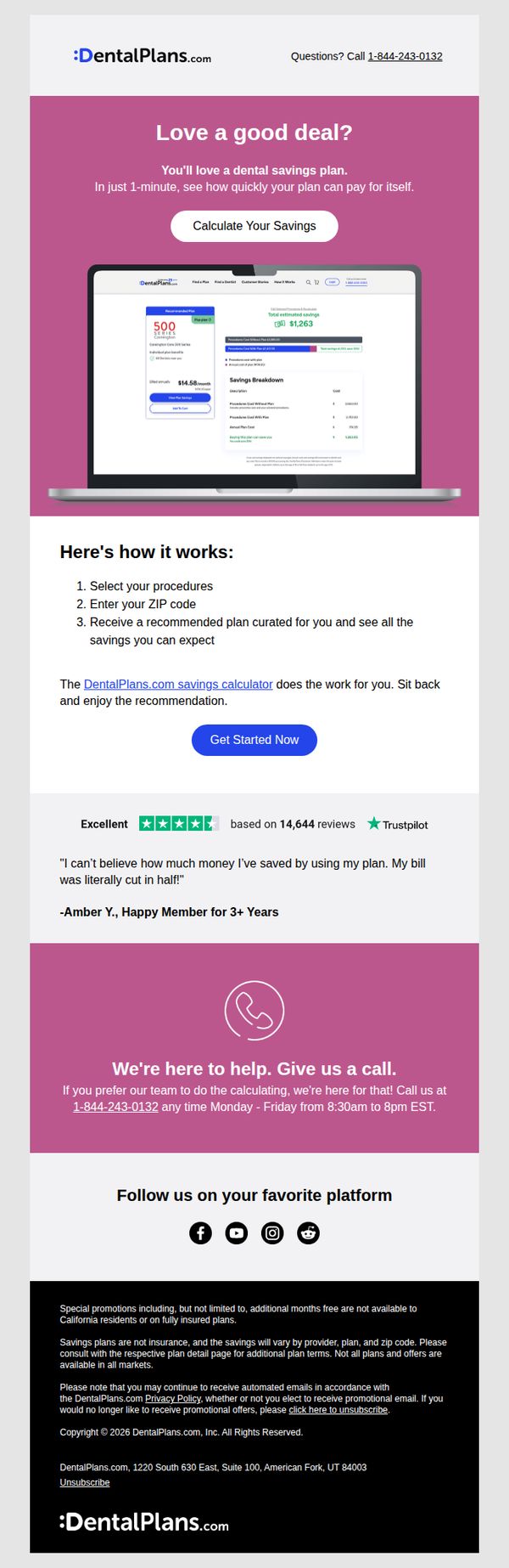
The email aims to drive immediate engagement by encouraging recipients to calculate their potential dental savings using DentalPlans.com’s tool, positioning the service as a fast, personalized solution to reduce dental costs. It leverages social proof and urgency to convert interest into action.
Why this works
The email opens with a bold, benefit-driven headline that speaks directly to financial pain points, immediately anchoring the reader’s attention on the value proposition of reducing dental bills, a smart emotional hook for cost-conscious consumers.
How to implement
Including a visual mockup of the savings calculator on a laptop creates instant credibility and reduces friction by showing users exactly what to expect, making the abstract idea of ‘savings’ feel tangible and achievable within minutes.
Pro Tip
Add a secondary CTA button below the testimonial that says 'Talk to a Savings Specialist' to capture users who prefer human assistance, reducing drop-off for those hesitant to self-navigate the calculator. • Include a small countdown timer or urgency indicator near the 'Calculate Your Savings' button (e.g., 'Savings calculator updated 2 hours ago, 87 people saved today') to create subtle FOMO and encourage immediate action.
4. InstantScripts: Welcome to InstantScripts
Objective
This email aims to onboard new users by introducing InstantScripts as Australia’s largest online medical clinic, highlighting key services like prescription refills, telehealth consultations, and medical certificates, all designed to position the brand as a trusted, convenient healthcare solution for everyday needs.
Why this works
The email immediately builds credibility by anchoring its value proposition in scale, ‘Australia’s largest online medical clinic’, which reassures new users that they’re joining a widely trusted platform with over 2 million Australians already onboard.
How to implement
Each service is clearly priced and paired with a specific visual cue, like a phone call or mobile app screenshot, making complex healthcare offerings feel tangible, accessible, and frictionless for users who may be unfamiliar with telemedicine.
Pro Tip
Add a countdown timer or urgency indicator near the $5 referral discount to encourage immediate sharing, since social proof loses impact when delayed, especially in a welcome email where momentum matters most. • Reorder the service CTAs to prioritize the highest-conversion offer first, likely ‘Request a Consultation $49’, since it drives deeper engagement than script requests, which may be more niche or conditional on existing prescriptions.
5. Aged Care Decisions: , are you asking the right care plan questions?
Objective
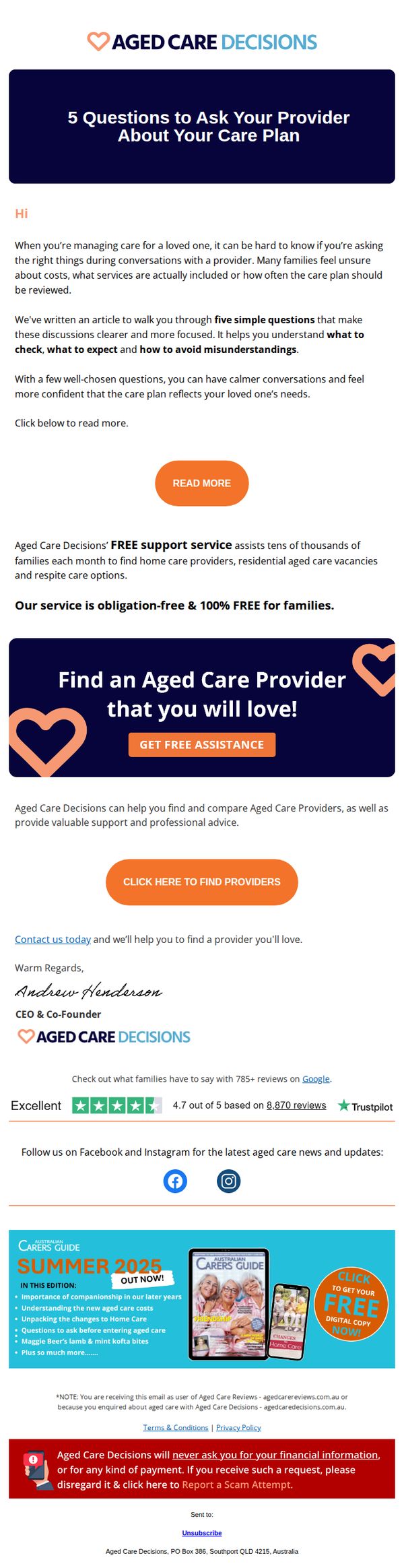
This email aims to empower families managing aged care by guiding them through essential questions to ask providers, while positioning Aged Care Decisions as a trusted, free support service that simplifies provider selection and reduces emotional stress during decision-making.
Why this works
The email opens with an empathetic tone that acknowledges the emotional weight of aged care decisions, instantly building trust by validating the reader’s uncertainty rather than jumping into sales or solutions too quickly.
How to implement
By framing the core content as five simple, actionable questions, the campaign transforms overwhelming complexity into manageable guidance, making the reader feel supported and equipped, not overwhelmed or judged for their lack of knowledge.
Pro Tip
Add a subtle countdown timer or urgency cue near the 'GET FREE ASSISTANCE' CTA to encourage faster action, especially since the service is positioned as timely and emotionally supportive during high-stress decision windows. • Include a short bulleted list under the hero section summarizing the five key questions to preview value upfront, this improves scannability and reinforces the educational promise before the reader clicks through.
6. Maximus Tribe: Why testosterone alone isn't enough

Objective
This email aims to educate men over 40 on why stacking Testosterone, Sermorelin, and GLP-1s delivers superior body composition results compared to using testosterone alone, while guiding them toward personalized protocol consultations.
Why this works
The email brilliantly reframes testosterone as just one piece of a larger puzzle, positioning stacking as the secret weapon of high-performing men over 40, a narrative that elevates perceived value and justifies premium pricing.
How to implement
By breaking down each compound’s unique role, Testosterone for muscle, Sermorelin for recovery, GLP-1s for appetite control, the email transforms complex science into digestible, benefit-driven storytelling that builds trust and reduces buyer hesitation.
Pro Tip
Add a short testimonial or case study snippet near the 'How they work together' section to humanize the science, e.g., 'John, 47, lost 18 lbs and gained 6 lbs of muscle in 12 weeks using this stack', to boost social proof and emotional resonance. • Include a subtle visual hierarchy cue, like a progress bar or numbered steps, to guide the reader through the stacking logic, making the educational flow feel more structured and less text-heavy, especially for skimmers.
7. My Mobility UK : Still have a stairlift you no longer need?
Objective
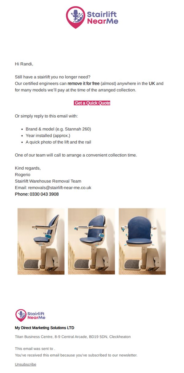
The email aims to encourage recipients to remove unused stairlifts by offering free removal services and cash compensation for eligible models, while prompting immediate action through a simple quote request or direct reply.
Why this works
The email opens with a direct, empathetic question that immediately resonates with the recipient’s potential situation, making the offer feel personalized and timely rather than generic or salesy.
How to implement
By offering both free removal and cash compensation, the campaign transforms a chore into a benefit, creating dual incentives that reduce friction and increase the likelihood of recipient action.
Pro Tip
Add a small countdown timer or urgency cue near the CTA to encourage faster replies, since the offer implies limited availability or time-sensitive compensation for certain models. • Include a brief testimonial or customer quote near the offer section to build social proof, something like, 'Over 2,000 stairlifts removed for free last year, clients loved the hassle-free process.'
8. Stem Cell Institute : Questions About Stem Cells? We've Got Answers.
Objective
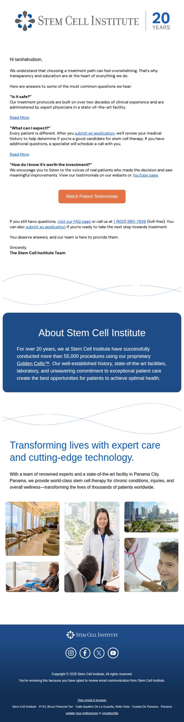
This email aims to build trust and reduce hesitation by directly addressing common patient concerns about stem cell therapy, guiding the reader toward taking the next step, submitting an application or watching testimonials, with the ultimate goal of converting curious prospects into qualified leads.
Why this works
The email brilliantly preempts buyer anxiety by front-loading answers to the top three patient objections, safety, personal outcomes, and ROI, making the reader feel heard and reducing friction before they even consider booking a consultation.
How to implement
Instead of pushing a hard sell, the campaign positions the brand as a trusted educator by using a conversational Q&A format that mirrors real patient conversations, which builds credibility and invites deeper engagement without triggering sales resistance.
Pro Tip
The primary CTA 'Watch Patient Testimonials' is visually prominent but lacks urgency or personalization; adding a dynamic element like 'See how patients like you improved in 30 days' would strengthen emotional pull and conversion intent. • The email lacks a secondary CTA or directional nudge after the testimonial section, adding a subtle 'Still unsure? Schedule a free 15-minute consult with our specialist' button would capture mid-funnel readers who need more hand-holding.
9. Aged Care Decisions: Signs it may be time for residential care
Objective
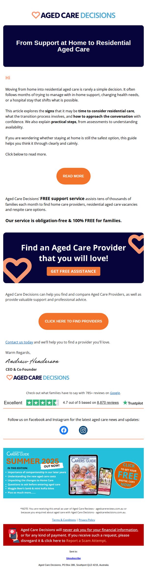
This email aims to guide families through the emotionally complex decision of transitioning a loved one into residential aged care by offering a clear, compassionate resource that outlines key signs, practical steps, and support options, ultimately encouraging them to seek free, obligation-free assistance.
Why this works
The email opens with empathy, acknowledging the emotional weight of the decision, which immediately builds trust and positions the brand as a compassionate guide rather than a sales-driven entity, a critical tone for sensitive healthcare transitions.
How to implement
By framing the content as a practical, step-by-step guide that addresses both emotional hesitation and logistical concerns, like assessments and availability, the email reduces overwhelm and positions the brand as an indispensable navigator through a complex process.
Pro Tip
The primary CTA 'READ MORE' is too generic and doesn’t reflect the urgency or emotional weight of the decision; replacing it with something like 'Start Your Care Journey Today' or 'Get Personalized Guidance Now' would better align with the campaign’s goal of driving action. • The email lacks a visual hierarchy that guides the eye from problem → solution → action; adding subtle dividers, icons, or a progress bar (e.g., 'Step 1: Recognize the Signs → Step 2: Explore Options') would improve flow and reduce cognitive load for overwhelmed readers.
10. Burlington Family Dental : Online Booking from Burlington Family Dental
Objective
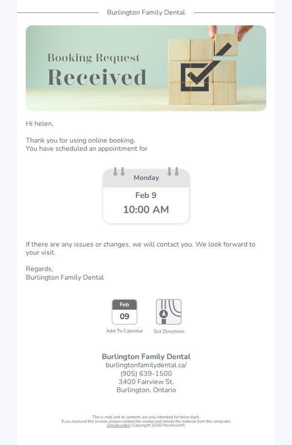
This email confirms a patient’s online appointment booking and reassures them that their visit is secured, while providing essential logistical details to reduce anxiety and encourage timely arrival. It also subtly reinforces brand trust through clean design and clear contact information.
Why this works
The email immediately validates the user’s action with a clear, visual confirmation header, 'Booking Request Received', which reduces uncertainty and builds trust right from the first glance, making the patient feel acknowledged and secure.
How to implement
By embedding a clean, calendar-style appointment card with date and time, the email transforms abstract scheduling into a tangible, visual commitment, helping patients mentally anchor their visit and reducing no-shows through psychological ownership.
Pro Tip
Add a brief pre-visit checklist (e.g., 'Bring your insurance card and arrive 10 minutes early') to reduce patient anxiety and improve on-time arrivals, directly supporting the goal of smooth appointment execution. • Include a personalized note from the dentist or front desk team (e.g., 'Dr. Smith looks forward to seeing you!') to humanize the confirmation and strengthen emotional connection, increasing patient loyalty and retention.