The complete International Women’s Day relational email collection


1. Fjällräven: Summer of opportunities
Objective
This email aims to inspire summer adventure planning by showcasing Fjällräven’s versatile outdoor gear, encouraging recipients to shop for functional clothing and equipment that experts trust for camping, kayaking, hiking, and more.
Why this works
The email brilliantly ties seasonal excitement to product utility by framing summer as a time of ‘opportunities’, not just sales, making the gear feel essential to the adventure rather than just an add-on.
How to implement
By featuring real outdoor moments, from kayaking to campfire cooking, the campaign builds emotional resonance, subtly positioning Fjällräven as a companion to authentic, expert-approved experiences rather than just a clothing brand.
Pro Tip
Add a subtle countdown timer or urgency cue near the 'Gear up for summer' CTA to nudge procrastinators, since summer planning is time-sensitive, this could boost conversion without compromising the inspirational tone. • Integrate a personalized product recommendation section (e.g., 'Based on your last hike, try these shorts') to leverage behavioral data and increase relevance, especially for returning customers who’ve browsed or purchased before.
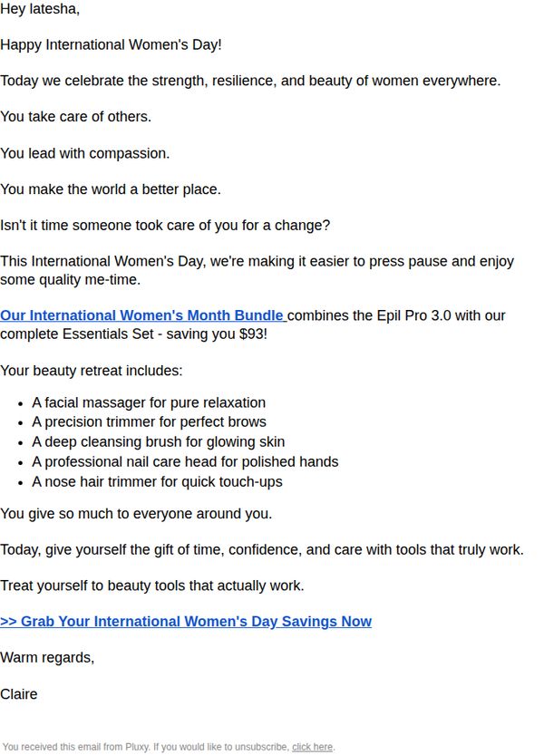
2. Pluxy Co : A Special Gift For International Women's Day 🎁
Objective
This email aims to celebrate International Women’s Day by honoring recipients with a personalized message of appreciation while encouraging them to treat themselves to a discounted beauty bundle that saves time and delivers real results. It positions self-care as a well-deserved reward.
Why this works
The email opens with emotional resonance by acknowledging the recipient’s daily sacrifices and leadership, making the offer feel like a personal gift rather than a sales pitch, a powerful way to build trust before asking for action.
How to implement
By bundling multiple high-value tools into one package with a clear dollar savings, the campaign reduces decision fatigue and positions the purchase as a smart, indulgent investment in self-care, not just another beauty product.
Pro Tip
Add a visual of the bundle or product icons next to the bullet list to increase perceived value and help recipients instantly visualize what they’re getting, this would strengthen the emotional-to-visual handoff before the CTA. • Include a subtle urgency element like ‘Offer expires in 48 hours’ or ‘Only 50 bundles left’ near the CTA to nudge action without undermining the celebratory tone, this would convert passive readers into buyers.
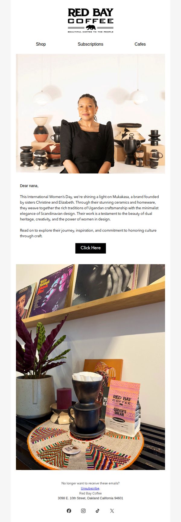
3. Red Bay Coffee: Happy International Women's Day feat Mukakasa!
Objective
This email celebrates International Women’s Day by spotlighting Mukakasa, a women-founded brand that blends Ugandan craftsmanship with Scandinavian design, aiming to inspire customers while driving engagement through storytelling and a direct call to explore the collaboration.
Why this works
The email masterfully ties a cultural moment, International Women’s Day, to a meaningful brand collaboration, making the promotion feel purposeful rather than purely transactional, which builds emotional resonance with socially conscious consumers.
How to implement
By introducing Mukakasa through a personal narrative that highlights heritage, design philosophy, and sisterhood, the email transforms a product feature into an inspiring story that invites readers to connect with the makers, not just the merchandise.
Pro Tip
Add a secondary CTA beneath the product image, such as 'Shop the Mukakasa Collection', to reduce friction for users who are already convinced and want to buy immediately, rather than being forced to click through to another page. • Include a short testimonial or quote from Christine or Elizabeth of Mukakasa within the body copy to humanize the brand further and reinforce authenticity, which would strengthen emotional persuasion without adding visual clutter.
4. Fjällräven: Light tops that last
Objective
This email aims to drive summer apparel sales by showcasing durable, breathable tops while subtly reinforcing brand values through sustainability storytelling and cross-category exploration. It encourages immediate browsing with clear category CTAs and leverages aspirational outdoor imagery to connect emotionally with active lifestyles.
Why this works
The email brilliantly ties product functionality to seasonal lifestyle needs by positioning breathable, durable tops as essential summer companions, not just clothing, but gear for lasting adventures that match the customer’s active rhythm.
How to implement
By embedding a sustainability report as a ‘summer read,’ the brand elevates its CSR message into a compelling narrative rather than a footnote, making ethical values feel relevant and digestible while reinforcing long-term brand trust without overt sales pressure.
Pro Tip
Add a subtle countdown timer or urgency cue near the ‘Limited Edition’ product tiles to nudge immediate action without disrupting the calm, exploratory tone, especially effective for time-sensitive items like the cream-colored limited edition tee. • Reposition the ‘All shorts’ CTA to appear immediately after the top product grid, creating a tighter visual and behavioral flow that capitalizes on the momentum of browsing tops before prompting the next logical category, shorts, for complete summer outfit planning.
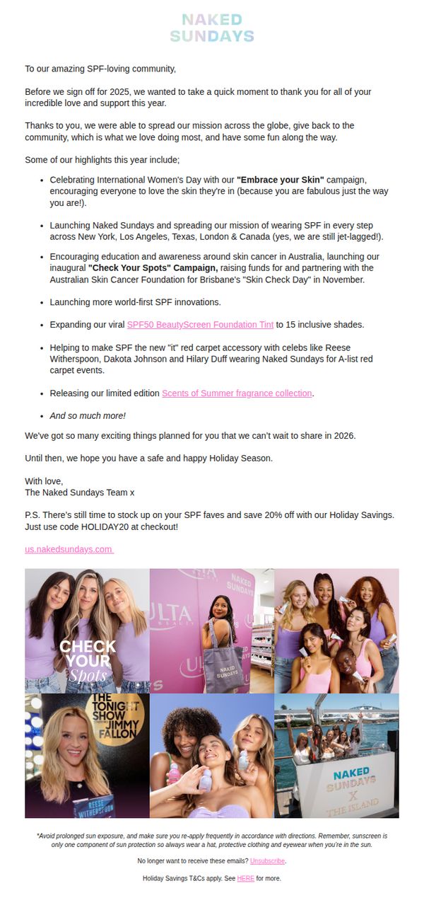
5. Naked Sundays: A Letter to Our SPF VIPs 💜
Objective
To express heartfelt gratitude to loyal customers while subtly encouraging year-end purchases through a limited-time discount, reinforcing brand mission and community connection ahead of the new year.
Why this works
The email brilliantly blends emotional storytelling with strategic promotion by opening with a personal thank-you letter that honors customer loyalty before gently introducing a time-sensitive discount, making the offer feel like a gift rather than a sales pitch.
How to implement
By spotlighting real-world brand moments, from red carpet celebrity partnerships to community-driven skin cancer awareness campaigns, the email builds credibility and emotional resonance, turning customers into proud ambassadors of a mission bigger than skincare.
Pro Tip
Add a visual countdown timer next to the 'HOLIDAY20' discount code to amplify urgency and reduce decision latency, especially since the offer is tied to a seasonal window that may already be closing. • Include a small 'Shop Bestsellers' button or product carousel beneath the P.S. to reduce friction, customers motivated by the discount may want to immediately browse top products without scrolling back up or navigating away.
6. Fjällräven: Need a change?

Objective
This email aims to inspire potential adventurers to apply for the Fjällräven Polar 2026 expedition by showcasing transformative personal stories and emphasizing life-changing experiences beyond comfort zones. It also subtly promotes the brand’s Expedition jacket line as essential gear for such journeys.
Why this works
The email masterfully blends emotional storytelling with adventure marketing by featuring real participant testimonials that highlight personal transformation, making the expedition feel both aspirational and attainable rather than just a physical challenge.
How to implement
By anchoring the campaign around the theme of stepping outside one’s comfort zone, the brand taps into universal human desires for growth and self-discovery, turning an extreme outdoor experience into a relatable metaphor for personal evolution.
Pro Tip
Add a visible countdown timer near the application deadline (November 24, 2025) to create urgency and reduce procrastination among interested applicants who may otherwise forget or delay action. • Include a brief FAQ or eligibility summary under ‘How to Apply’ to preemptively address common questions about fitness requirements, gear expectations, or travel logistics, reducing friction for hesitant prospects.
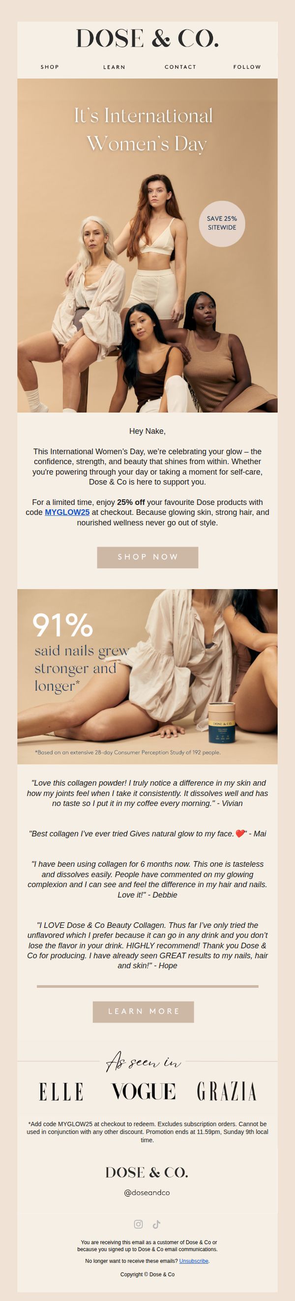
7. Dose & Co: Happy International Women's Day 🤍
Objective
This email aims to celebrate International Women’s Day by connecting emotionally with recipients through empowerment messaging while driving immediate sales via a time-sensitive 25% discount on collagen products. It positions Dose & Co as a wellness partner that supports inner and outer glow.
Why this works
The email brilliantly ties a cultural moment, International Women’s Day, to product benefits by framing collagen not just as a supplement, but as a symbol of inner strength and radiant self-care that aligns with modern femininity.
How to implement
By featuring diverse women in the hero image and pairing it with a bold sitewide discount, the campaign creates emotional resonance while immediately converting sentiment into action without sacrificing brand tone or visual cohesion.
Pro Tip
Add a countdown timer near the CTA to reinforce urgency around the Sunday 11:59pm deadline, which is currently buried in fine print at the bottom, this would increase conversion pressure without disrupting the elegant layout. • Include a small visual icon or badge next to the '91% said nails grew stronger' stat to make the data point more scannable and credible, helping users quickly absorb the benefit without reading the footnote.
8. uncommon goods: It's International Women's Day

Objective
This email aims to celebrate International Women’s Day by spotlighting empowering, women-made, and women-inspired products while encouraging immediate purchases through curated collections and emotional storytelling. It also seeks to drive membership sign-ups for perks like free shipping.
Why this works
The email opens with a bold, emotionally resonant headline that reframes International Women’s Day as an everyday celebration, instantly connecting with values-driven shoppers while softening the pressure of a one-day sale event.
How to implement
By curating products around themes like 'Women’s Empowerment' and 'Woman-powered and on-point,' the campaign transforms gift-giving into a mission-driven act, making purchases feel meaningful rather than transactional and deepening brand loyalty.
Pro Tip
Add a subtle countdown timer or urgency indicator near the 'Shop Women’s Empowerment' CTA to nudge immediate action, since the current design lacks time-sensitive motivation despite the holiday context. • Reposition the 'Unlimited free shipping' perk higher in the email, ideally beneath the hero section, to reduce friction for new customers who may abandon before seeing the value proposition that justifies signing up.
9. Fjällräven: Fleece or flannel?

Objective
This email aims to educate customers on the importance of mid-layering for winter warmth and guide them toward purchasing versatile, high-performance fleece and flannel pieces from Fjällräven’s collection. It positions the brand as an authority on functional outdoor wear while driving traffic to gender-specific product pages.
Why this works
The email brilliantly reframes a technical outdoor concept, mid-layering, into an accessible, lifestyle-relevant decision point, making customers feel informed rather than sold to, which builds trust before the click.
How to implement
By showcasing both fleece and flannel as equally valid mid-layer options with distinct benefits, the campaign avoids alienating style or function-focused shoppers, widening its appeal without diluting the core message of performance-driven warmth.
Pro Tip
Add a visual comparison chart or toggle between fleece vs. flannel under the 'Master winter mid-layering' header to help indecisive shoppers quickly self-select based on warmth, packability, or activity type. • Include a micro-testimonial or user-generated photo beneath each 'Shop now' button, e.g., 'Worn on 30+ hikes in Norway', to reinforce real-world credibility and reduce perceived risk for first-time buyers.
10. Fjällräven: Buy trousers that last

Objective
This email aims to drive sales of durable, high-performance trousers by positioning them as long-term investments for outdoor enthusiasts, while reinforcing Fjällräven’s brand values of quality, functionality, and thoughtful design tailored to both men and women.
Why this works
Fjällräven brilliantly reframes the purchase of trousers not as a seasonal fashion decision but as a long-term investment in durability and performance, appealing directly to outdoor lovers who value gear that endures real-world conditions.
How to implement
By featuring both men’s and women’s models in authentic outdoor settings and then explicitly calling out gender-specific design philosophy, the brand builds trust with audiences who care about thoughtful, body-conscious engineering rather than just scaled-down versions of men’s styles.
Pro Tip
Add a subtle countdown timer or limited-edition badge near the 'New Colour' product (Vidda Pro Lite Trousers M) to create urgency and highlight novelty, encouraging faster decision-making without disrupting the email’s calm, premium tone. • Reposition the 'Explore' CTA button under the 'Trekking trousers for life' section to be more visually prominent, perhaps with a contrasting color or larger size, to better guide users from emotional storytelling to immediate action, reducing friction in the conversion path.