Relational Campaign email gallery from real brands


1. Lubna Iqbal just posted something that might be of interest to you
Objective
This email aims to re-engage the recipient by surfacing relevant, personalized LinkedIn posts from their network that align with career development and professional growth interests, encouraging them to return to the platform for deeper interaction.
Why this works
The email leverages social proof by highlighting posts from real connections with visible engagement metrics, making the content feel timely, credible, and worth exploring, a smart way to trigger curiosity without being pushy.
How to implement
Each post preview is intentionally truncated with a 'see more' link and a dedicated 'Read more' button, creating a frictionless path to deeper content while preserving the email’s scannability and respecting the reader’s time.
Pro Tip
Add a personalized subject line or preheader that references the recipient’s industry or recent activity (e.g., 'Posts from HR pros you follow, plus 5 interview tips you’ll want to see') to increase relevance and open rates. • Include a small visual indicator (like a badge or icon) next to posts that match the user’s stated interests or job function to reinforce personalization and help users prioritize what to read first.
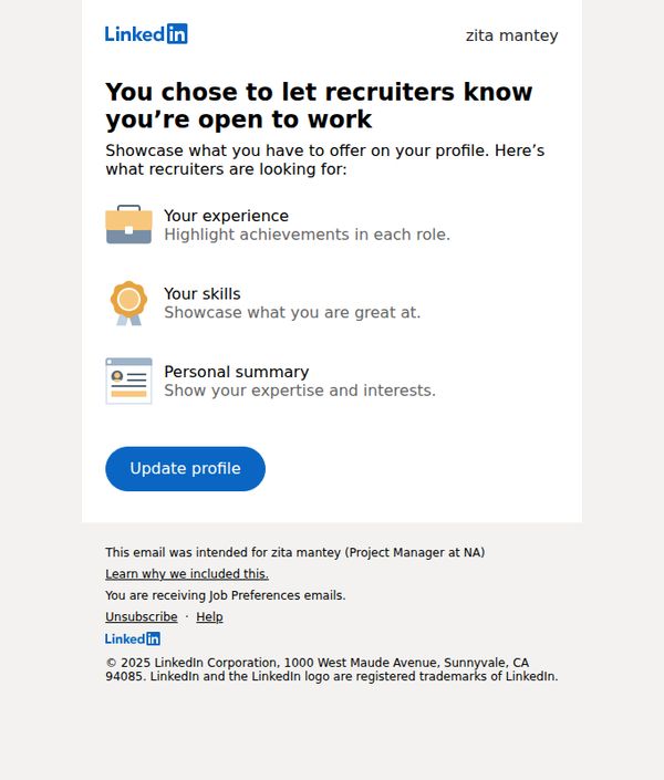
2. You’re now open to work - we can help you get noticed
Objective
This email aims to encourage LinkedIn users who’ve signaled they’re open to work to optimize their profiles so recruiters can easily discover and evaluate them. It guides users to highlight key professional assets that attract hiring managers.
Why this works
The email immediately validates the user’s decision to go job-seeking by affirming it’s a smart move, then quickly pivots to actionable guidance, making the recipient feel supported rather than sold to.
How to implement
By breaking down profile optimization into three digestible, icon-supported components, experience, skills, and personal summary, the email reduces overwhelm and makes profile updating feel manageable and goal-oriented.
Pro Tip
Add a visual example or mini-preview of what an optimized profile looks like after updating, so users can visualize the outcome and feel more motivated to act. • Include a time-sensitive element like ‘Recruiters view 30% more profiles this week’ to create urgency and nudge immediate action instead of passive reading.
3. Tamsin Hawes just posted something that might be of interest to you
Objective
To re-engage users by surfacing relevant, personalized content from their network that aligns with professional development interests, encouraging them to return to LinkedIn for deeper interaction.
Why this works
The email leverages social proof by highlighting content from recognizable network members, creating a sense of FOMO that nudges users to re-engage with the platform for timely, relevant career insights.
How to implement
Each post preview is curated to reflect professional growth themes, from CV writing to interview prep, ensuring the content resonates with the user’s career stage and encourages click-throughs with targeted value propositions.
Pro Tip
Add a subtle visual indicator (like a small badge or timestamp) next to each post to show how recently it was published, enhancing urgency and relevance for time-sensitive professional content. • Include a personalized tagline above the feed, such as 'Because you follow HR professionals' or 'Based on your job search activity', to strengthen the perception of tailored curation and increase trust in the content selection.
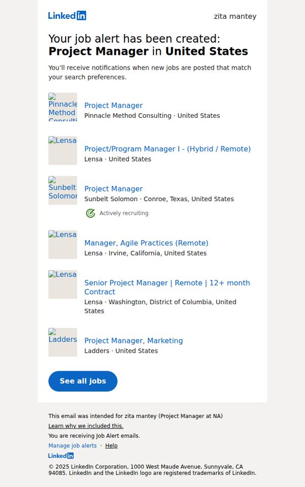
4. Zita: your job alert for Project Manager in United States has been created
Objective
To confirm the user’s job alert has been successfully created and immediately surface relevant job matches to encourage engagement and prompt action. The email aims to reduce friction by delivering value upfront while reinforcing LinkedIn’s role as a proactive career partner.
Why this works
By immediately listing real-time job matches after confirming alert creation, the email transforms a passive notification into an active engagement tool, capitalizing on the user’s moment of intent to drive clicks and reduce drop-off.
How to implement
The clean, scannable job grid with company logos, location tags, and status indicators like 'Actively recruiting' builds credibility and urgency without overwhelming the reader, making it easy to self-select relevant opportunities in seconds.
Pro Tip
Add a subtle countdown or time-sensitive indicator (e.g., 'New jobs added in the last 24 hours') near the top to create urgency and encourage immediate action rather than passive browsing. • Include a secondary CTA above the job grid such as 'Adjust your alert preferences' to empower users to refine results without needing to scroll or navigate away, reducing friction for power users.
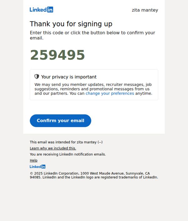
5. zita, your pin is 259495. Please confirm your email address.
Objective
This email aims to verify the user’s email address by prompting them to enter or confirm a unique PIN, ensuring account security and accurate communication preferences while reinforcing LinkedIn’s commitment to user privacy.
Why this works
The email immediately establishes trust by displaying the user’s name and a unique PIN upfront, reducing friction and signaling personalization even in a transactional verification flow.
How to implement
Privacy reassurance is woven into the core message, not as a footnote, by explaining exactly what types of communications the user may receive and offering instant control over preferences.
Pro Tip
Add a secondary CTA or link near the PIN to allow users to request a new code if they didn’t receive or forgot the original, reducing drop-off for users who may have missed the initial message. • Include a brief visual indicator (like a checkmark or progress bar) after the CTA to subtly reinforce that this is step one of a multi-step onboarding process, helping users mentally prepare for next actions.
6. Waseem Younus just posted something that might be of interest to you

Objective
To re-engage users by surfacing relevant, personalized content from their network that aligns with professional interests, encouraging them to return to LinkedIn and interact with posts or download the app.
Why this works
The email leverages social proof by highlighting posts from real connections, making the content feel personally relevant and increasing the likelihood of engagement through familiarity and trust.
How to implement
By featuring multiple posts with consistent 'Read more' CTAs, the email creates a scrollable feed experience that mimics the platform’s native UI, reducing friction for users returning to LinkedIn.
Pro Tip
Add a personalized subject line or preheader that references the user’s industry or recent activity to increase relevance and open rates beyond generic network notifications. • Include a brief summary or highlight of the most engaging post (e.g., 'Top post: 8,789 likes') to create urgency and prioritize content, helping users decide what to click first.
7. Loving your job might make you quit…
Objective
To intrigue recipients by challenging the conventional wisdom around job satisfaction, prompting them to explore why loving their job might lead to quitting, and ultimately drive engagement with LinkedIn’s career resources or platform.
Why this works
The email masterfully flips conventional career wisdom on its head by suggesting that loving your job might actually be the catalyst for quitting, a provocative hook that instantly grabs attention and invites deeper exploration.
How to implement
By personalizing the recipient’s name at the top and pairing it with a bold, curiosity-driven headline, the email creates an immediate sense of relevance and psychological ownership, making the reader feel the message was crafted specifically for them.
Pro Tip
Add a brief teaser paragraph or bullet points under the headline to hint at the psychological or strategic reasoning behind the claim, this would reduce ambiguity and increase click-through rates by giving readers a preview of value. • Include a subtle social proof element, such as 'Read by 120,000 professionals this week' or a short testimonial quote, to build credibility and urgency around the insight, making the CTA feel more like a must-read than a curiosity.
8. Here's why you should keep up with your…
Objective
The email aims to encourage users to stay active in their job search during the holiday season by reinforcing the value of LinkedIn’s platform, while subtly prompting engagement through a compelling CTA. It also promotes app adoption to ensure users remain connected to opportunities.
Why this works
LinkedIn smartly ties seasonal behavior, holiday downtime, to professional urgency, reminding users that job markets don’t pause, which creates timely, emotionally resonant motivation to stay active on the platform.
How to implement
The minimalist design with a single, bold CTA button reduces friction and focuses attention, making it easy for distracted users to take the next step without overthinking or scrolling past the message.
Pro Tip
Add a brief testimonial or stat (e.g., '80% of hires happen during the holidays') in the hero section to strengthen social proof and urgency, making the 'why' more tangible before the CTA. • Rephrase the CTA from 'Read more' to something action-oriented like 'Keep Your Job Search Active This Holiday' to better align with the objective and increase click-through intent.
9. Have you heard of the Pomodoro…
Objective
This email aims to engage users by introducing the Pomodoro productivity technique and encouraging them to explore LinkedIn’s career resources, while also promoting the LinkedIn desktop and mobile apps to increase platform usage and retention.
Why this works
The email opens with a curiosity-driven hook by referencing the Pomodoro technique, instantly connecting with professionals seeking productivity tips while subtly positioning LinkedIn as a source of career growth strategies.
How to implement
By embedding a clear, high-contrast CTA button labeled 'Read more,' the email guides users toward deeper engagement without overwhelming them, balancing simplicity with persuasive intent to drive click-throughs.
Pro Tip
Add a brief testimonial or stat near the CTA (e.g., '87% of users who tried Pomodoro on LinkedIn saw improved focus') to build social proof and strengthen the incentive to click. • Include a visual element, like a minimalist timer icon or productivity graphic, next to the Pomodoro mention to make the concept more tangible and visually anchor the user’s attention before the CTA.
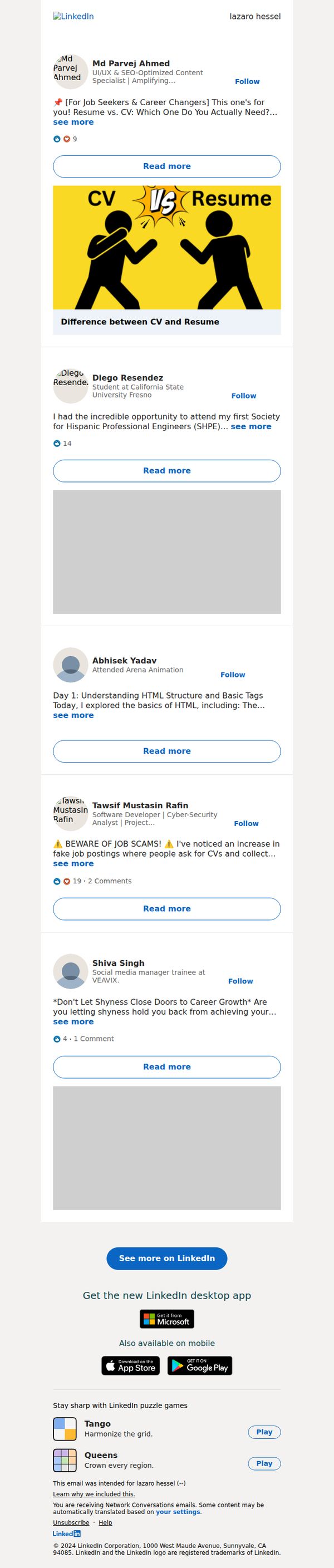
10. Md Parvej Ahmed just posted something that might be of interest to you
Objective
To re-engage users by surfacing relevant, personalized content from their network that aligns with career interests, encouraging them to return to LinkedIn for deeper interaction and continued platform usage.
Why this works
The email leverages social proof by highlighting posts from real connections, making the content feel personally relevant and trustworthy rather than generic promotional material.
How to implement
Each post preview includes a clear, benefit-driven headline and a visual hook, like the CV vs. Resume graphic, that instantly communicates value and encourages curiosity-driven clicks.
Pro Tip
Add a personalized subject line that references the user’s industry or recent activity (e.g., 'Posts from your network in tech just dropped') to increase open rates beyond generic network notifications. • Include a brief, one-sentence summary under each post preview to reduce cognitive load and help users quickly decide which content to engage with, especially on mobile.