Relational Campaign email examples & ideas from Made By Sunday
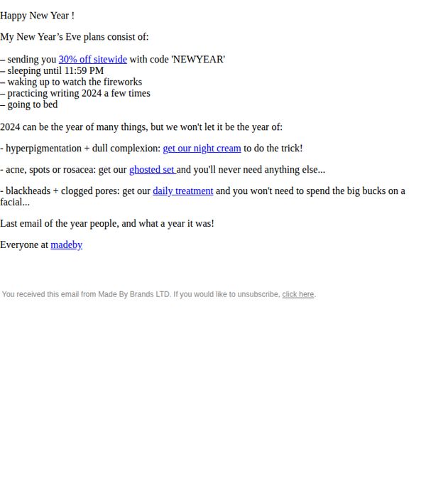
1. you really thought I'd forget?
Objective
To celebrate the end of the year with a lighthearted, personal tone while driving immediate sales through a time-sensitive 30% off discount, positioning Made By Sunday’s products as essential solutions for common skin concerns in the new year.
Why this works
The email opens with a cheeky, conversational tone that mirrors how a friend would tease you about forgetting something important, instantly building rapport and making the promotion feel personal rather than pushy.
How to implement
Instead of generic skincare claims, it ties each product to a specific, relatable skin concern, like hyperpigmentation or blackheads, helping customers instantly recognize which solution fits their unique needs without extra research.
Pro Tip
Add a visual product grid or thumbnail images next to each recommended solution (night cream, ghosted set, daily treatment) to reduce cognitive load and increase click-through by showing what’s being offered, not just describing it. • Include a subtle countdown timer or urgency indicator near the CTA (e.g., 'Offer expires Jan 1 at midnight') to reinforce time sensitivity and reduce hesitation, especially since the discount is tied to a specific holiday event.
2. £34 off the ghosted set
Objective
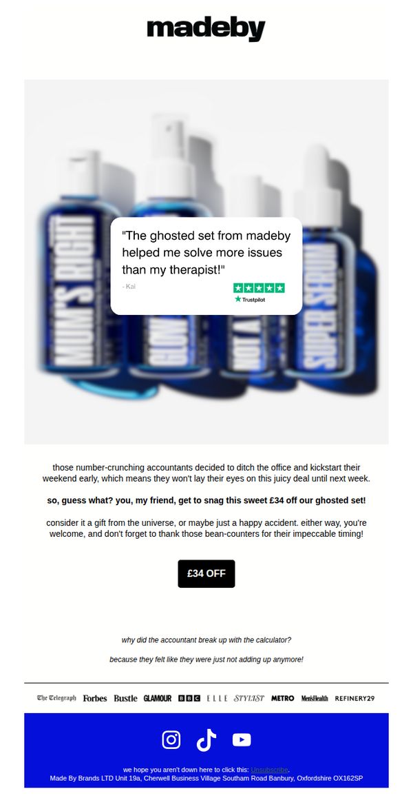
This email aims to drive immediate purchases of the 'ghosted set' by creating urgency around a limited-time £34 discount, while using humor and social proof to make the offer feel serendipitous and irresistible.
Why this works
The email brilliantly frames the discount as a cosmic accident caused by accountants leaving early, turning a sales promotion into a whimsical, relatable story that disarms skepticism and invites emotional engagement.
How to implement
By embedding a Trustpilot testimonial directly over the product image, the campaign leverages social proof at the exact moment of visual impact, subtly validating the product’s value before the customer even reads the offer details.
Pro Tip
Add a countdown timer or 'deal expires in X hours' notice near the CTA to reinforce urgency, since the current copy implies time sensitivity but doesn’t visually pressure the reader to act now. • Include a mini product grid or bullet list of what’s included in the 'ghosted set' beneath the CTA to reduce friction, curious buyers may hesitate without knowing exactly what they’re getting for £34 off.
3. £34 off (the right link!)
Objective
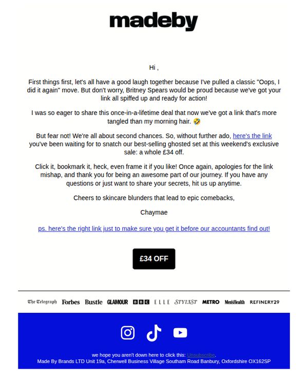
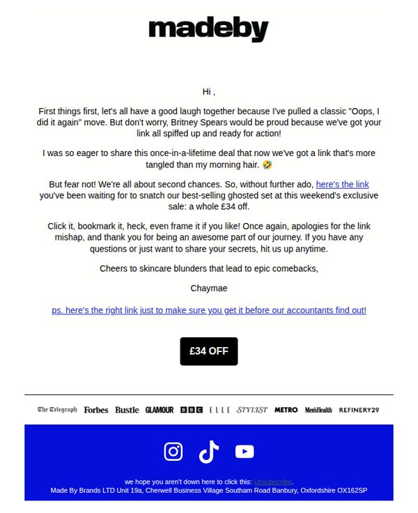
The email aims to re-engage subscribers by humorously acknowledging a broken link error and turning it into a promotional opportunity, encouraging immediate action to redeem a £34 discount on a best-selling skincare set before the sale ends.
Why this works
The brand turns a technical mishap into a relatable, personality-driven moment by referencing Britney Spears and morning hair, making the error feel human and endearing rather than frustrating, which builds trust and encourages forgiveness.
How to implement
By framing the discount as a 'once-in-a-lifetime deal' and tying it to a 'ghosted set' from a weekend sale, the email creates urgency and exclusivity without sounding pushy, making the offer feel like a special second chance rather than a generic promotion.
Pro Tip
Add a visual countdown timer or 'limited stock' indicator near the CTA to amplify urgency, since the current text-only urgency ('weekend’s exclusive sale') lacks real-time pressure that could boost immediate clicks. • Include a small hero image or product thumbnail of the 'best-selling ghosted set' to give visual context to the offer, currently, the lack of imagery may reduce emotional connection and perceived value for new or less familiar subscribers.
4. £34 off the ghosted set
Objective
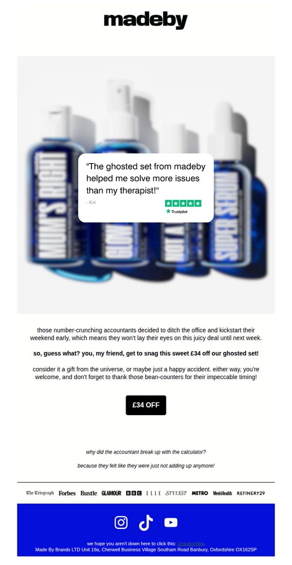
This email aims to drive immediate purchases of the 'ghosted set' by leveraging a limited-time £34 discount, framed as a serendipitous opportunity created by accountants leaving early, turning a humorous narrative into persuasive urgency.
Why this works
The email brilliantly turns a mundane discount into a story-driven event by blaming accountants for the early sale, making the offer feel exclusive, accidental, and emotionally resonant rather than transactional.
How to implement
By embedding a glowing Trustpilot testimonial directly over the product image, the campaign visually reinforces social proof at the moment of visual impact, subtly validating the purchase before the customer even reads the copy.
Pro Tip
Add a countdown timer or urgency indicator near the CTA to reinforce the fleeting nature of the deal, since the 'accountants left early' joke implies time sensitivity but doesn’t visually enforce it. • Include a mini product grid or visual breakdown of what’s included in the 'ghosted set' beneath the CTA to reduce friction, customers may hesitate if they don’t know exactly what they’re getting for £34 off.
5. £34 off (the right link!)
Objective
To re-engage subscribers with a humorous, self-aware apology for a broken link while delivering a time-sensitive £34 discount on best-selling products, encouraging immediate click-through and purchase.
Why this works
The brand turns a technical mishap into a relatable, personality-driven moment by comparing the broken link to Britney Spears’ infamous hair moment, instantly humanizing the brand and building emotional connection through humor.
How to implement
By repeating the correct link in both the body and postscript, the email reduces friction for the user while subtly reinforcing urgency, making it harder to ignore or lose the offer even if distracted by the playful tone.
Pro Tip
Add a countdown timer or 'limited stock' indicator near the CTA to heighten urgency, since the email references a 'weekend exclusive sale' but doesn’t visually reinforce time sensitivity. • Include a small product image or grid preview of the 'best-selling ghosted set' to give visual context to the offer, currently, the email relies entirely on text, which may reduce conversion for visual shoppers.
6. our gift to you...
Objective
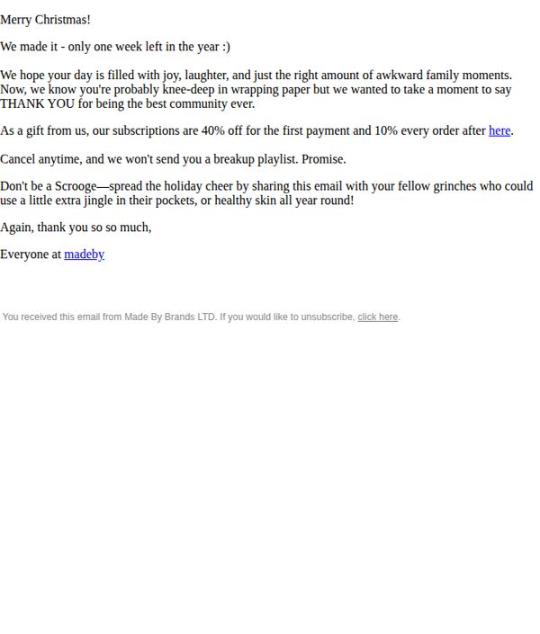
This email aims to express gratitude to the brand’s community while incentivizing subscription sign-ups through a limited-time holiday discount, leveraging festive emotion and social sharing to drive conversions and customer loyalty.
Why this works
The email brilliantly ties the holiday season to customer appreciation by framing the discount as a personal gift, making the promotion feel warm and reciprocal rather than transactional.
How to implement
By humorously acknowledging the chaos of holiday wrapping and family moments, the brand builds relatability and emotional resonance, which lowers resistance to the sales pitch and strengthens community bonds.
Pro Tip
The CTA 'here' is visually underwhelming and lacks urgency, replace it with a button labeled 'Claim Your 40% Holiday Gift' to increase click-throughs and align with the gift-giving theme. • Add a subtle countdown timer or 'Ends Soon' note near the offer to create scarcity, since the 'one week left' mention is buried and doesn’t drive immediate action.
7. £34 off the ghosted set
Objective
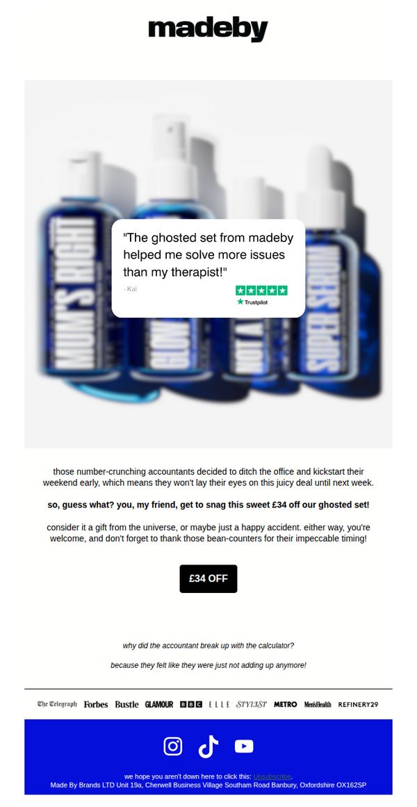
The email aims to drive immediate purchases of the 'ghosted set' by leveraging a limited-time £34 discount, framed as a serendipitous opportunity created by accountants leaving early, blending humor with urgency to reduce friction and encourage impulse buying.
Why this works
The email brilliantly personifies the discount as a cosmic gift from the universe, turning a simple price drop into an emotionally resonant, almost fated opportunity that makes the customer feel lucky rather than just savvy.
How to implement
By humorously blaming accountants for the early weekend and the resulting deal, the brand injects personality and relatability, transforming a transactional message into a shared joke that builds emotional connection and brand likability.
Pro Tip
Add a subtle countdown timer or 'deal ends soon' indicator near the CTA to heighten urgency, since the current copy implies time sensitivity but doesn’t visually reinforce it, which could increase conversion rates. • Include a mini product grid or quick-view of what’s included in the 'ghosted set' beneath the CTA to reduce decision friction, customers may hesitate if they don’t know exactly what they’re getting for £34 off.
8. oil vs face cream
Objective
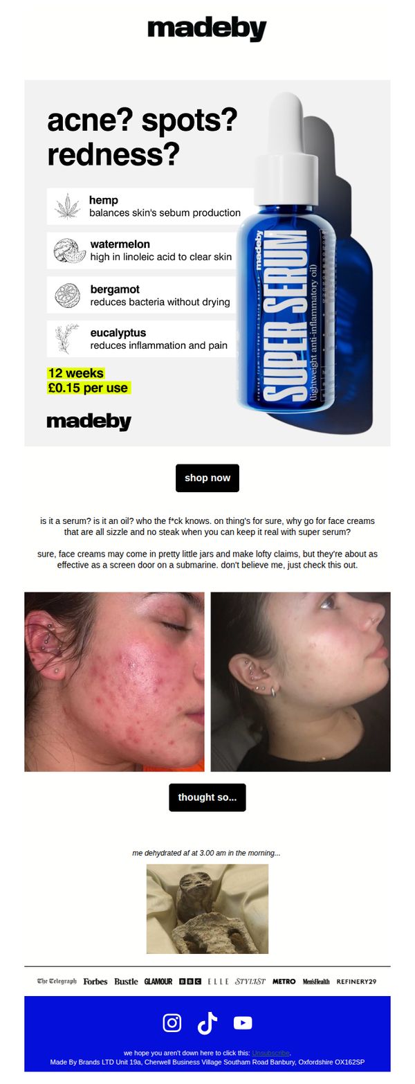
To position Made By Sunday’s Super Serum as a superior, no-nonsense alternative to traditional face creams by highlighting its acne-fighting ingredients and cost efficiency, while using humor and real results to drive conversions.
Why this works
The email brilliantly reframes the product not as a serum or oil but as a rebellious, no-BS solution, using irreverent humor to disarm skepticism and position the brand as refreshingly honest in a saturated skincare market.
How to implement
By juxtaposing a raw before-and-after photo with a meme about dehydration, the campaign leverages emotional contrast and cultural references to make the transformation feel relatable, authentic, and memorable rather than overly polished or salesy.
Pro Tip
Add a subtle countdown timer or limited-quantity indicator near the CTA to create urgency, since the current design lacks any time-sensitive incentive despite the product’s strong value proposition. • Include a short bullet-point FAQ or myth-buster section beneath the hero image to preemptively answer ‘Is this really an oil?’ and ‘Will it break me out?’, reducing friction for skeptical first-time buyers.
9. our gift to you...
Objective
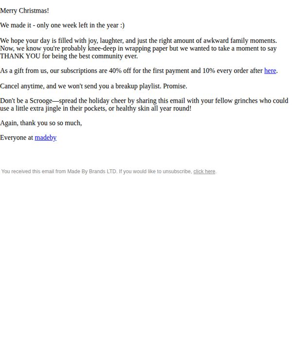
To express gratitude to the community while incentivizing new subscriptions with a holiday-themed discount, encouraging immediate sign-ups and social sharing to expand reach during the festive season.
Why this works
The email brilliantly blends holiday warmth with a clear promotional hook, making the discount feel like a personal gift rather than a sales pitch, which builds emotional resonance and trust with the audience.
How to implement
By framing the offer as a 'thank you' to the community, the brand reinforces loyalty while subtly encouraging referrals, turning existing customers into advocates without sounding transactional or pushy.
Pro Tip
The CTA is buried in the body text as a hyperlink labeled 'here', it should be visually elevated as a button with action-oriented text like 'Claim Your 40% Off Gift' to improve conversion rates. • Adding a visual element, even a simple holiday-themed divider or icon, would break up the text-heavy layout and reinforce the festive theme, making the email more scannable and emotionally engaging.
10. stubborn bumps? textured skin?
Objective
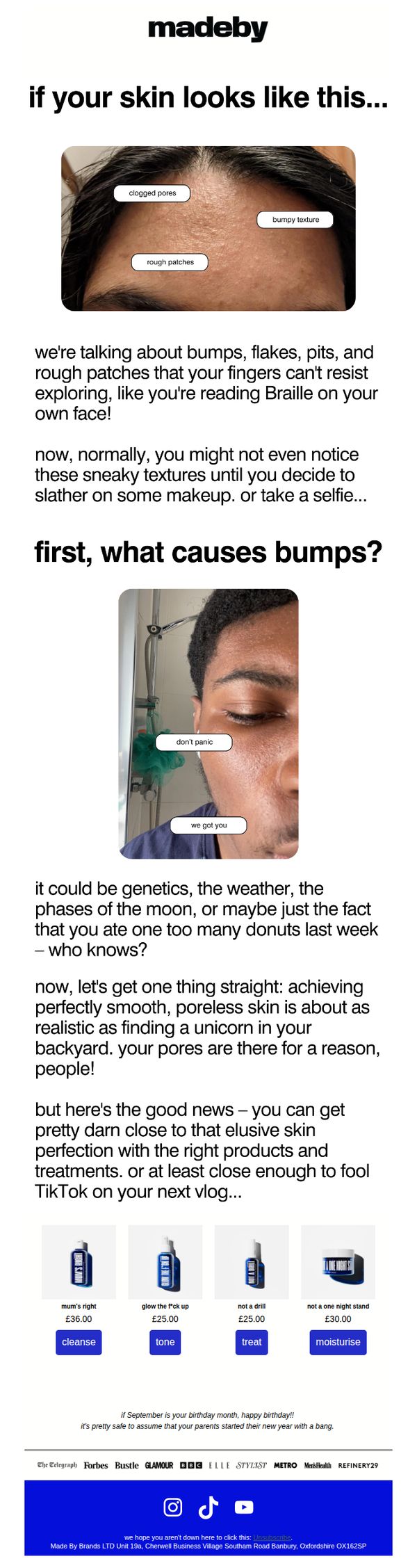
This email aims to resonate with users struggling with textured skin by validating their concerns and positioning Made By Sunday’s products as the realistic, effective solution to achieve smoother, more confident skin, not perfection, but noticeable improvement that looks great on camera.
Why this works
The email opens with a brutally honest, visually relatable image of textured skin, immediately validating the reader’s experience and building trust by acknowledging a problem many feel too embarrassed to name, a powerful hook for skincare audiences.
How to implement
Instead of promising impossible perfection, the copy leans into realism, comparing smooth skin to finding a unicorn, which disarms skepticism and makes the brand feel authentic, approachable, and refreshingly honest in a saturated beauty market.
Pro Tip
Add a short testimonial or user-generated content snippet near the product grid to reinforce social proof, seeing real results from others would strengthen the credibility of the 'pretty darn close to perfection' claim. • Include a micro-CTA or directional arrow after the education section that says 'See the products that fix this' to guide the reader’s eye toward the product grid and reduce friction in the conversion path.