How makeup brands do relational campaign emails
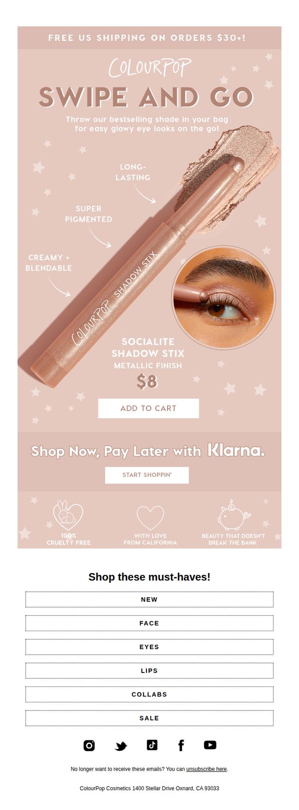

1. ColourPop: Dreamy, glowy eye looks in one swipe 💫
Objective
This email aims to drive immediate sales of the Socialite Shadow Stix by highlighting its convenience, glowy finish, and affordable price, while reinforcing brand values like cruelty-free beauty and accessibility through flexible payment options.
Why this works
The email brilliantly simplifies the product’s value by focusing on a single, relatable benefit, creating dreamy, glowy eye looks in one swipe, which speaks directly to time-poor beauty lovers seeking effortless glam.
How to implement
By visually anchoring the product with real-life application and labeling key attributes like 'creamy + blendable' and 'long-lasting,' the email builds instant credibility and reduces perceived risk for first-time buyers.
Pro Tip
Add a subtle countdown timer near the CTA to create urgency around the $8 price point, especially since the email lacks any time-sensitive offer or limited-edition framing that could drive faster action. • Replace the generic 'Shop these must-haves!' category grid with a dynamic product carousel or curated bundle suggestion featuring complementary items (like mascara or highlighter) to increase average order value through smart cross-selling.
2. Saie: GLOSSY. JUICY. SAVINGS.
Objective
This email aims to drive immediate sales by showcasing curated, value-packed beauty bundles with discounted pricing, while reinforcing Saie’s clean, eco-conscious brand identity to appeal to conscious consumers seeking both performance and ethics.
Why this works
The email brilliantly pairs product visuals with benefit-driven copy that speaks to both aesthetic desire and emotional reward, like 'Undeniably Healthy Glow', making the bundles feel indulgent yet purposeful, which aligns perfectly with modern beauty shoppers’ values.
How to implement
By using strikethrough pricing next to bold discounted amounts, the campaign creates a clear perception of savings without overwhelming the user, subtly encouraging urgency while maintaining a clean, premium aesthetic that matches the brand’s minimalist identity.
Pro Tip
Add a subtle countdown timer or limited-quantity indicator near each bundle’s CTA to amplify urgency without disrupting the minimalist design, encouraging faster decision-making among hesitant shoppers. • Include a short customer testimonial or star rating beneath each bundle to social proof the value proposition, especially since the email lacks personal validation, which could increase perceived trust and conversion.
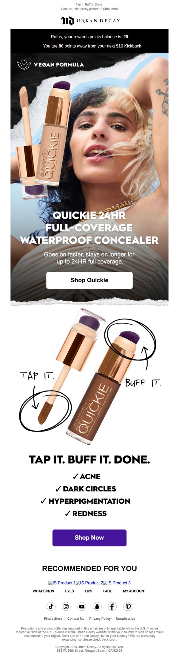
3. Urban Decay - US: Dark under eyes?
Objective
This email aims to convert users struggling with dark under-eye circles by showcasing Urban Decay’s Quickie 24HR concealer as the effortless, long-wearing solution that delivers full coverage with minimal effort. It leverages urgency and simplicity to drive immediate purchases.
Why this works
The email brilliantly reframes a common beauty pain point, dark circles, into a quick, confident fix using the product’s name and tagline, making the solution feel both aspirational and instantly achievable.
How to implement
By visually breaking down application into three simple steps, Tap. Buff. Done., the brand reduces perceived effort and builds trust through clear, no-fuss instruction that appeals to time-strapped consumers.
Pro Tip
Add a small countdown timer or limited-quantity indicator near the CTA to amplify urgency, since the current design lacks temporal pressure despite promoting a high-performance product. • Include a micro-testimonial or user rating snippet directly under the product image to build social proof, especially effective for first-time buyers hesitant about coverage claims.
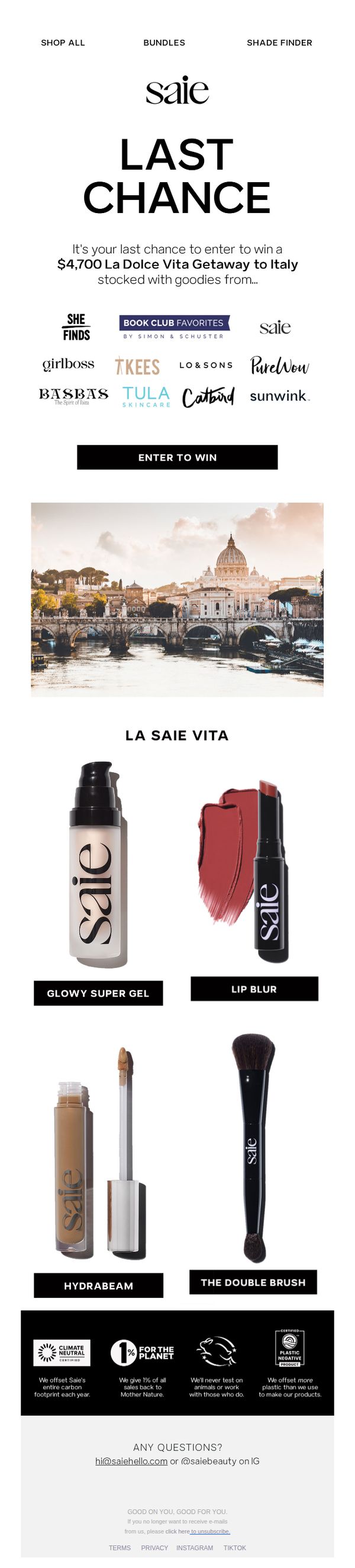
4. Saie: Last Chance to win a $4,700 Italian Getaway
Objective
This email aims to create urgency and drive immediate participation in a high-value giveaway by positioning it as the final opportunity to win a luxury Italian getaway bundled with premium beauty products from Saie and partner brands. It leverages aspirational imagery and social proof to convert interest into action.
Why this works
The email brilliantly combines emotional aspiration with tangible value by pairing a dream Italian getaway with curated beauty products, making the prize feel both luxurious and personally relevant to the target audience’s lifestyle.
How to implement
Using bold, minimalist typography and a clean layout, the campaign directs attention instantly to the urgency-driven headline and CTA, ensuring the core message isn’t lost in visual clutter, a masterclass in conversion-focused design.
Pro Tip
Add a countdown timer beneath the 'LAST CHANCE' headline to visually reinforce urgency and trigger FOMO, increasing the likelihood of immediate clicks before the entry window closes. • Include a short testimonial or user-generated photo from a past winner near the CTA to build social proof and reduce perceived risk, making the giveaway feel more attainable and trustworthy.
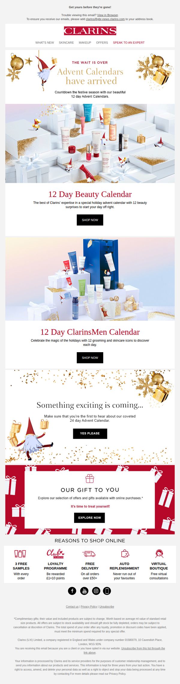
5. Clarins - UK: Our 12 day Advent Calendars are here! 🎁
Objective
To drive immediate sales of Clarins’ limited-edition 12-day Advent Calendars by creating urgency and excitement around holiday gifting, while teasing a future 24-day calendar to build anticipation and email list engagement.
Why this works
The email brilliantly leverages holiday FOMO by announcing limited-edition advent calendars with a clear 'Shop Now' CTA, turning seasonal excitement into immediate purchase intent without overwhelming the reader with too many options.
How to implement
By teasing a 24-day calendar with a 'Yes Please' opt-in button, the campaign smartly converts passive readers into engaged subscribers, building a warm audience for future high-value holiday launches while rewarding curiosity with exclusivity.
Pro Tip
Add a countdown timer under the '12 Day Beauty Calendar' section to visually reinforce scarcity and urgency, encouraging faster decision-making before stock runs out. • Include a short customer testimonial or star rating near the 'Shop Now' button for each calendar to build social proof and reduce perceived risk for first-time buyers.
6. Glossier: There’s no going back
Objective
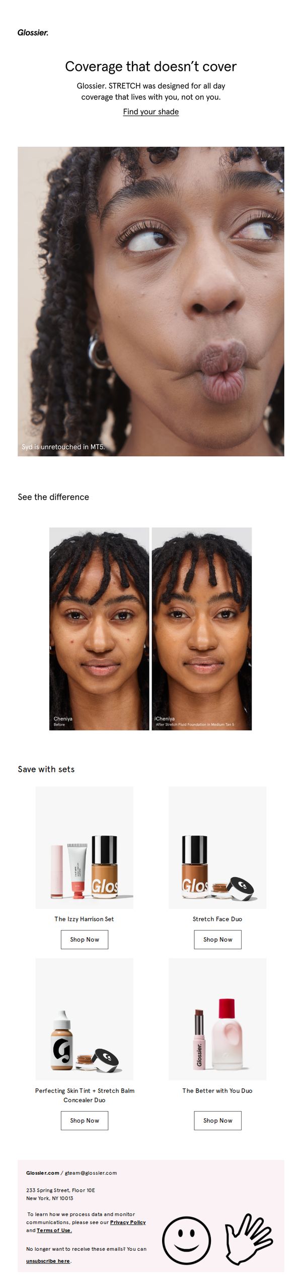
To drive sales of Glossier’s STRETCH foundation by showcasing its natural, skin-like coverage through authentic before-and-after visuals and bundled product sets, encouraging immediate purchase with minimal friction.
Why this works
The email brilliantly uses unretouched, expressive imagery to normalize real skin texture while subtly demonstrating product efficacy, turning authenticity into a persuasive selling point without overt claims.
How to implement
By pairing before-and-after visuals with named models and specific shade names, Glossier builds trust through transparency and personalization, making the product feel tailored rather than generic.
Pro Tip
Add a subtle countdown timer or limited-edition badge near the CTA to create urgency, especially since the subject line implies irreversibility, this would align emotional tone with conversion tactics. • Include a short testimonial or user quote under the before/after section to reinforce social proof, helping hesitant buyers overcome skepticism about coverage claims.
7. Saie: Mother's Day Gift Guide

Objective
This email aims to drive Mother’s Day gift purchases by personalizing product recommendations for different mom archetypes, New Mom, Grandmom, and Busy Mom, while incentivizing higher spend through tiered free gift offers. It positions Saie as a thoughtful, values-driven brand that understands diverse maternal needs.
Why this works
The email brilliantly segments moms into relatable archetypes, New Mom, Grandmom, Busy Mom, making product recommendations feel personal and emotionally resonant rather than generic, which increases relevance and conversion potential.
How to implement
By pairing each mom persona with a specific product and benefit-driven copy, the campaign transforms a simple gift guide into a storytelling experience that validates the recipient’s identity and lifestyle, deepening emotional connection to the brand.
Pro Tip
Add a subtle countdown timer or 'limited stock' indicator near the offer section to create urgency, since the promotion expires 5/8 and could benefit from behavioral nudges to accelerate decision-making. • Include a small 'Why This Works for Her' testimonial snippet under each mom archetype to reinforce social proof and reduce perceived risk, especially helpful for first-time buyers unfamiliar with Saie’s product performance.
8. Charlotte Tilbury - UK: Step Into My Magic World On CharlotteTilbury.com!

Objective
This email aims to drive holiday gifting sales by immersing subscribers in Charlotte Tilbury’s ‘magic’ brand universe, encouraging exploration of personalized beauty gifts, exclusive digital tools, and limited-time offers that evoke emotional connection and urgency.
Why this works
The email brilliantly frames gifting as an emotional, personalized experience by using phrases like ‘make EVERYONE’S BEAUTY DREAMS COME TRUE’ and ‘treating them to the beauty secrets they love,’ which transforms transactional shopping into a sentimental act of care.
How to implement
By integrating interactive tools like the ‘Magic Gift Finder’ and ‘Pro Beauty Tech Tools,’ the campaign doesn’t just sell products, it offers a consultative, tech-enhanced journey that builds trust and reduces purchase hesitation during the high-stakes holiday season.
Pro Tip
The primary CTA ‘DISCOVER MORE’ is repeated too often without clear hierarchy; vary CTAs by section (e.g., ‘FIND YOUR GIFT’ or ‘BOOK YOUR MASTERCLASS’) to guide users toward specific conversion paths aligned with each section’s intent. • The ‘Gift Magic’ section at the bottom visually clusters too many options without visual prioritization; consider using a carousel or progressive reveal to reduce cognitive load and highlight top-performing gift options like e-gift cards or virtual consultations first.
9. Saie: Glossybounce™ Guide

Objective
This email aims to educate subscribers on how to use Saie’s Glossybounce™ lip gloss for maximum shine and comfort while driving product interest and encouraging purchase through visual tutorials and complementary product suggestions.
Why this works
The step-by-step visual tutorial transforms a simple product demo into an engaging, almost ASMR-like experience that makes application feel intuitive and satisfying, encouraging immediate trial and emotional connection with the product.
How to implement
By naming each shade with playful, action-oriented terms like 'Dream,' 'Play,' and 'Bounce,' the brand turns color selection into a personality-driven, mood-based decision, making the purchase feel more expressive and less transactional.
Pro Tip
Add a subtle countdown timer or limited-edition badge near the CTA to create urgency, especially since the product is positioned as crave-worthy and addictive, this could nudge hesitant buyers toward immediate action. • Include a short testimonial or user-generated content snippet beneath the tutorial steps to reinforce social proof, as the current email relies solely on brand-led visuals without third-party validation of the product’s effect.
10. Jeffree Star Cosmetics: Confirm Your Subscription
Objective
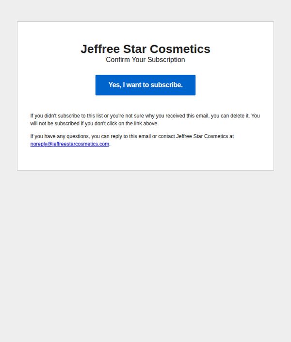
This email aims to confirm new subscribers’ intent to join Jeffree Star Cosmetics’ mailing list, ensuring list hygiene and compliance while gently encouraging engagement through a clear, low-friction CTA.
Why this works
The email uses minimal design and bold typography to immediately communicate its purpose without overwhelming the recipient, making the subscription confirmation feel effortless and trustworthy.
How to implement
By including a clear opt-out reassurance and direct contact email, the brand reduces subscriber anxiety and builds credibility, turning a routine confirmation into a trust-building moment.
Pro Tip
Add a brief value proposition beneath the CTA, such as 'Get early access to new launches and exclusive discounts', to reinforce why subscribing is worth the user’s time and increase conversion. • Include a subtle brand visual element (like a signature swatch or logo accent) to strengthen brand recognition without cluttering the clean layout, making the email feel more authentically Jeffree Star.